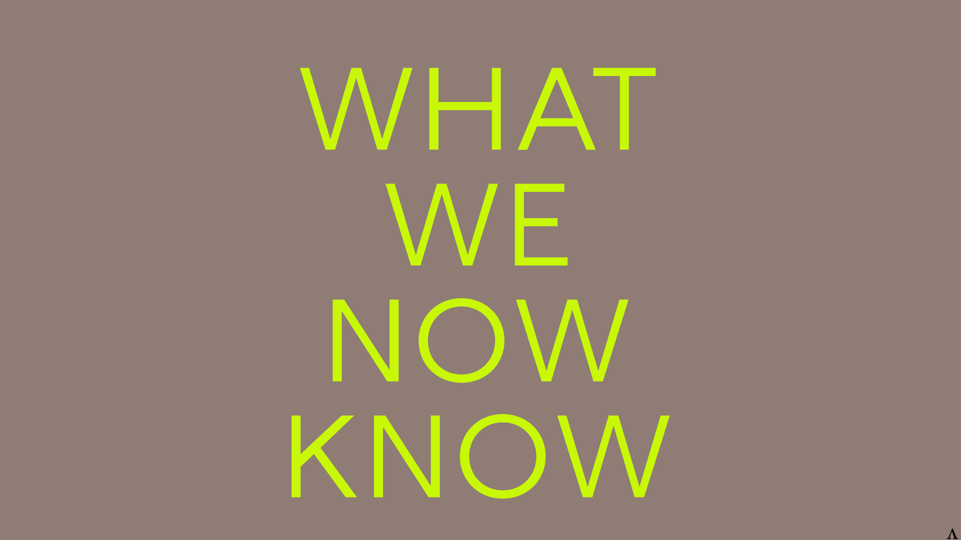
Typography
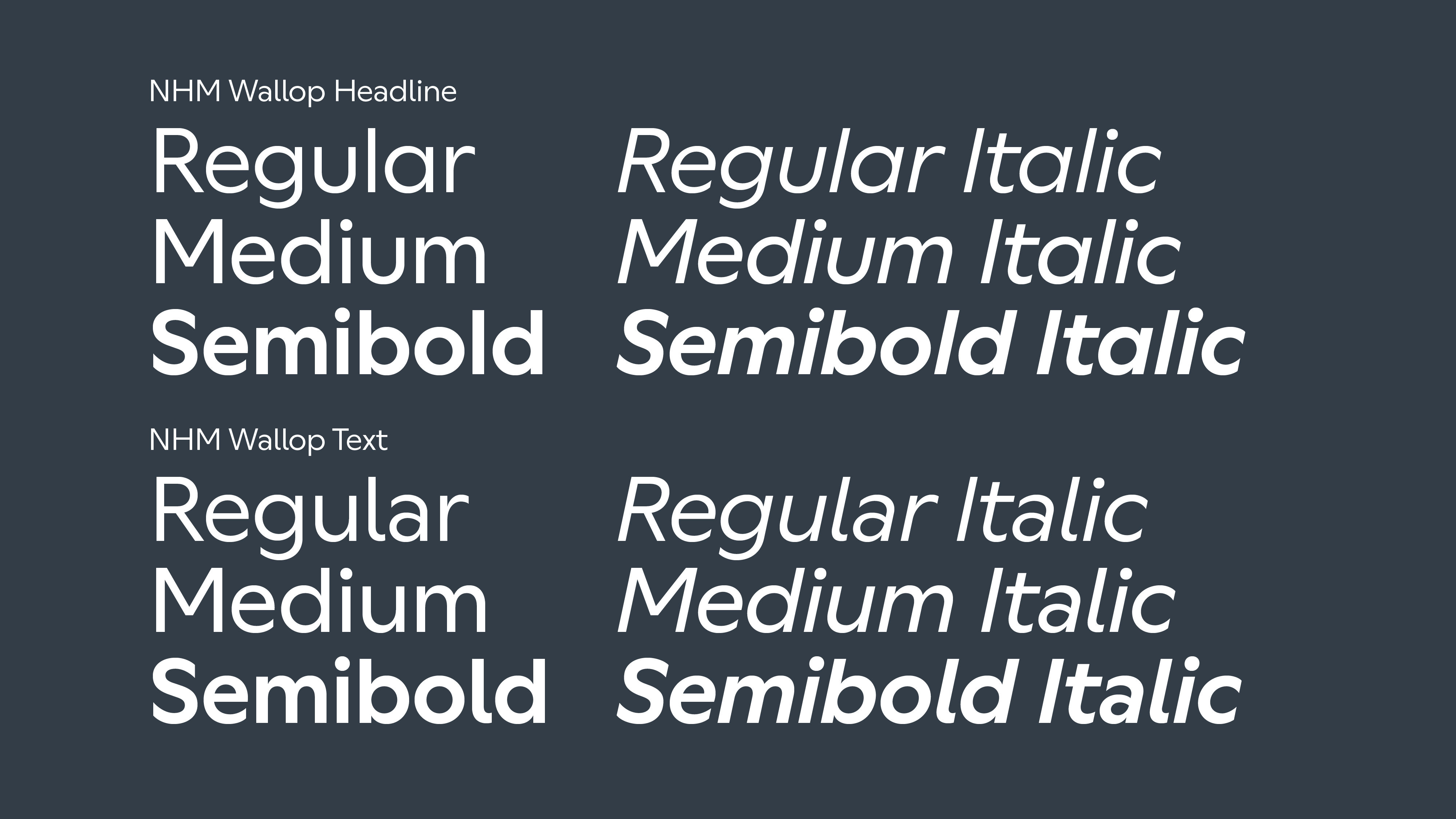
Our typeface NHM Wallop is friendly, straightforward and confident. We use two variations - one for headlines and the other for text to create a balance between personality and readability, being suitable for all of our communications, from large and playful headlines to serious academic text.
Distributing our typeface externally
NHM Wallop Headline and NHM Wallop Text can only be used on communications for the Museum, by employees of the Museum or authorised third party users such as freelance designers and contractors. Never distribute it without prior authorisation from the Design Team.
If you do need to share the typeface with an external partner please get in touch with the design studio to discuss this and obtain the correct files and guidance. brand@nhm.ac.uk
The type files should never be edited or renamed.
Styles
There are various ways we use our typeface. It flexs across different outputs of the museum. Below are some different areas and examples.
Masterbrand
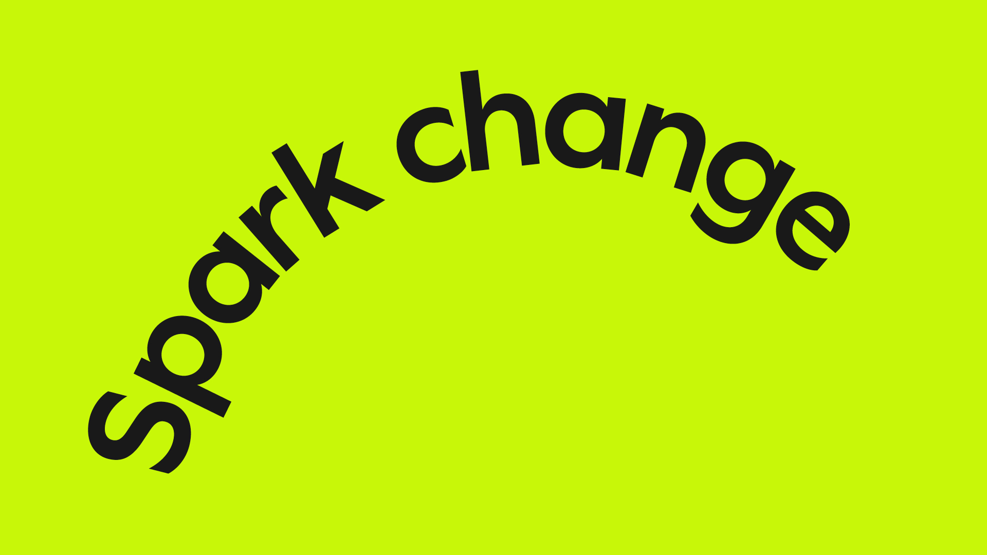

For masterbrand communication we use repetition and text set in circular paths – these reference the catalyst effect our brand represents. The content is deliberately short to create readable messages that have impact.
Commercial
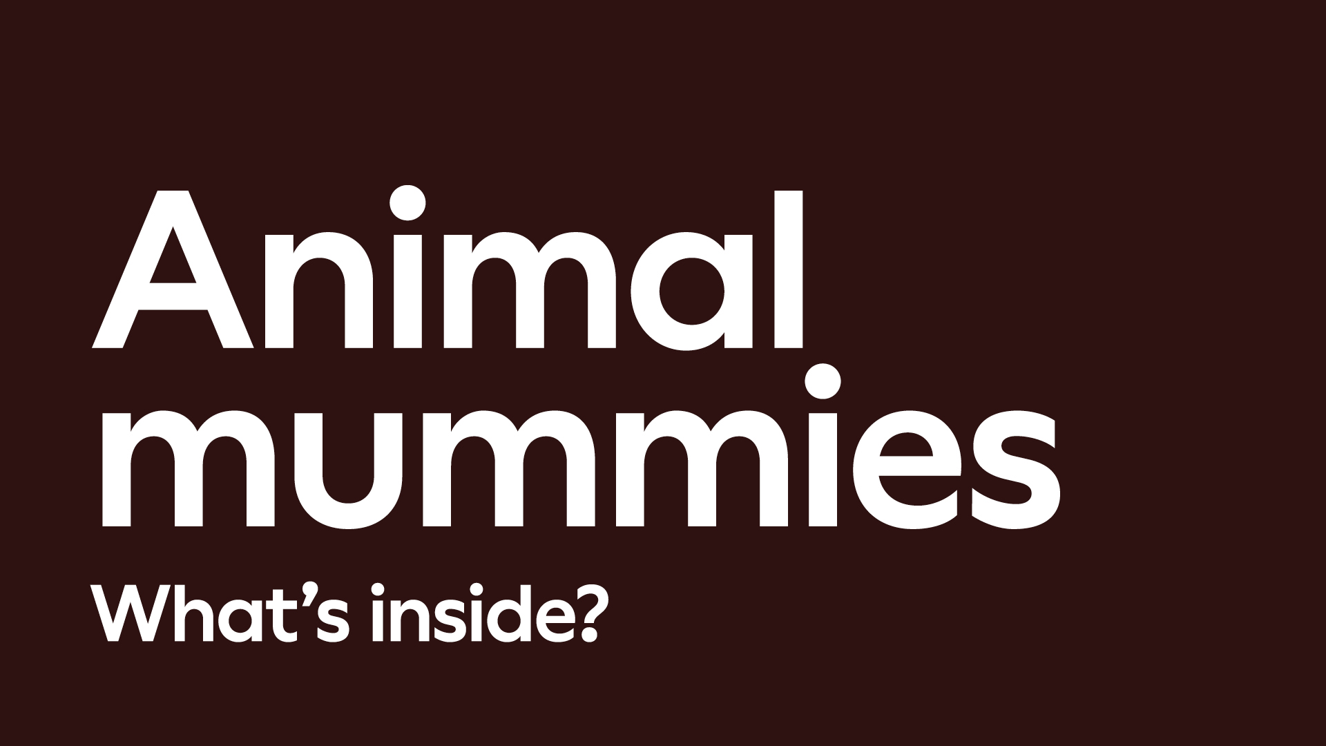
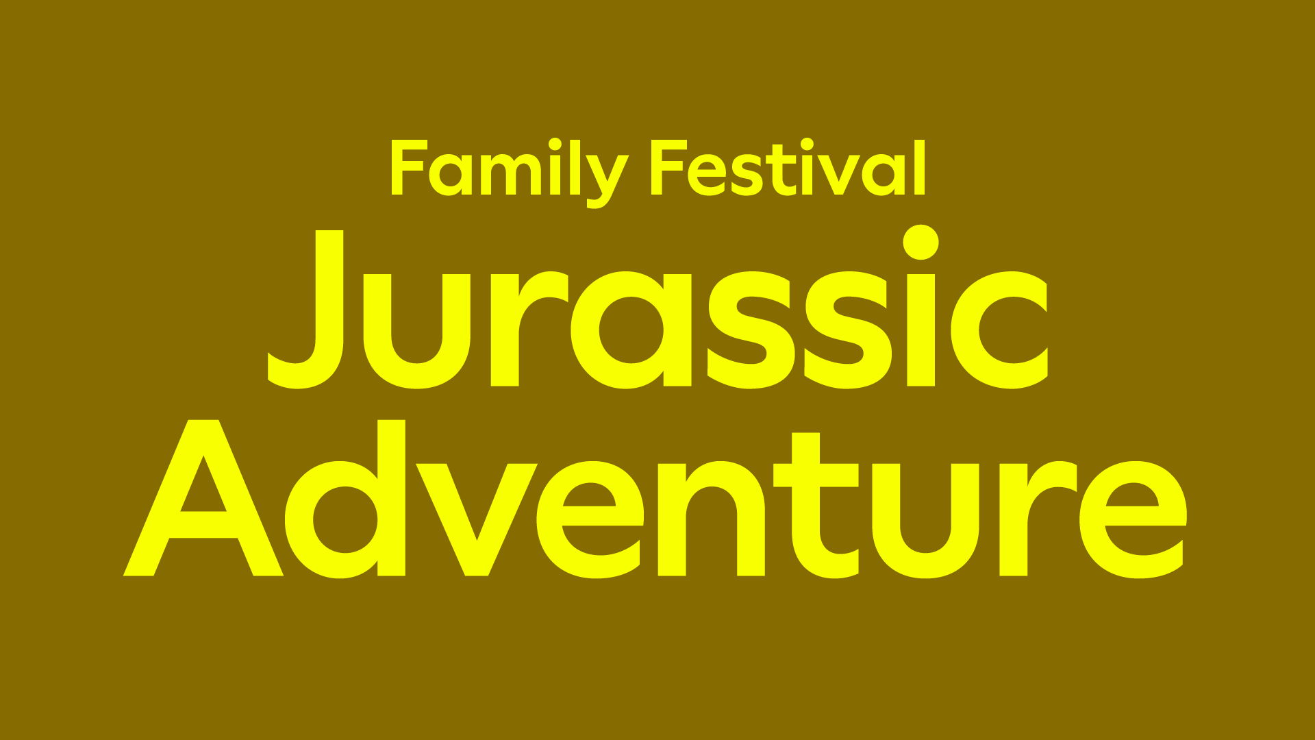
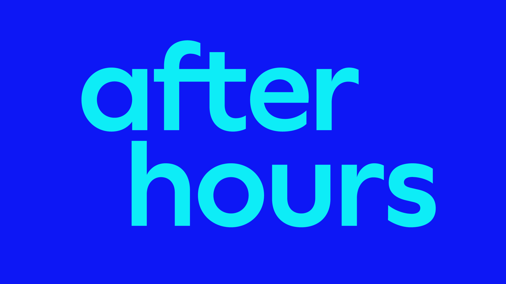
Headlines for exhibitions and events are large and set in straight type for maximum impact and greater accessibility. Alignments and layout can flex according to content.
Editorial
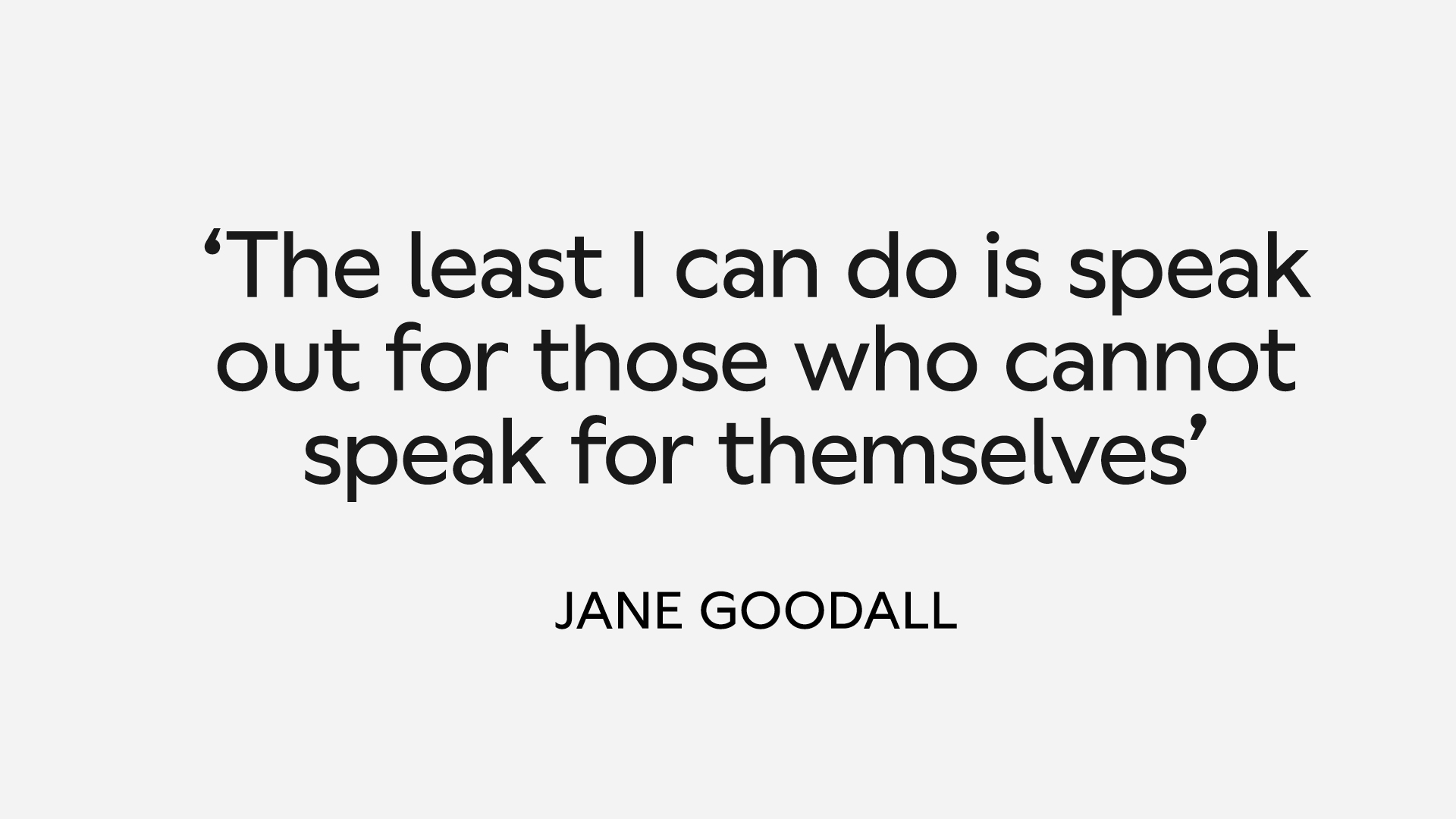
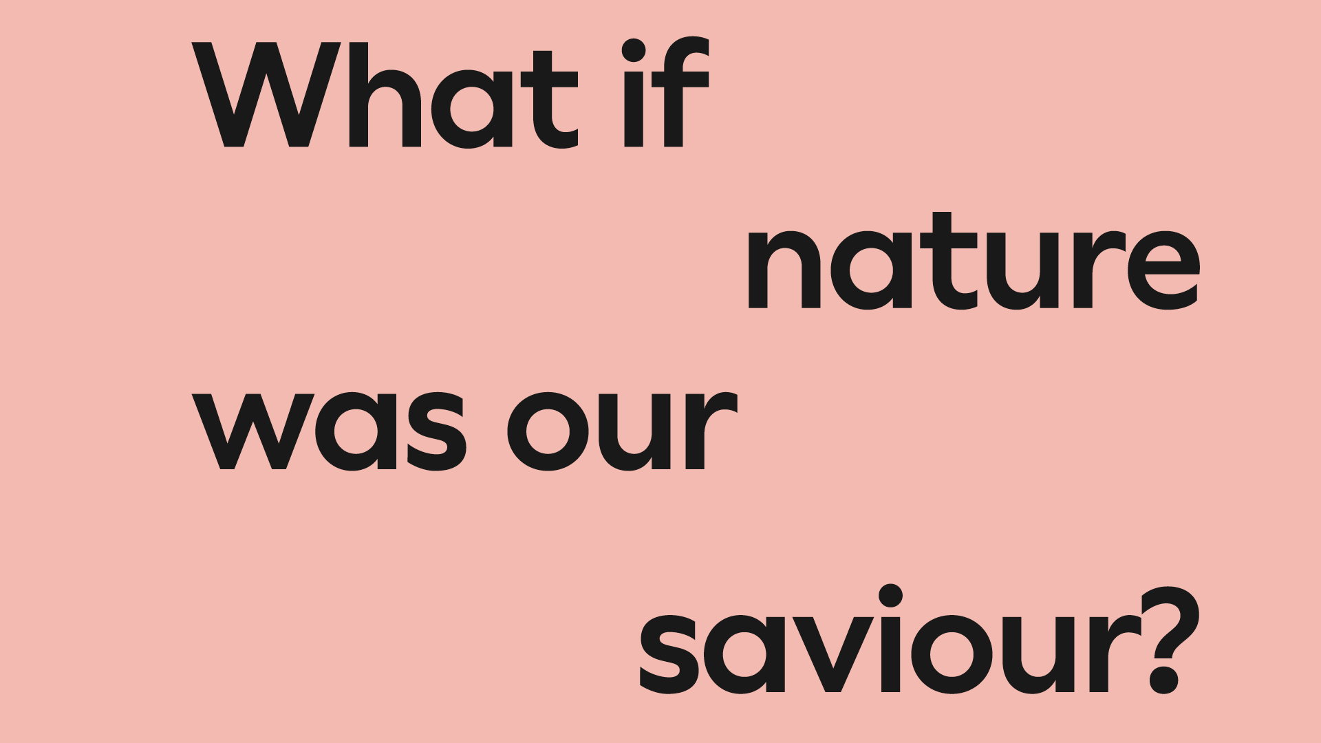
Editorial publications can use both mixed case and all caps, in a variety of weights, to attend to complex type hierarchies and a variety of subjects and moods.
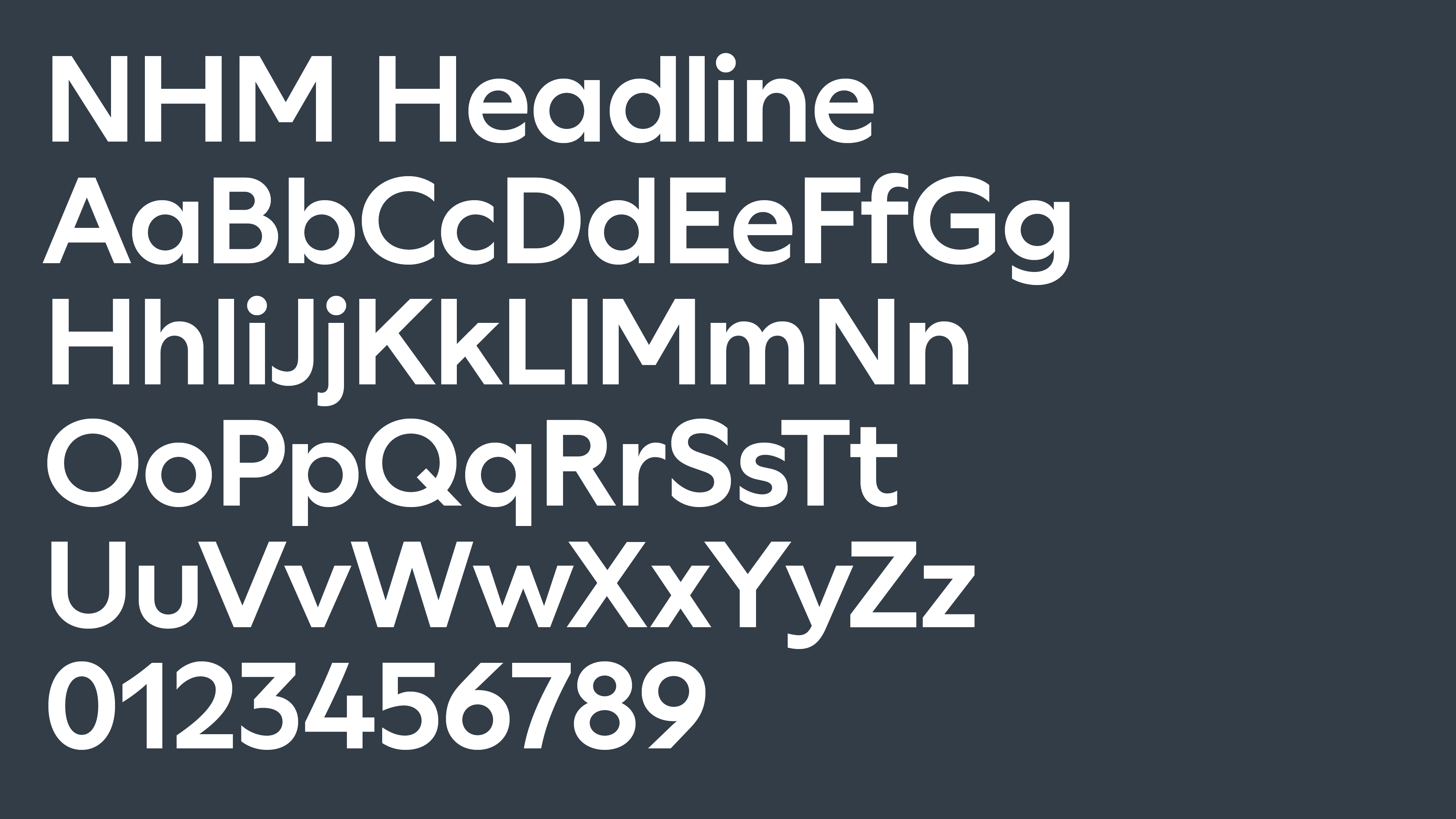
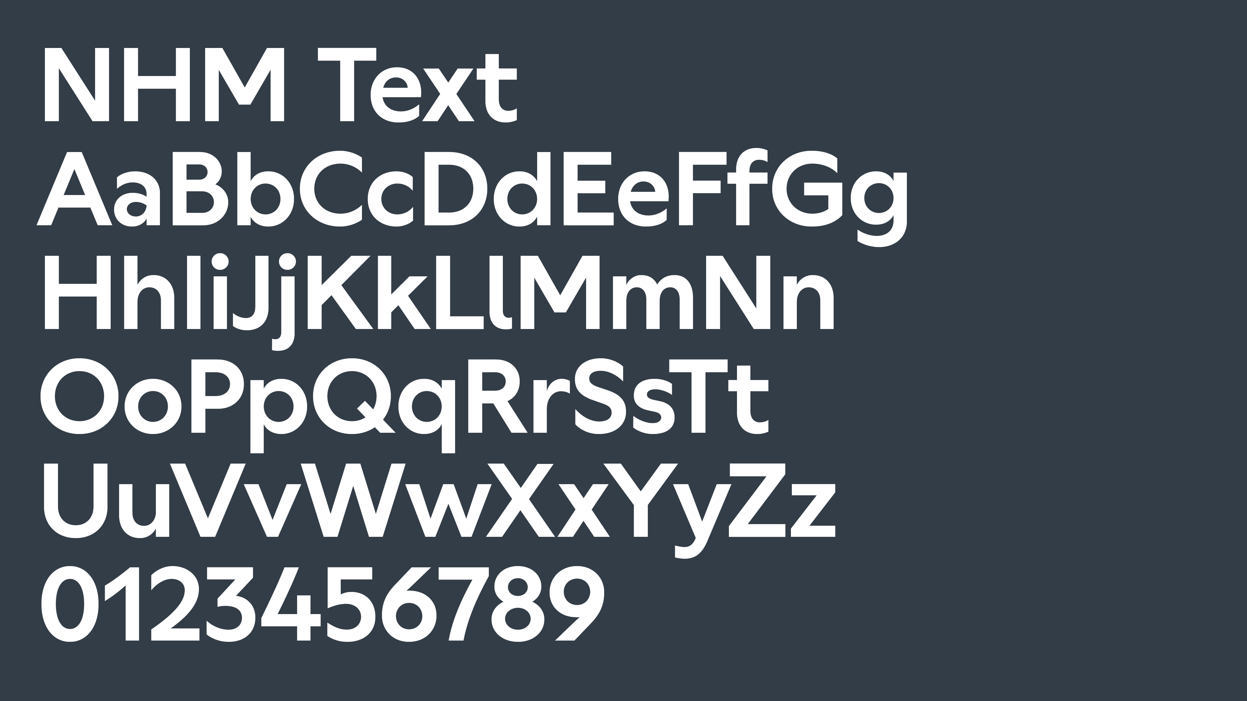
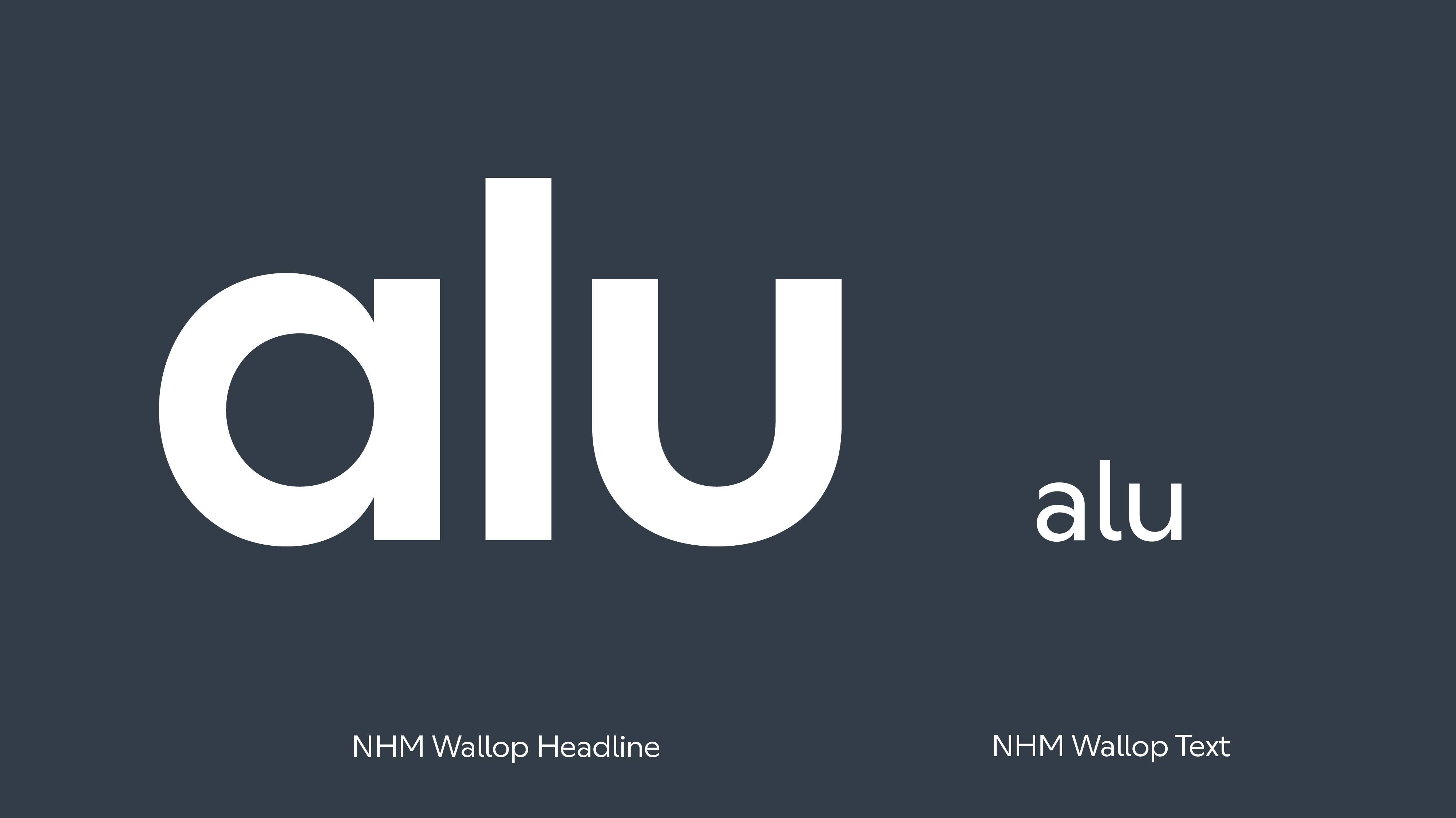
Two different cuts of our typeface
Our custom typeface is designed by Displaay Type Foundry, a reinterpretation of their typeface, Wallop. Based on geometric shapes, such as near-perfect circles and squares – forged with sharp and pointed characters. The large x-height and open counters make them very readable.
We use two different cuts, one for headlines and the other for body copy. The difference between the two are the characters ‘a’, ‘l’ and ‘u’. NHM Wallop Headline also has slightly shorter descenders, enabling large headlines to be typeset with tighter leading.
There is no difference between the uppercase characters of both versions.
Important
NHM Wallop Headline and NHM Wallop Text can be used only on communications for the museum, by employees of the museum or authorized third party users. Never distribute it without prior authorization from the NHM Design Team.
Basic typesetting
To maintain a consistent style that is simple, clean and easily identifiable as the Natural History Museum, follow these basic principles when designing communication for content. Ensure that the majority of text is mixed case for greater legibility.
Short-form
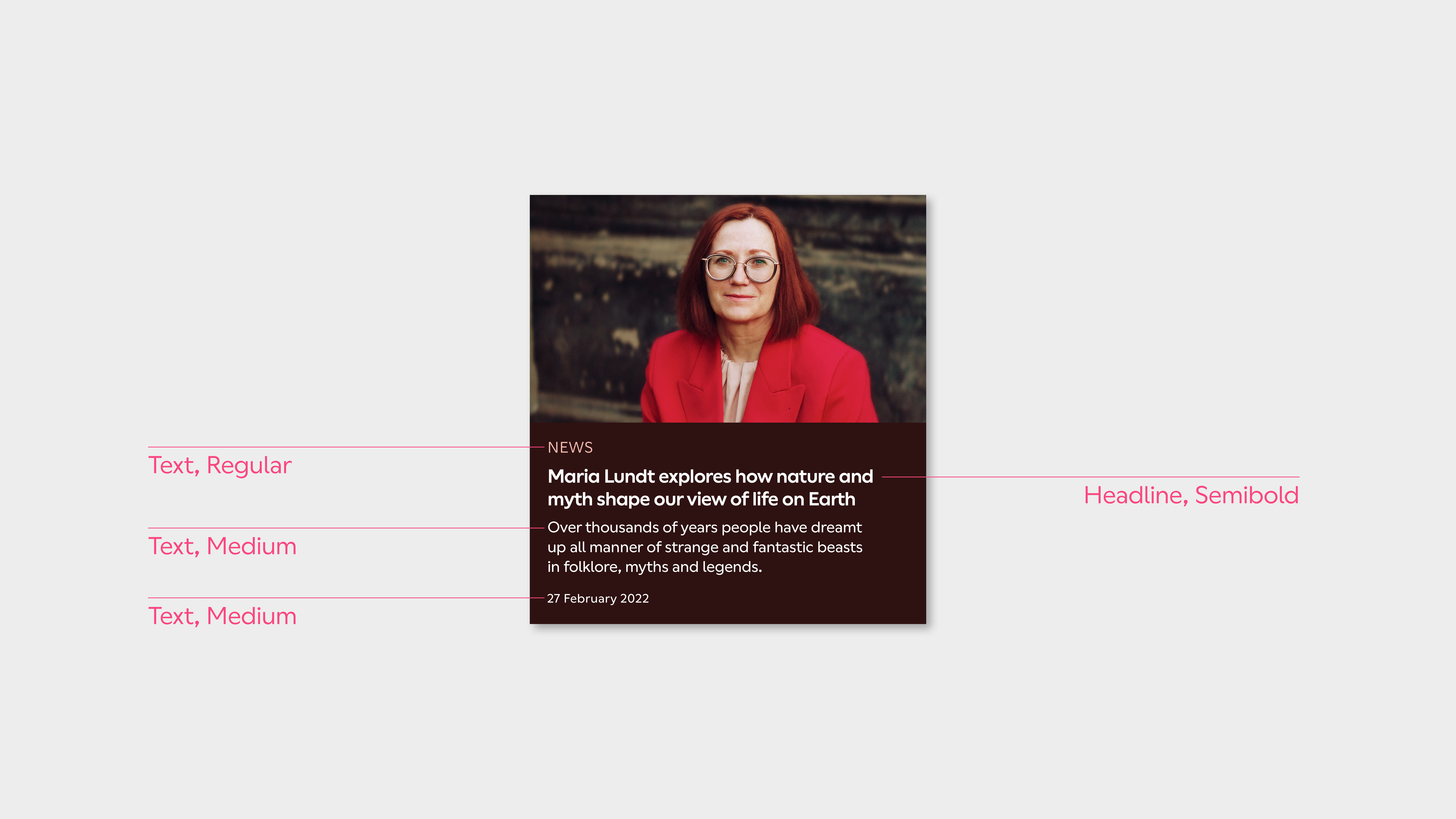
Heading
NHM Wallop Headline, SemiBold
Tracking (metric): -10
Leading: 95%
Subheading
NHM Wallop Headline, SemiBold
Tracking (metric): -10
Leading: 110%
Long-form
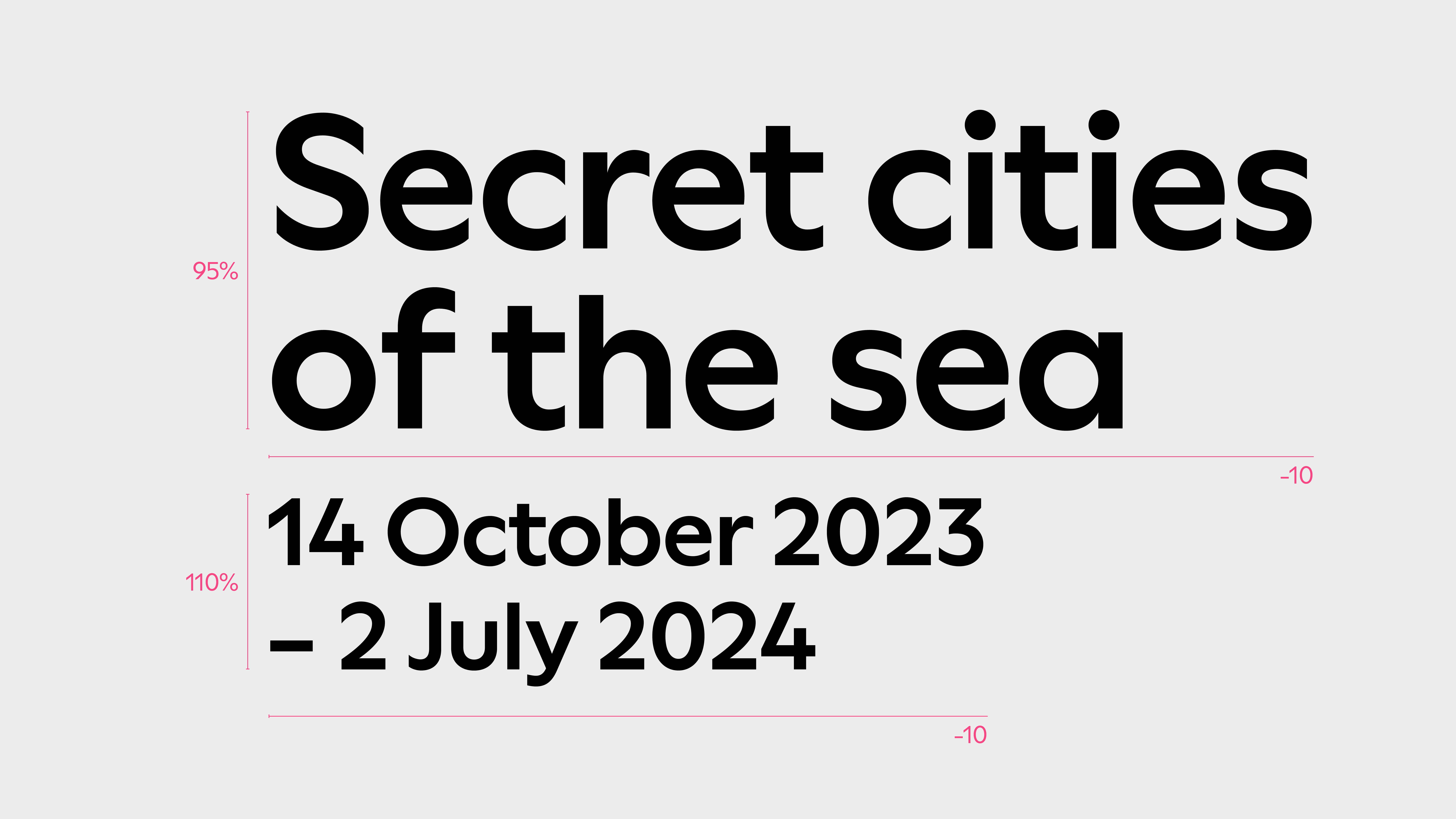
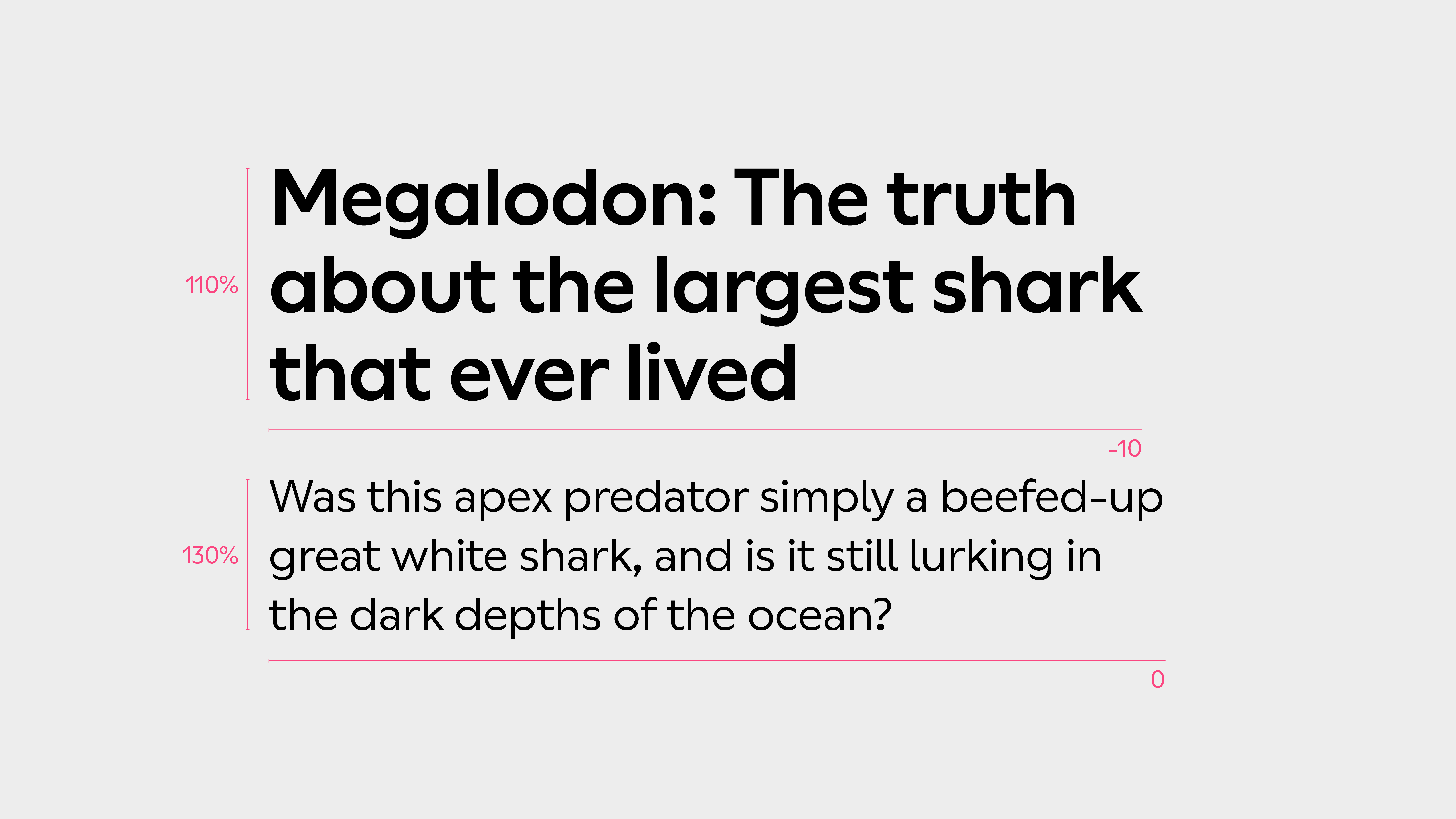
Heading
NHM Wallop Headline, SemiBold
Tracking (metric): -10
Leading: 110%
Standfirst
NHM Wallop Text, Regular
Tracking (metric): 0
Leading: 130%
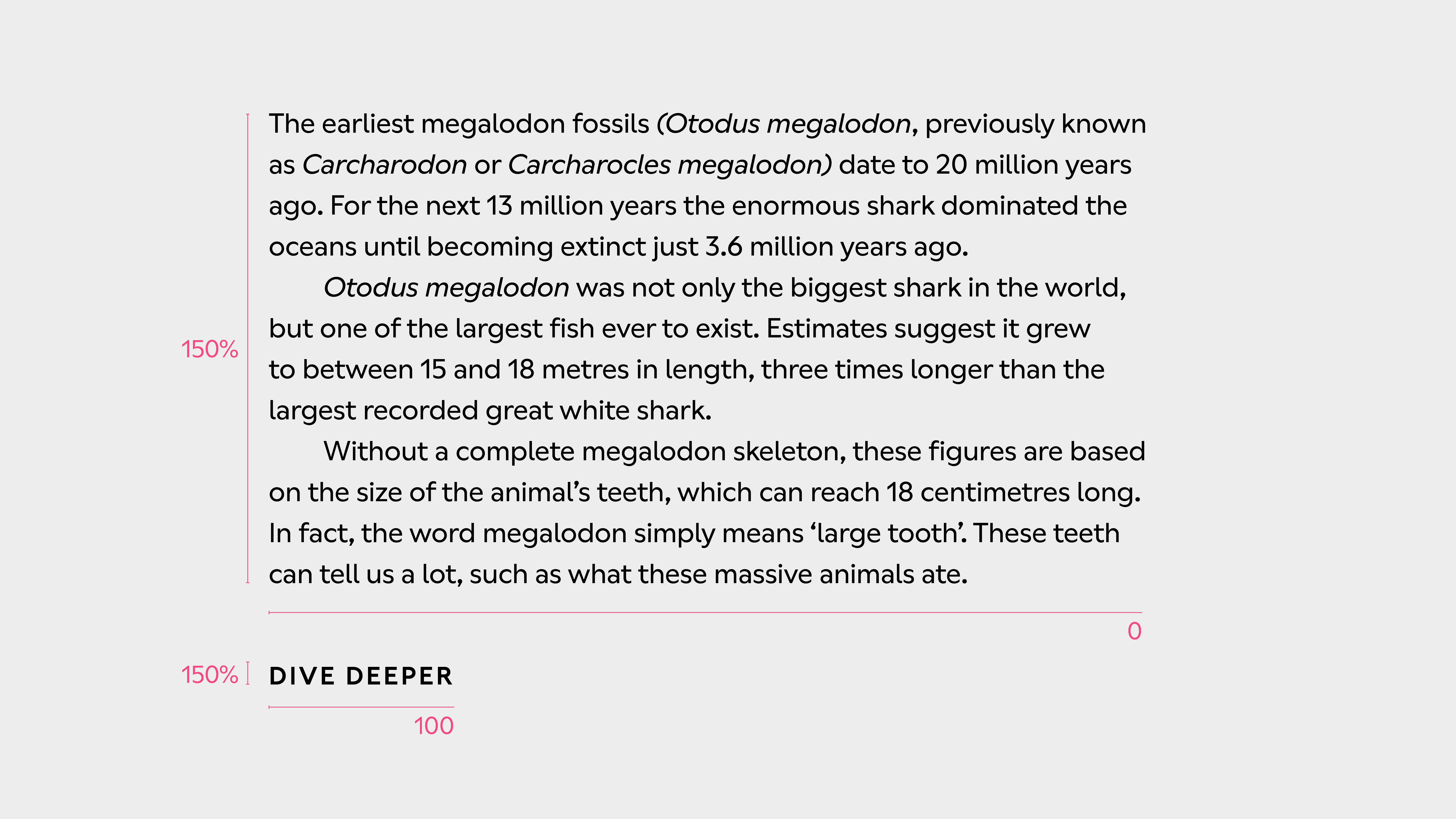
Body copy
(Digital) NHM Wallop Text, Medium
(Print) NHM Wallop Text, Regular
Tracking (metric): 0
Leading: 150%
Call to action
NHM Wallop Text, SemiBold
Tracking (metric): 100
Leading: 150%
Further considerations
Line lengths
We follow the recommendations of Bringhurst’s 'The Elements of Typographic Style'. The following averages count both letters and spaces:
Single-column text:
45 to 75 characters
Multiple-column text:
40 to 50 characters
Discontinuous texts:
Longer lines of around 85 characters can be used in discontinuous texts, such as bibliographies.
Isolated patches:
Shorter lines of around 15 characters, can also be used for isolated patches of text, such as captions.
Paragraphs
Both indents at the beginning of a paragraph or space between paragraphs can be used as devices to mark the rhythm of a text.
In a print publication with multiple columns, for example, the body copy will be set with indents, ensuring the baselines between columns and pages are always aligned. The same publication can use space between paragraphs for short text in the beginning of a chapter or in offset columns with captions.
Since online texts are normally set as single column, they preferably use space between paragraphs, instead of indents.
Never use indents and space between paragraph on the same block of text.
Indents
When setting text with indents, the opening paragraph is always flush left. All paragraphs after the first should be set with an indent.
How much indent will depend on the style of the publication, but twice the size of the type is a good base measure i.e. if type size is 8pt, indent is 16pt.
Space between paragraphs
Half a space is enough for related paragraphs in the body copy, while two thirds can be used for unrelated paragraphs in elements such as blocks of captions.
A full line of space will always be too much space between paragraphs.
Leading considerations
The shape of words can affect our headings, especially at larger scales when negative leading is used.
Rather than increasing the overall leading to accomodate ascenders and descenders, we can manually adjust the leading of individual lines.
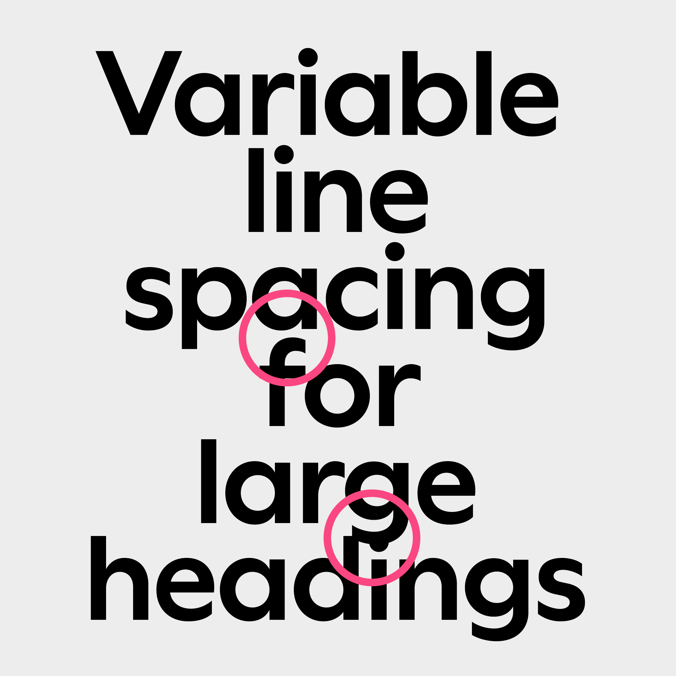
Do not allow ascenders and descenders to get too tight or touch
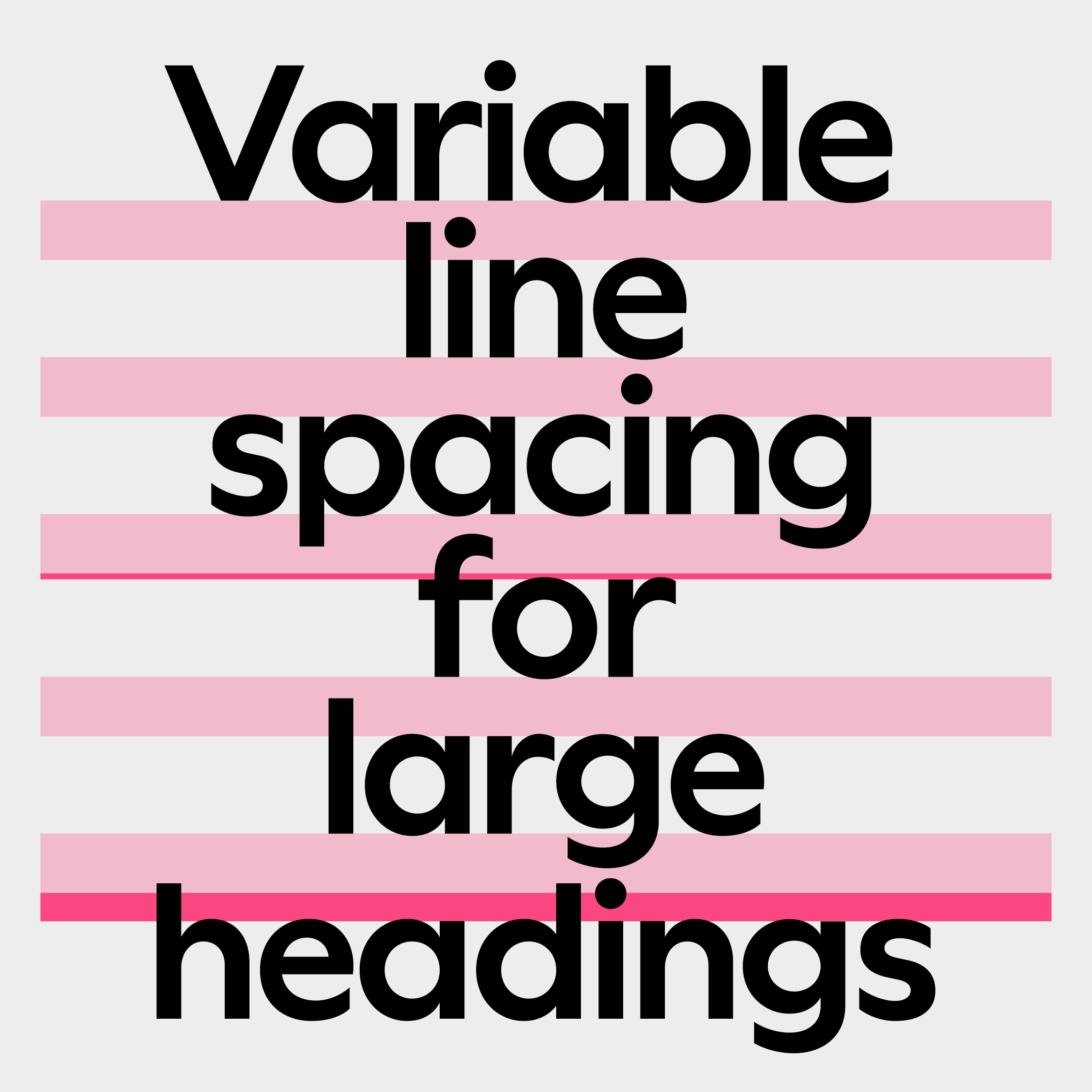
Ensure leading is adjusted to account for ascenders and descenders
Highlights inside body copy
Contextual highlight inside text must be kept to a bare minimum to not disturb the reading experience. Use two weights above the body copy to create enough differentiation between styles.
Italics are used for scienitfic names and foreign language expressions in print and digital. In print, italics are also used for things such as the names of ships, books, films, works of art, publications, exhibition names and event titles.
Example 1
NHM Wallop Text, Regular
Hightlight: NHM Wallop Text, Semibold
Example 2
NHM Wallop Text, Medium
Hightlight: NHM Wallop Text, Bold
Example 1
Copy = Regular
Highlight = Semibold
Example 2
Copy = Medium
Highlight = Bold
Using all caps
Headings in all caps can convey a specific tone. It's much more favourable to use all caps for editorial content in social media and publications. However, all caps can help differentiate between initiatives, for example, Patrons could use all caps to differentiate itself from Members.
Tracking, alignment, orientation and scale can also be adjusted to convey different moods, from expressive to more considered compositions.
Example 1
NHM Headline, Regular
Upper case
Tracking: 150
Kerning: Metrics
Leading: 120%
Example 2
NHM Headline, Regular
Upper case
Tracking: 40
Kerning: Metrics
Leading: 120%
Example 1
Smaller type, centred with larger tracking, conveys a classic and considered mood

Example 2
Bigger and more playful alignment, suitable for more expressive applications
Type on paths
A shared characteristic through the brand is the clear focal point at the centre, we can use this focal point to place short sentences and headings on circular paths.
To compensate for the circle, text placed outside needs to be tracked in, whereas text placed inside needs to be tracked out.
Extra consideration needs to be applied to each letter pairing, ensuring the appropriate kerning is applied.
Outside circle example
NHM Headline, Semibold
Mixed case
Tracking: -50
Kerning: Metrics + individual adjustments
Path aligning to the baseline
Inside circle example
NHM Headline, Semibold
Mixed case
Tracking: 40
Kerning: Metrics + individual adjustments
Path aligning to the baseline

Outside circle example

Inside circle example
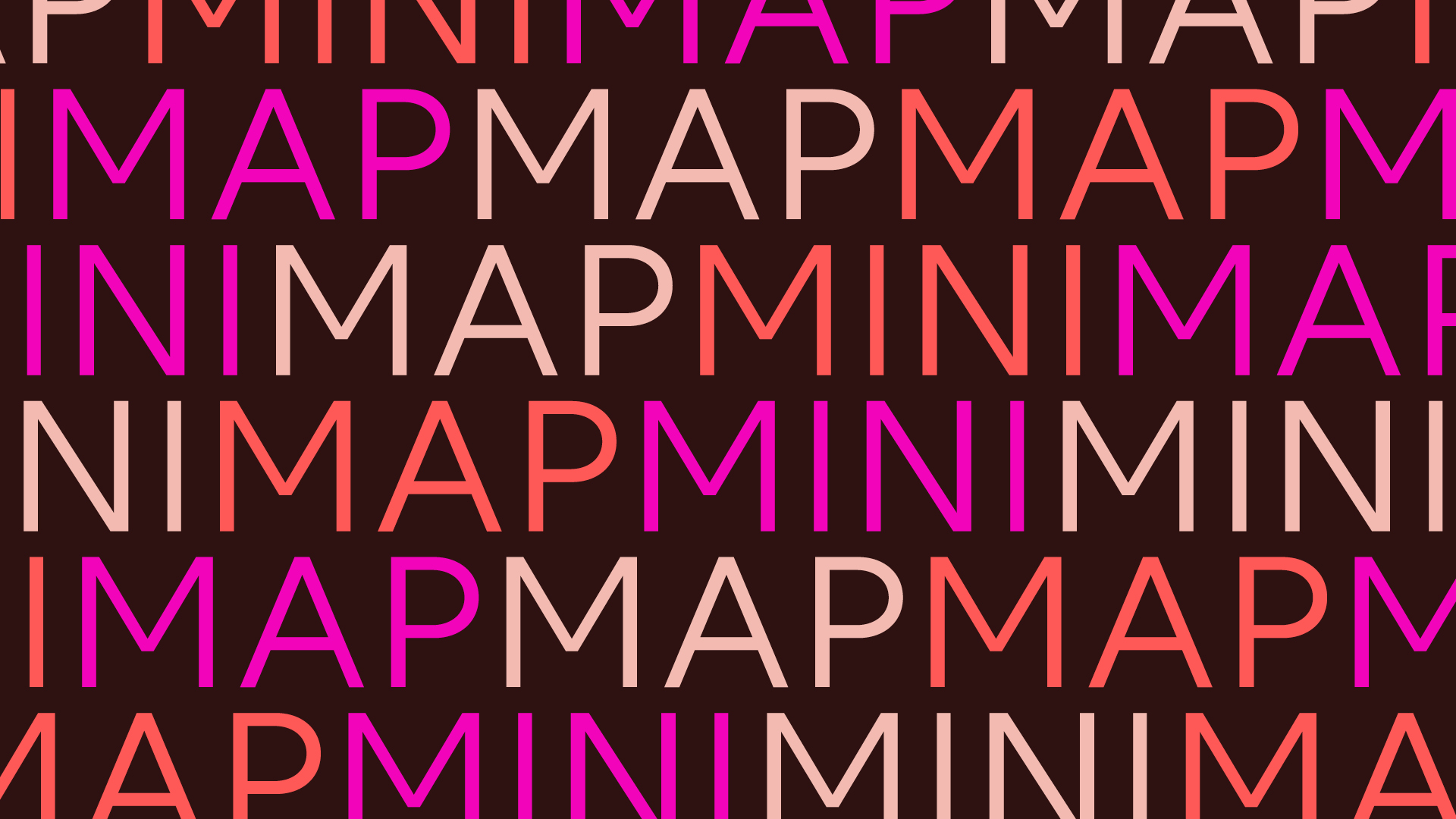
Word rings
Word rings are used for contextual information only, never display critical information and use only 1-2 words per ring. These repeated words along circular paths can be easily created using the NHM Generator or through manual typesetting. They are visually identifiable and closely connected to our brand.
Care is required when creating Word Rings manually, the aim is to ensure words fit nicely. Due to the aperture size of each ring being different, every word requires different tracking values.
Word Rings can be adjusted by:
- The aperture size of the rings
- The space in between the rings
- The number of rings
Type settings for Word Rings
NHM Headline, Semibold
Upper case
Tracking: -20 to +30
Leading: At least size of the word
Kerning: Metrics+ individual adjustments
Path aligning to the center
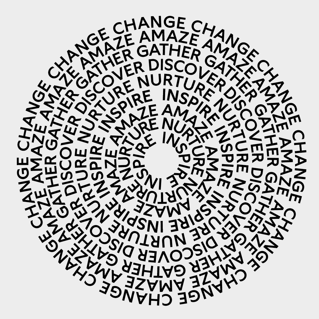
Do not scale the inside ring so small that the number of characters falls below 20 characters. The inside word must repeat three times. The distance between rings needs to be equal to or larger than the size of the type.
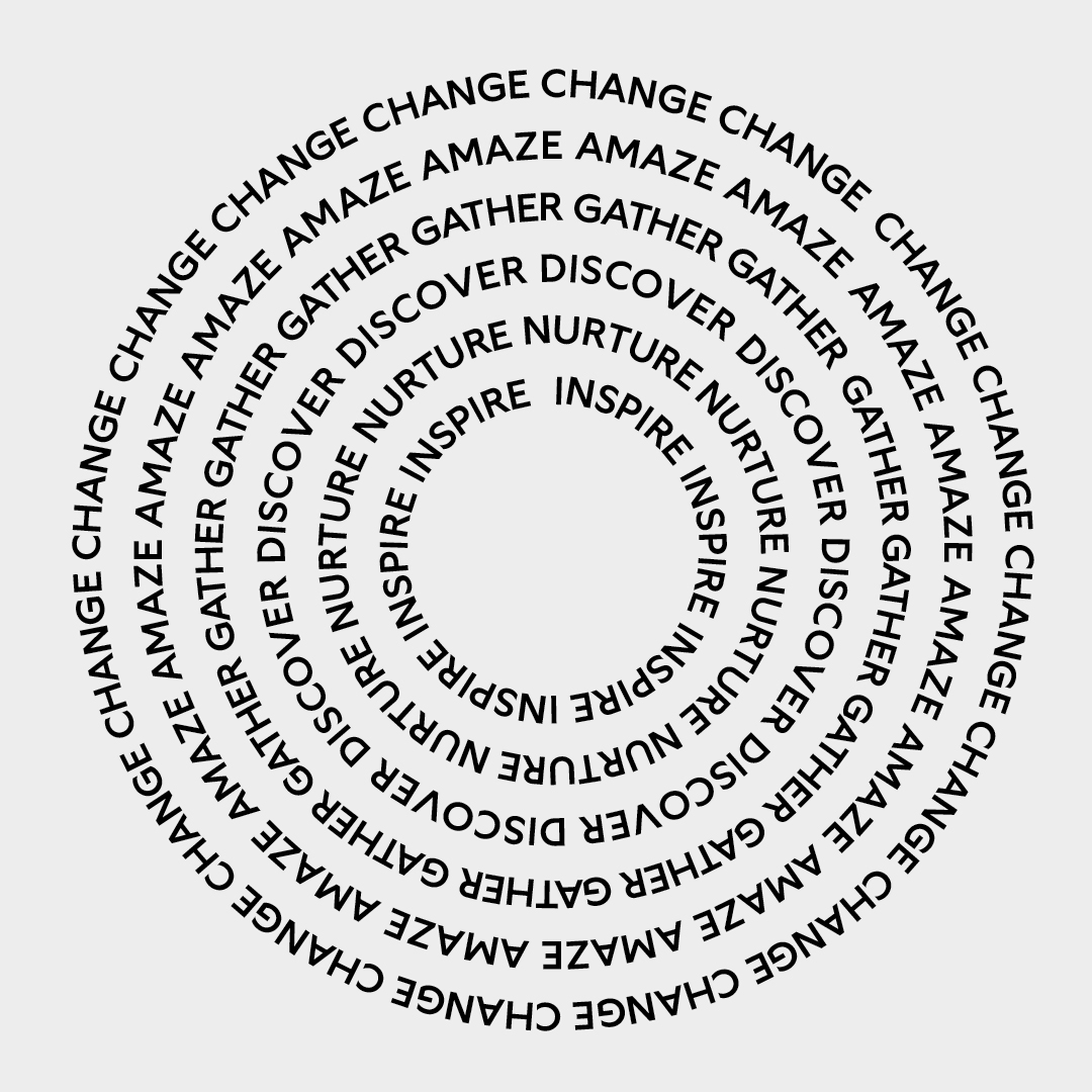
Ensure the aperture of the ring in the centre fits at least 20 characters (counting white spaces), the word in the centre ring must repeat at least three times and the minimum distance between rings is equal to the size of a word.
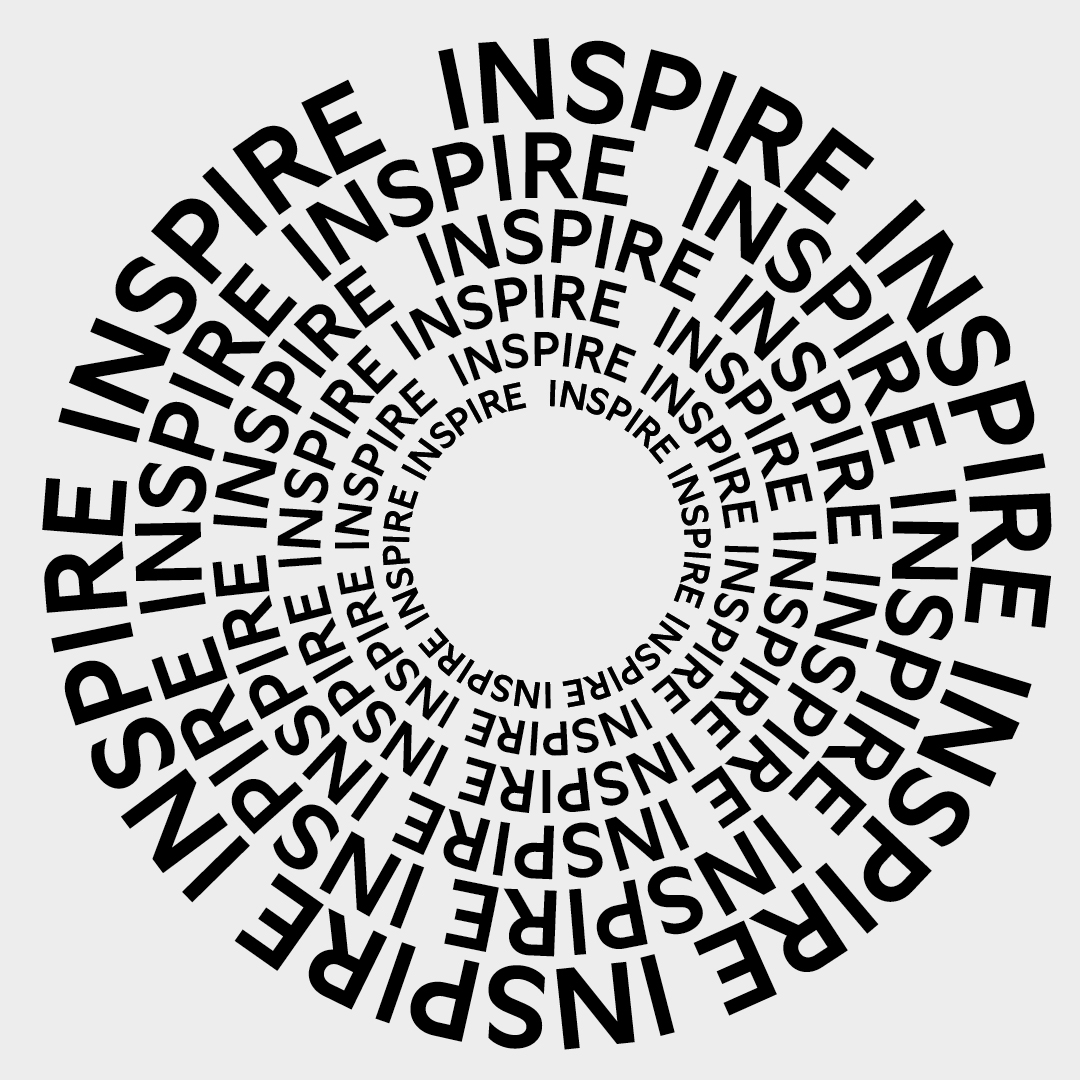
Do not use different type sizes
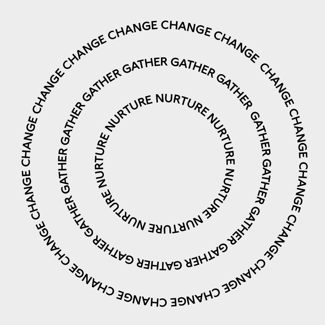
Ensure the spacing between rings is even