Accreditation
We strive for a coherent and straight-forward approach to crediting partners and sponsors. It is important to adhere to the following rules carefully, to ensure the integrity of our creditors is maintained at all times.
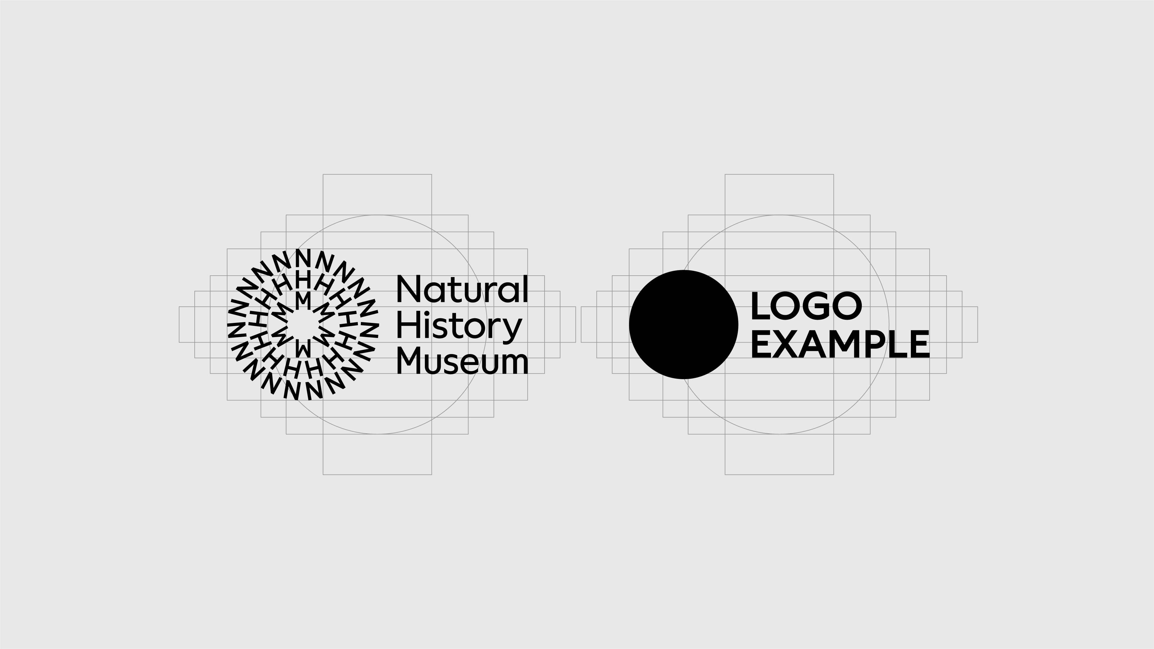
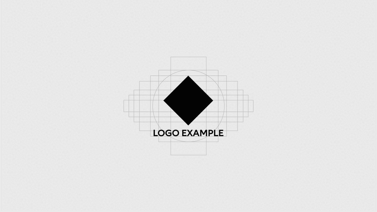
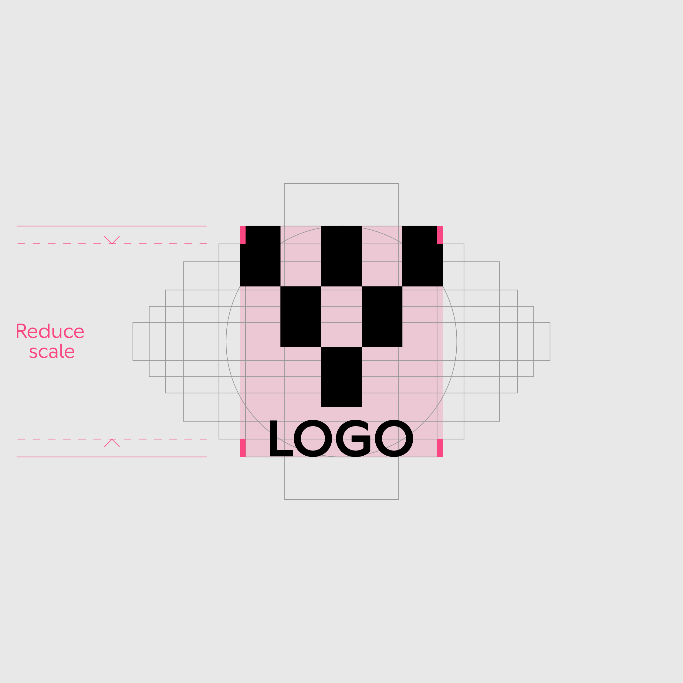
What is the accreditation grid?
The accreditation grid is used to ensure partner logos of different proportions have optical balance when used next to each other.
We use the accreditation grid to avoid complicated area calculations when using third party logos.
How to use the grid
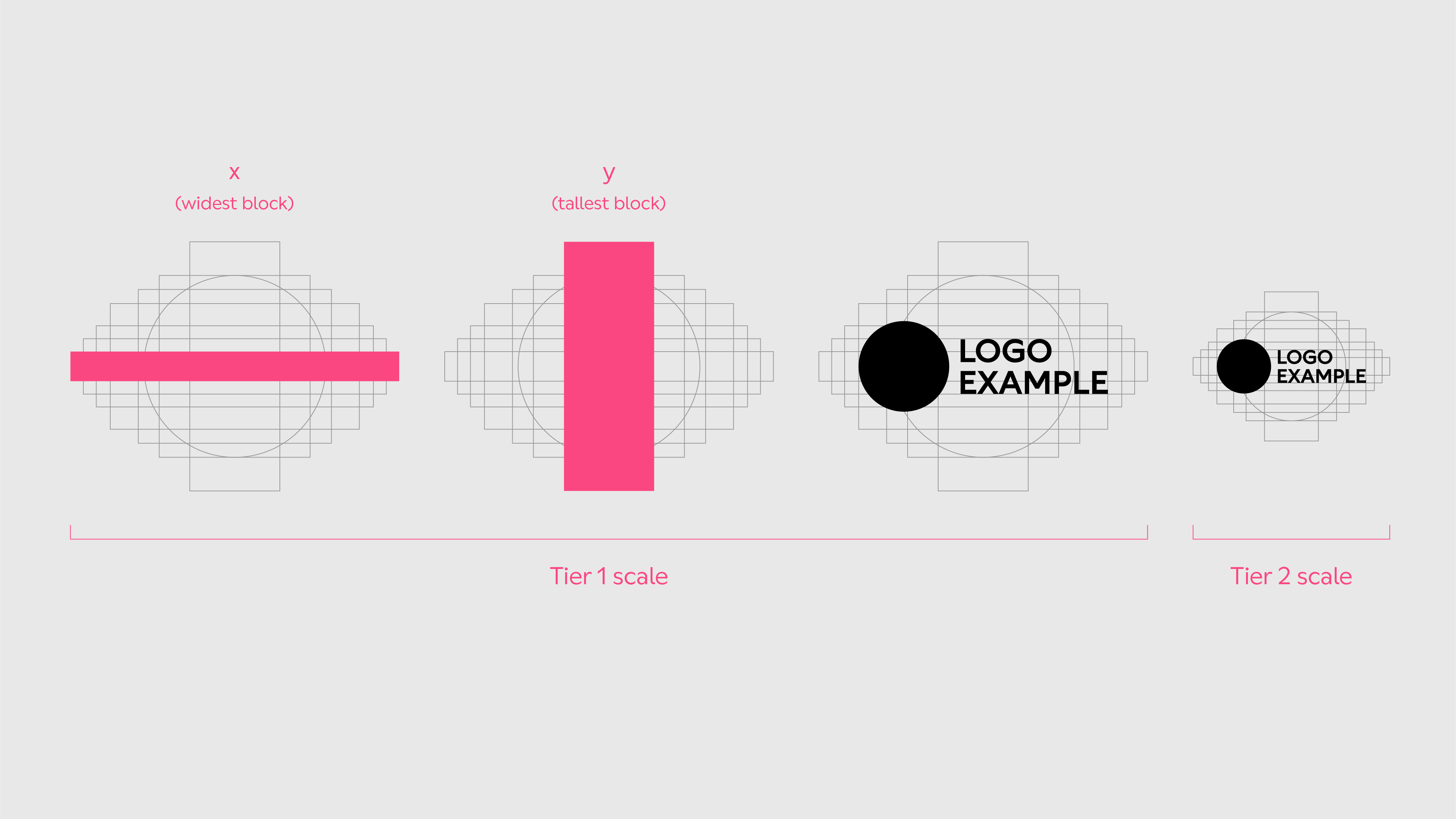
- Place the creditor logo in the centre of the grid.
- Scale the logo proportionatly until it snaps to either the widest or tallest grid line.
- Make sure the bounding box of the logo does not breach the perimeter of the grid.
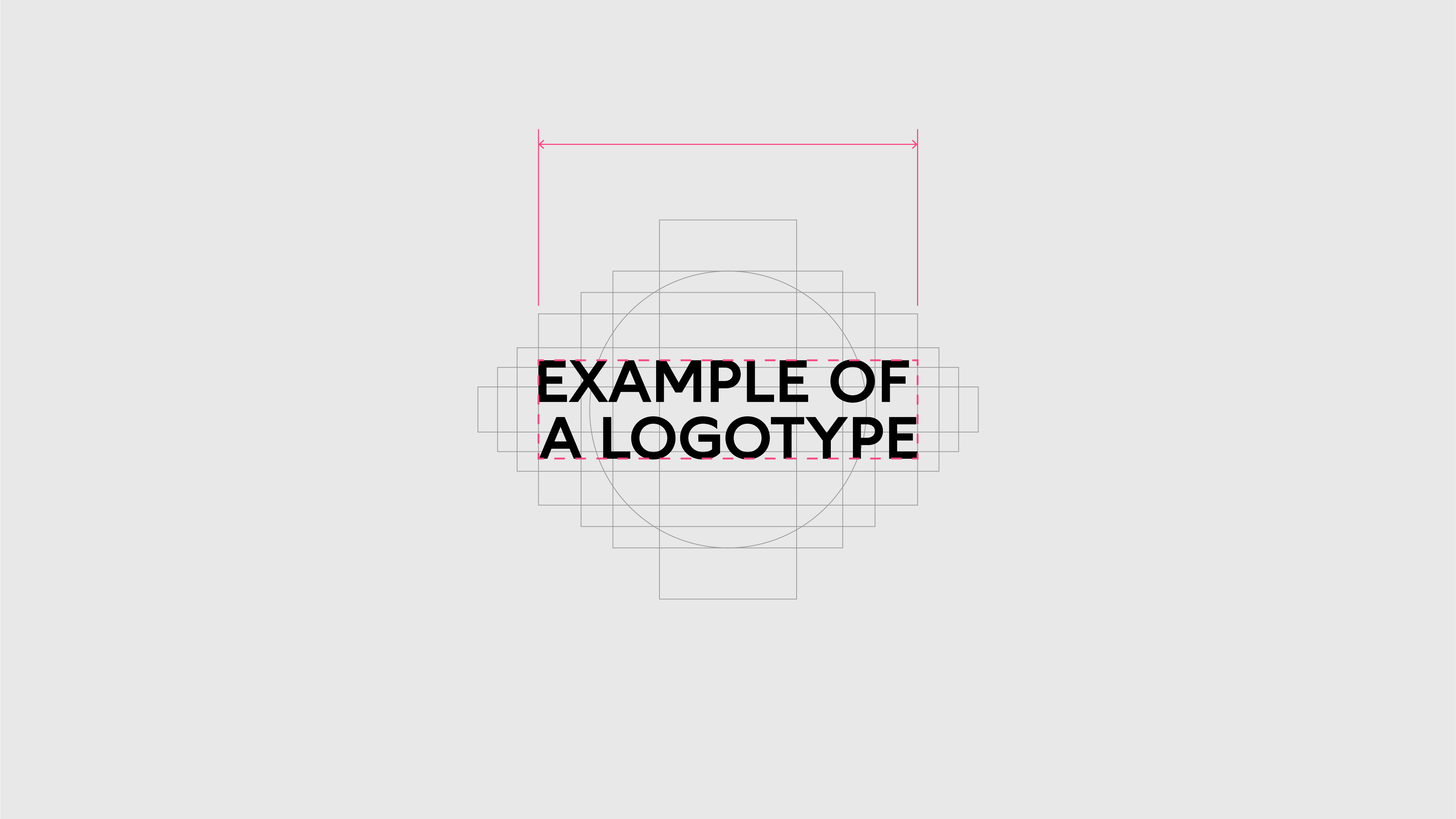
For landscape logos
Scale until the left and right edges of the bounding box snap to vertical grid lines.
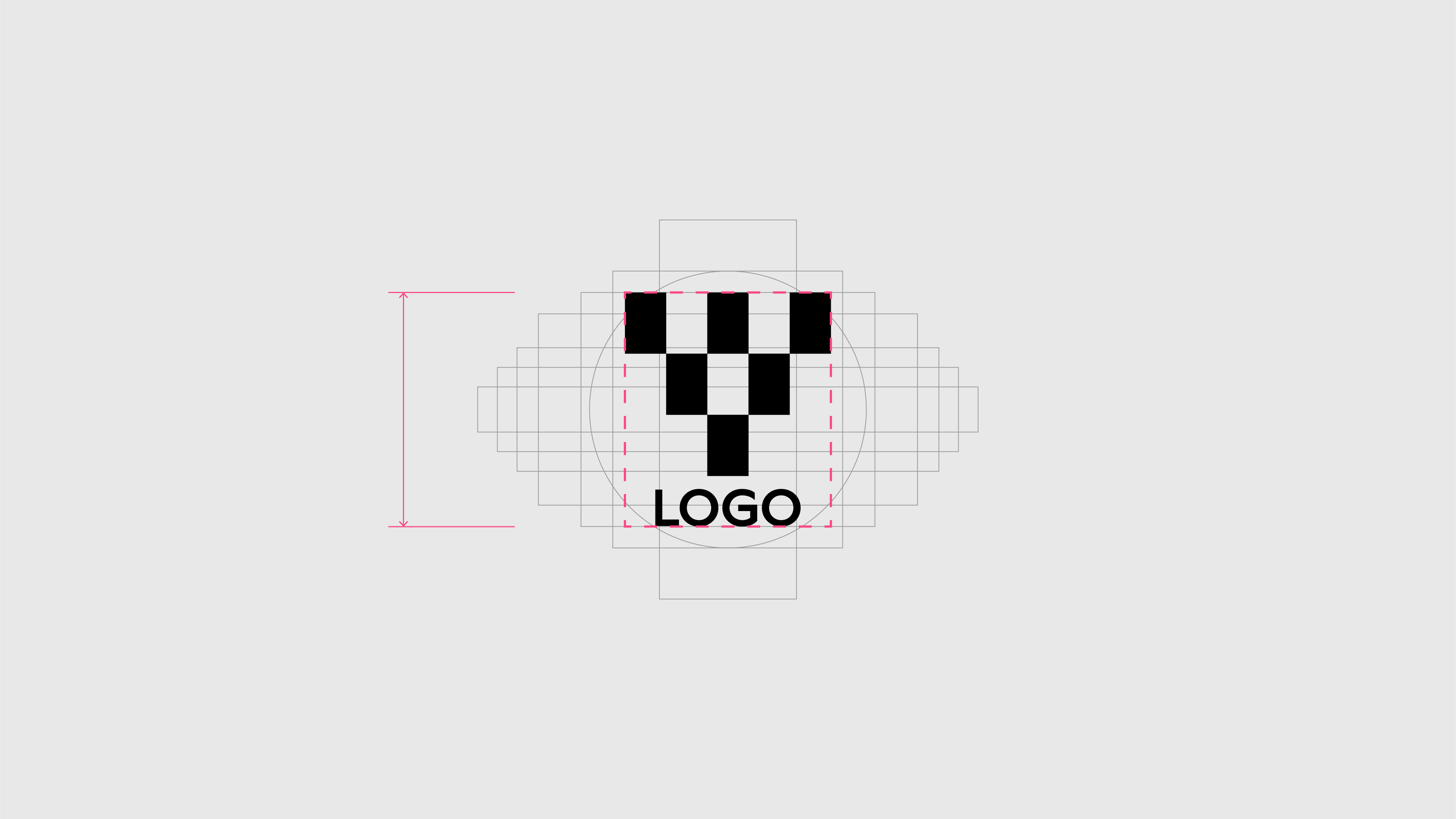
For portrait logos
Scale until the top and bottom edges of the bounding box snap to horizontal grid lines.
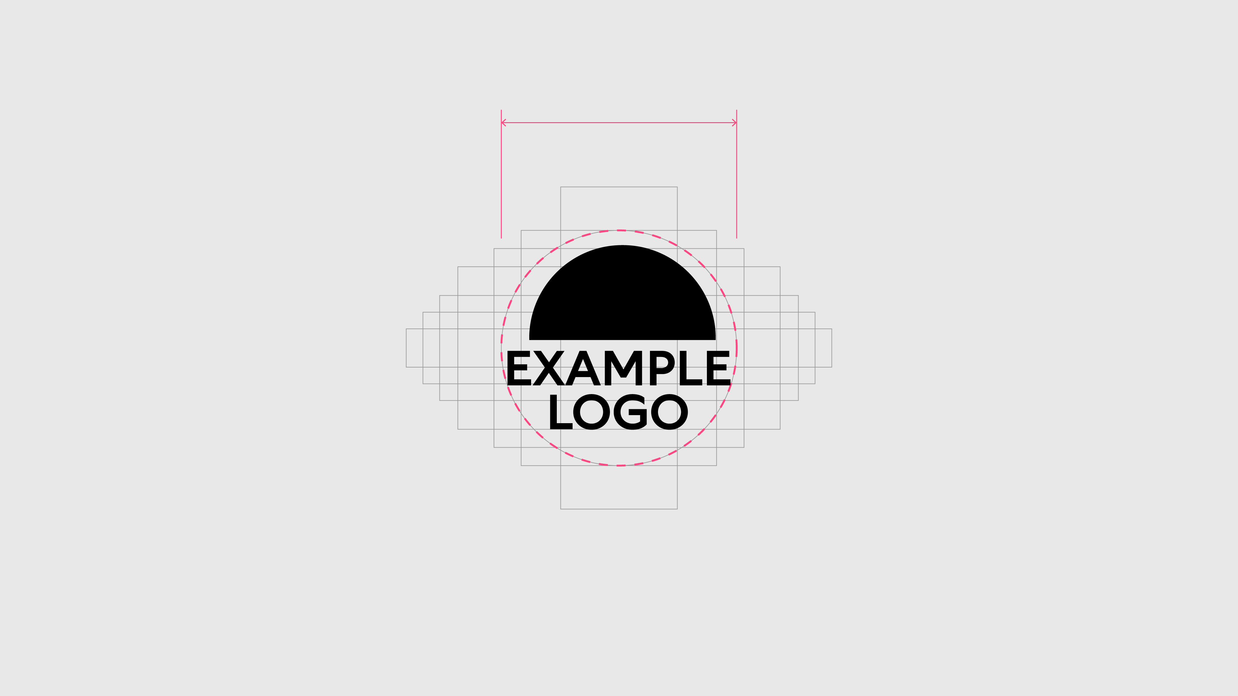
For circular logos
Scale until the circular grid line is reached.
Don’ts
Never let the bounding box of the creditor logo go beyond the grid. If this occurs, scale down the bounding box of the logo until it snaps to the next grid line.
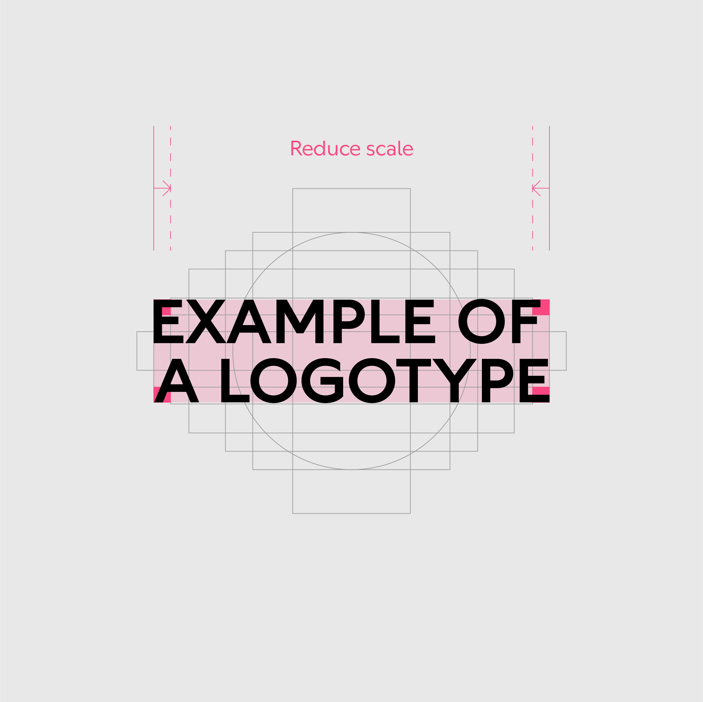
Never let the bounding box of the creditor logo go beyond the accreditation grid – reduce to the next grid line
Never let the bounding box of the creditor logo go beyond the accreditation grid – reduce to the next grid line
Application
Follow the rules below to apply creditor logos consistently across applications.
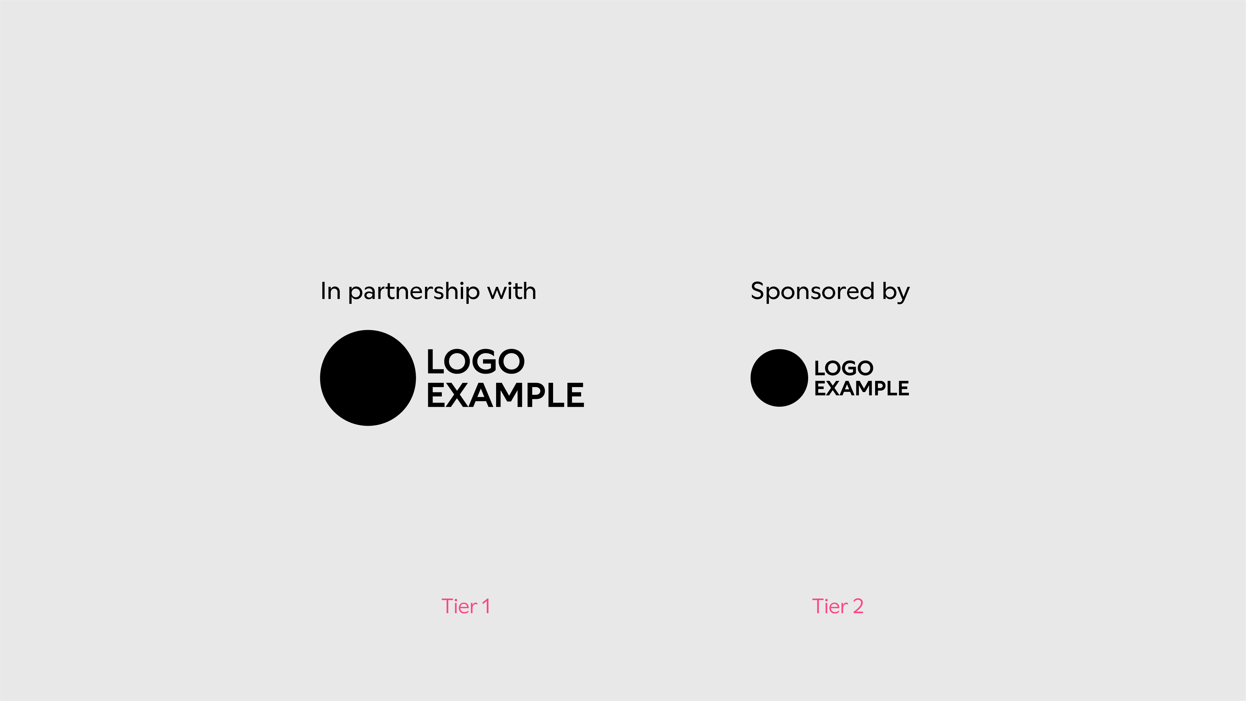
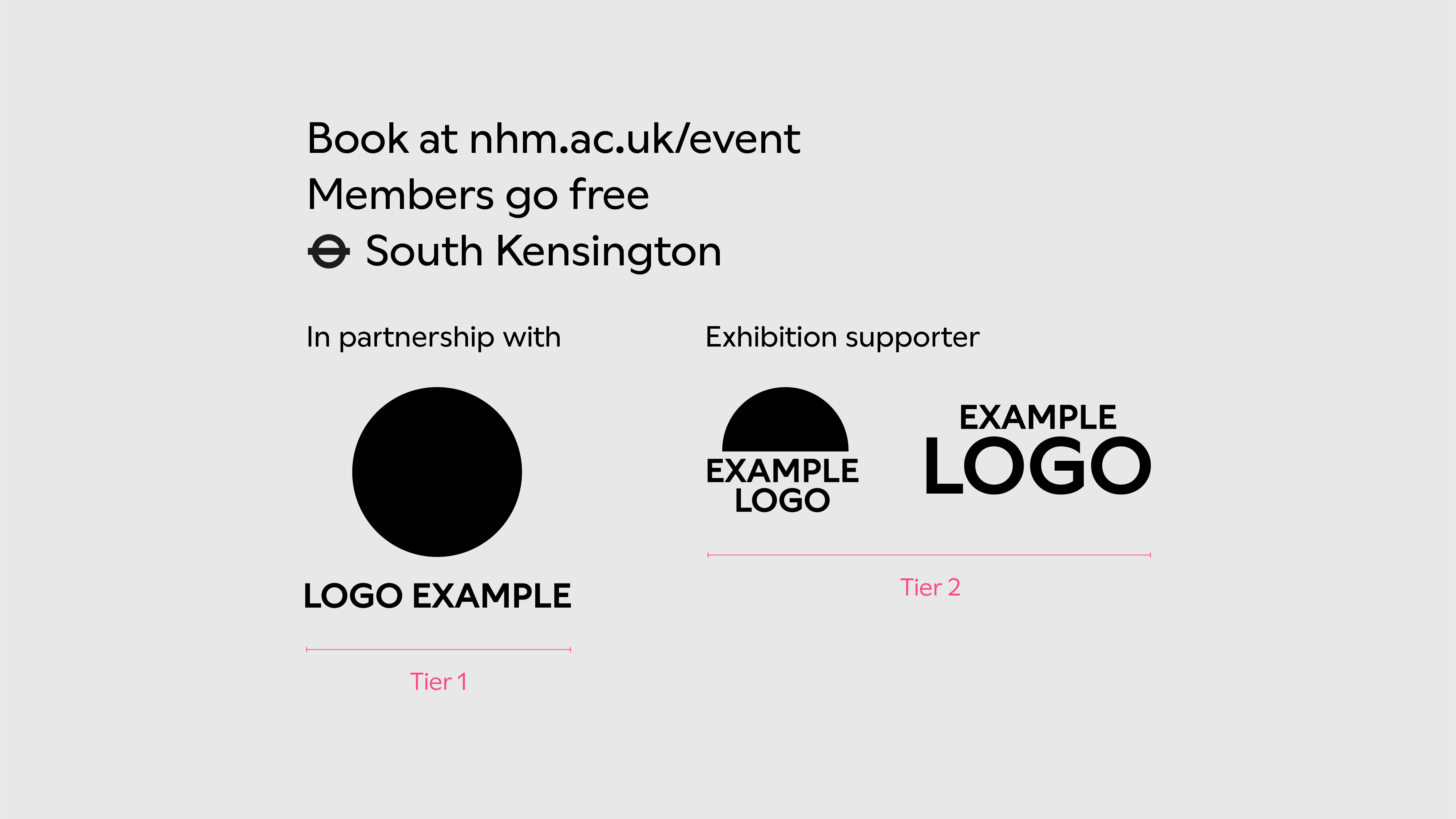
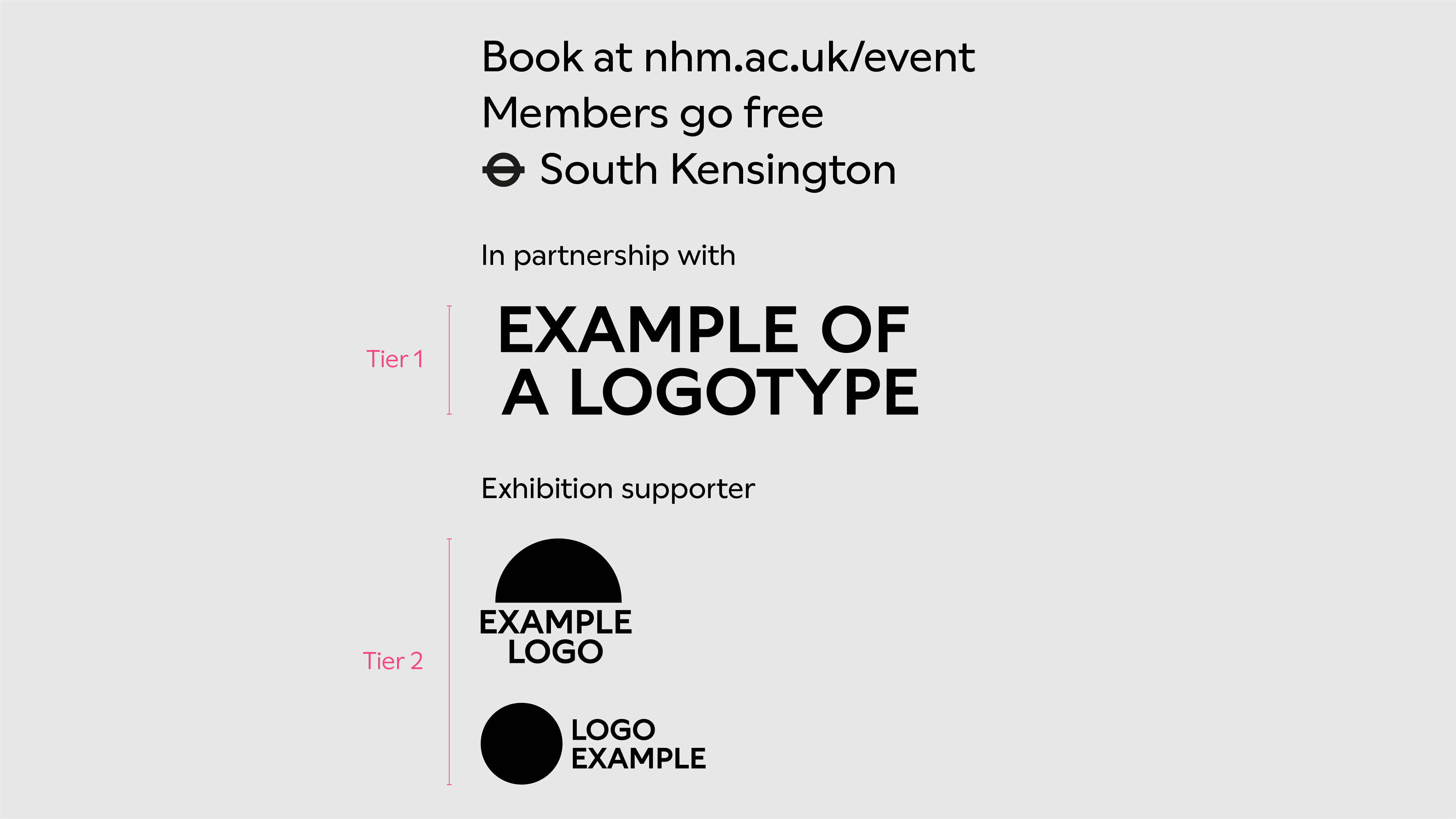
Tiers
We use two tier types depending on the agreed accreditation. Tier 1 is larger and tier 2 is smaller.
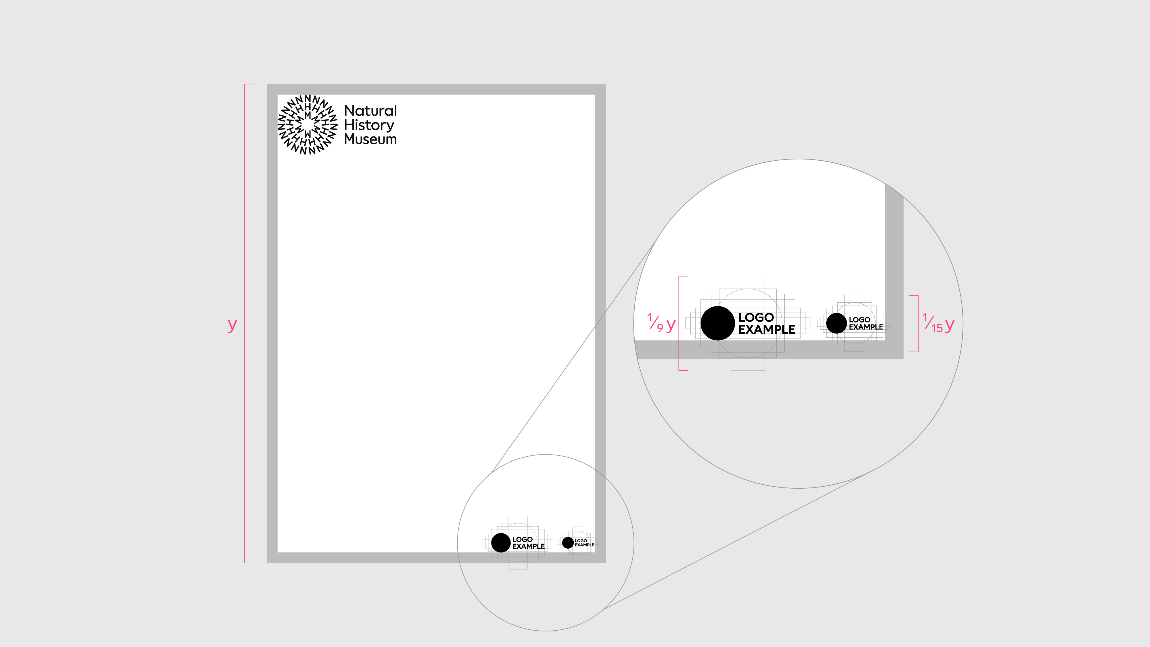
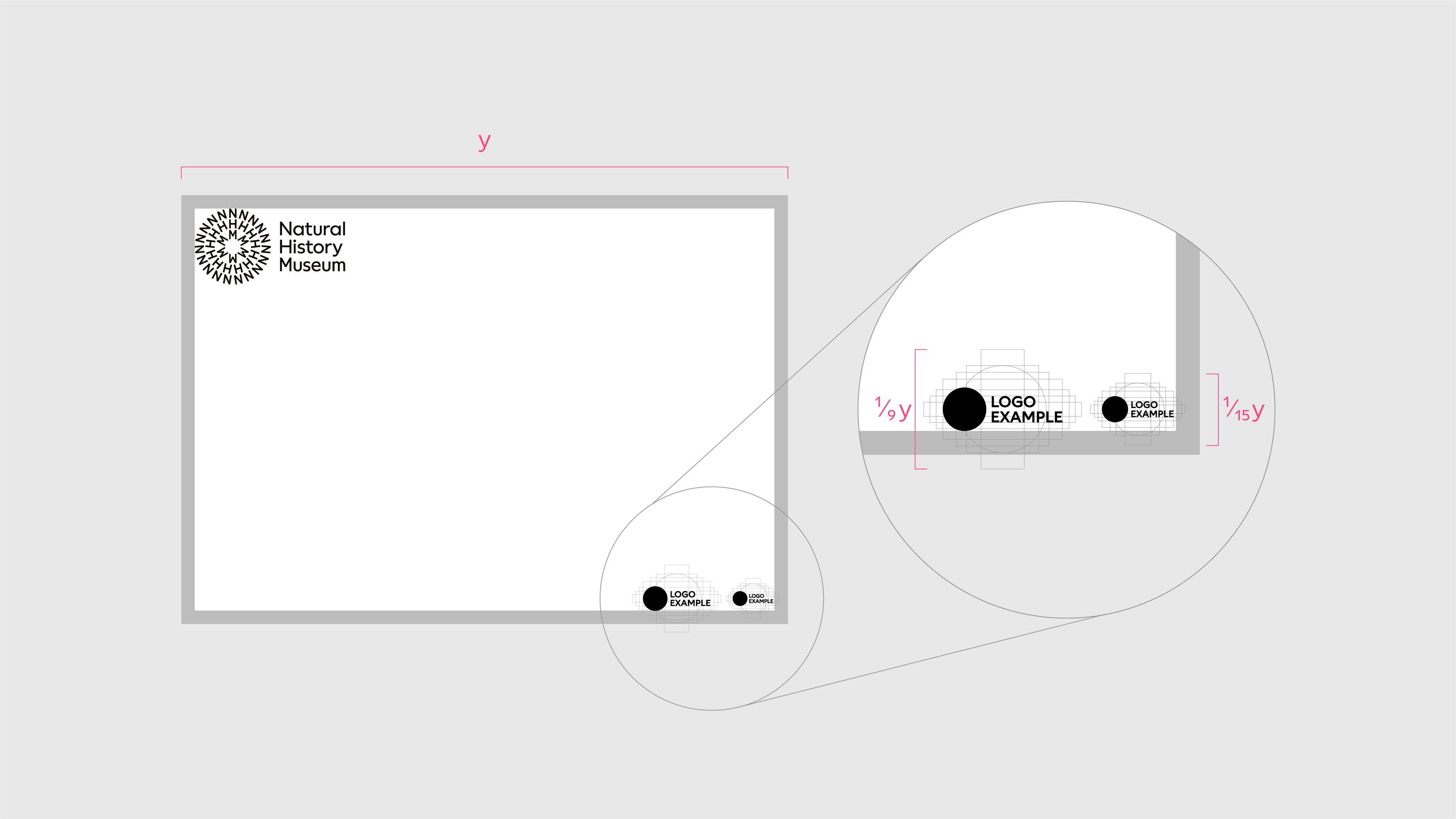
Scale
We use a division of the longest edge of the format to determine the size of the accreditation grids.
Portrait format
Tier 1 accreditation grid height = 1/9 format height
Tier 2 accreditation grid height = 1/15 format height
Landscape format
Tier 1 accreditation grid height = 1/9 format width
Tier 2 accreditation grid height = 1/15 format width
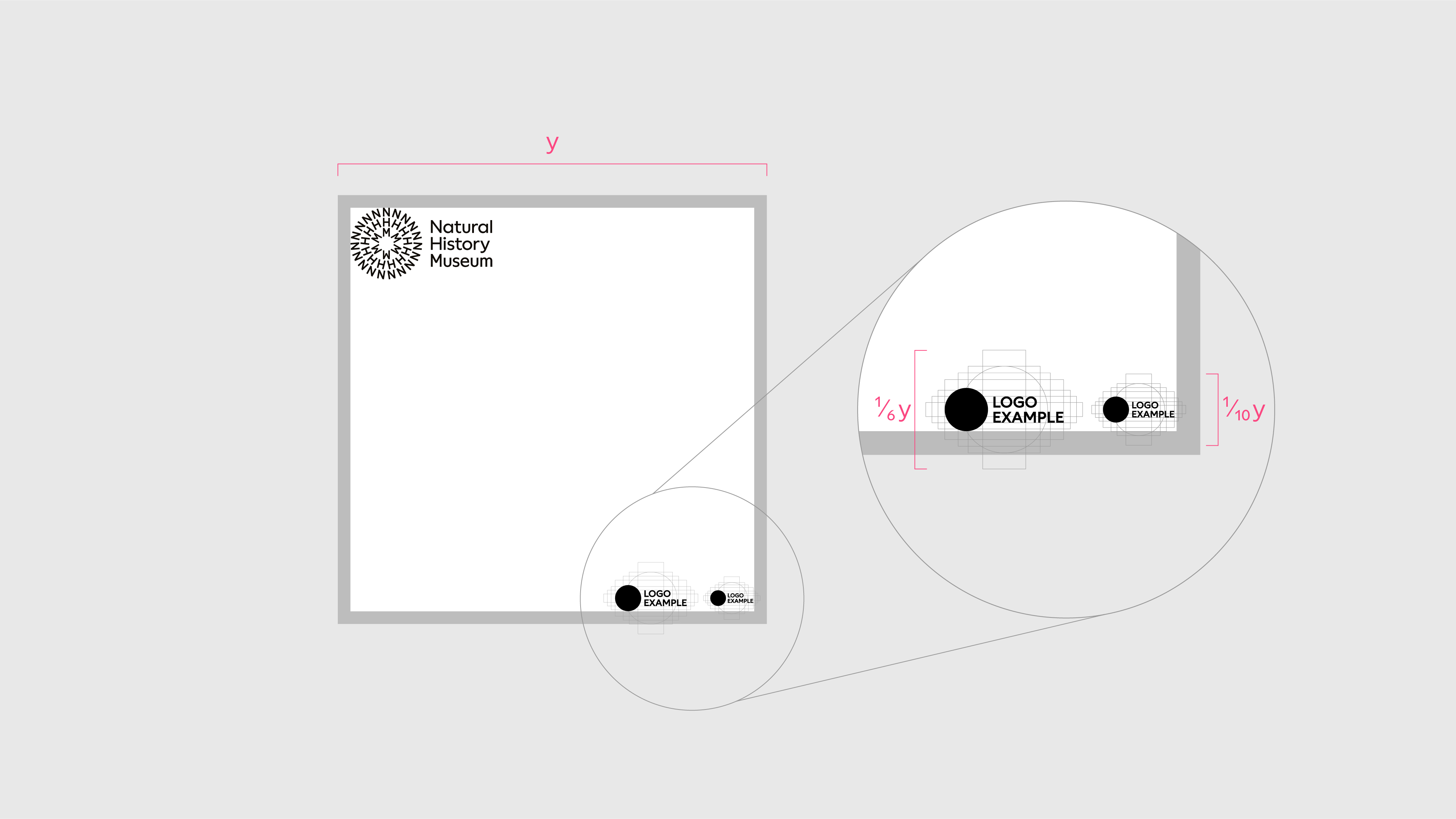
Square format
Tier 1 accreditation grid height = 1/6 format width
Tier 2 accreditation grid height = 1/10 format width
If the size of the partner logo falls below its minimum size, increase the scale of the accreditation grid for all logos - never go below the minimum size of the partner logo.
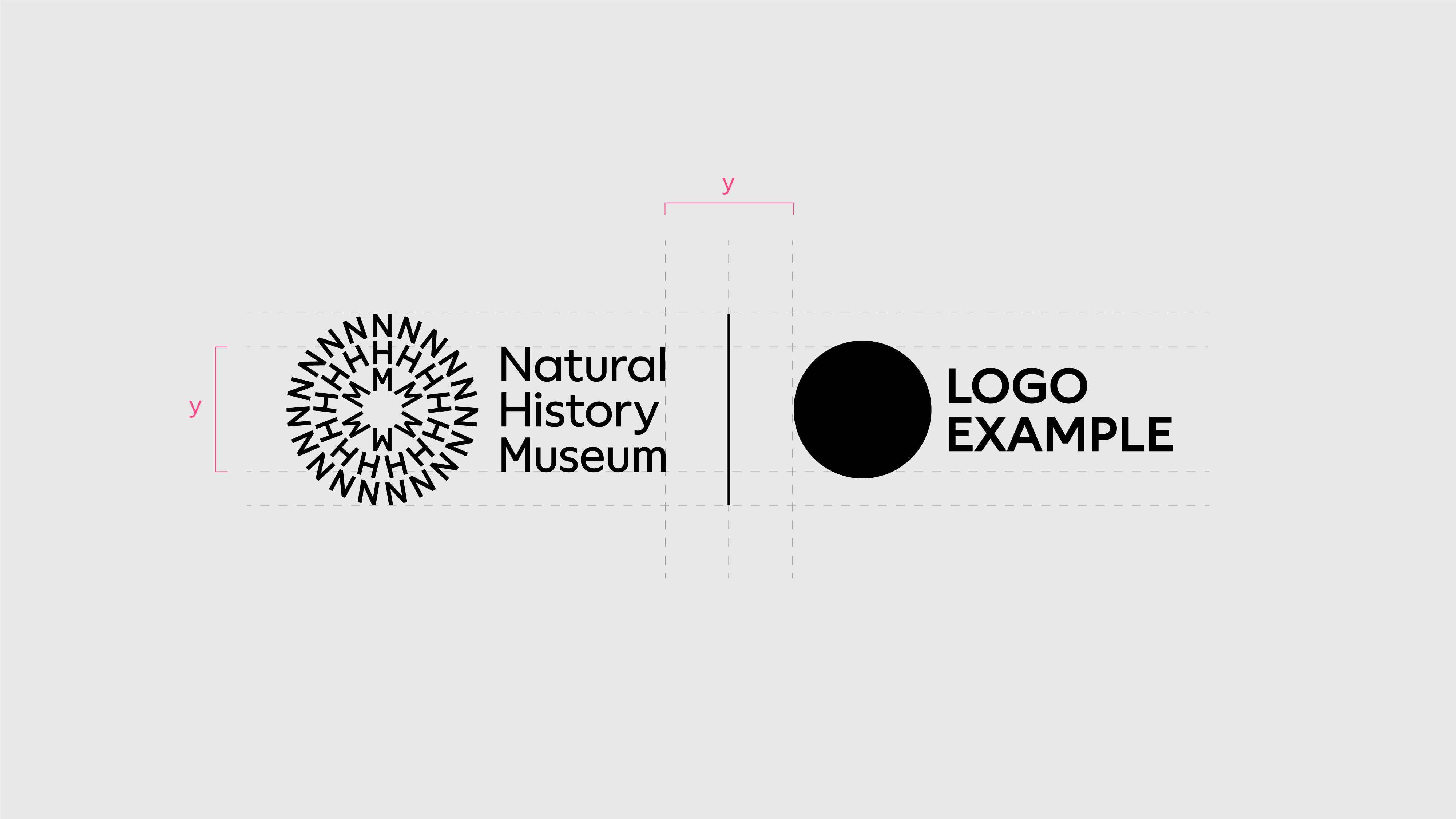
Spacing and scale
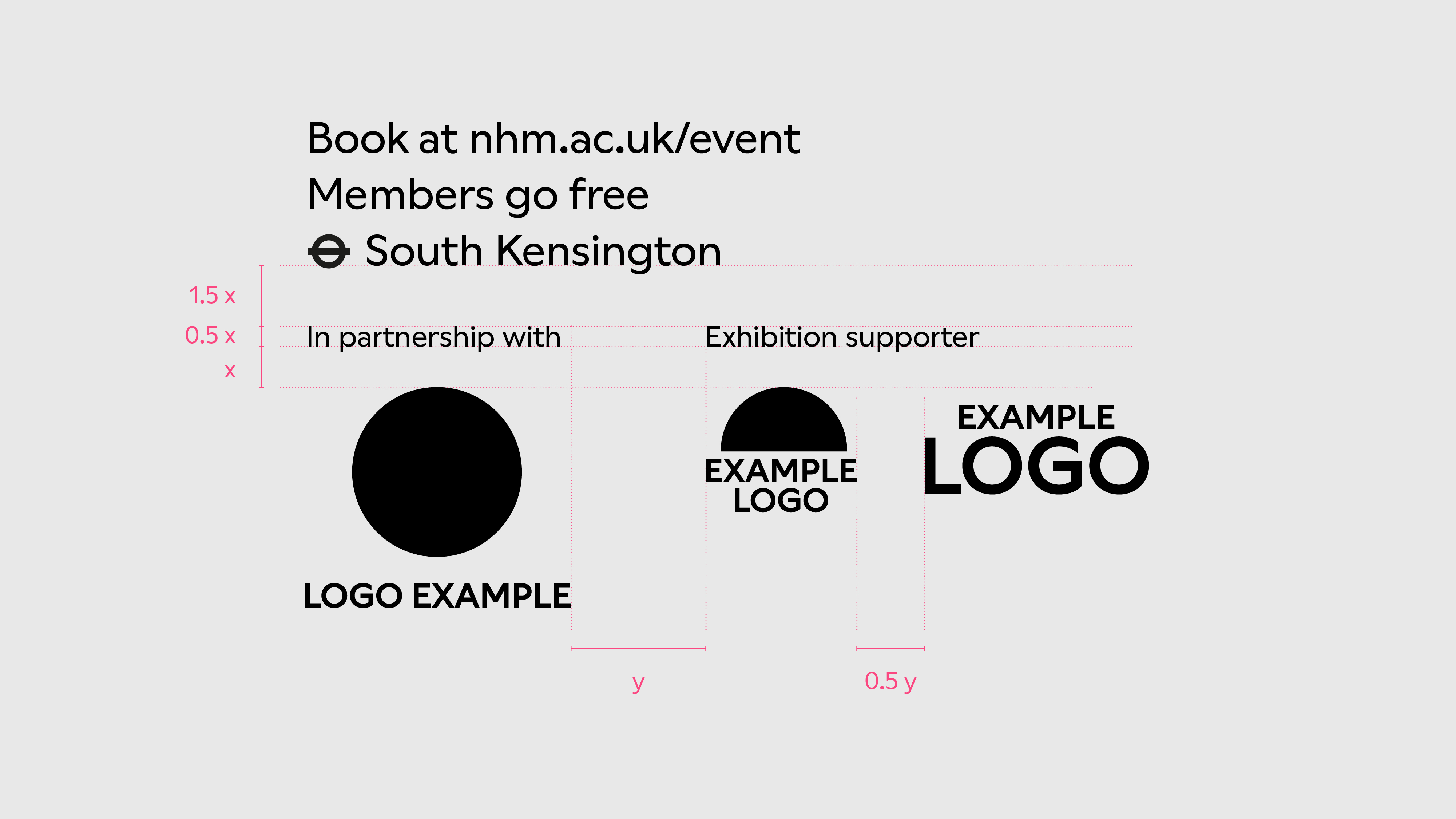
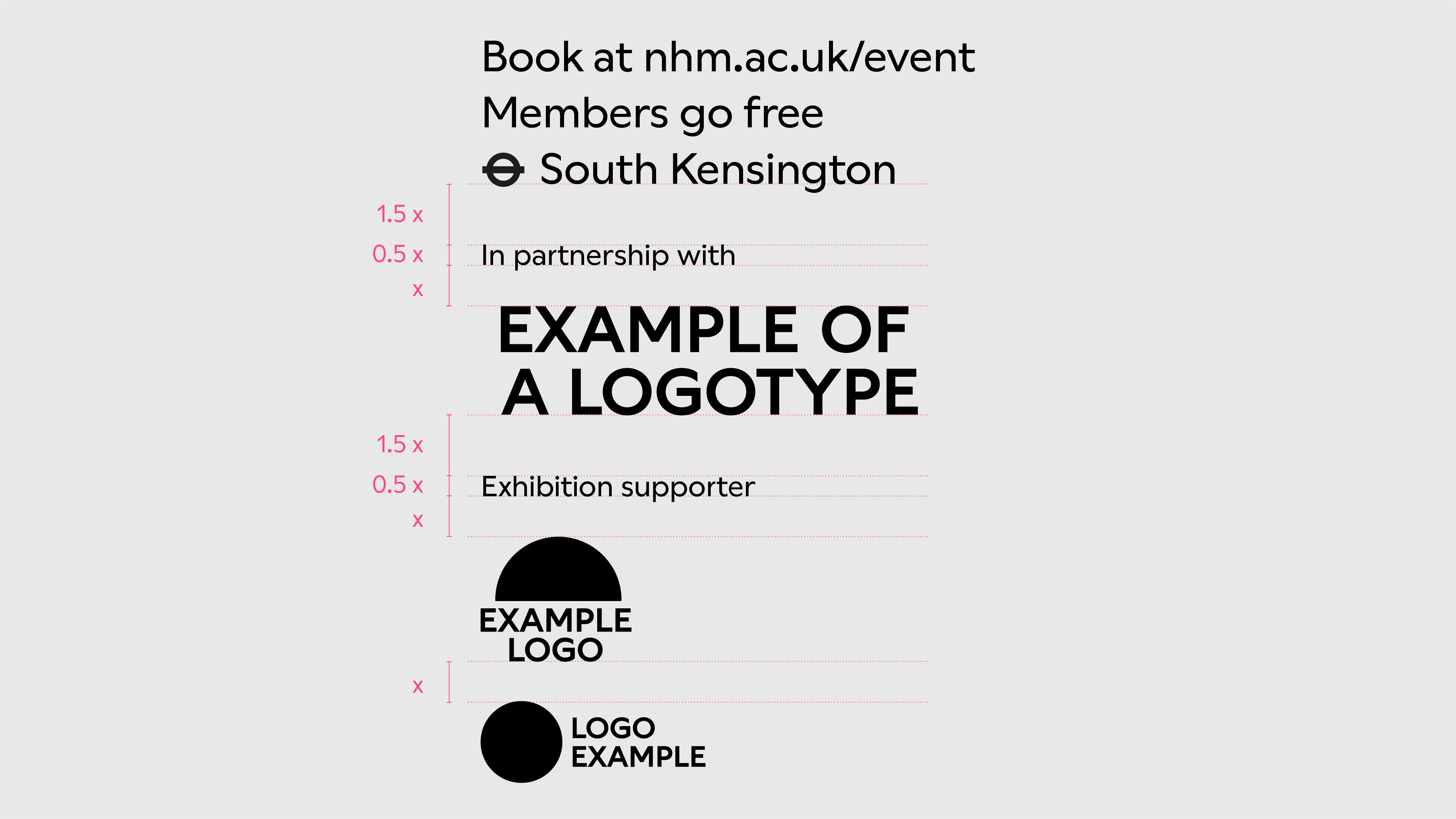
Elements for spacing
The distance between elements is determined by the largest (Tier 1) accreditation grid.
We use the height of the widest block (x) and the width of the tallest block (y).
Labels
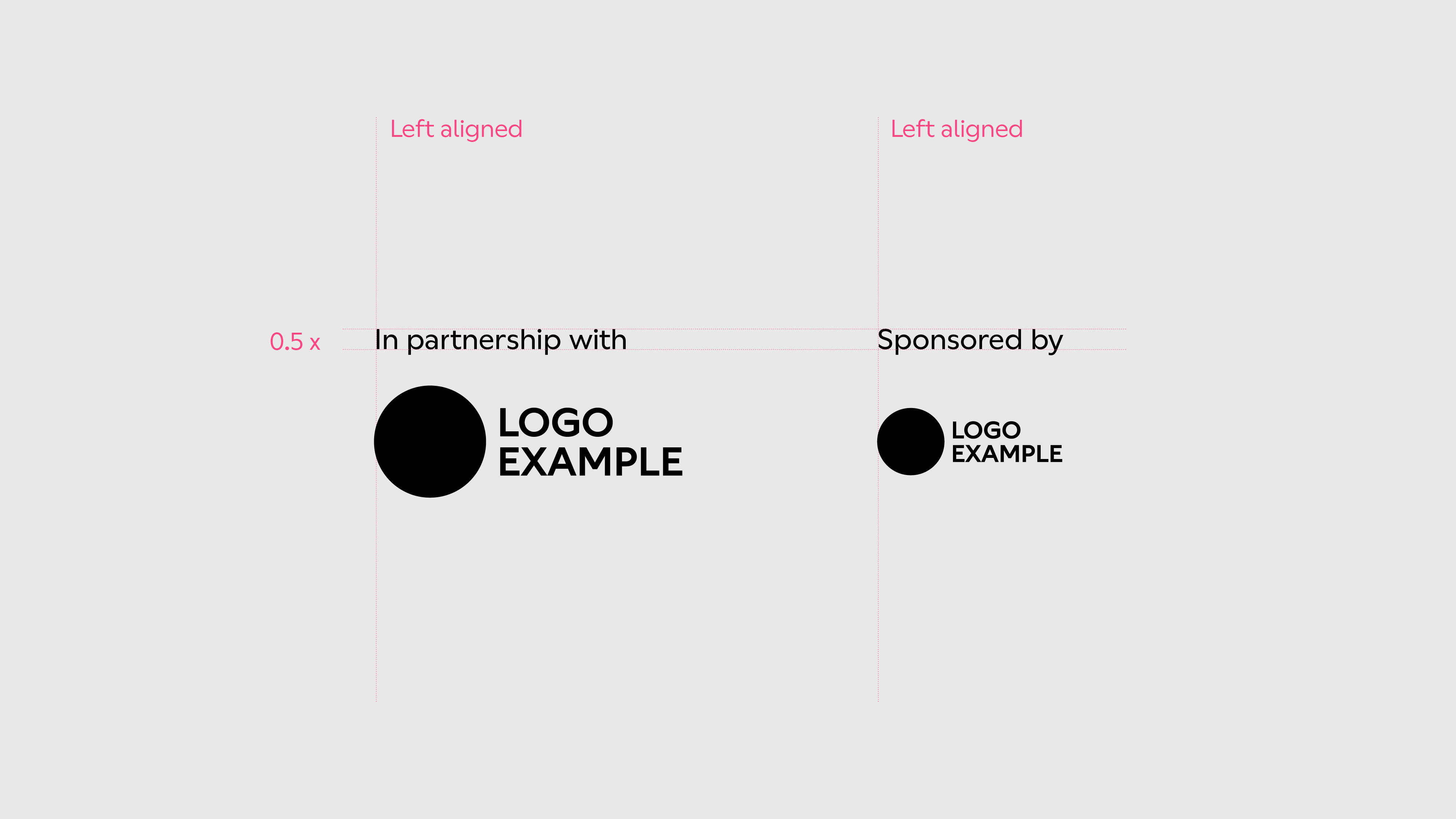
Ensure labels are clear and that the accreditation can be easily interpreted in the language. They must align with one another and left align with the accreditation logo.
The size of a label is determined by half the height of the widest block. Ensure labels are always smaller than other text elements. See the Typography section to find out more.
Different labels in the same communication piece use a consistent scale no matter the size of the creditor logo.
Horizontal alignment
To determine the spacing between Tier 1 accreditation logos, use the width of the tallest block.
For Tier 2 accreditation logos, use half the width of the tallest block.
Central vertical alignment is recommended. Small elements of the logos can overshoot to account for optical balance.
Vertical alignment
To determine the spacing for stacked accreditation logos, use the height of the widest block in increments.
Left vertical alignment is recommended. Small elements of the logos can overshoot to account for optical balance.
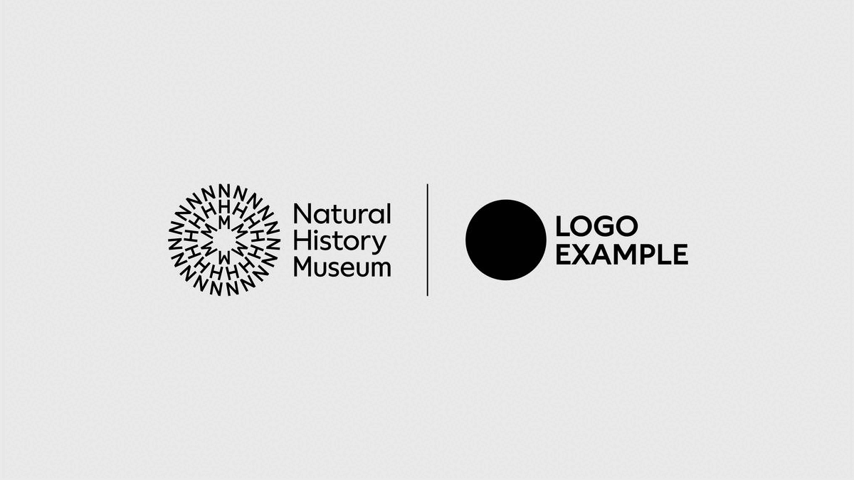
Co-branding
We use our lock-up when we require close proximity to other logos for co-branding.
Use the accreditation grid to determine the size of NHM lock-up and the partner logo.
The distance between the two logos equals the height of the stacked logotype.
We use a vertical bar directly in between to make a clear separation between the two logos – this equals the height of the NHM symbol.
For situations where the Natural History Museum doesn't have control of the output, such as co-branding partnerships designed by third parties, we recommend supplying the black-and-white lock-up.