Colour
We are a multicloured brand inspired by the diverse colours found in nature. Our palette is mixed, rich and inclusive like natural ecosystems, such as forests, oceans and grasslands.
Inspired by nature with a close connection to the environment, our palette is a diverse range of strong vivid colours juxtaposed with warm muted tones that are supported by simple mono colours.
Caution
Our colour values are not direct conversions between different colour profiles. Always use the colour swatches and values provided for each colour and double check them.
Example: CMYK breakdowns are custom and different to generic PMS to CMYK conversions.
Vivid
Lime Yellow |
|
|---|---|
| HEX | #C9F708 |
| RGB | 201 247 8 |
| CMYK | 23 0 94 0 |
| PMS | 389 C / 388 U |
| RAL | 100 80 80 |
Bright Green |
|
|---|---|
| HEX | #30ff2e |
| RGB | 48 255 46 |
| CMYK | 52 0 100 0 |
| PMS | 802 |
| RAL | 6038 |
Rainforest Green |
|
|---|---|
| HEX | #00ad00 |
| RGB | 0 173 0 |
| CMYK | 94 0 96 0 |
| PMS | 355 |
| RAL | 140 50 60 |
Bright Yellow |
|
|---|---|
| HEX | #ffe600 |
| RGB | 205 230 0 |
| CMYK | 0 4 100 0 |
| PMS | Yellow |
| RAL | 090 80 90 |
Aqua Blue |
|
|---|---|
| HEX | #0dedf7 |
| RGB | 13 237 247 |
| CMYK | 59 0 9 0 |
| PMS | 3115 |
| RAL | 210 70 35 |
Azure Blue |
|
|---|---|
| HEX | #0d17f5 |
| RGB | 13 23 245 |
| CMYK | 100 18 0 0 |
| PMS | Pro. Blue |
| RAL | 240 50 40 |
Magenta Pink |
|
|---|---|
| HEX | #f205ba |
| RGB | 242 5 186 |
| CMYK | 0 100 0 0 |
| PMS | Rhod. Red |
| RAL | 4003 |
Scarlet Red |
|
|---|---|
| HEX | #fa3608 |
| RGB | 250 54 8 |
| CMYK | 0 100 87 0 |
| PMS | 1788 |
| RAL | 3024 |
Coral Red |
|
|---|---|
| HEX | #ff5957 |
| RGB | 255 89 87 |
| CMYK | 0 75 58 0 |
| PMS | 2346 |
| RAL | 3017 |
Muted
Brown Grey |
|
|---|---|
| HEX | #8f7d75 |
| RGB | 143 125 117 |
| CMYK | 17 24 25 49 |
| PMS | Warm Gray 8 |
| RAL | 7006 |
Oil Green |
|
|---|---|
| HEX | #856b00 |
| RGB | 133 107 0 |
| CMYK | 11 42 98 28 |
| PMS | 132 |
| RAL | 8000 |
Anthracite Grey |
|
|---|---|
| HEX | #333d47 |
| RGB | 51 61 71 |
| CMYK | 77 53 44 66 |
| PMS | 432 |
| RAL | 7016 |
Bluish Grey |
|
|---|---|
| HEX | #87999e |
| RGB | 135 153 158 |
| CMYK | 33 9 18 21 |
| PMS | 443 |
| RAL | 7000 |
Indigo Blue |
|
|---|---|
| HEX | #24087d |
| RGB | 36 8 125 |
| CMYK | 100 95 0 9 |
| PMS | Blue 072 |
| RAL | 5002 |
Night Blue |
|
|---|---|
| HEX | #290340 |
| RGB | 41 3 64 |
| CMYK | 100 100 5 57 |
| PMS | 274 |
| RAL | 5022 |
Peach Blossom |
|
|---|---|
| HEX | #f2bab0 |
| RGB | 242 186 176 |
| CMYK | 0 34 26 0 |
| PMS | 488 |
| RAL | 040 080 20 |
Brownish Red |
|
|---|---|
| HEX | #651604 |
| RGB | 101 22 4 |
| CMYK | 9 97 64 60 |
| PMS | 202 |
| RAL | 3003 |
Dark Brown |
|
|---|---|
| HEX | #2e1212 |
| RGB | 46 18 18 |
| CMYK | 44 84 51 85 |
| PMS | 4975 |
| RAL | 3007 |
Mono
White |
|
|---|---|
| HEX | #FFFFFF |
| RGB | 255 255 255 |
| CMYK | 0 0 0 0 |
| PMS | Spot White |
| RAL | 9003 |
Off White |
|
|---|---|
| HEX | #f3f3f3 |
| RGB | 243 243 243 |
| CMYK | 3 1 11 12 |
| PMS | 7534 |
| RAL | 9002 |
Black |
|
|---|---|
| HEX | #191919 |
| RGB | 25 25 25 |
| CMYK | 0 0 0 100 |
| PMS | Black 6 |
| RAL | 9005 |
Approach to colour
When selecting colours from the palette, always consider the context that it's going to be used in.
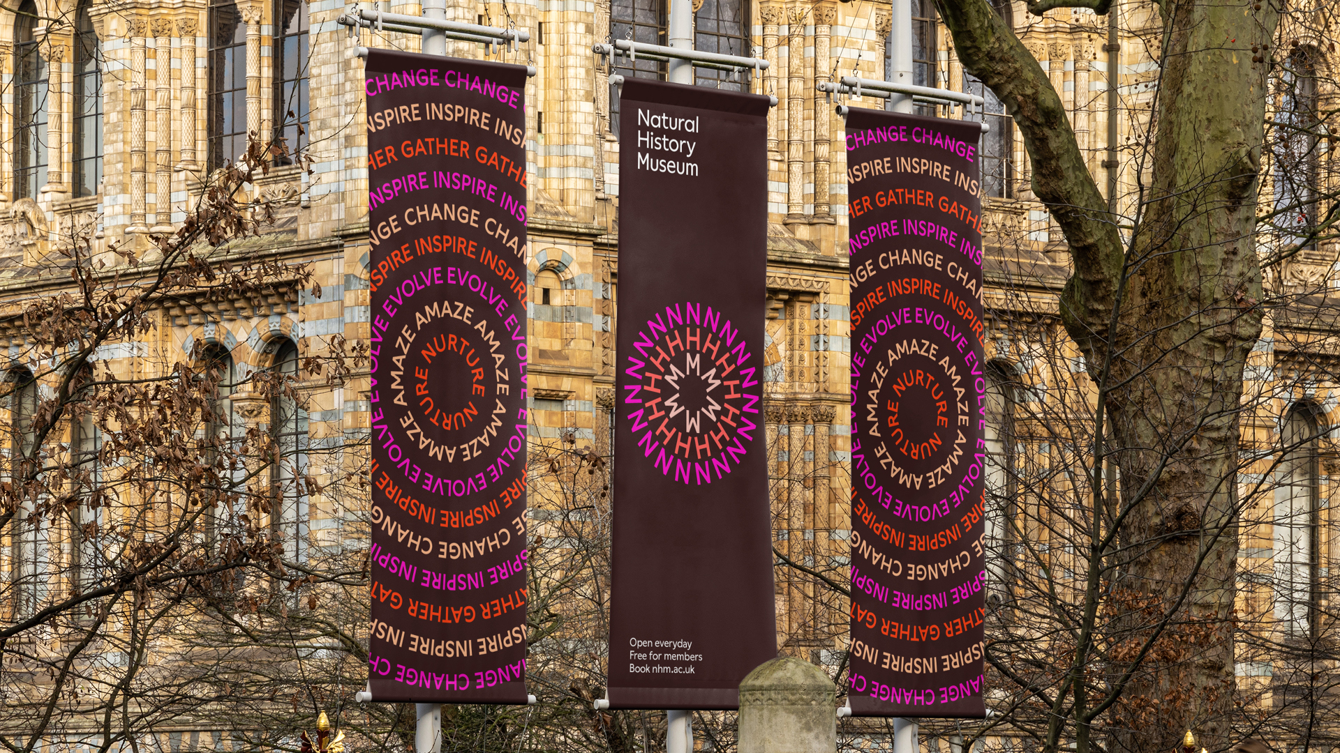
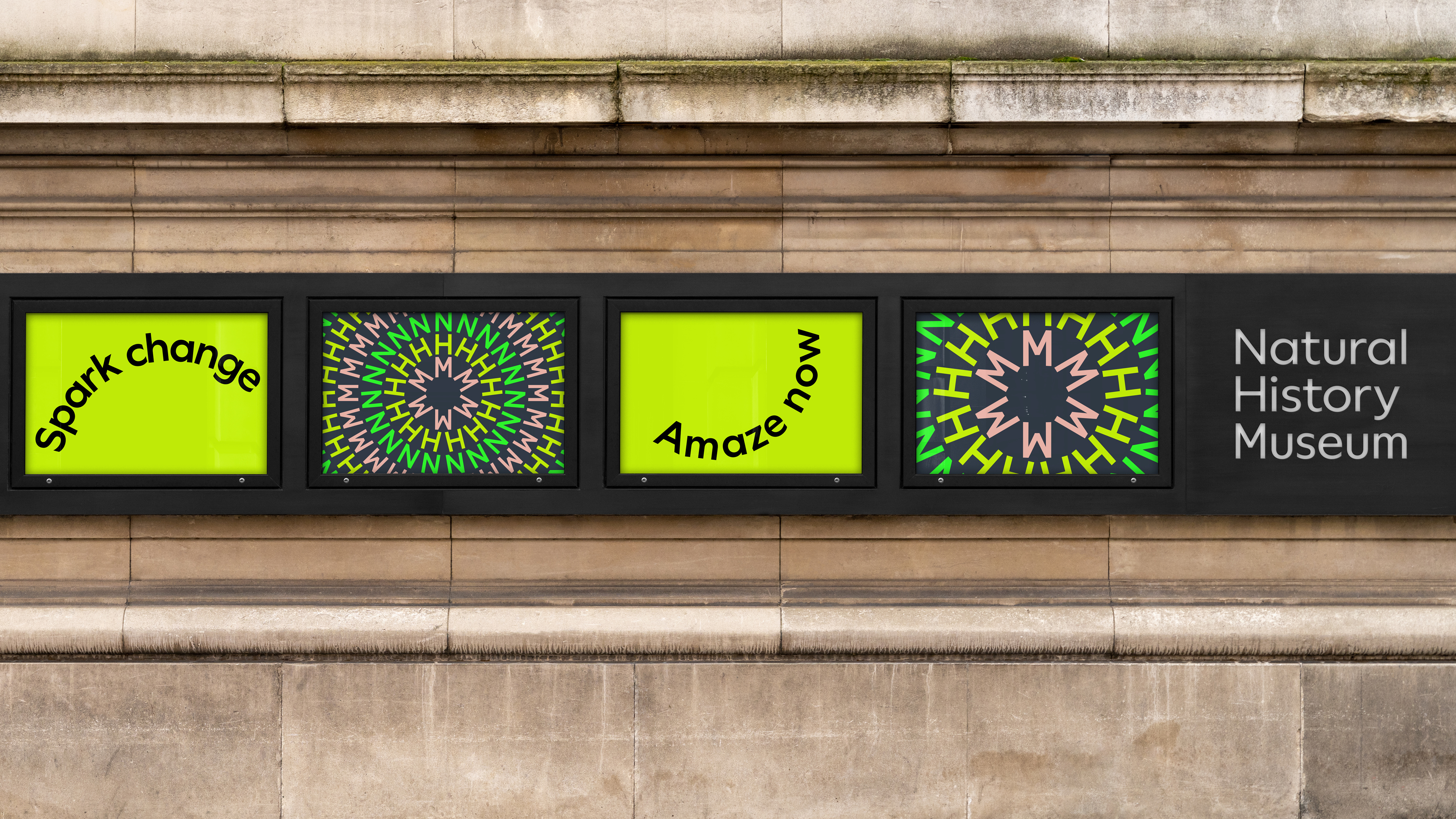
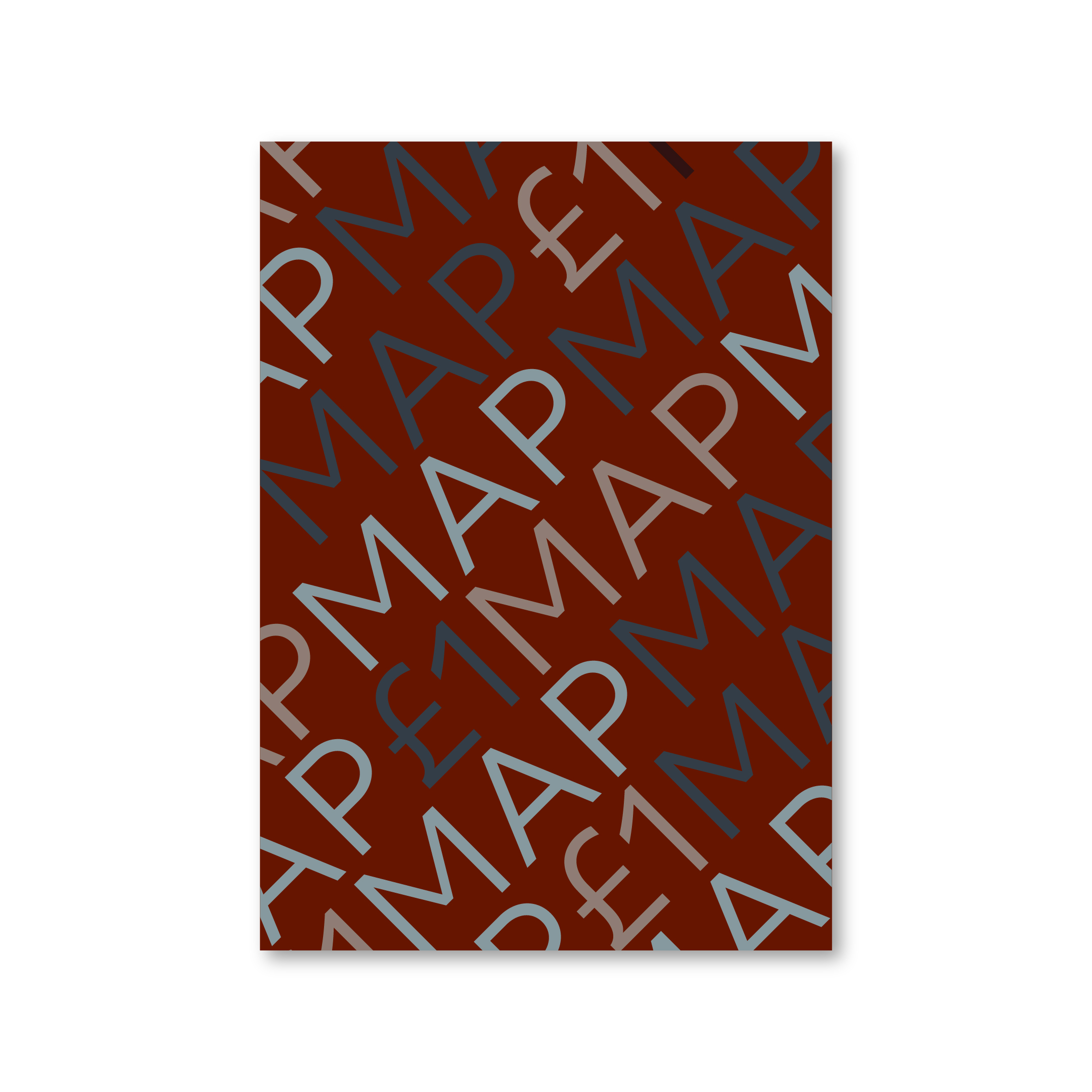
Colour combinations
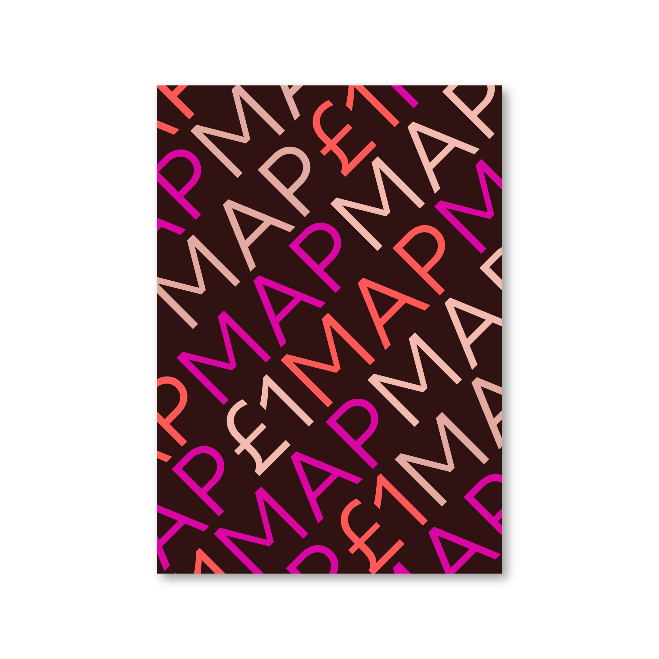
When creating graphic or typographic applications, we use our curated colour combinations – these are unique to the organisation and must always be followed.
These combinations can be applied to patterns, word rings, typography and other graphical layouts.
See below the acceptable colour combinations.
Note
Chromaticity significantly impacts visual disturbance - cool/warm colour combinations are particularly problematic and vibrant colours enhance issues around visual disturbance. Designer discretion is required to choose an appropriate colour combination and ensure it is used with accessibility in mind.
Always take into consideration the behaviour of colours according to the media. What may be considered with good contrast in print may not be on screen. Equally, higher contrast colours will be more disturbing when used in motion.
For example, a combination of high-intensity may be adequate in short time periods or at small scale. While a low-intensity combination may be more appropriate as a background for typography or in subtle applications where the feeling may be more important than immediate attention.
Ensure the colour combinations are always used.
Follow the supplied colour combinations to create diverse and engaging graphic content that is easy to recognise.
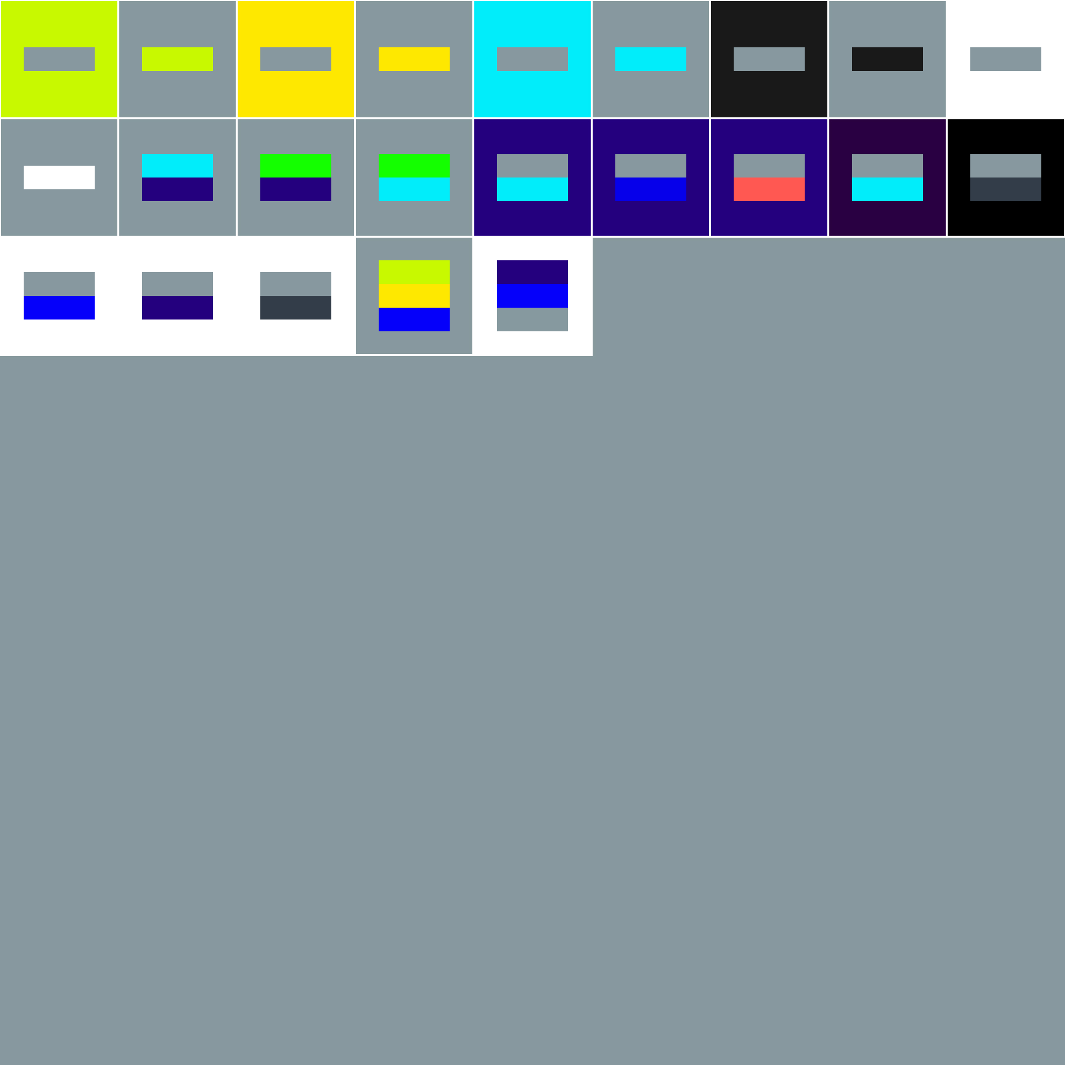
Single colours
Use single colours when working with imagery, footage or illustration – these need to work with the content and offer appropriate legibility.
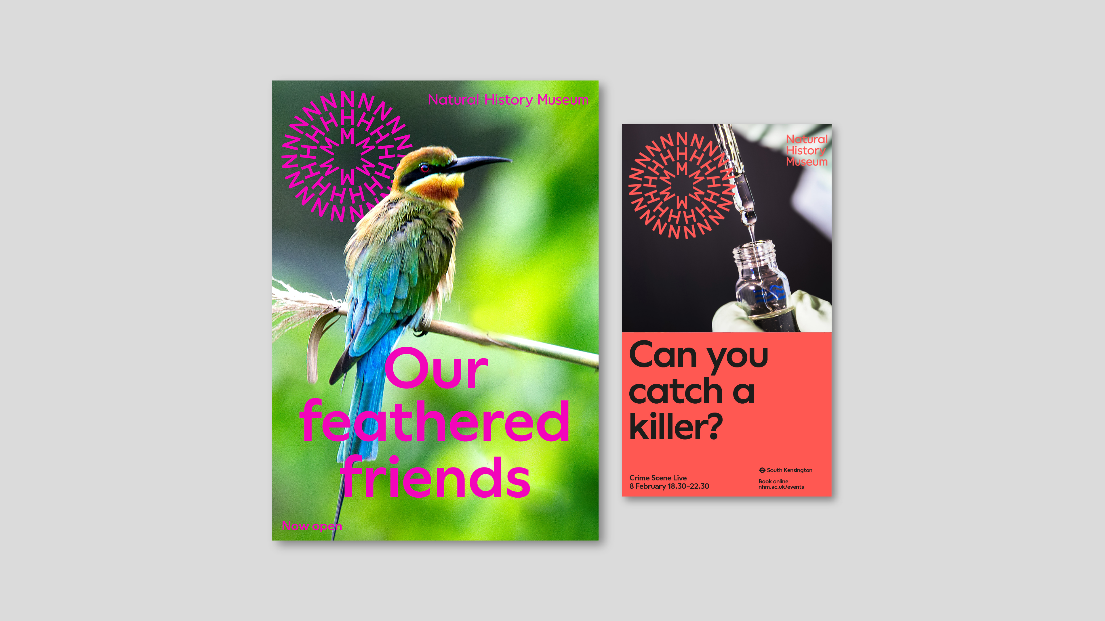

Avoid colours with low contrast with image that cause illegibility
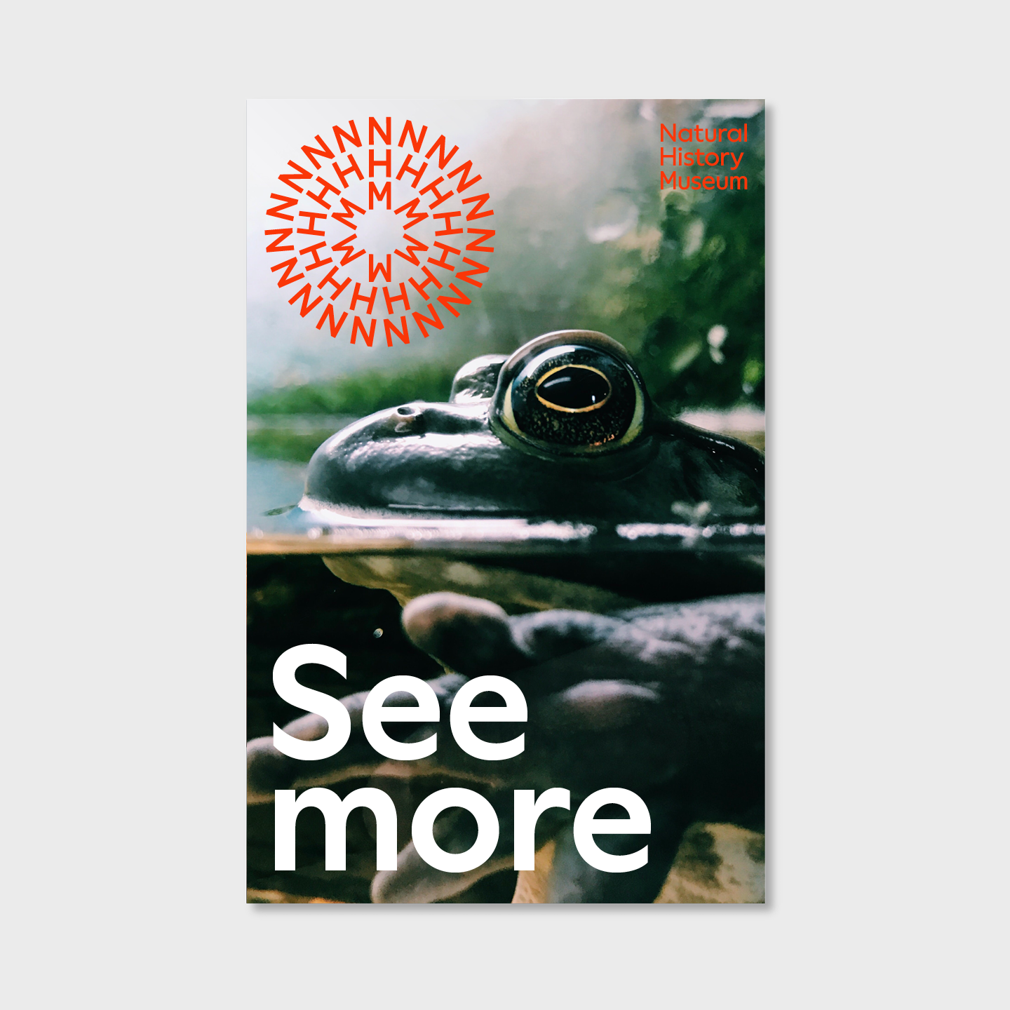
Ensure there is enough contrast for text to be legible
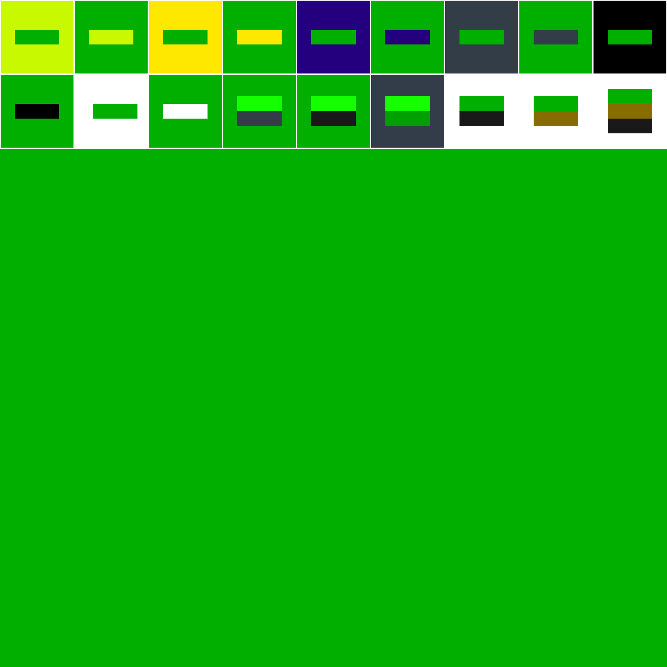
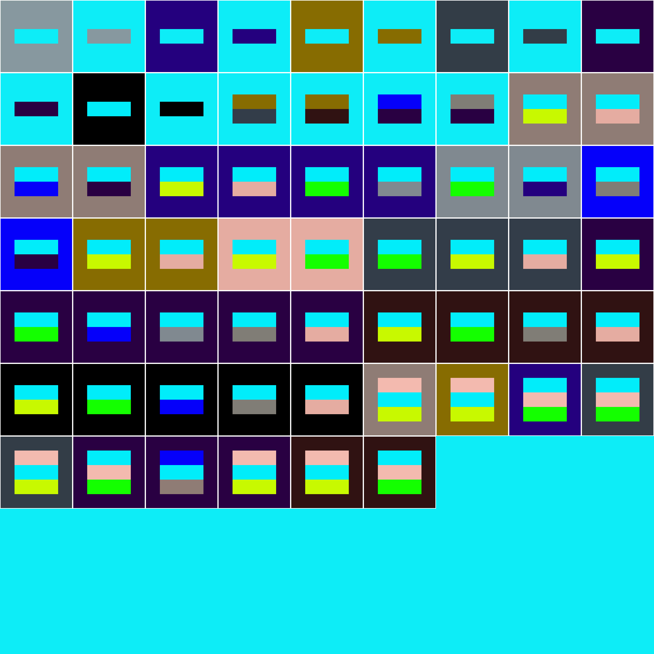
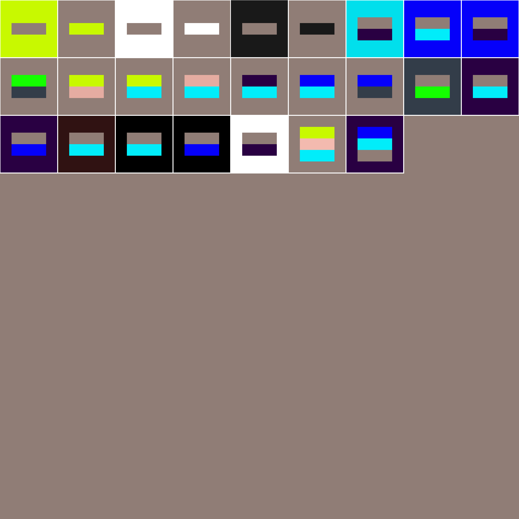
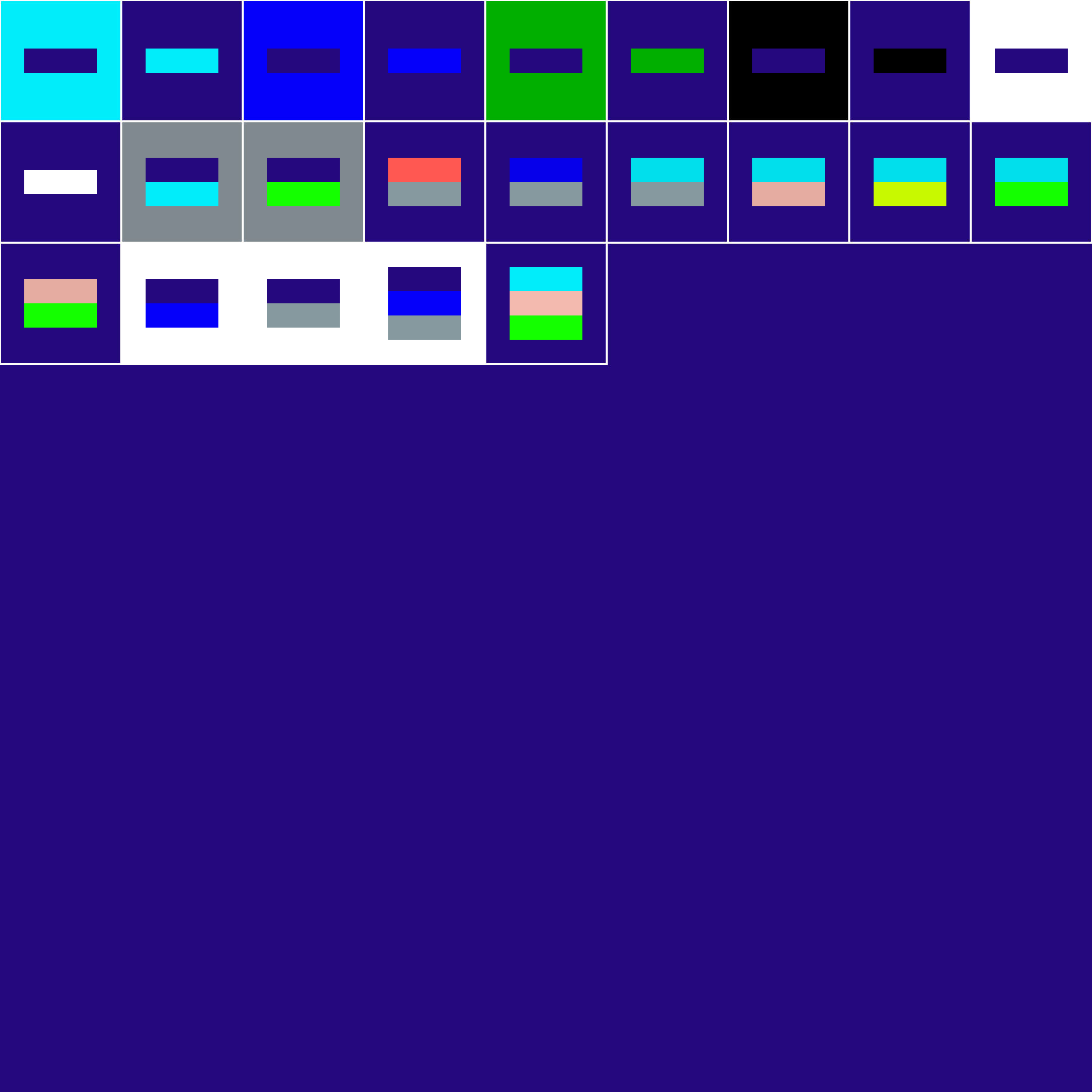
Acceptable colour combinations
Below are the acceptable colour combinations – some have more combinations than others.
Lime Yellow
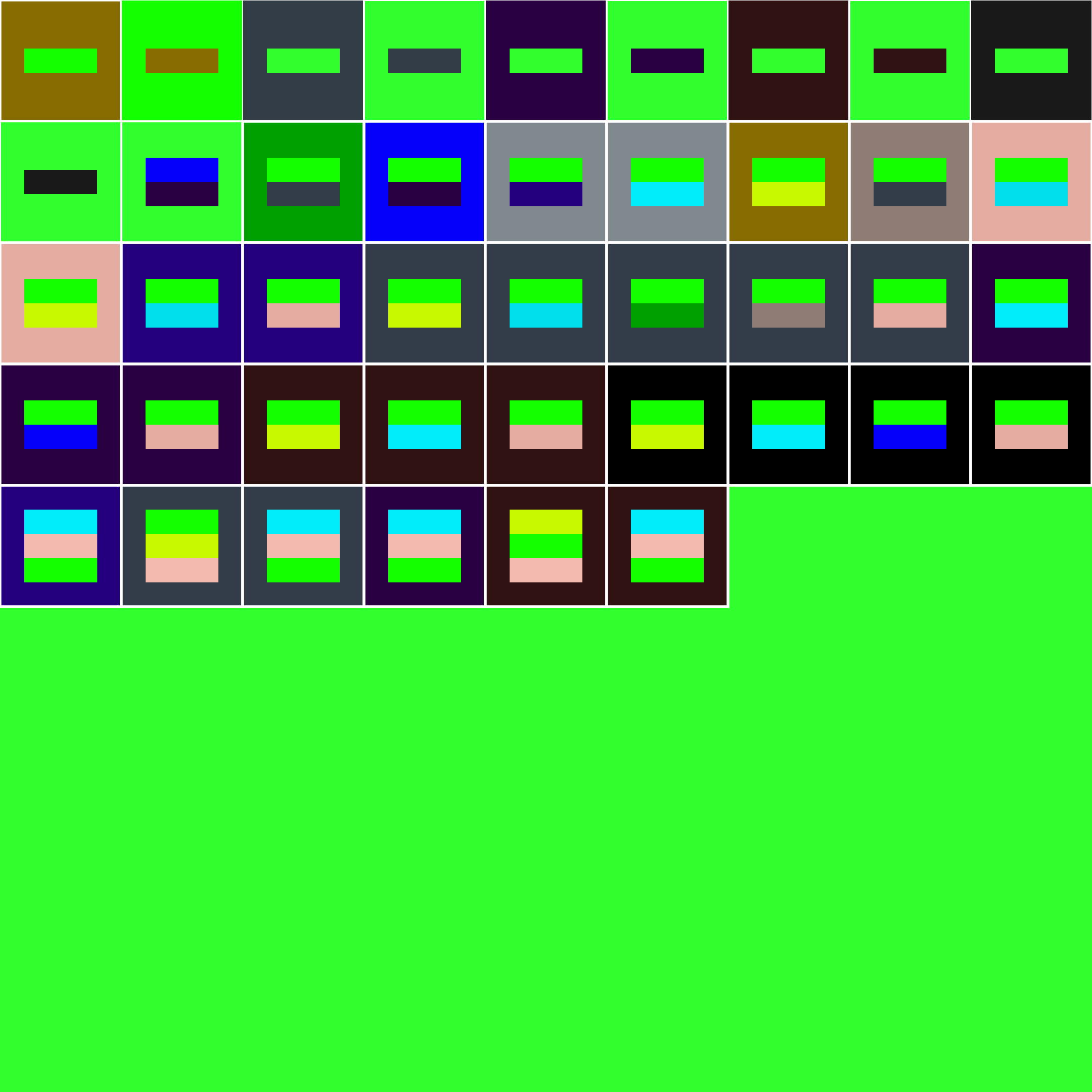
Bright Green
Rainforest Green
Bright Yellow
Aqua Blue
Azure Blue
Magenta Pink
Scarlet Red
Coral Red
Brown Grey
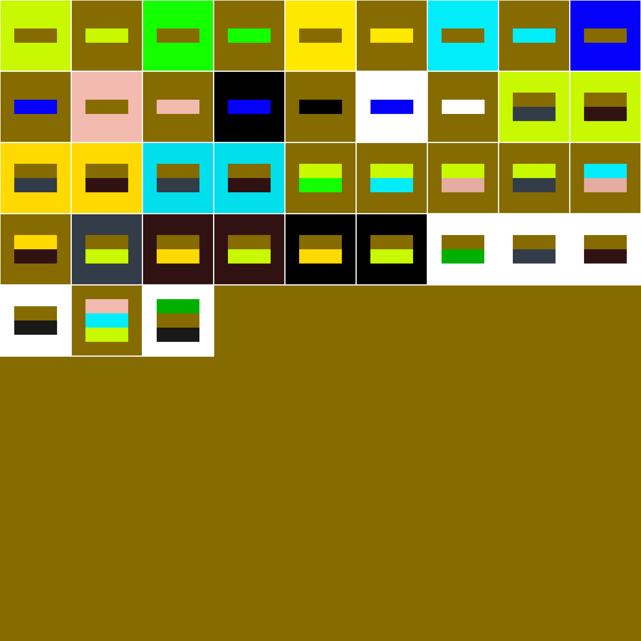
Oil Green
Anthracite Grey
Bluish Grey
Indigo Blue
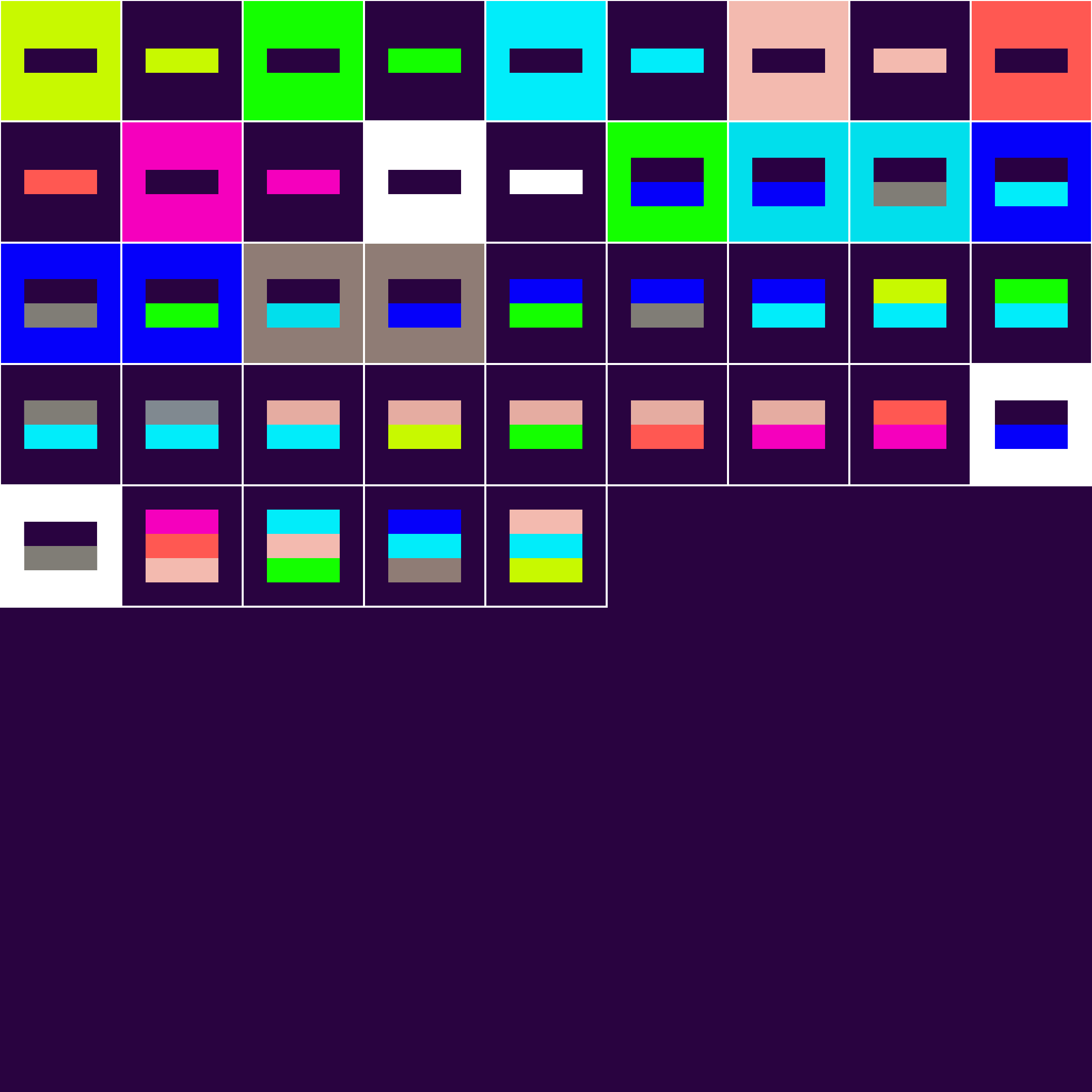
Night Blue
Peach Blossom
Brownish Red
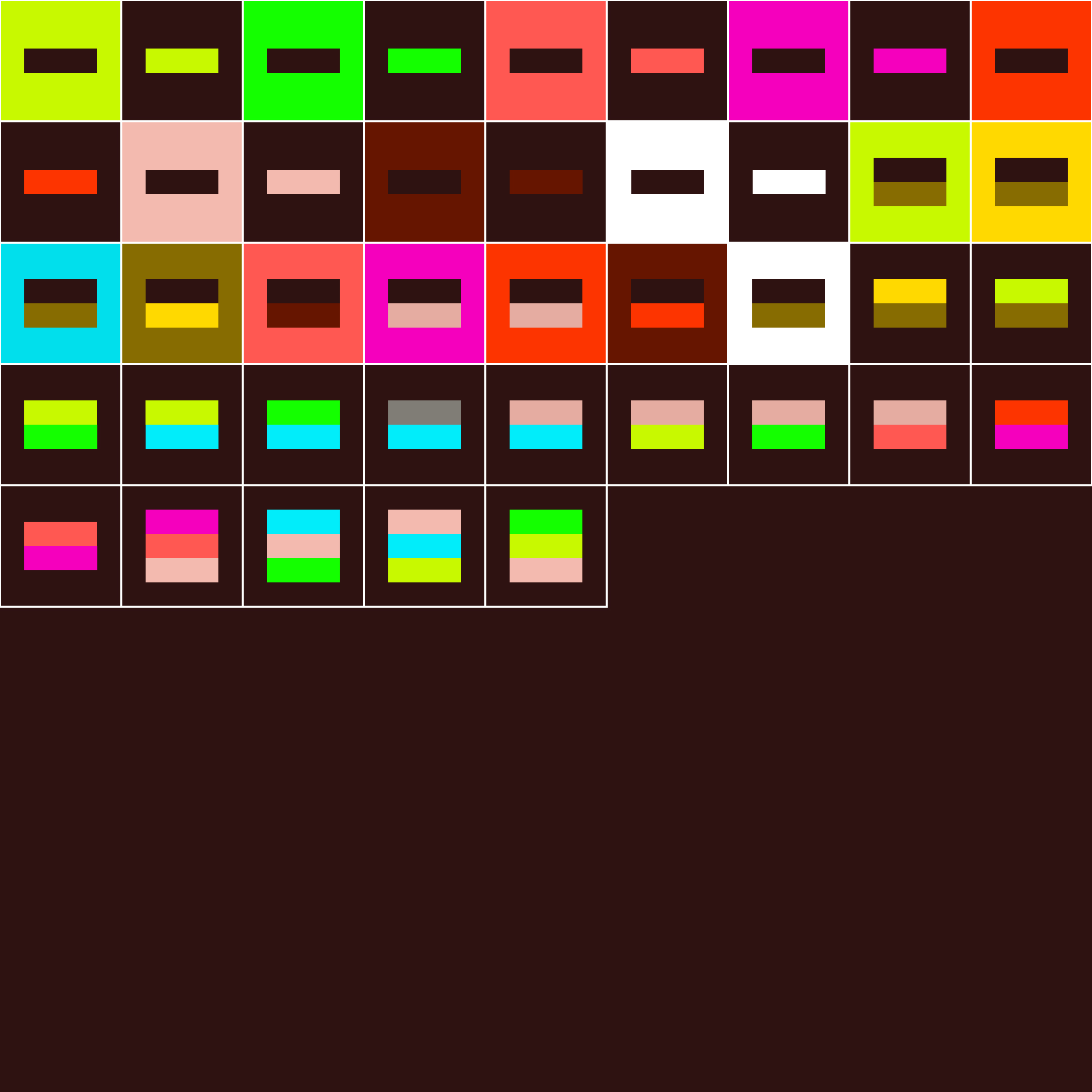
Dark Brown
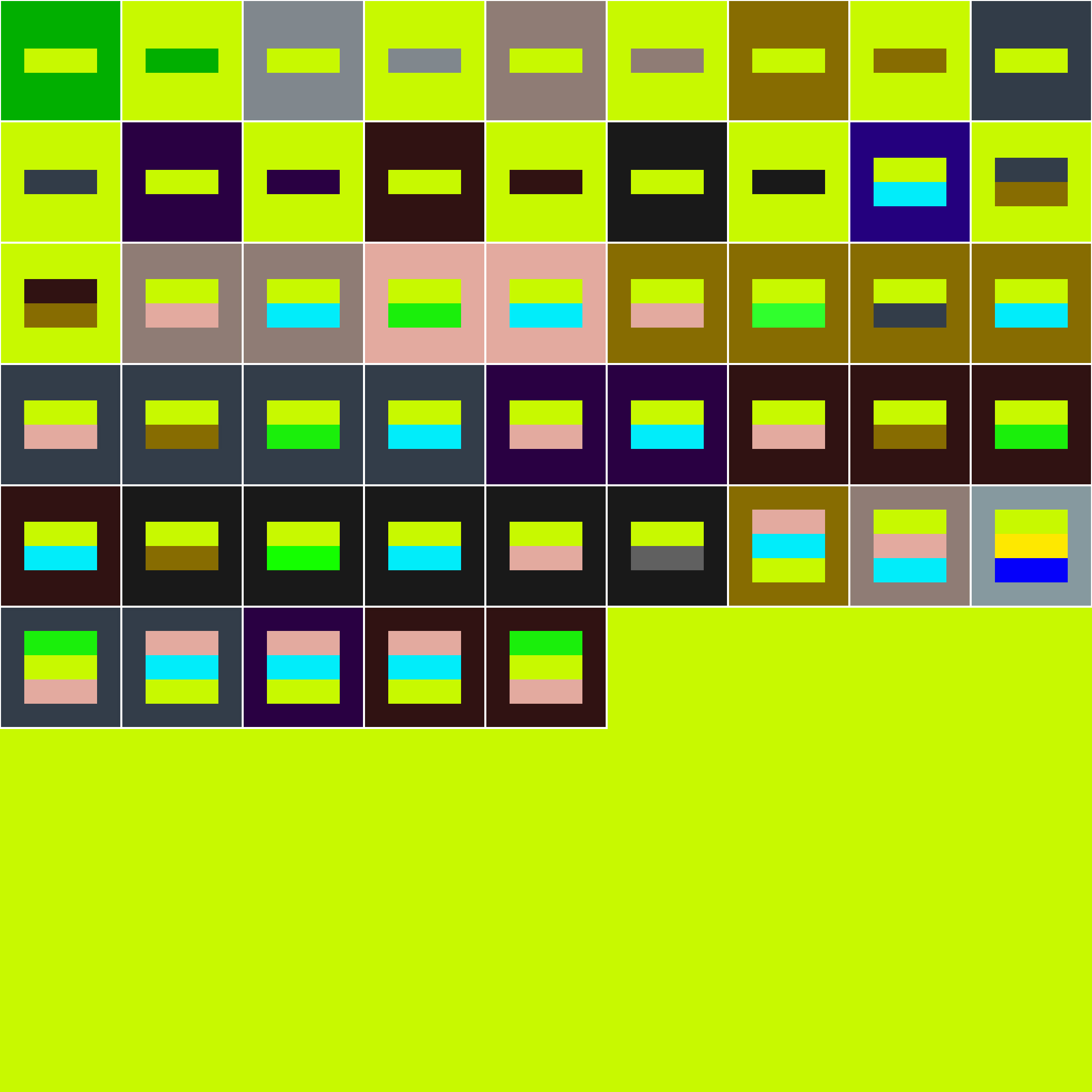
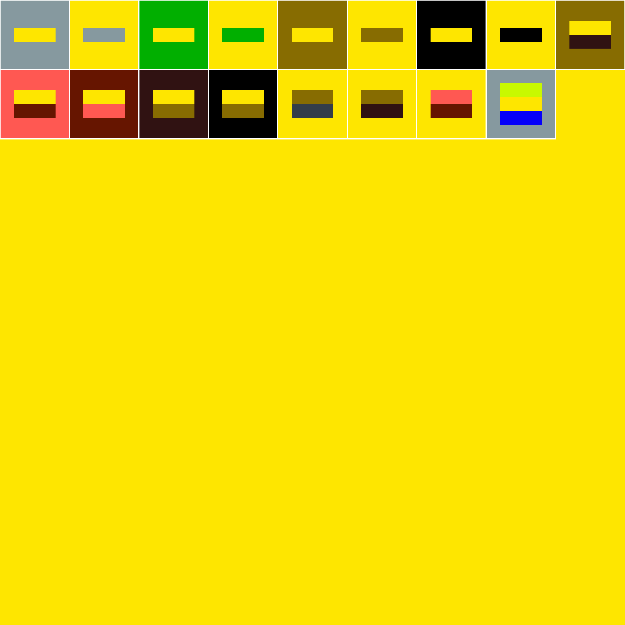
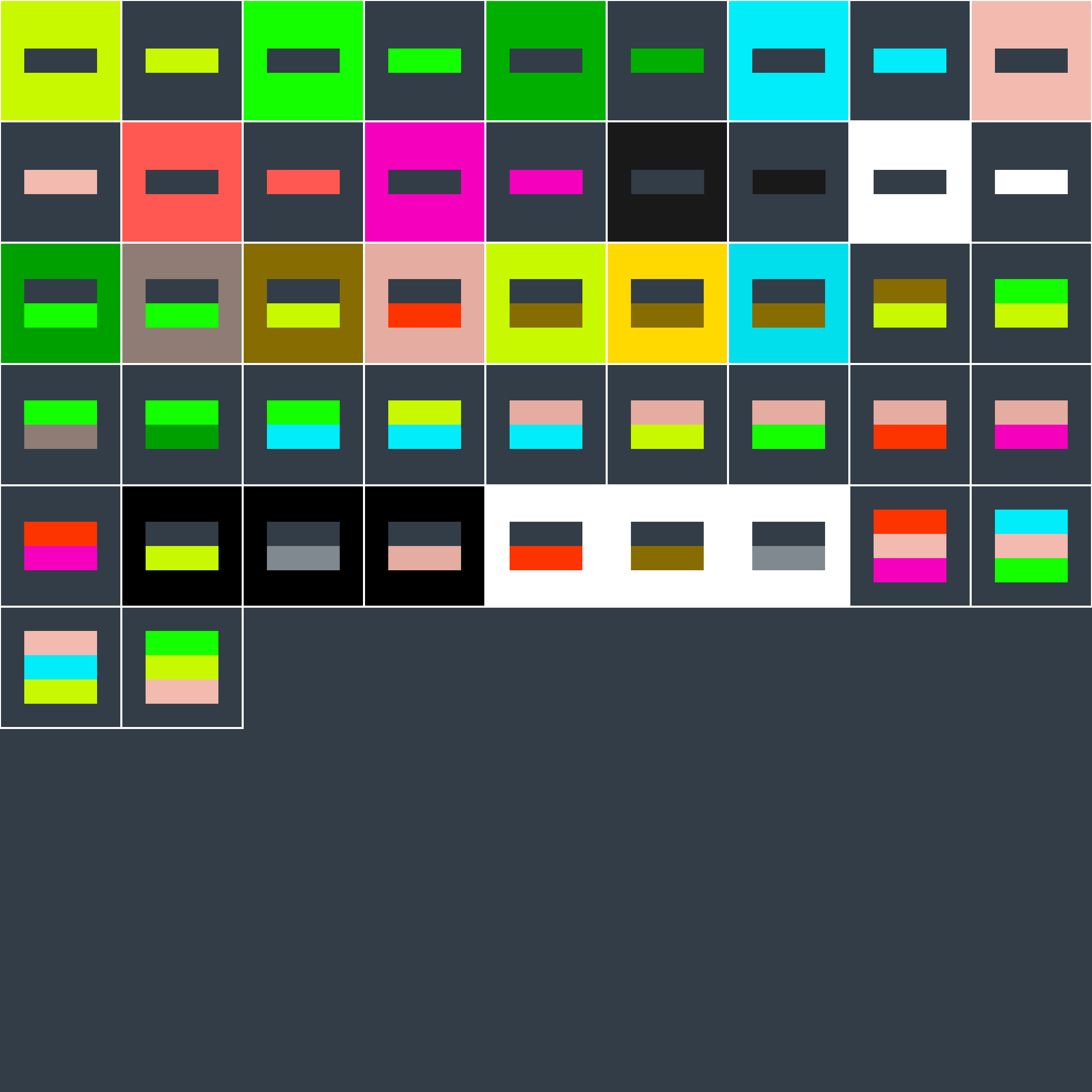
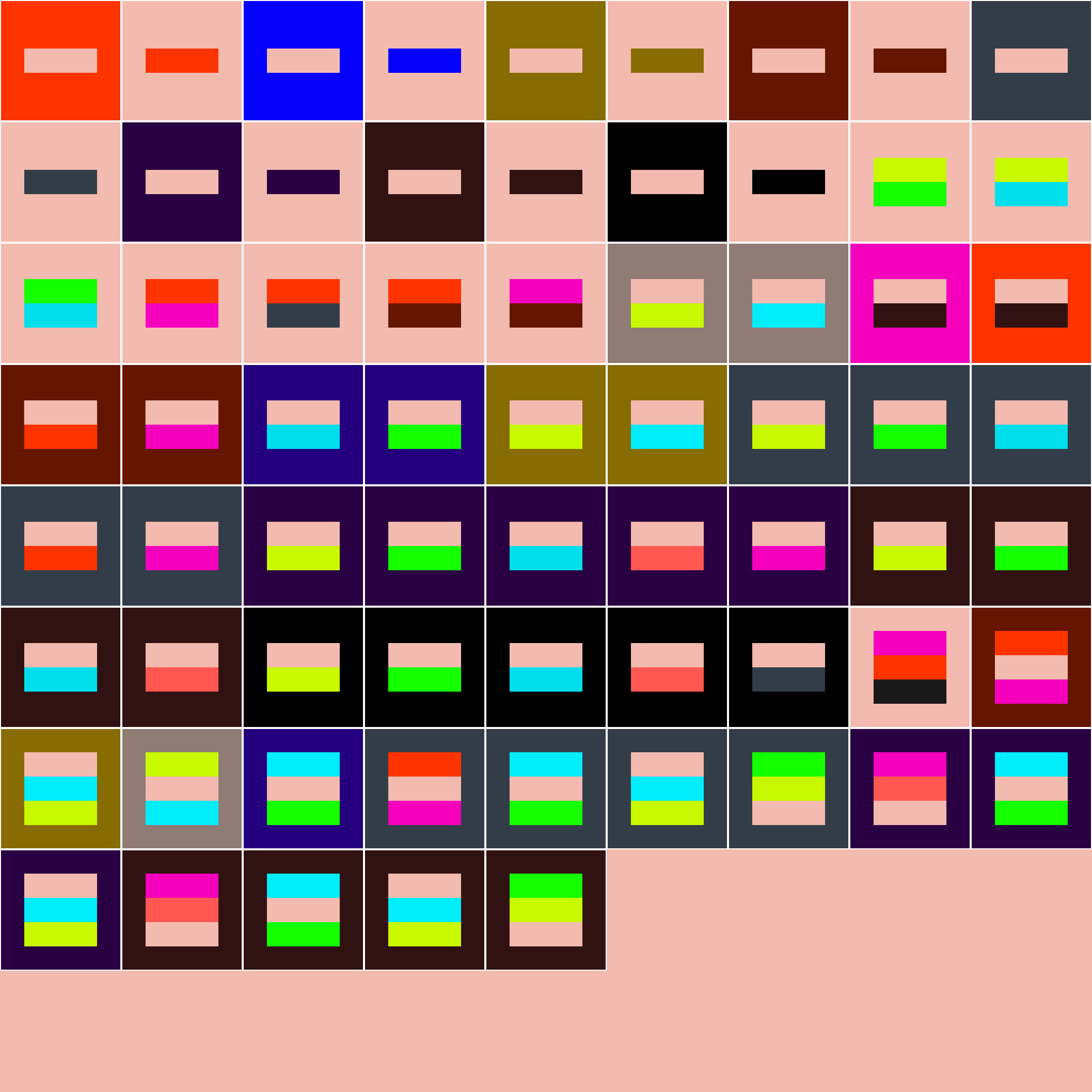
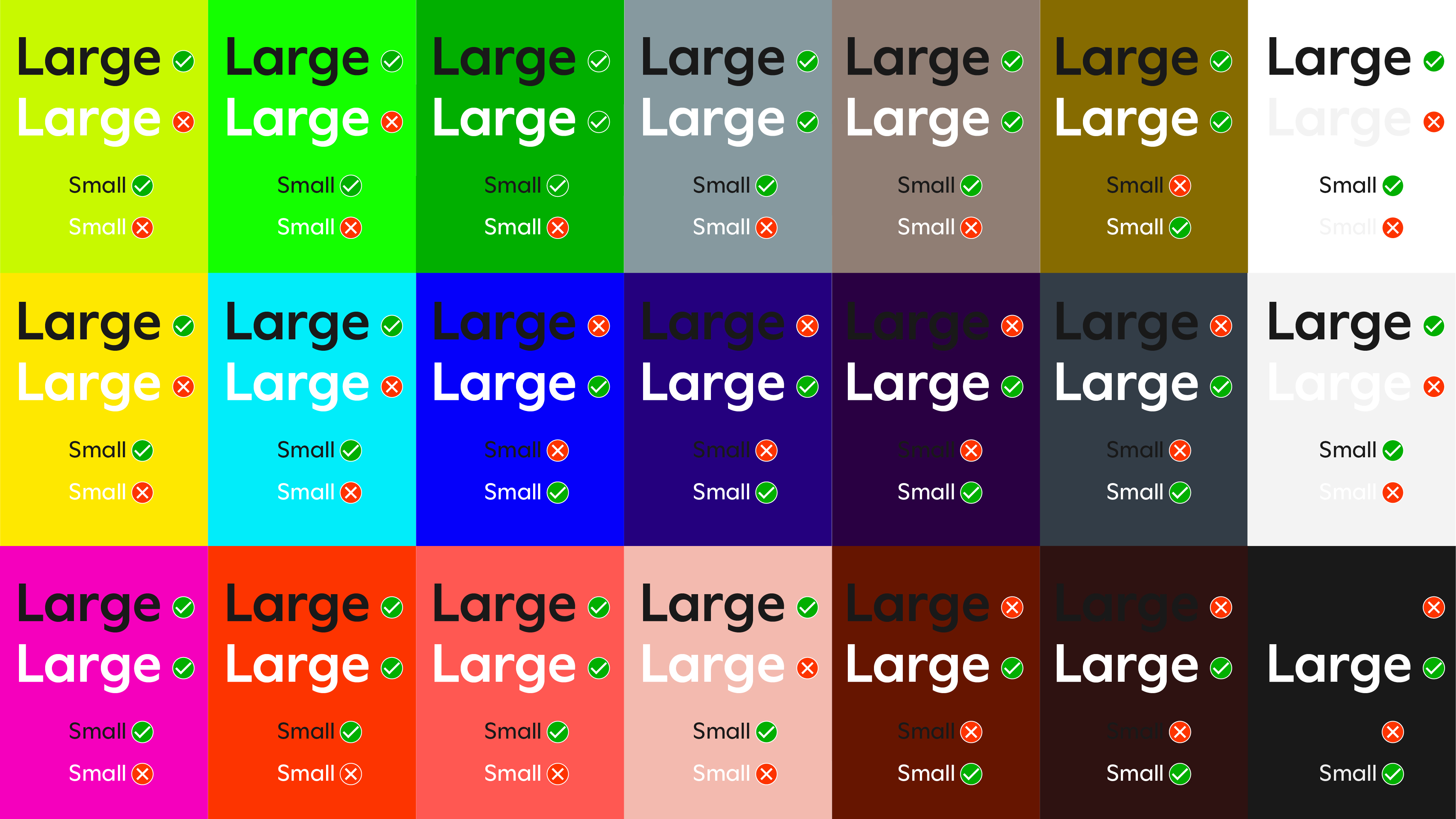
Text legibility
Shown are Web Content Accessibility Guidelines AA passes and fails for text. To pass, the colour contrast ratio is at least 4.5:1 for normal text and 3:1 for large text.
This is a guide only – designers must consider the context of application, its size and medium. Print reproduction behaves differently to digital and can be affected by material and print quality.
Avoid setting large blocks of small text on colour backgrounds. White or Off-White backgrounds with black text will make reading more comfortable.
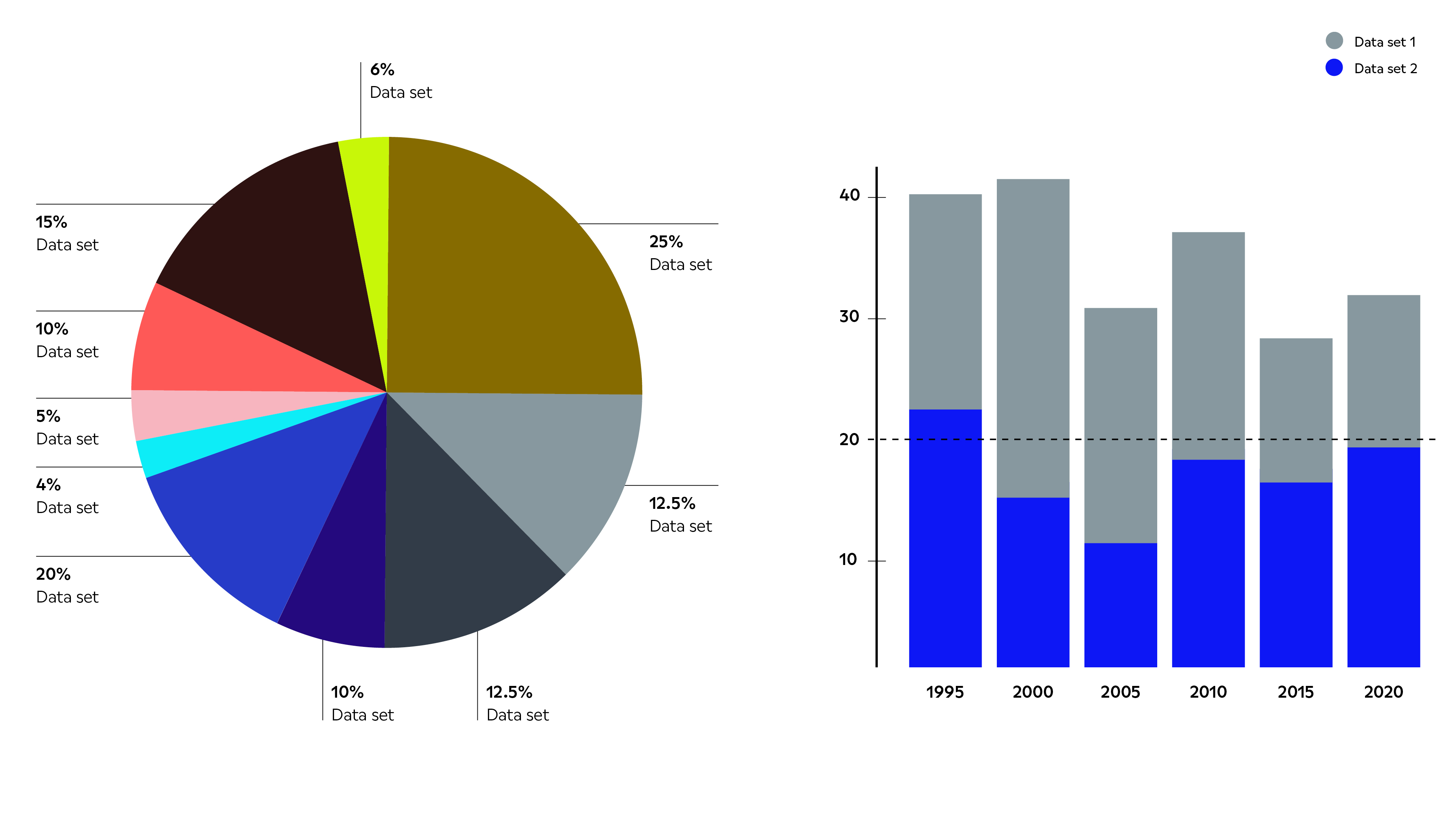
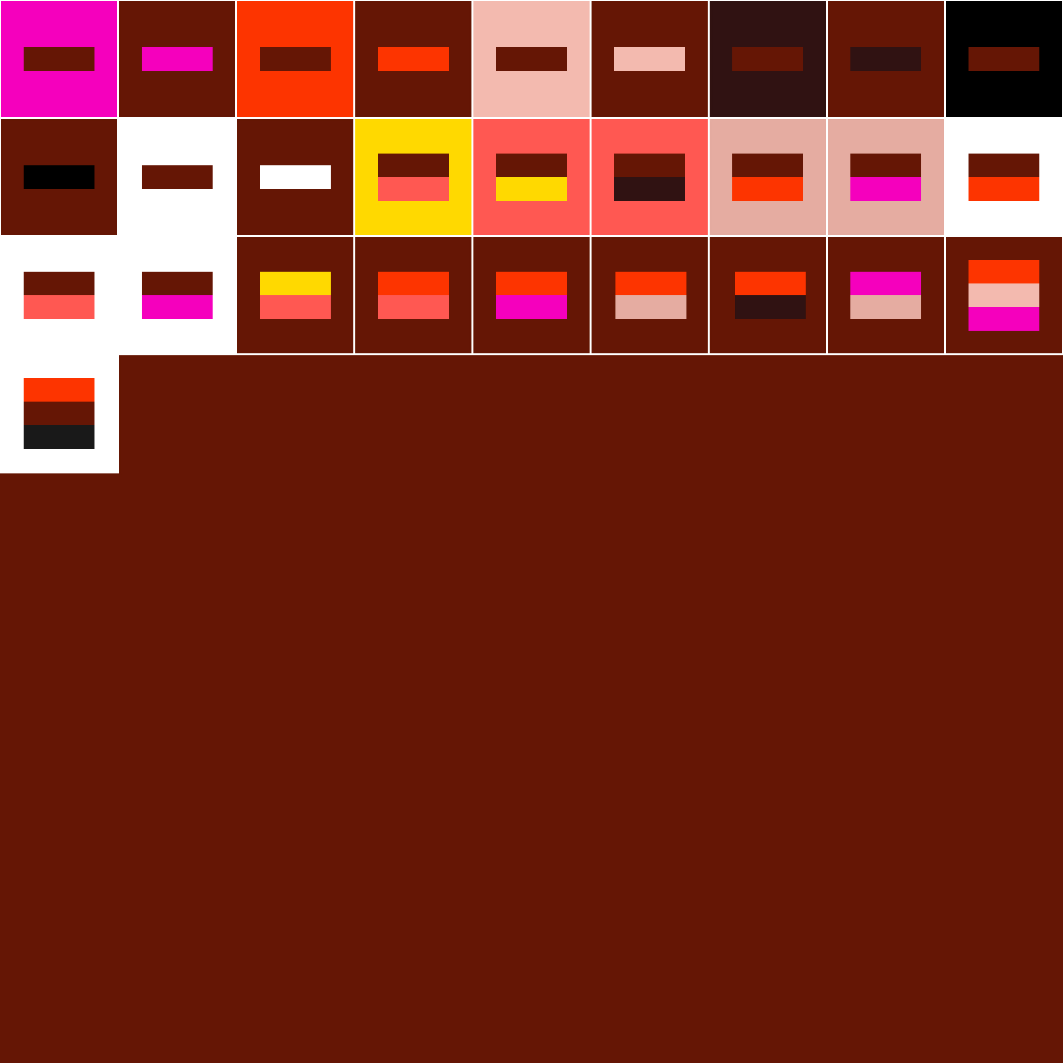
Hierarchy
Colours can be used to give information hierarchy as demonstrated in these notional graphs. When applying colour to:
Simple graphs
Use the recommended colour combinations.
Complex datasets
Use pulling lines from the graph to provide greater legibility.
Accessibility
Everyone sees and interacts with colours differently – to ensure greater accessibility and better legibility, check for possible watchouts using this link.