Layout
Our approach is simple, clear and direct. We use a flexible system that works with different types of content for a range of audiences, to be clearly identifiable and as engaging as possible.
Different approaches
We use our core assets in three different ways to allow for greater flexibility and diversity. We can use the symbol plus the logotype, the lock-up or the pattern plus the logotype - we never use the symbol and pattern together.
When deciding which approach to take, always consider the application and content - using the symbol plus the logotype raises our brand awareness, whereas the lock-up provides more space for content.
Symbol + Logotype
Lock-up
Pattern + Logotype
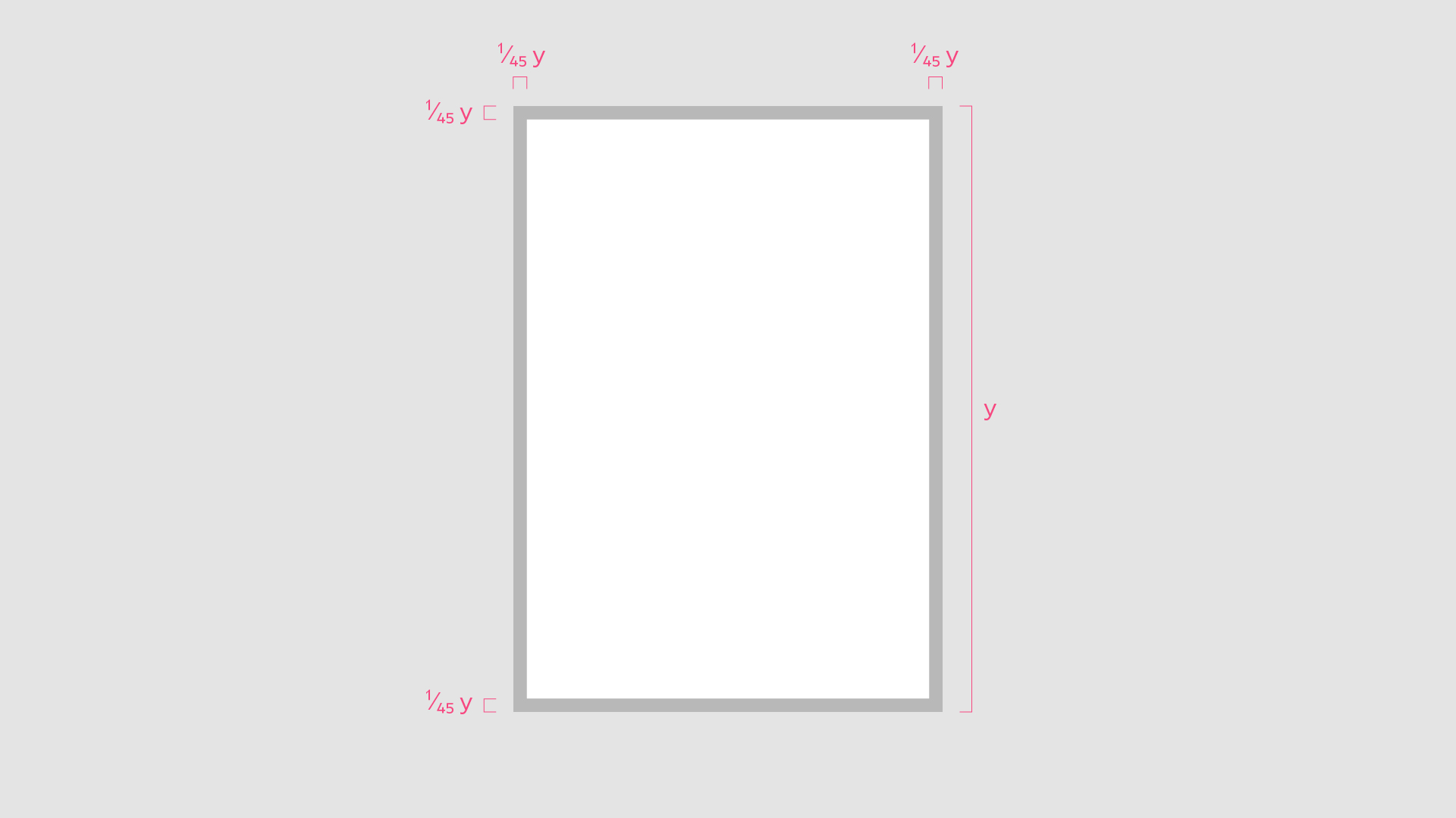
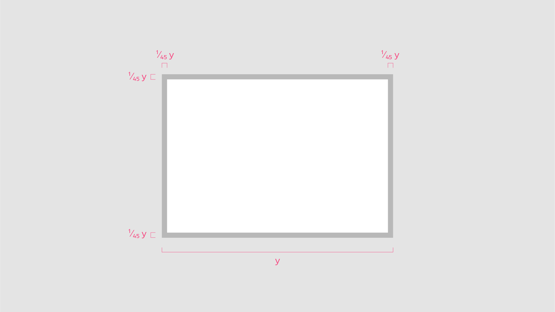
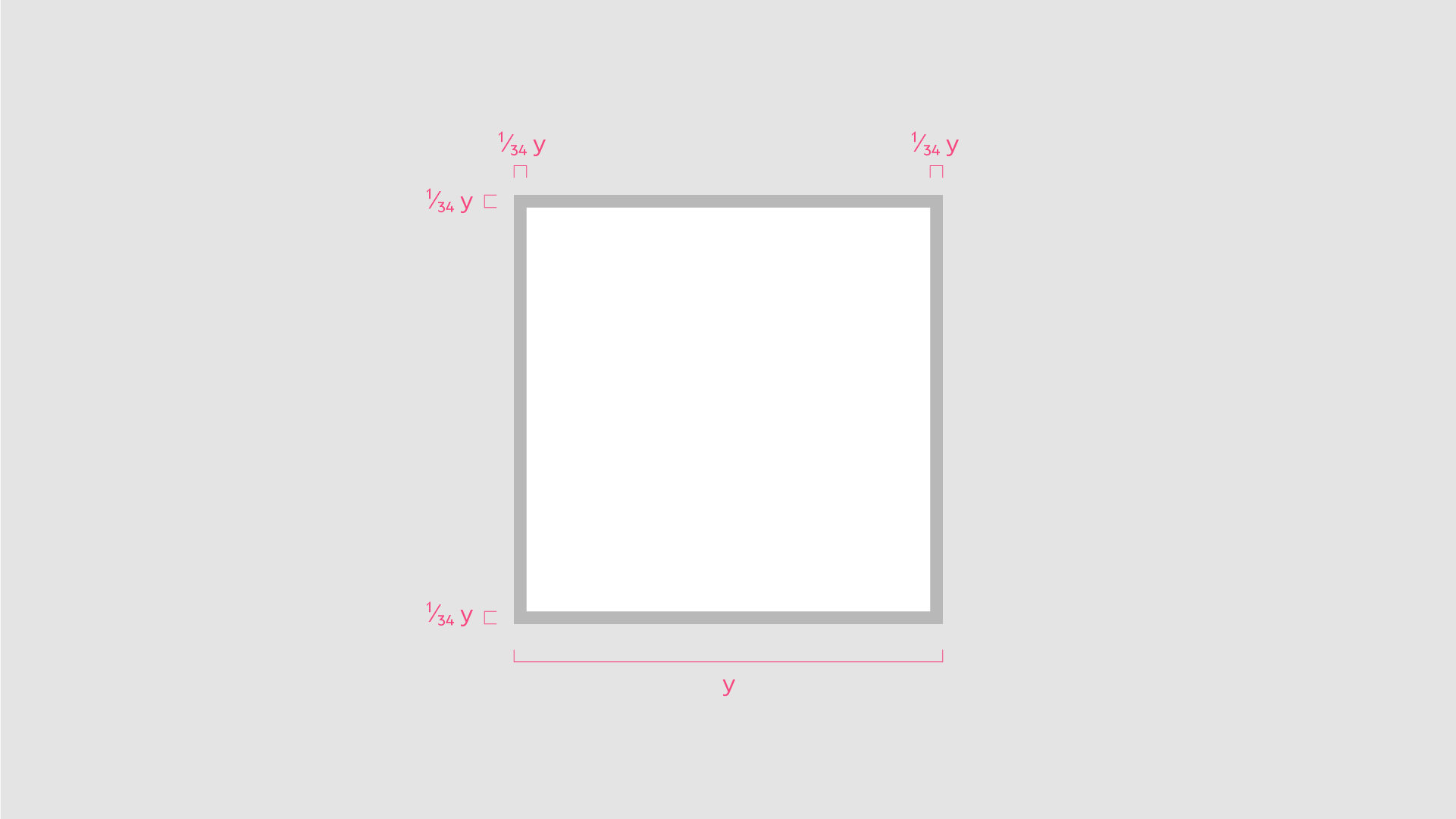
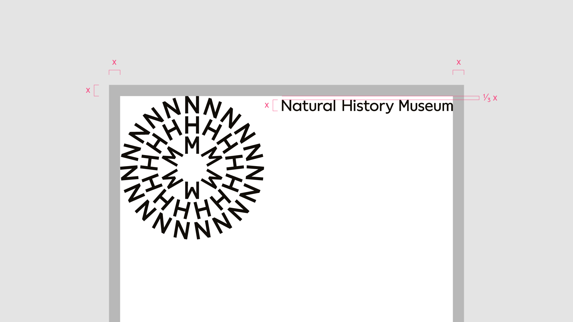
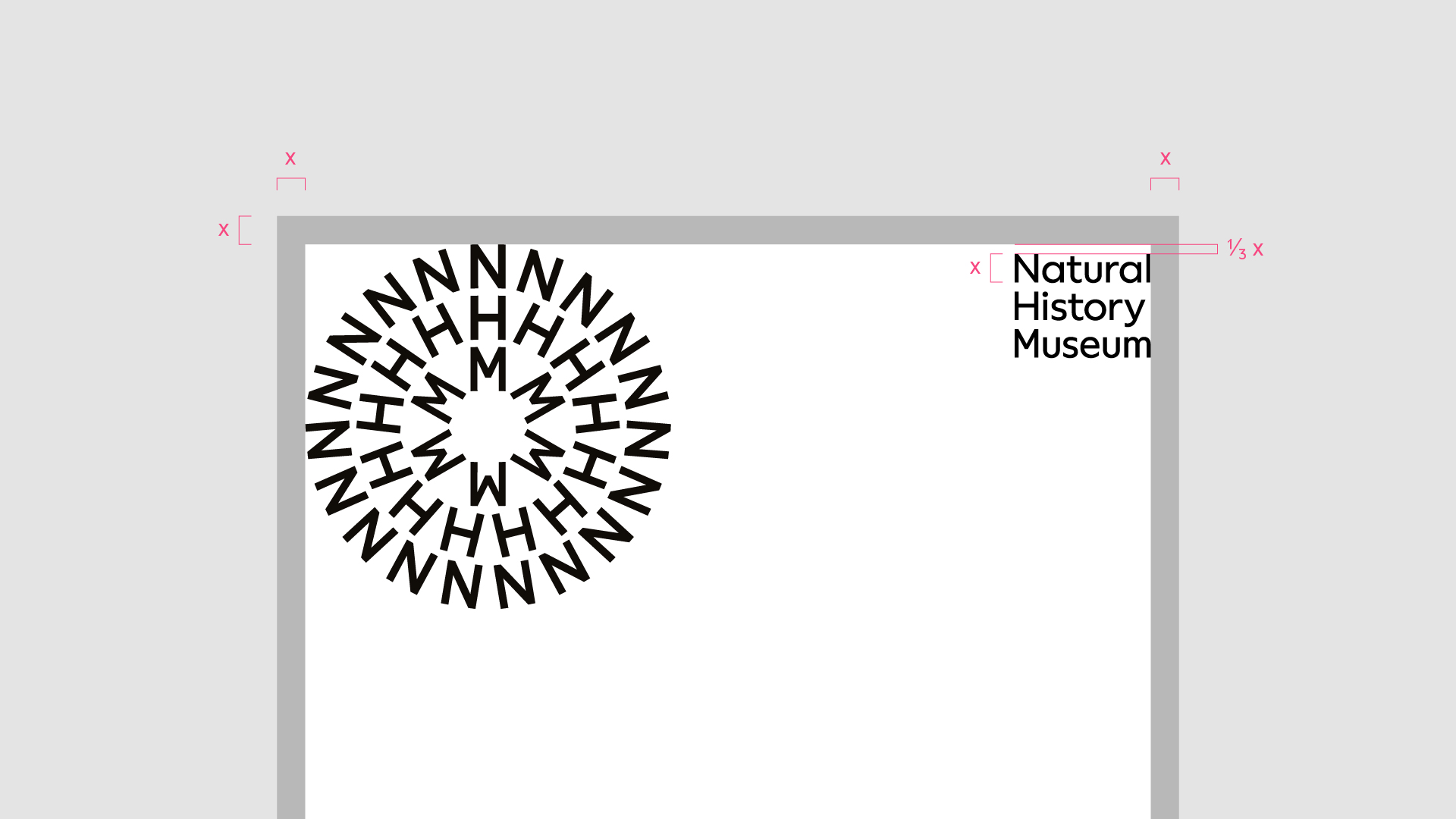
Margins
Most formats will have established margins or safe areas, depending on the medium, production process and scale.
For when we are establishing our own margins, we use a division of the longest edge of the format to determine the size. Establish the margin sizes first before applying the grid to the area within these margins.
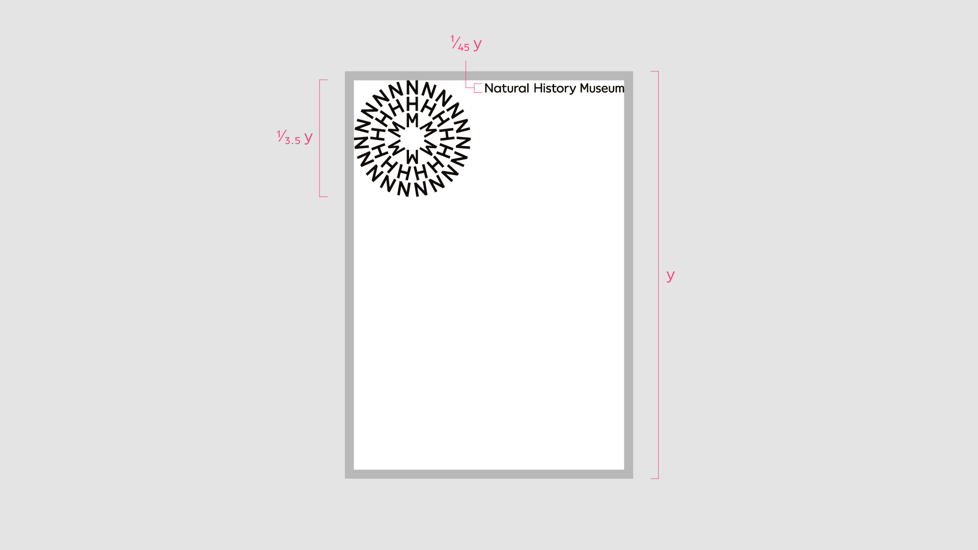
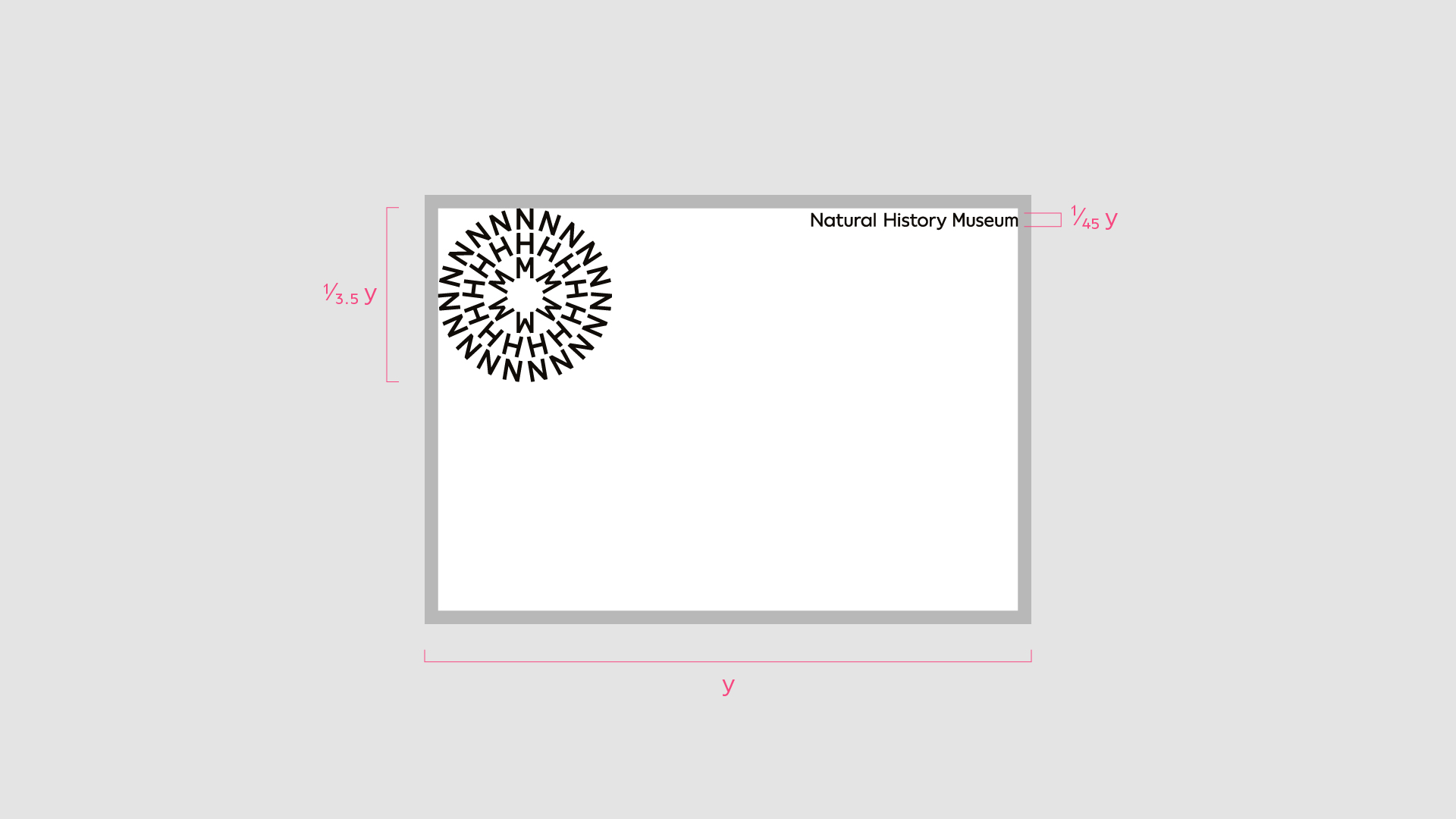
Logo scale
We use a division of the longest edge of the format to determine the size of the symbol, lock-up or logotype. Follow the rules below for consist use.
Symbol
Portrait format
Symbol height = 1/3.5 format height
Landscape format
Symbol height = 1/3.5 format width
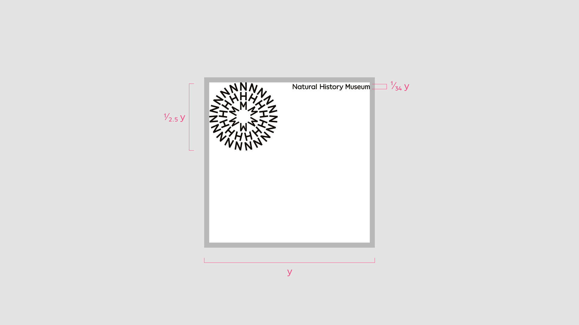
Square format
Symbol height = 1/2.5 format width
Logotype
Portrait format
Cap height = 1/45 format height
Landscape format
Cap height = 1/45 format width
Square format
Cap height = 1/34 format width
Note
Logotype scale is determined by the cap height only
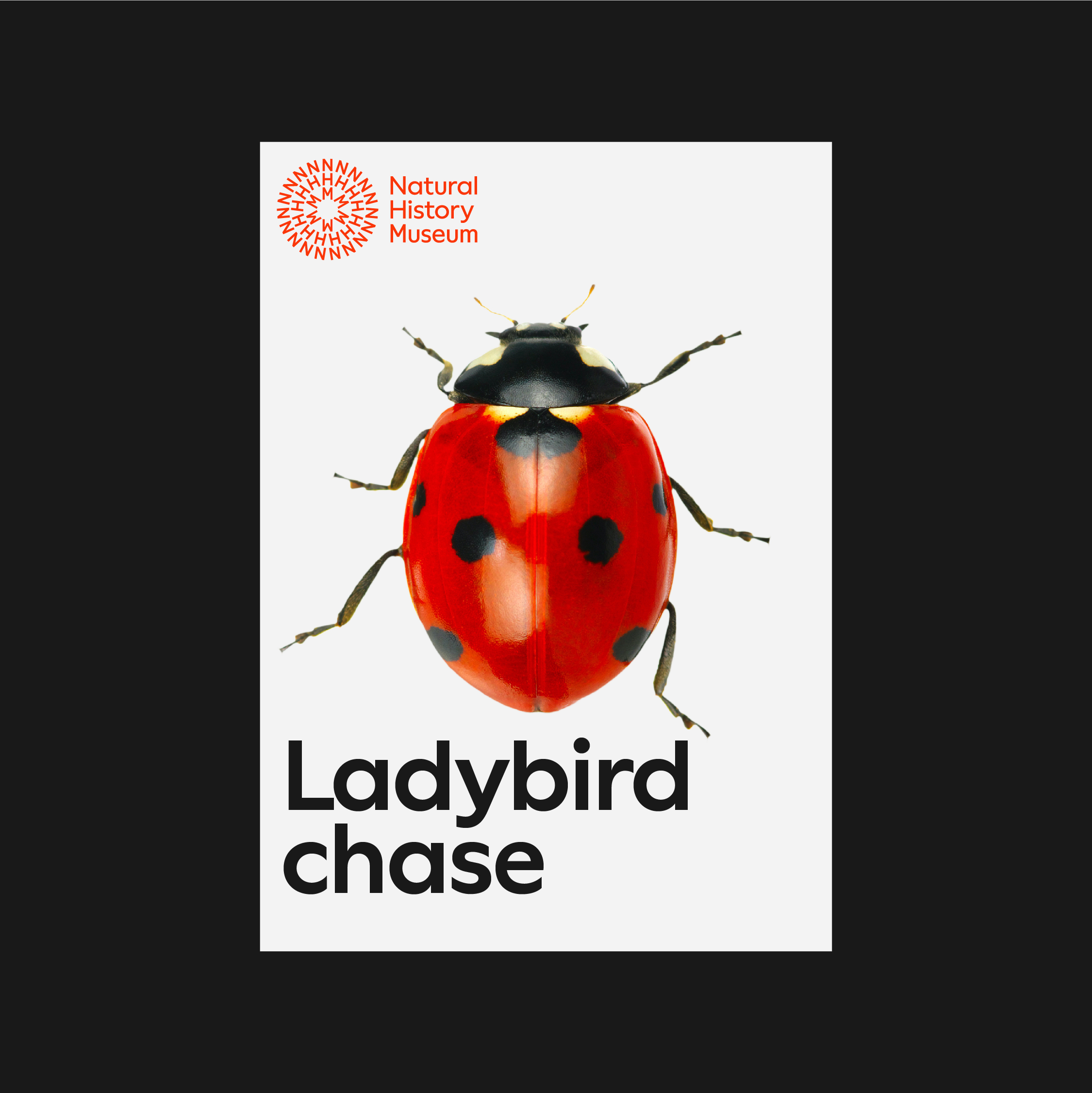
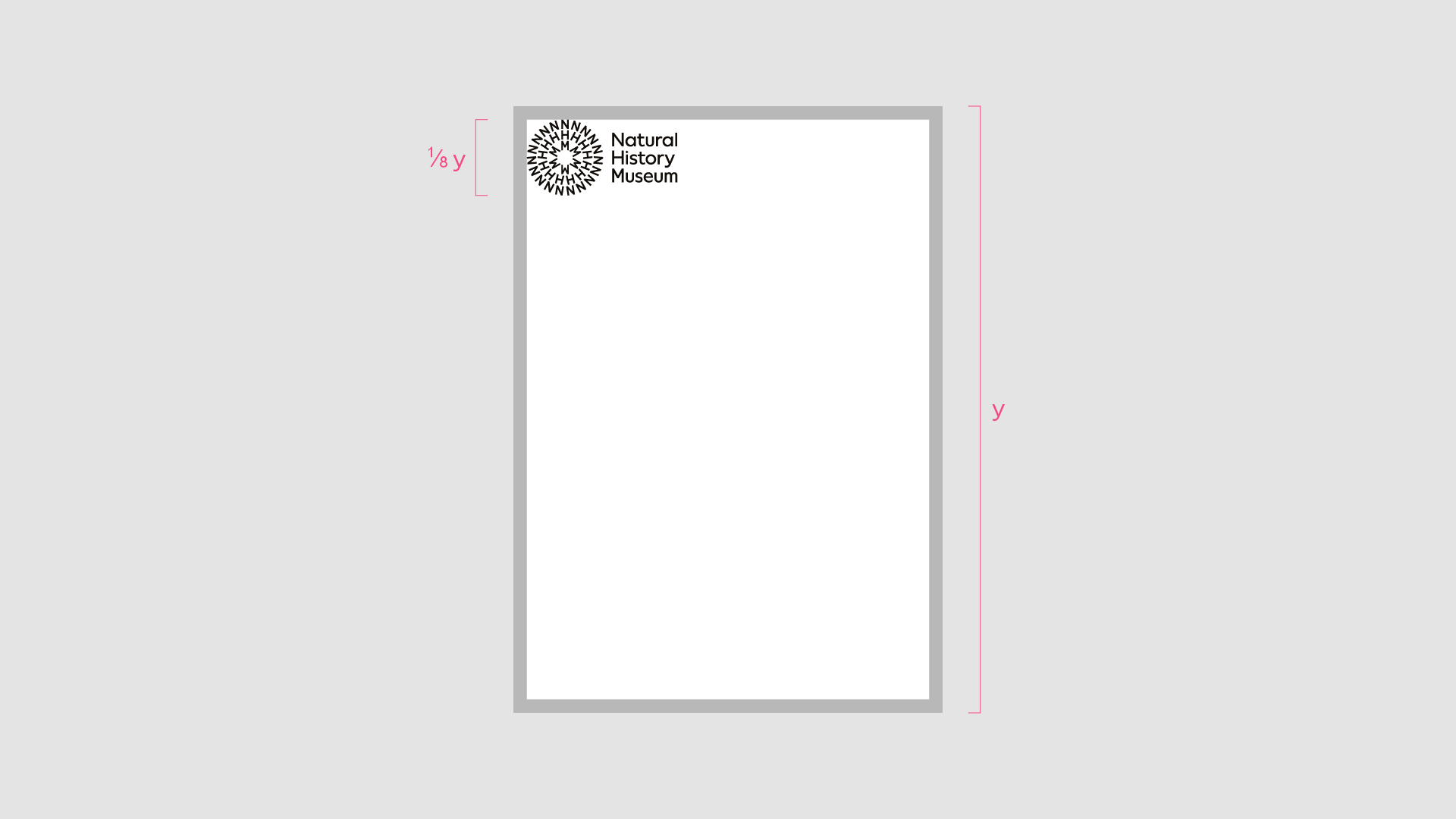
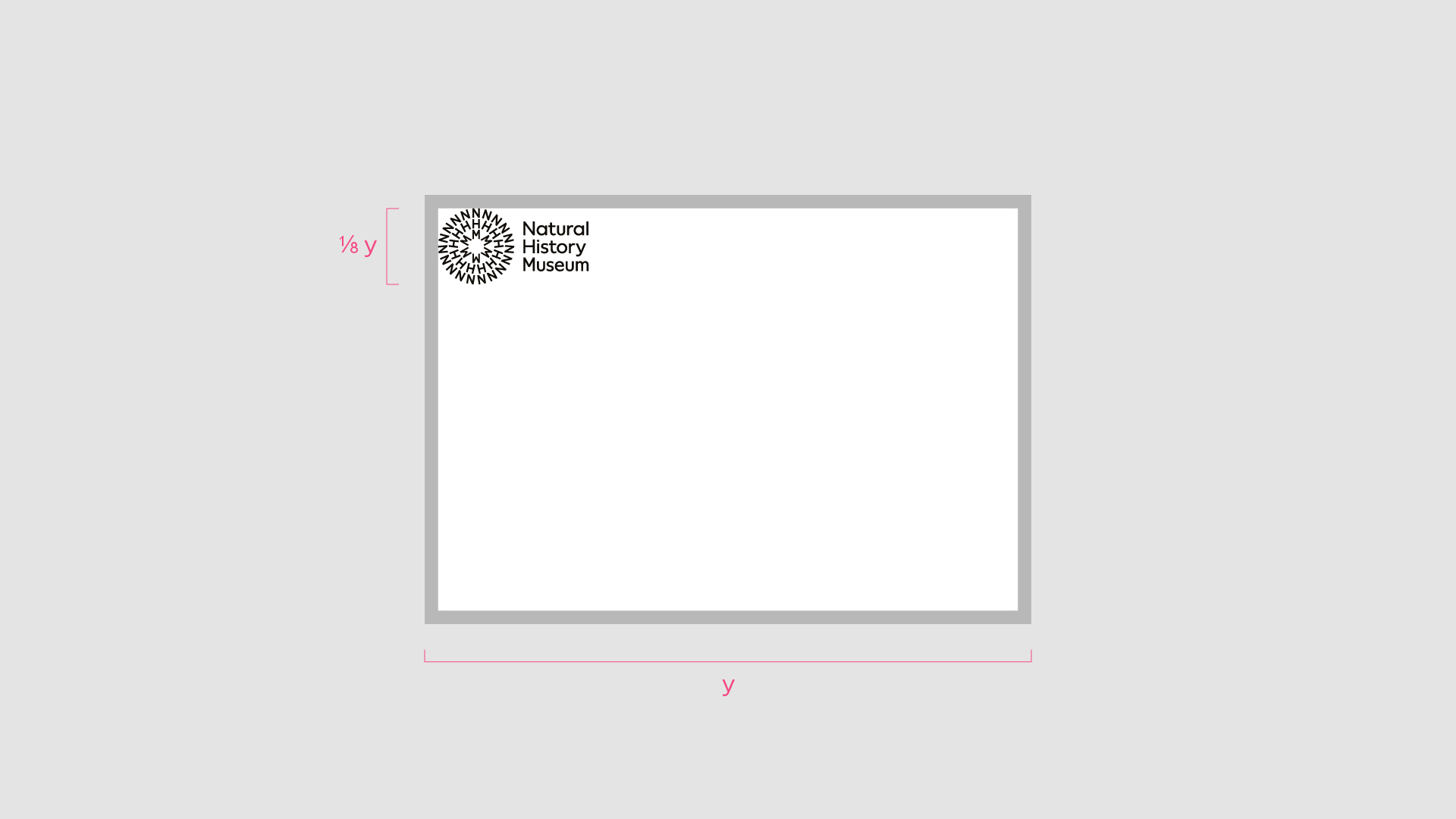
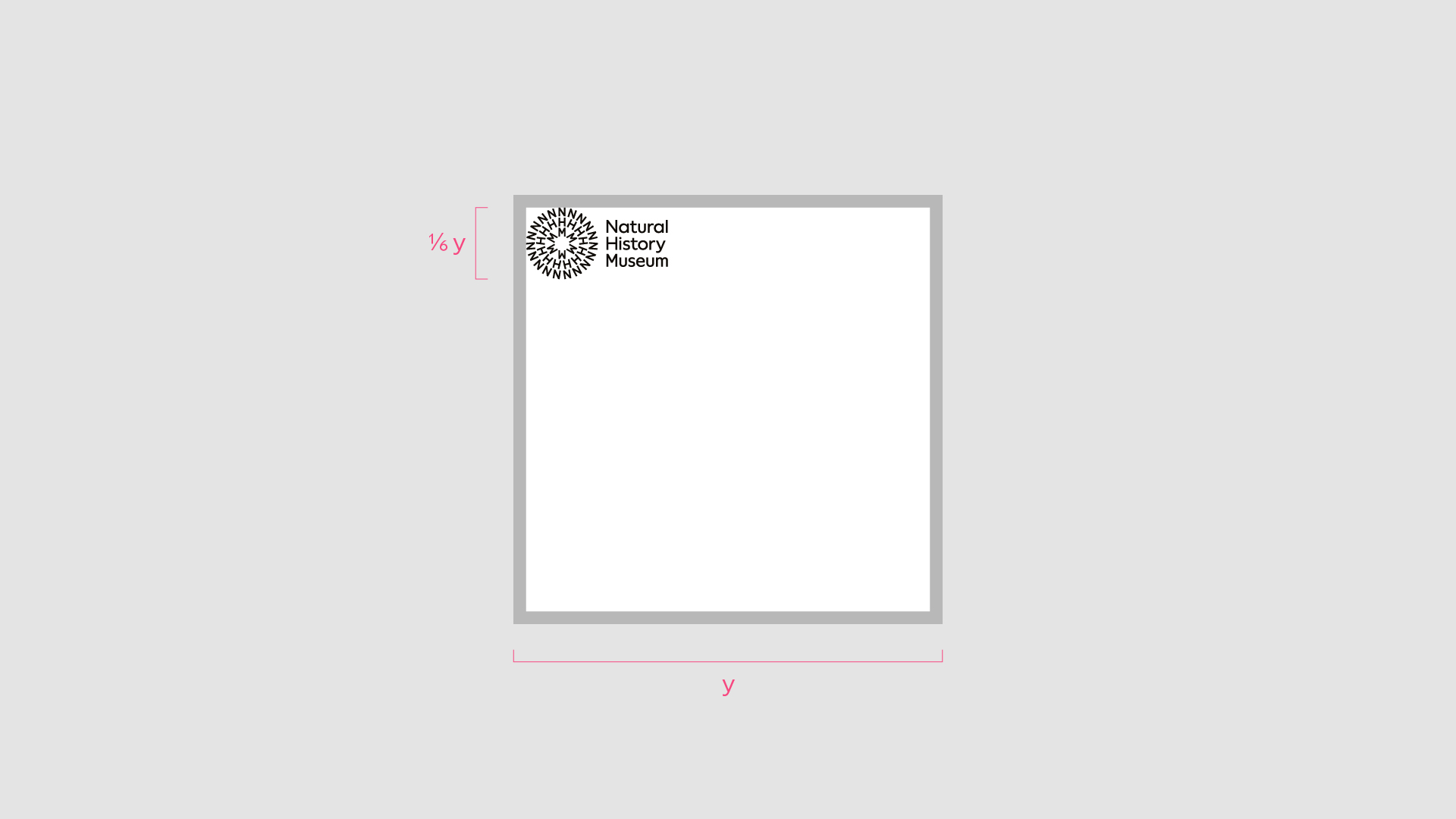
Lock-up
Portrait format
Symbol height = 1/8 format height
Landscape format
Symbol height = 1/8 format width
Square format
Symbol height = 1/6 format width
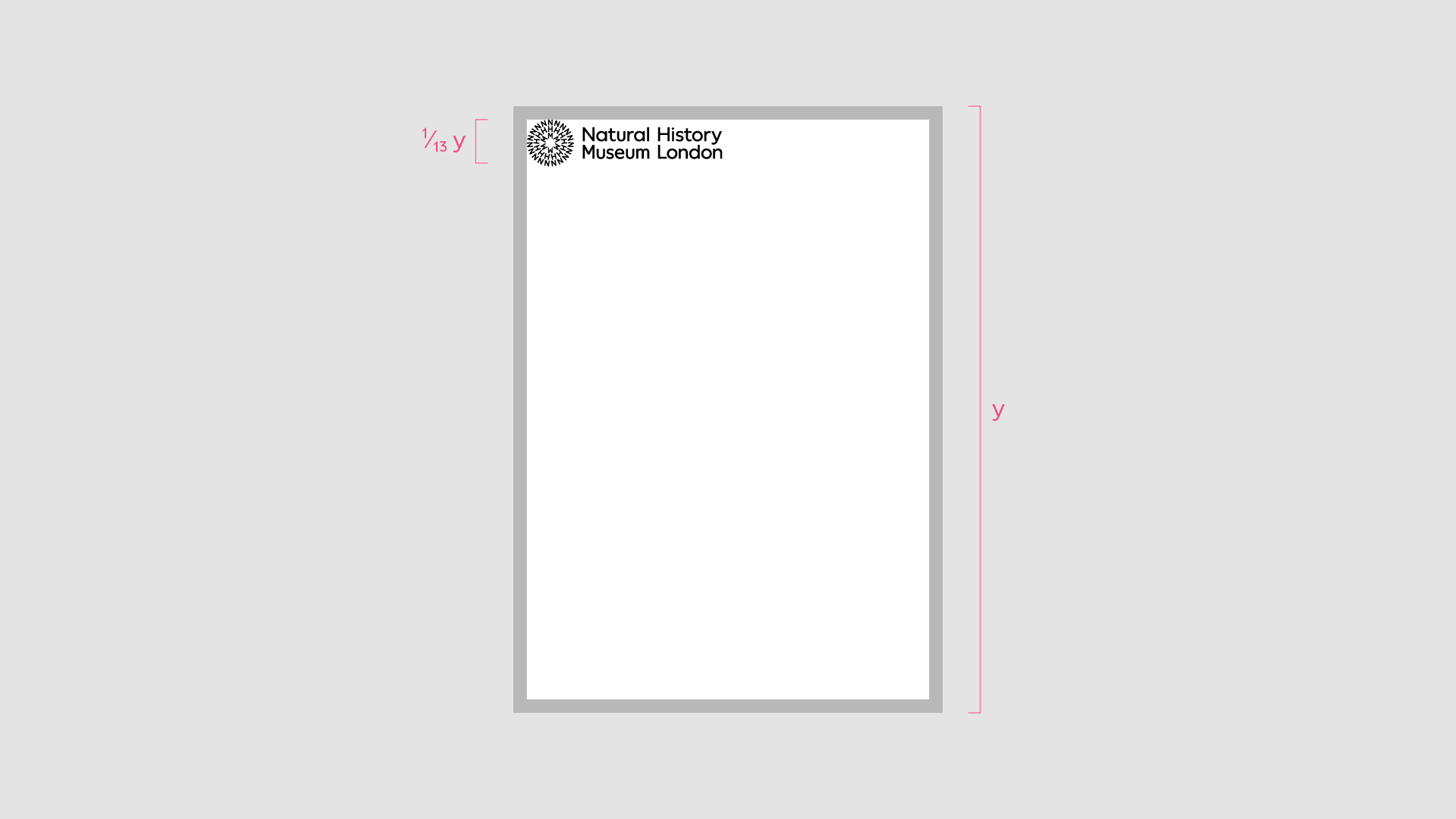
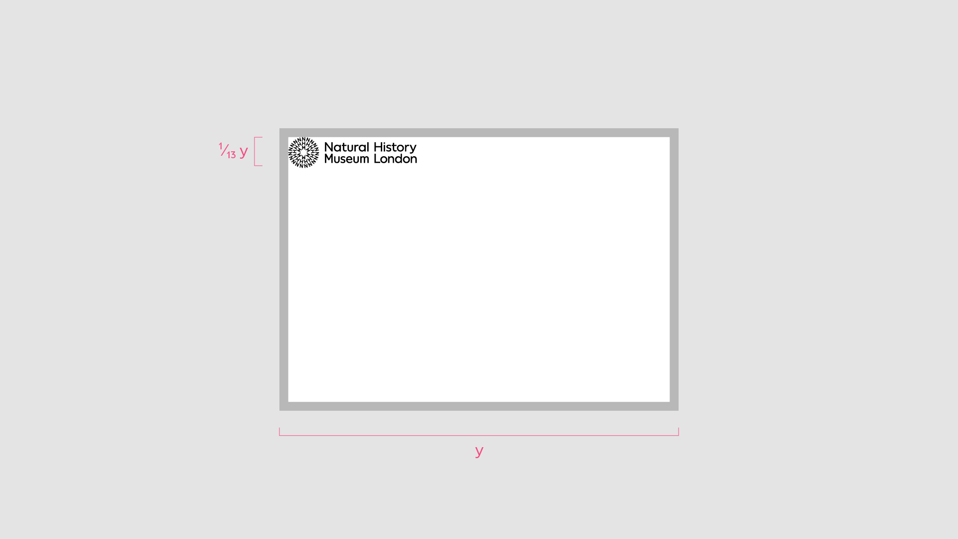
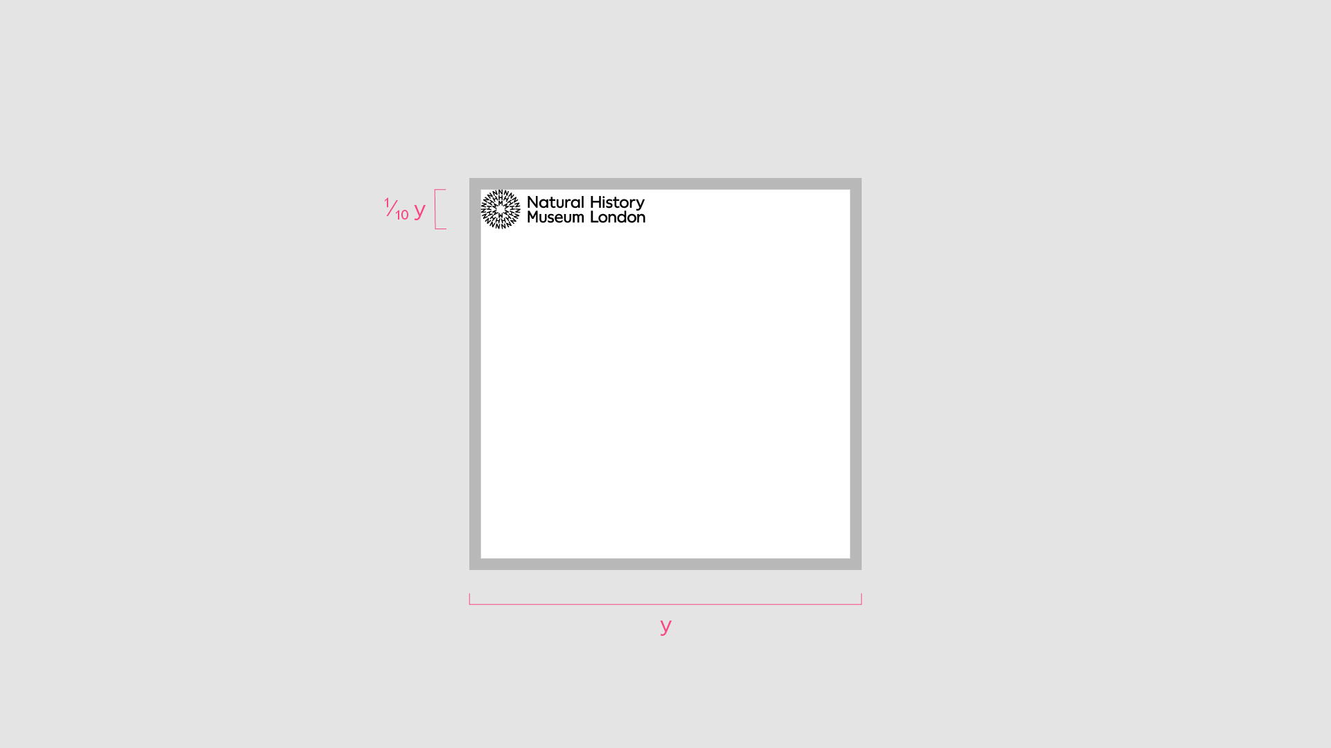
Lock-up alternative
Portrait format
Symbol height = 1/13 format height
Landscape format
Symbol height = 1/13 format width
Square format
Symbol height = 1/10 format width
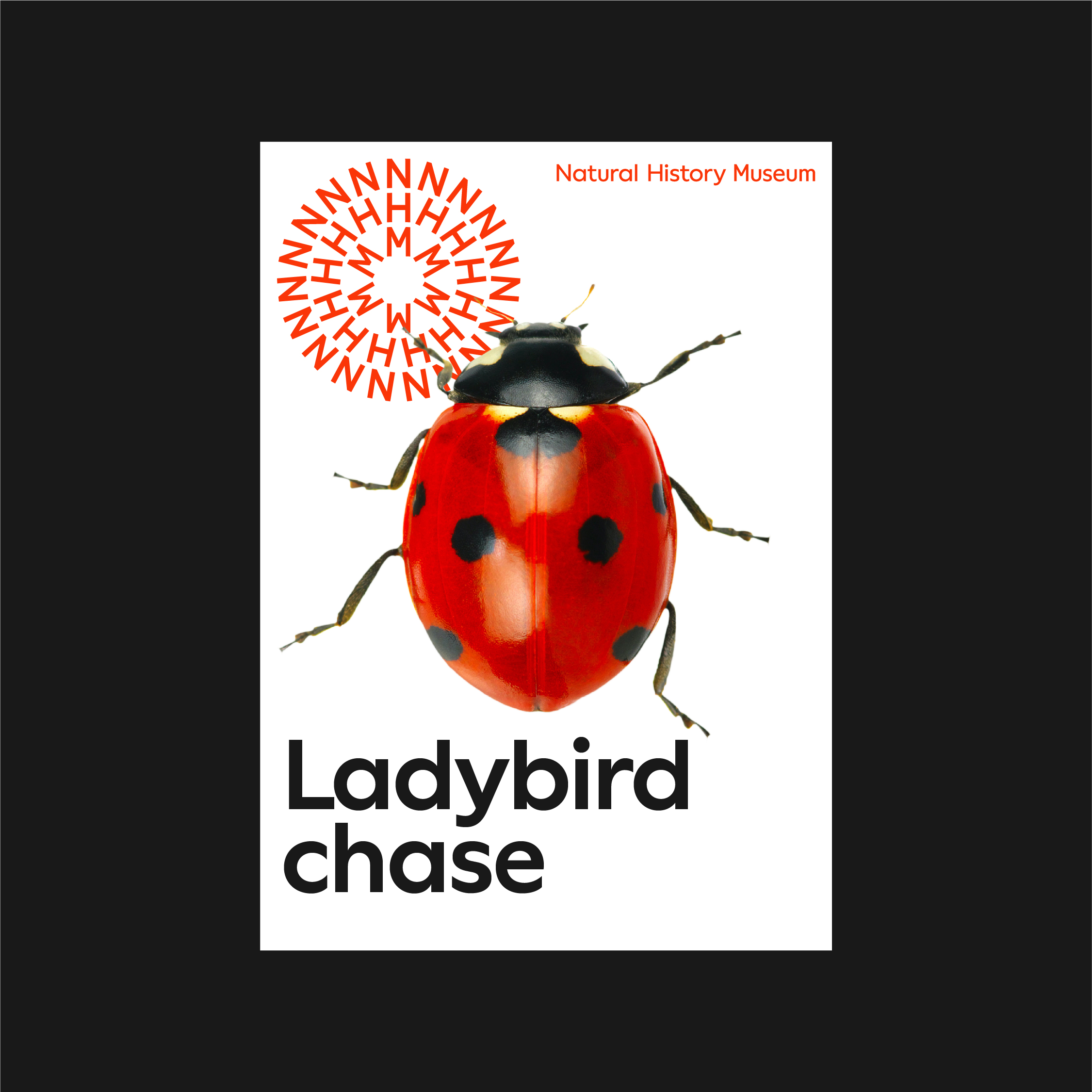
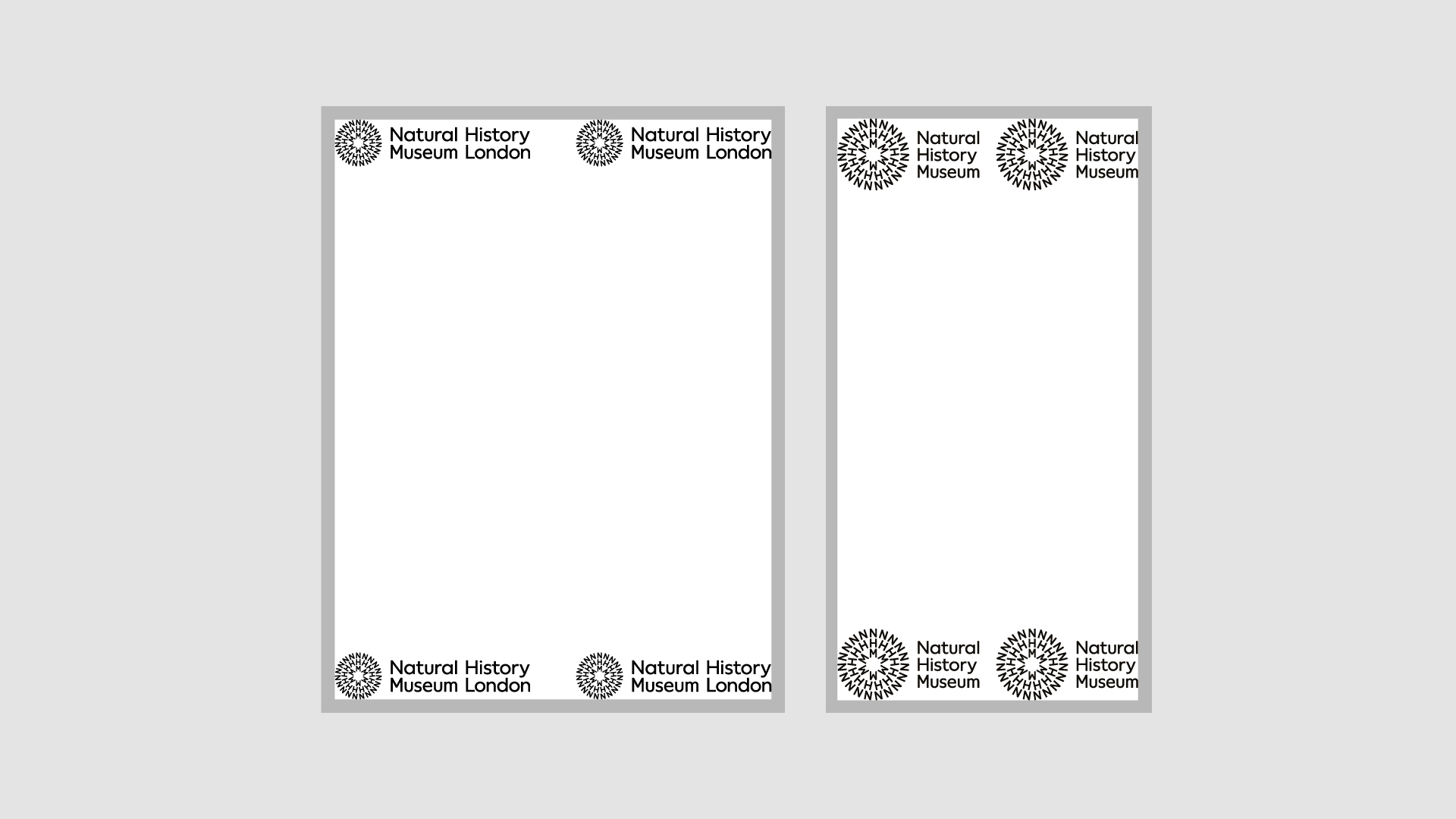
Logo position
Our logos are positioned into the corners of a format. Use the following rules for consistency across the identity.
Symbol + Logotype
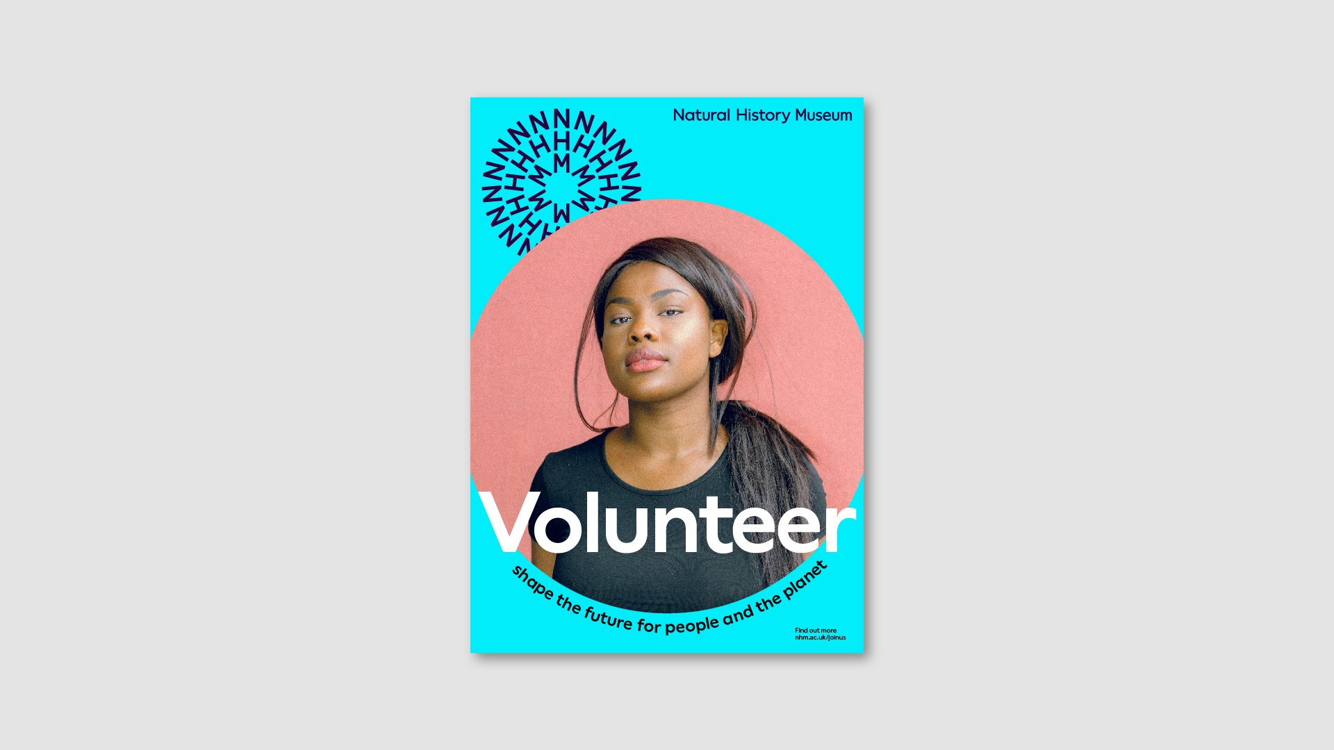
Using the symbol as a masthead is our primary application – this is always positioned top left of the format.
The logotype is placed on the opposite edge to the symbol – this applies to all logotypes.
Lock-up
The lock-up can be positioned in any of the corners of a format – this applies to all lock-ups.
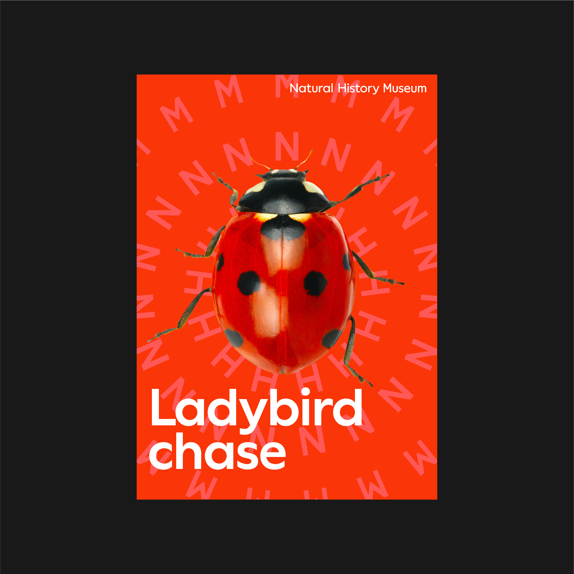
Pattern + Logotype
When using the pattern, the logotype can be positioned in any of the corners of the format – this applies to all logotypes.
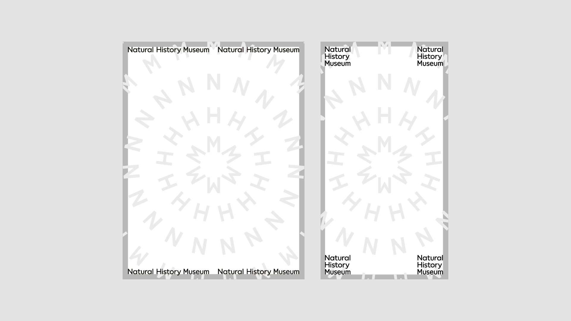
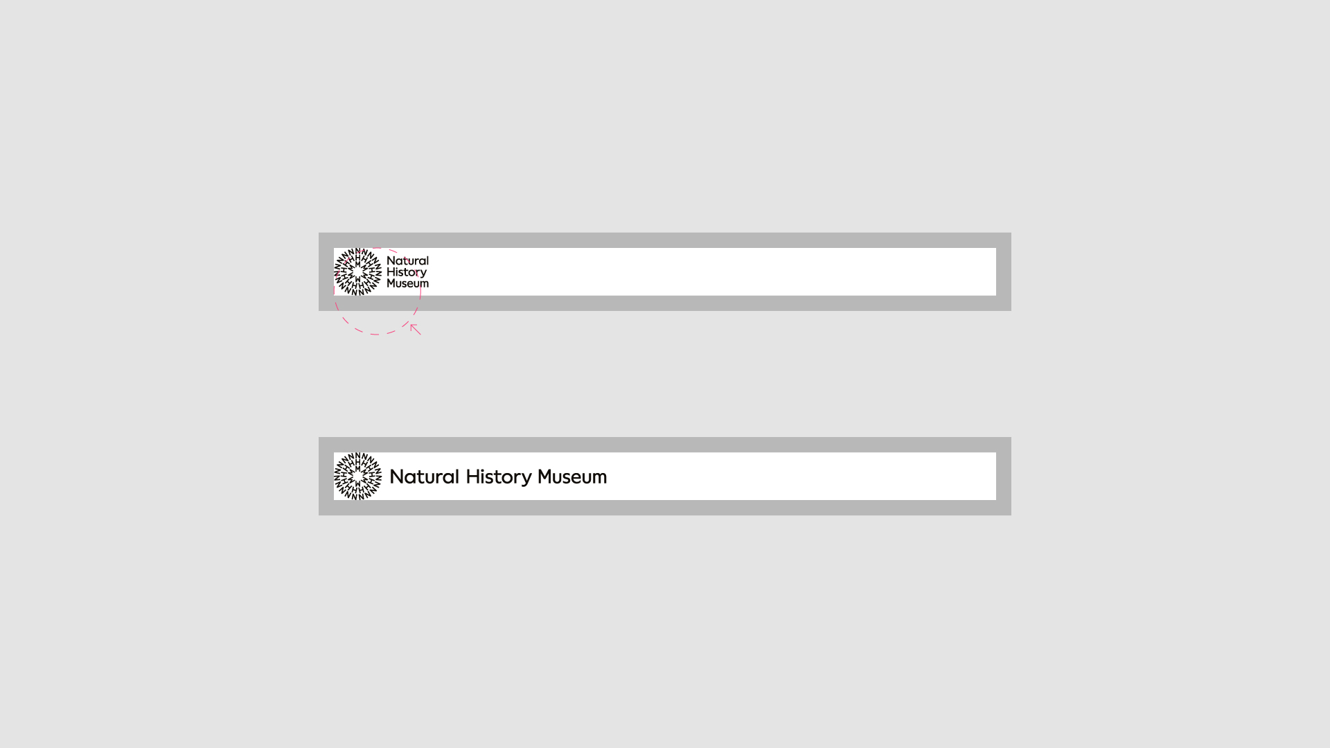
Optical balance
When placing the logotype on the top edge, ensure it sits away from the margin for optical balance between the symbol and the logotype.
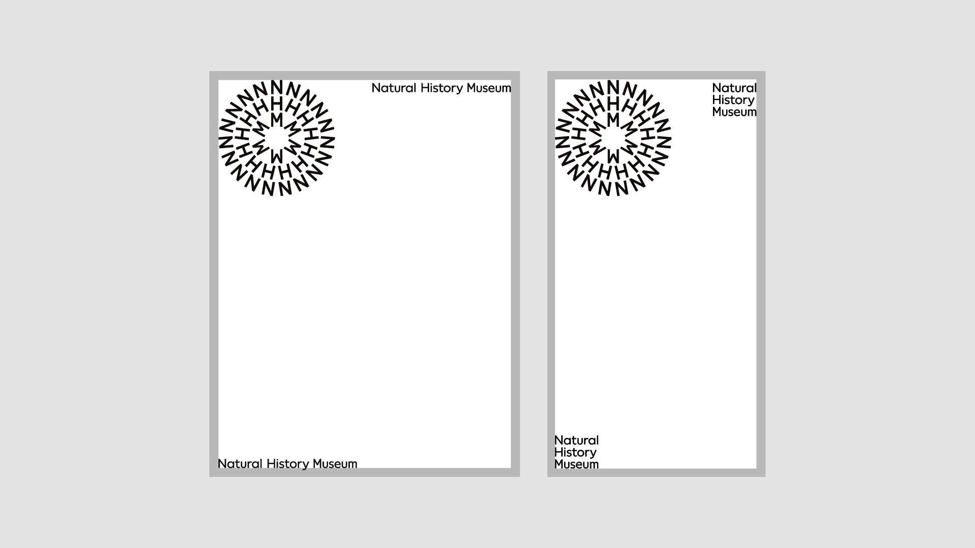
Responsive layouts
When space allows, use the single-line logotype. If space becomes limited, use the stacked logotype. If space becomes even more limited, reduce the size of the symbol butting up to the margins.
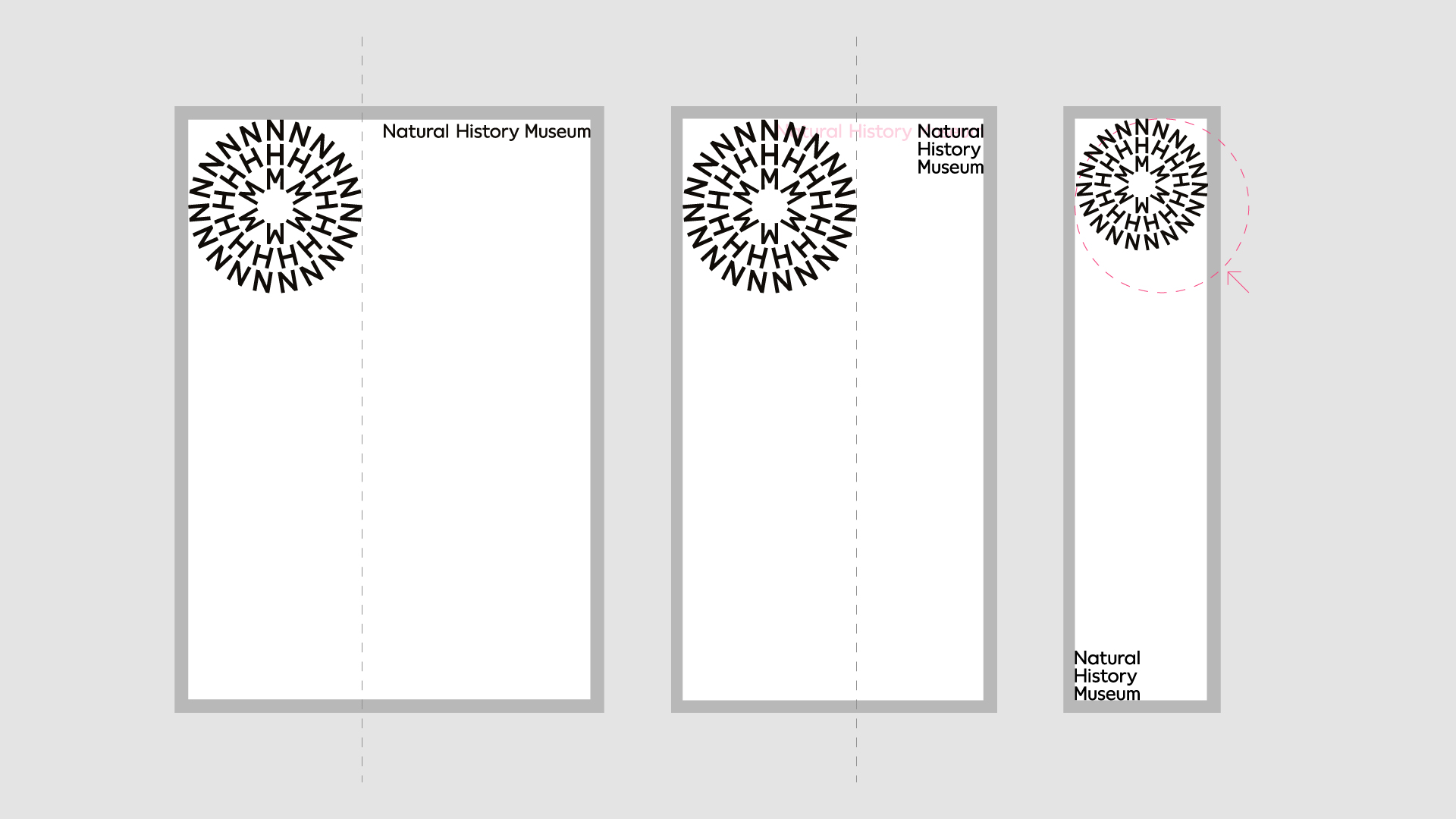
When the logotype goes past the edge of the symbol, use the stacked logotype. When the stacked logotype goes past the edge of the symbol, move it to bottom corner of the format.
When the symbol is larger than the format width (portrait formats) or height (landscape formats), reduce the size of the symbol so that it butts up to the margins.
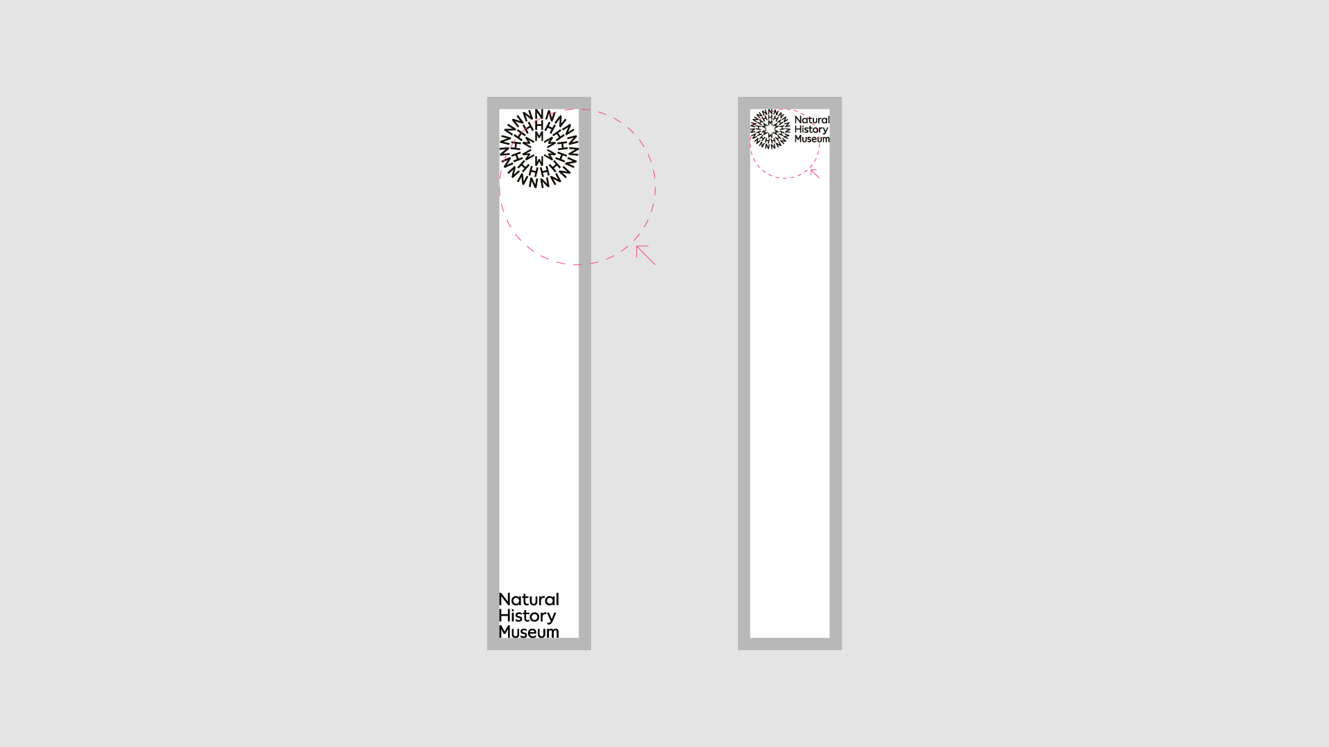
Extreme formats
When applying logos to extreme formats, resize the necessary assets so that they butt up to the margins.
Be mindful of legibility at smaller scales and that alternative configurations might work better than others.
See the Logo section for more information on minimum sizes.
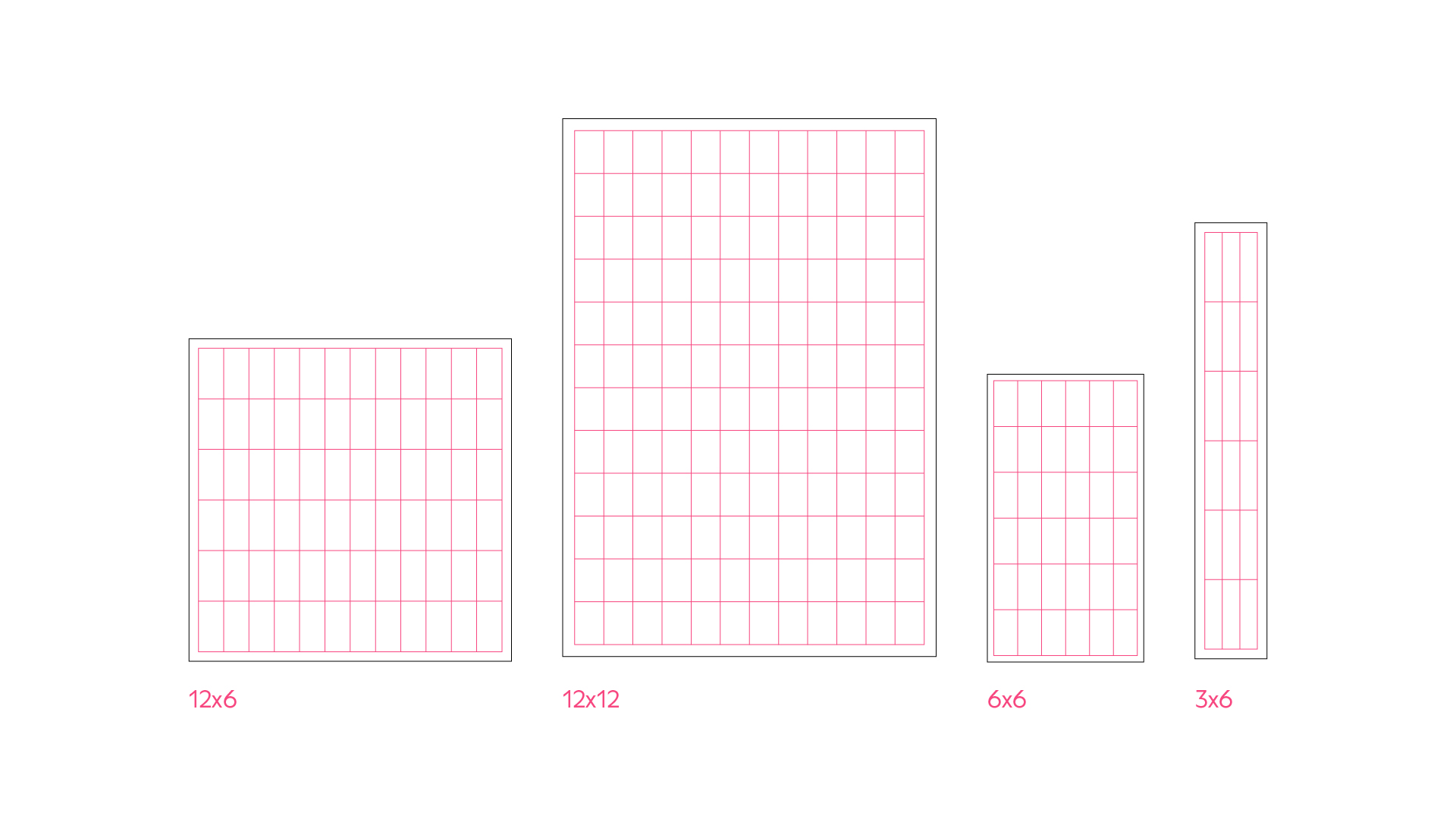
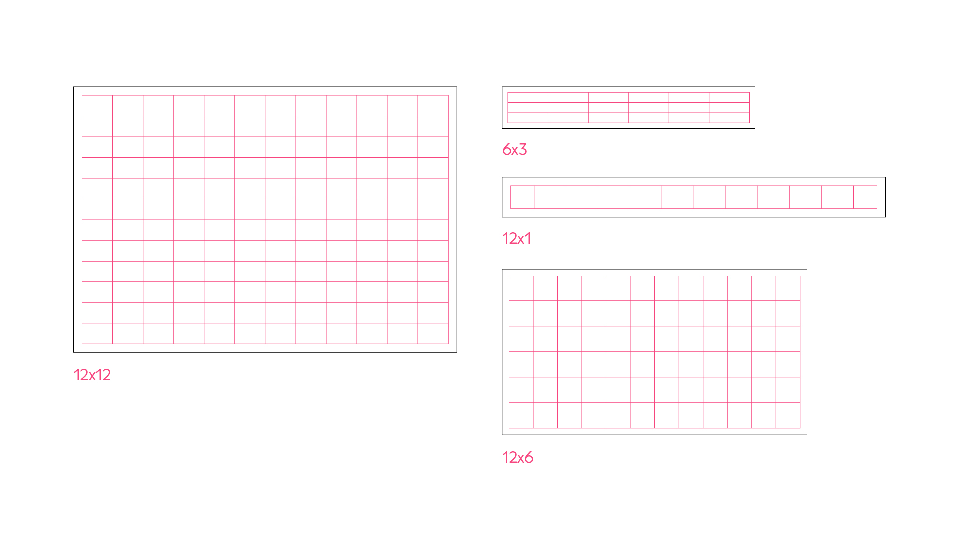
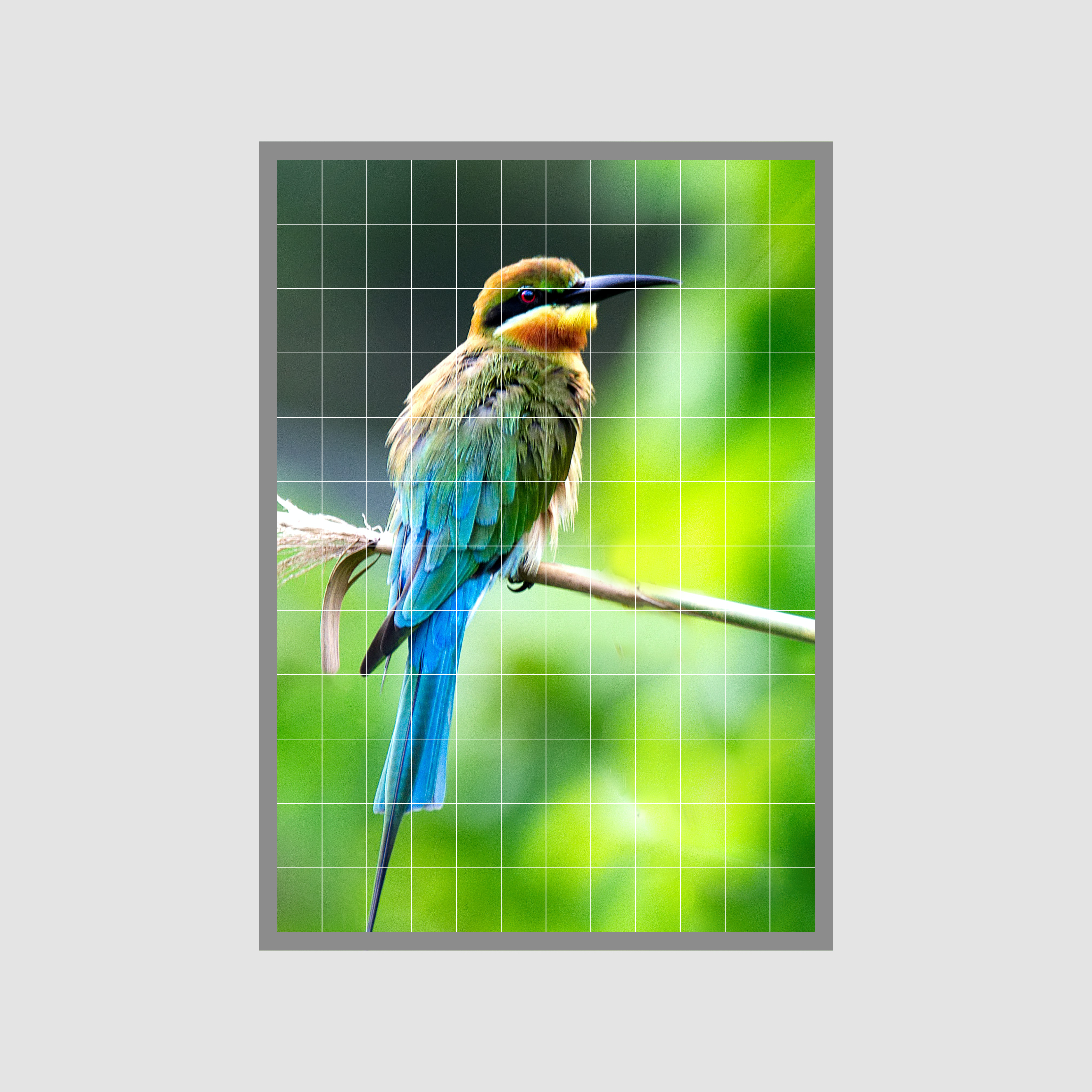
Grids
The default grid is 12x12, this is because 12 is a highly devisable number that can be broken down into:
12 / 6 / 4 / 3 / 2 / 1
Always apply the grid within the margins. We can reduce the grid units accordingly depending on the format size.
Applying the grid
The following steps suggest how the grid is applied.
Step 1
Determine the format.
Step 2
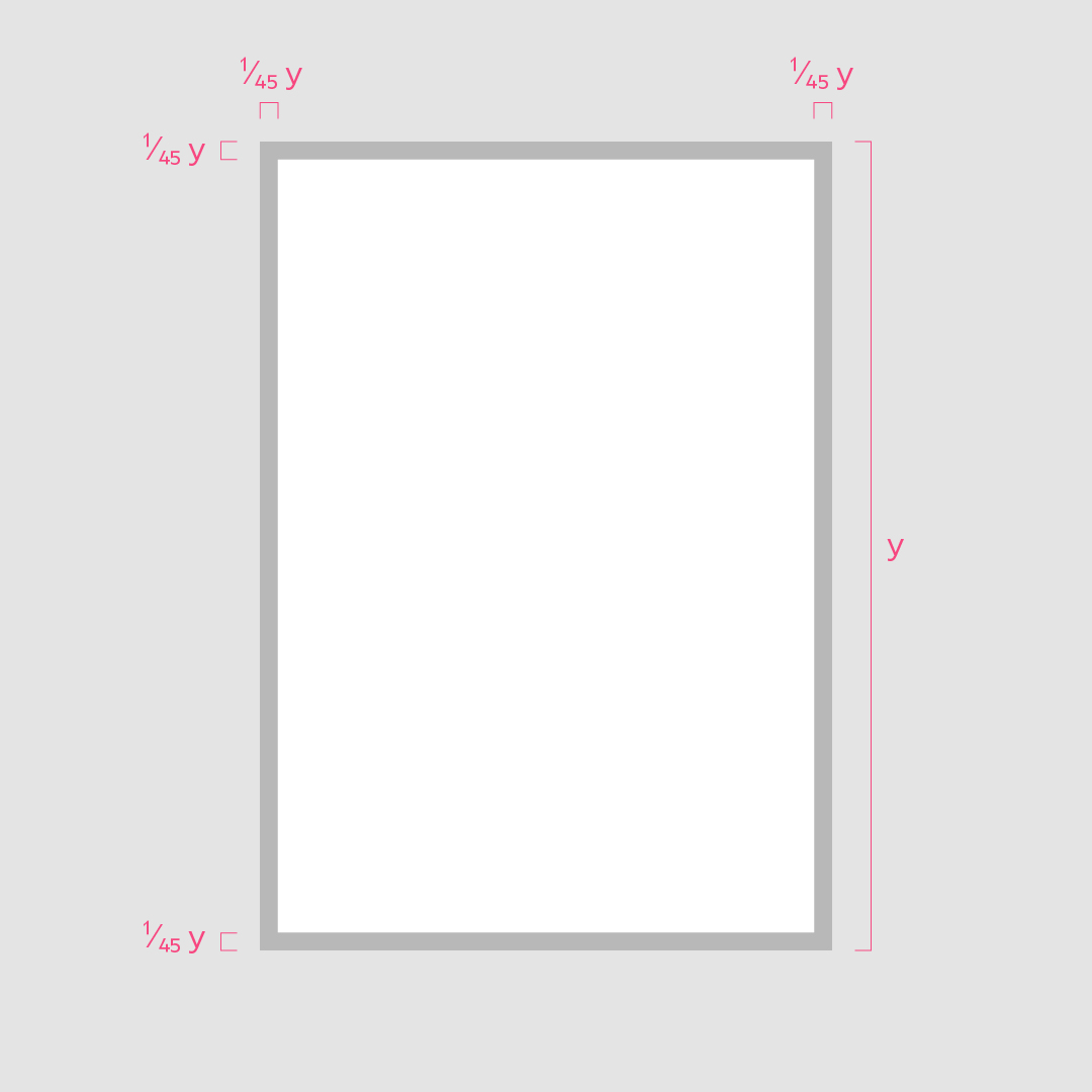
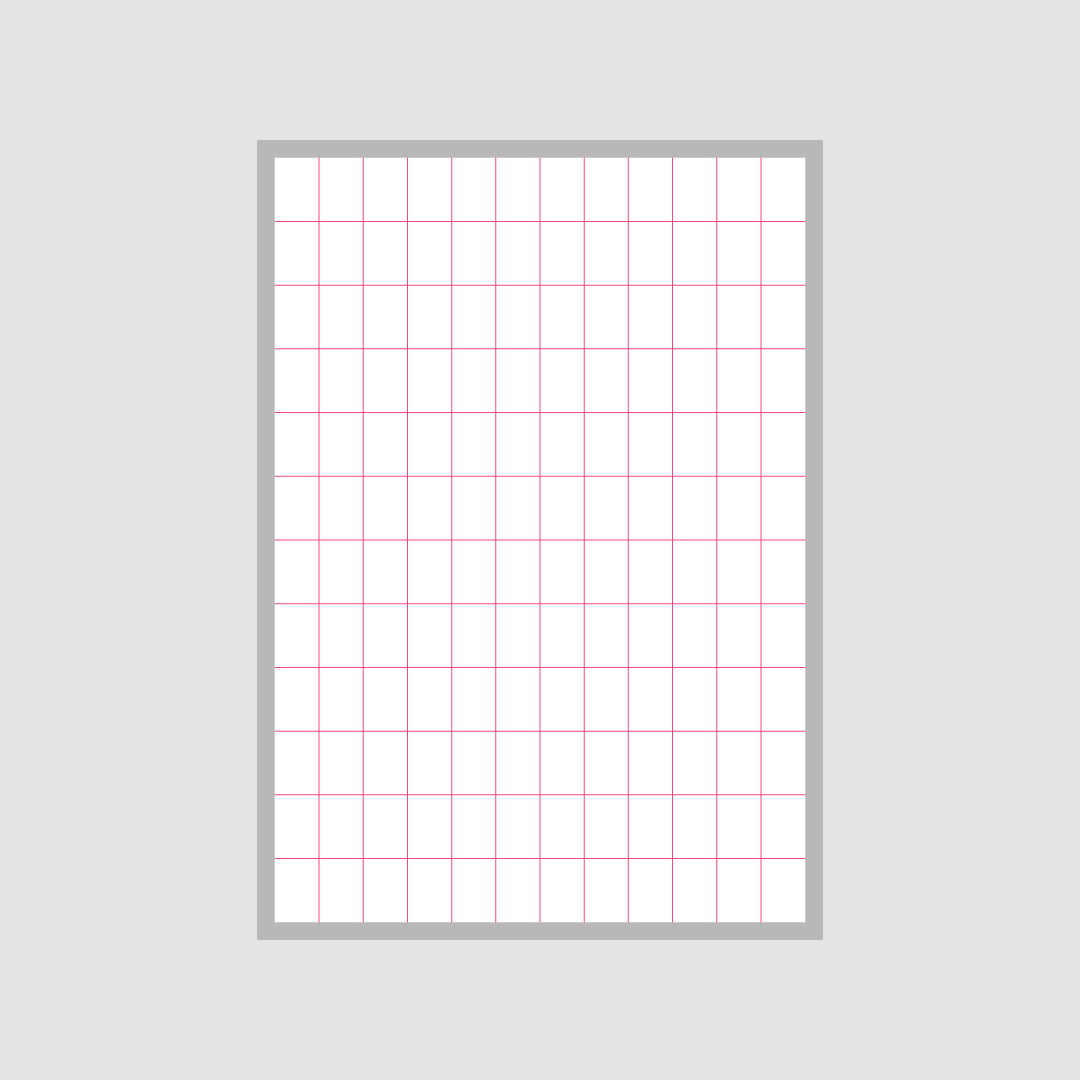
Determine the margins – as a starting guide, margin size can be 1/45 the longest edge. For square formats this will be 1/34 of the edge.
Step 3
Apply a 12x12 grid within the margins. To better suit certain formats, this can be broken down by: 12/6/4/3/2/1
Step 4
Place key imagery
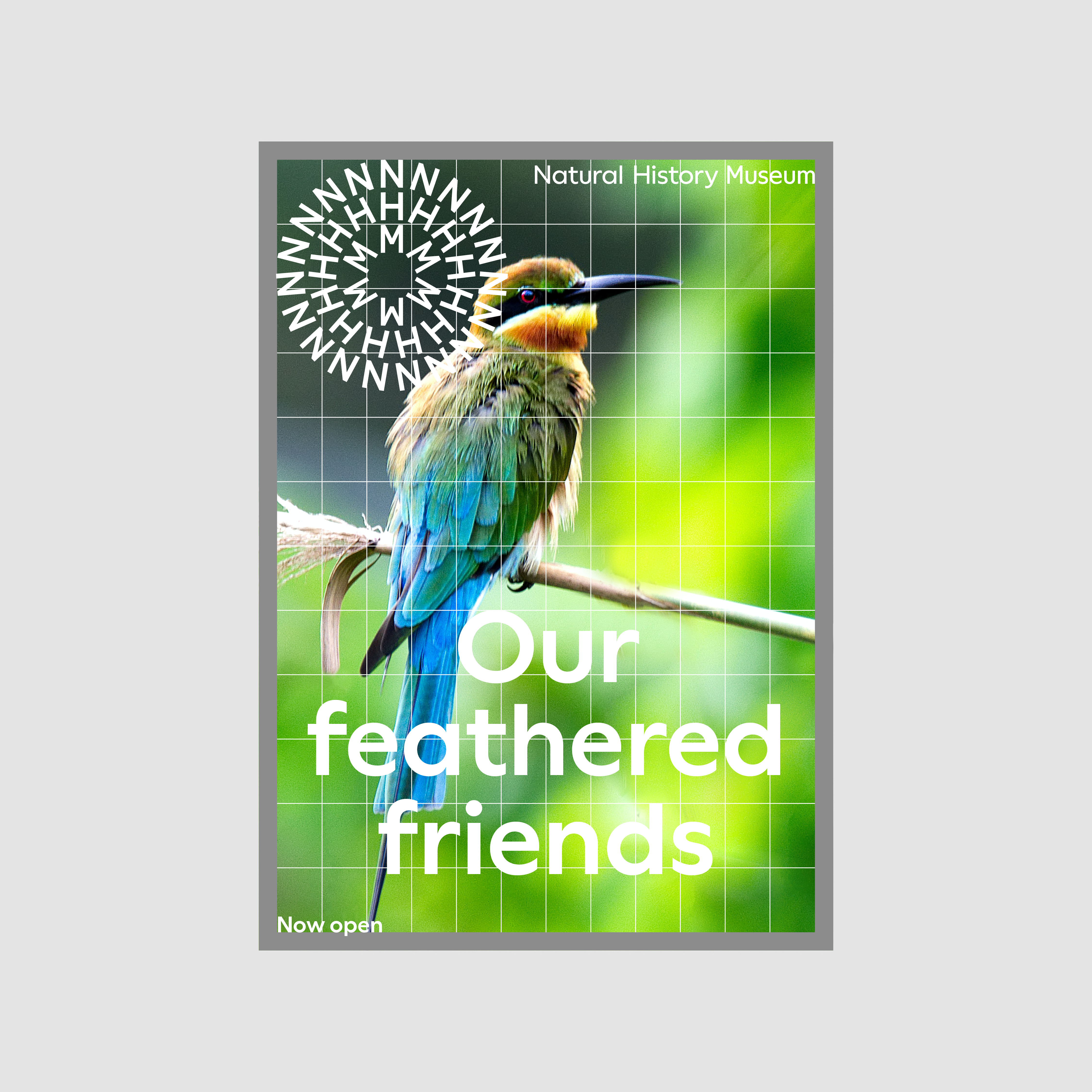
Step 5
Add appropriate logo (symbol / logotype / lock-up) and content. Hang text anchoring directly to the grid without gutters.
Step 6
Add colour and complete composition.
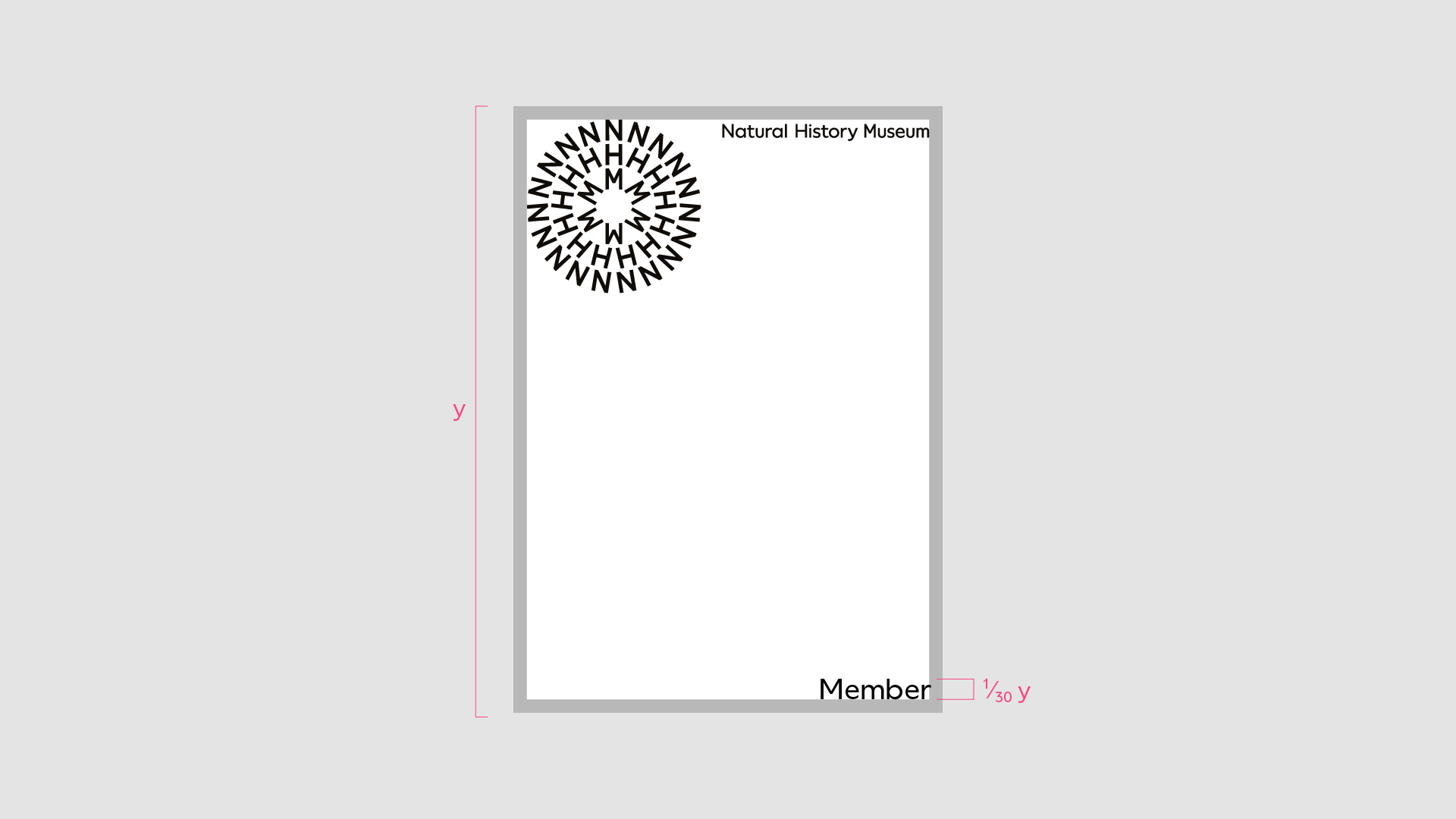
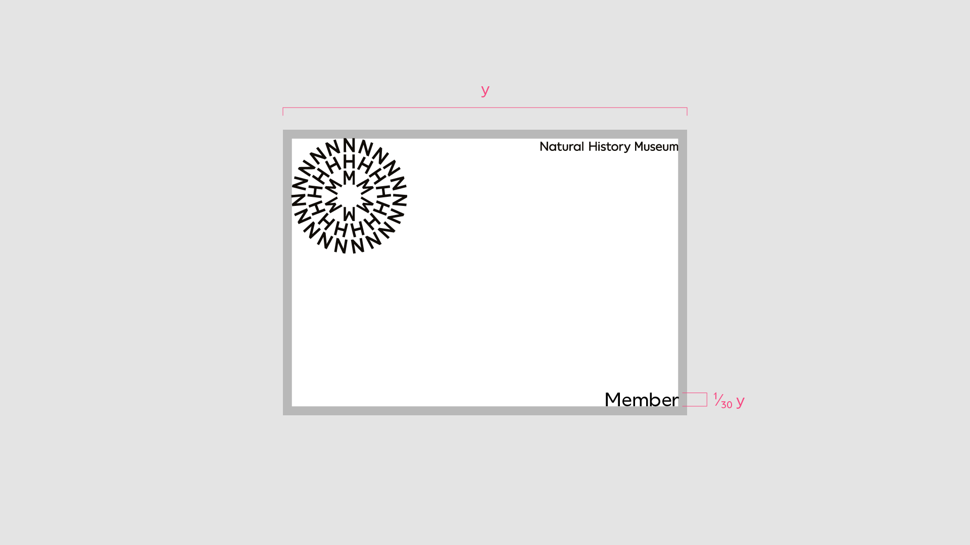
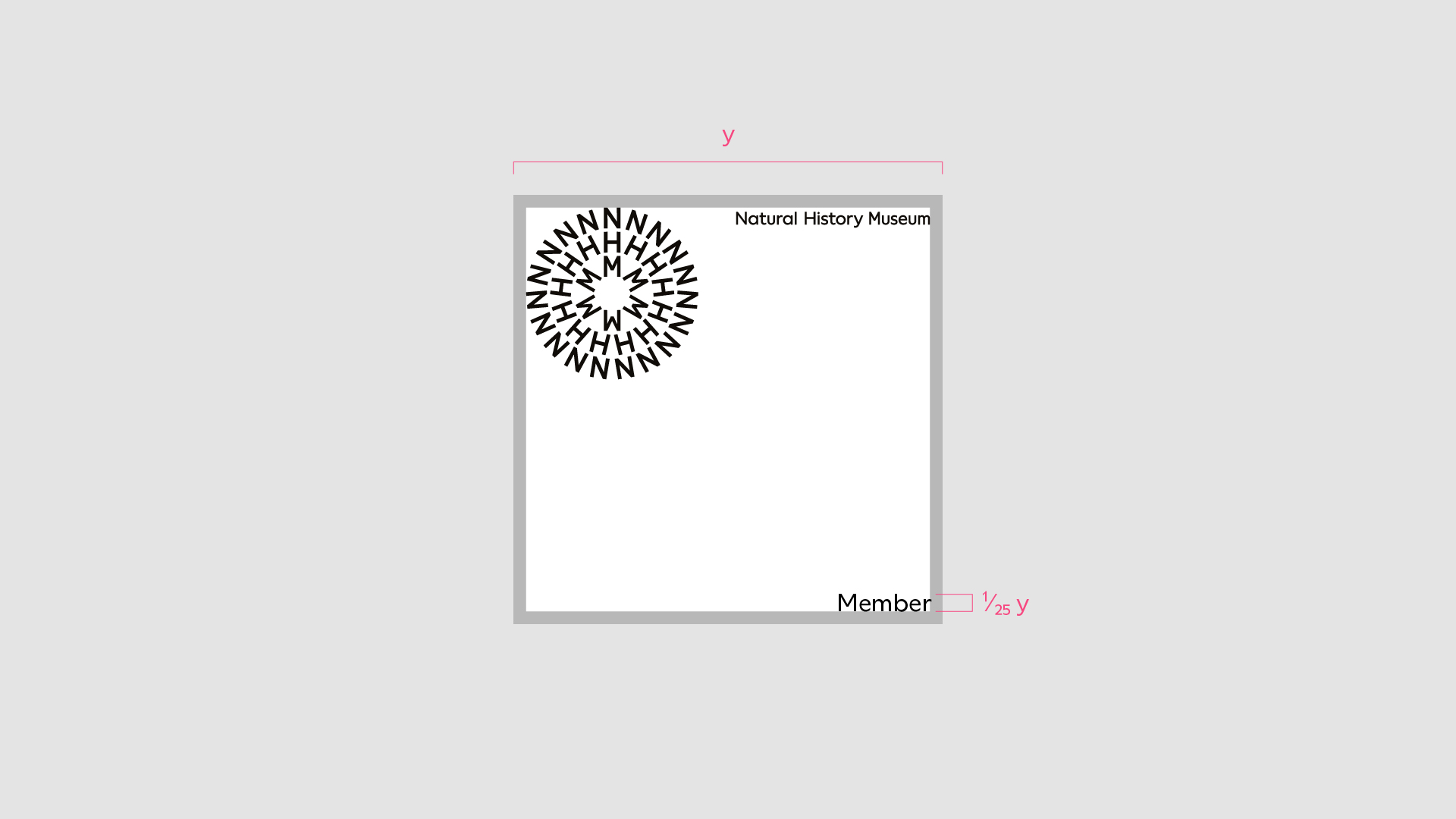
Labelling
When labelling is required we use a division of the longest edge of the format to determine the size of the label. Follow the rules below for consist use.
Label scale
Labels commonly occur within Join and Support – they act as an easy identifier. When labelling is required it must be applied consistently across the brand.
Portrait format
Label cap height = 1/30 format height
Landscape format
Label cap height = 1/30 format width
Square format
Label cap height = 1/25 format width
Note
Label scale is determined by the cap height only
Label frame
When more emphasis to the label is required or when applying labels to busy backgrounds – we can place the label within a frame.
The margins of the frame are equal across all edges and match the width of the margin.
When using a frame, ensure the colour connects with the rest of the content.
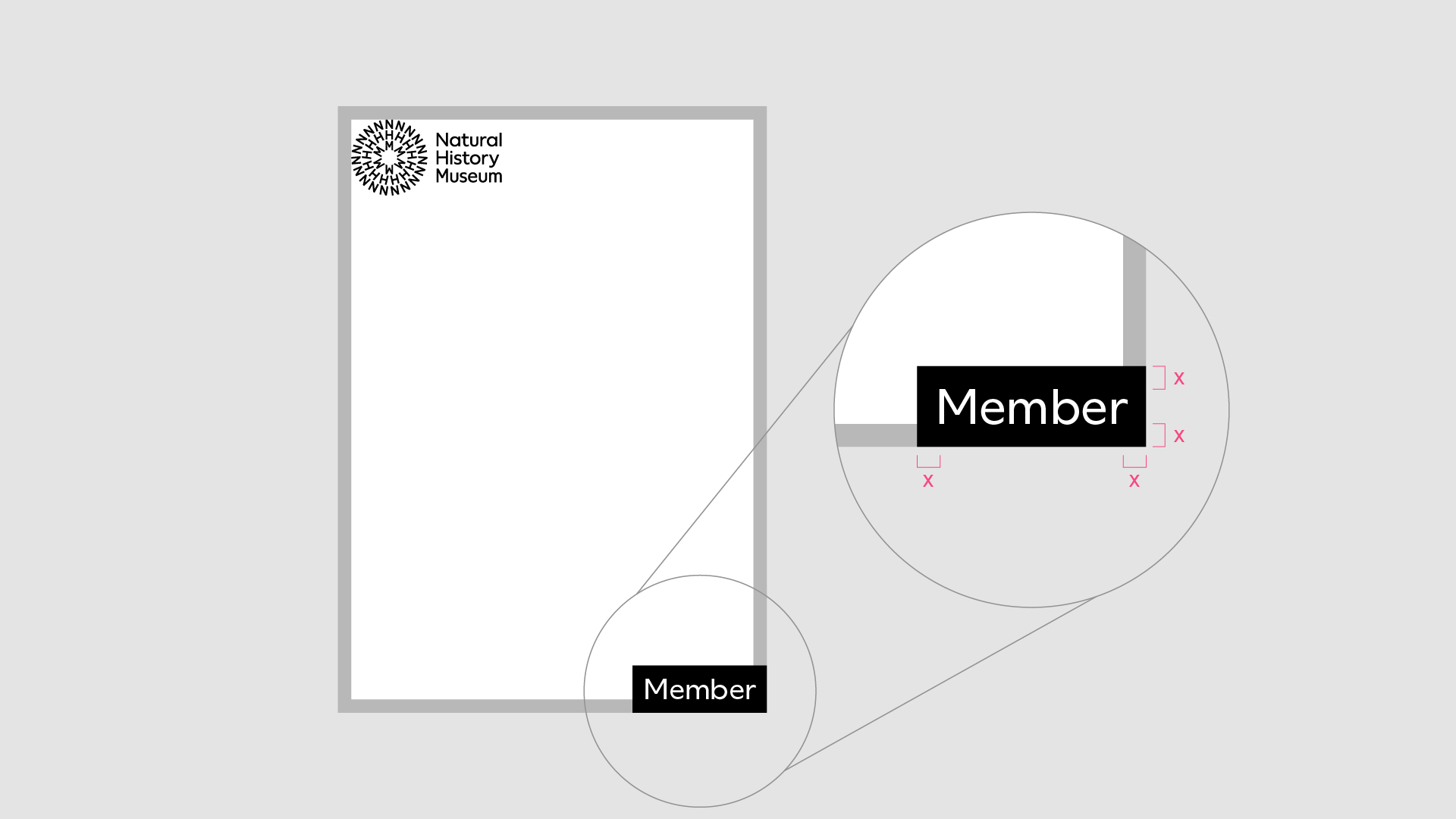
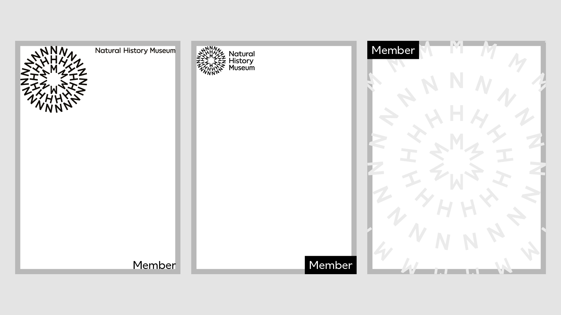
Label position
The label can be positioned in any of the corners of a format – it must never be positioned in the same corner as other assets.
When the symbol, logotype or lock-up are used the label is primarily positioned in the bottom right corner.
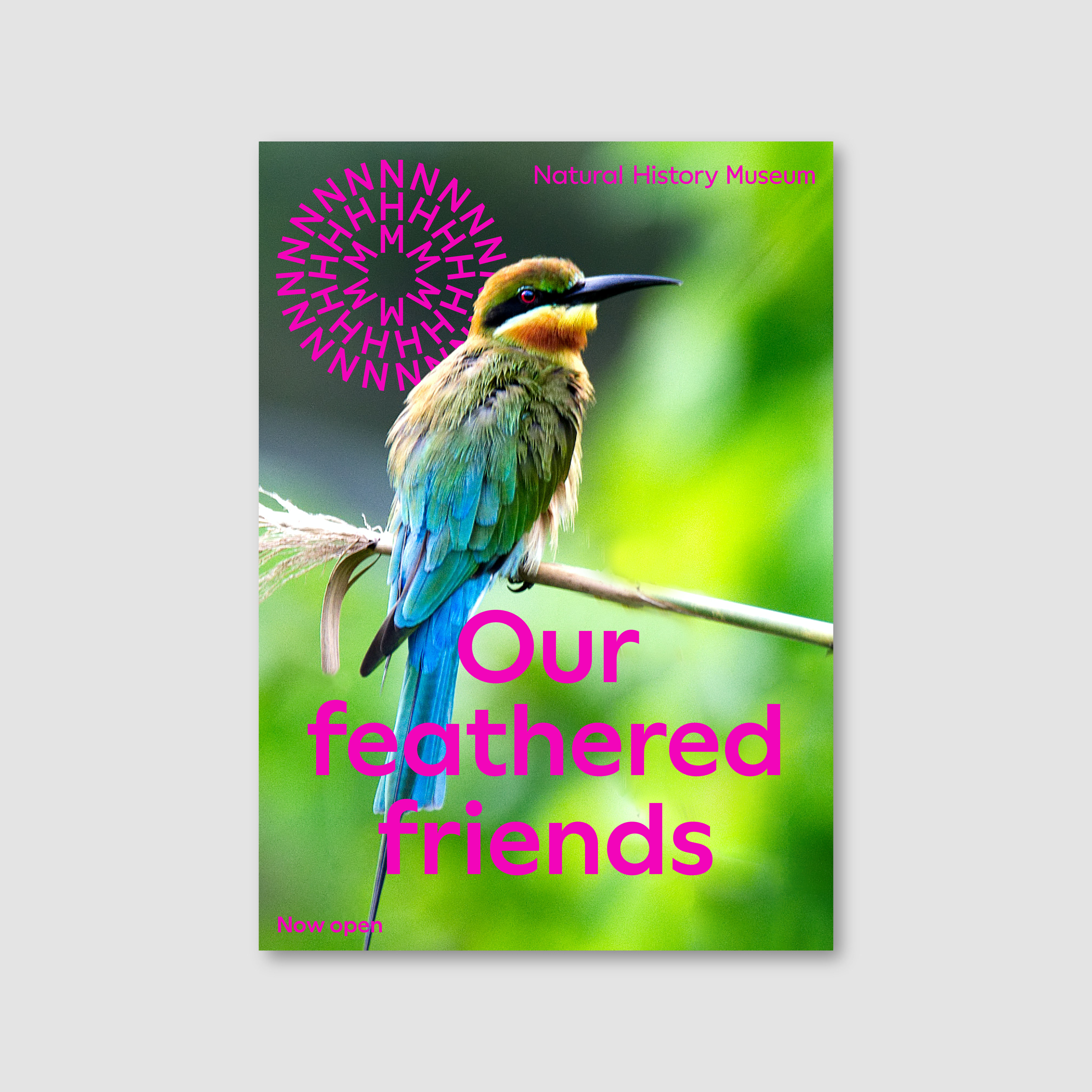
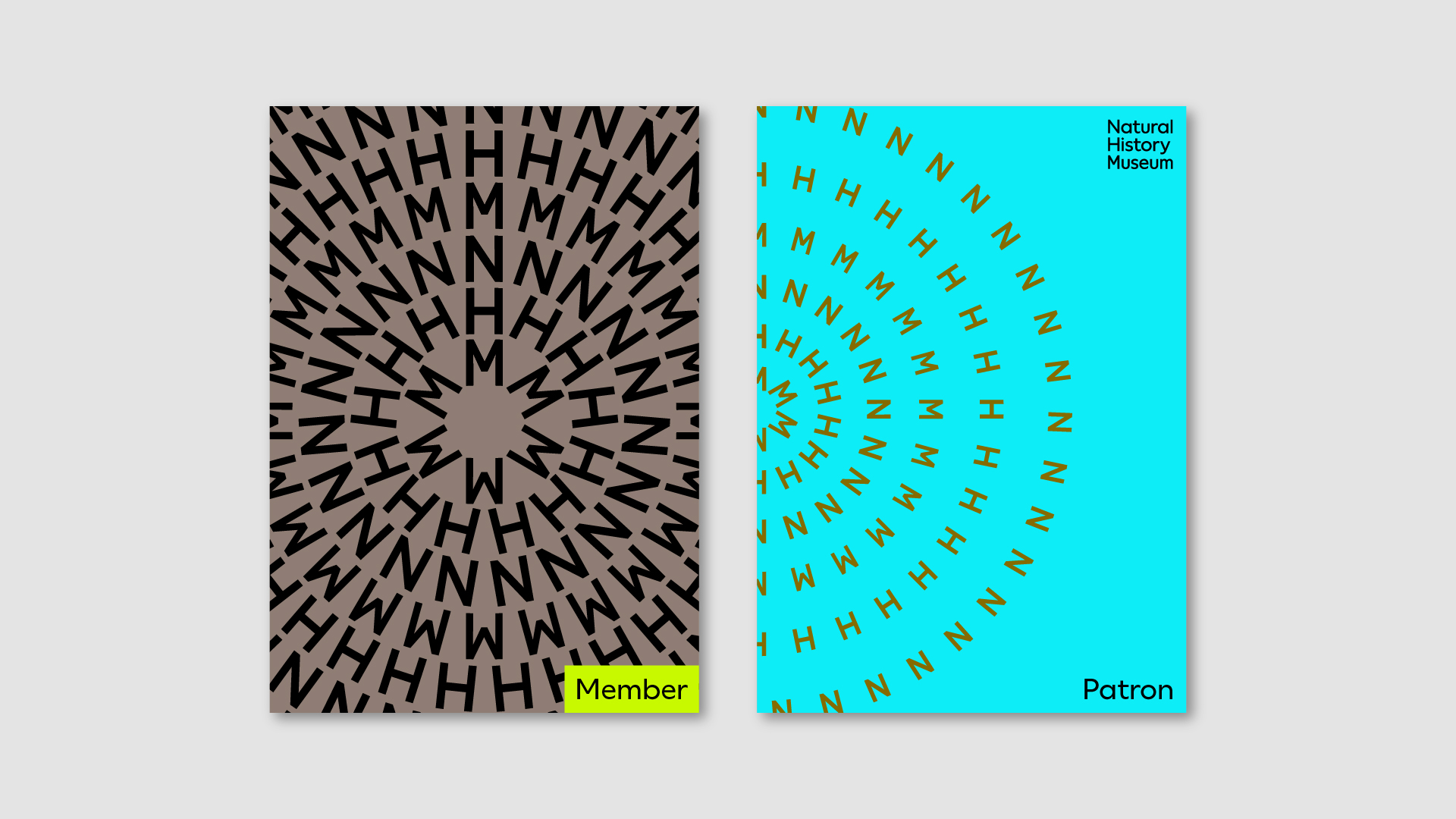
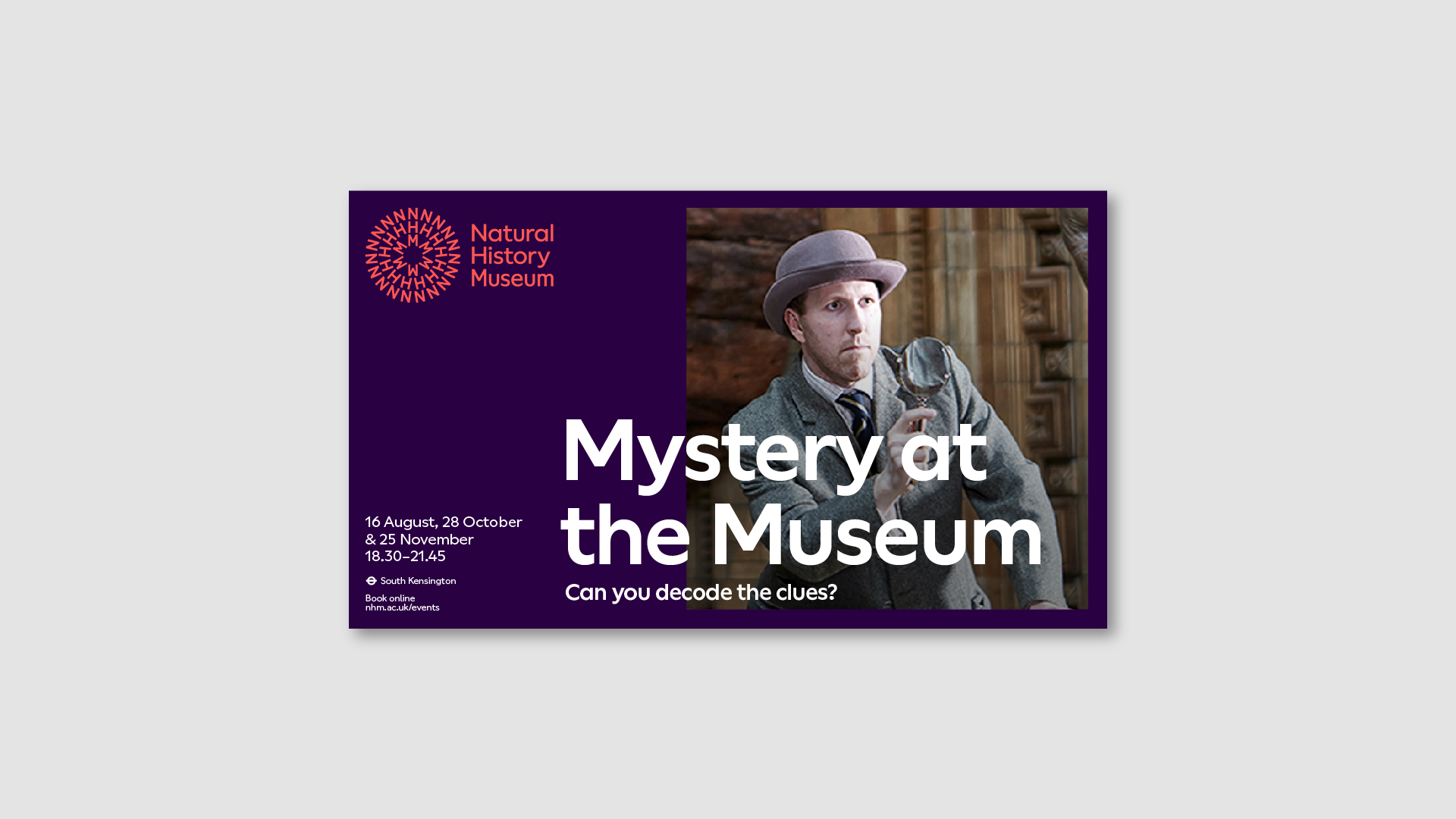
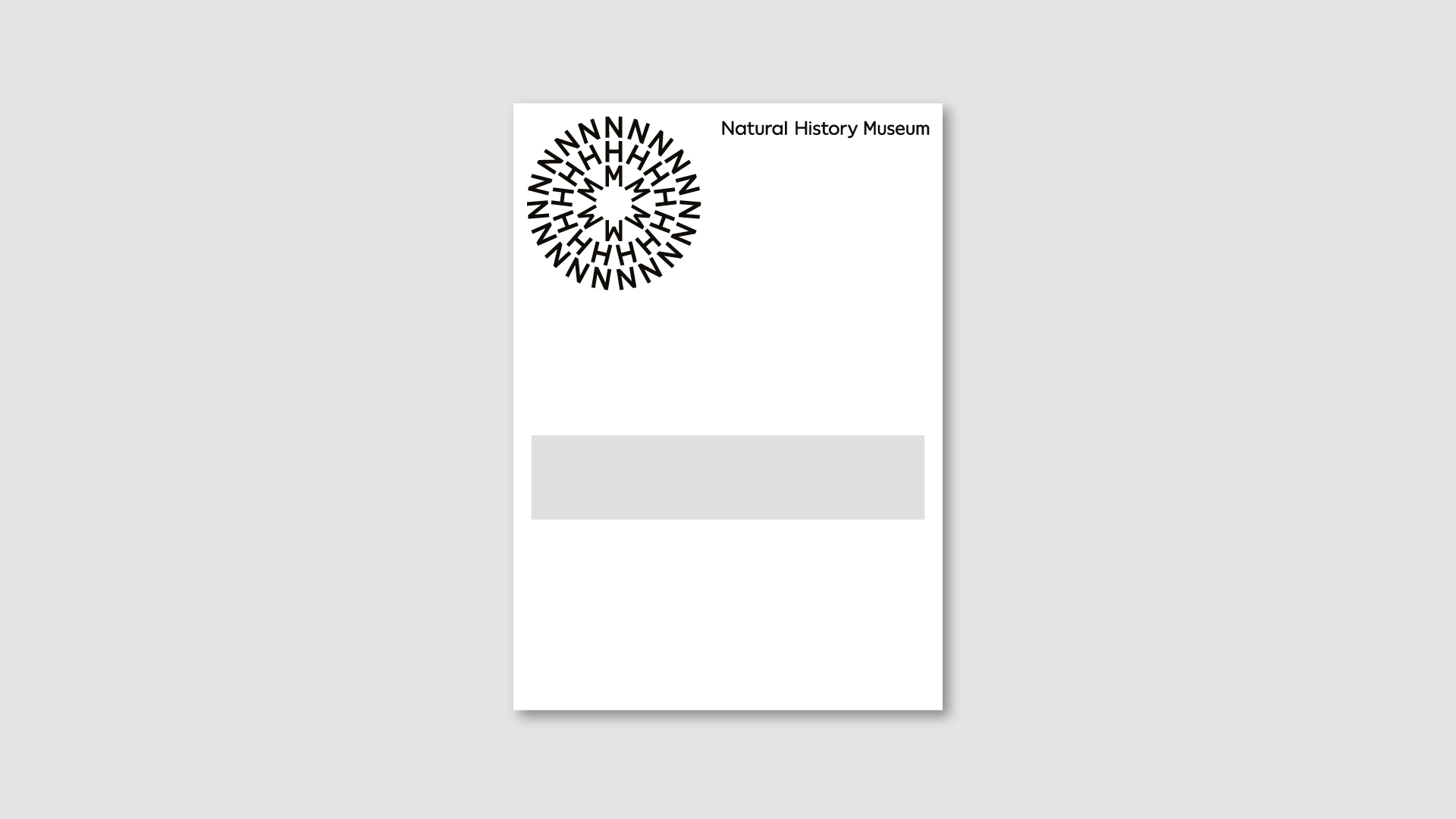
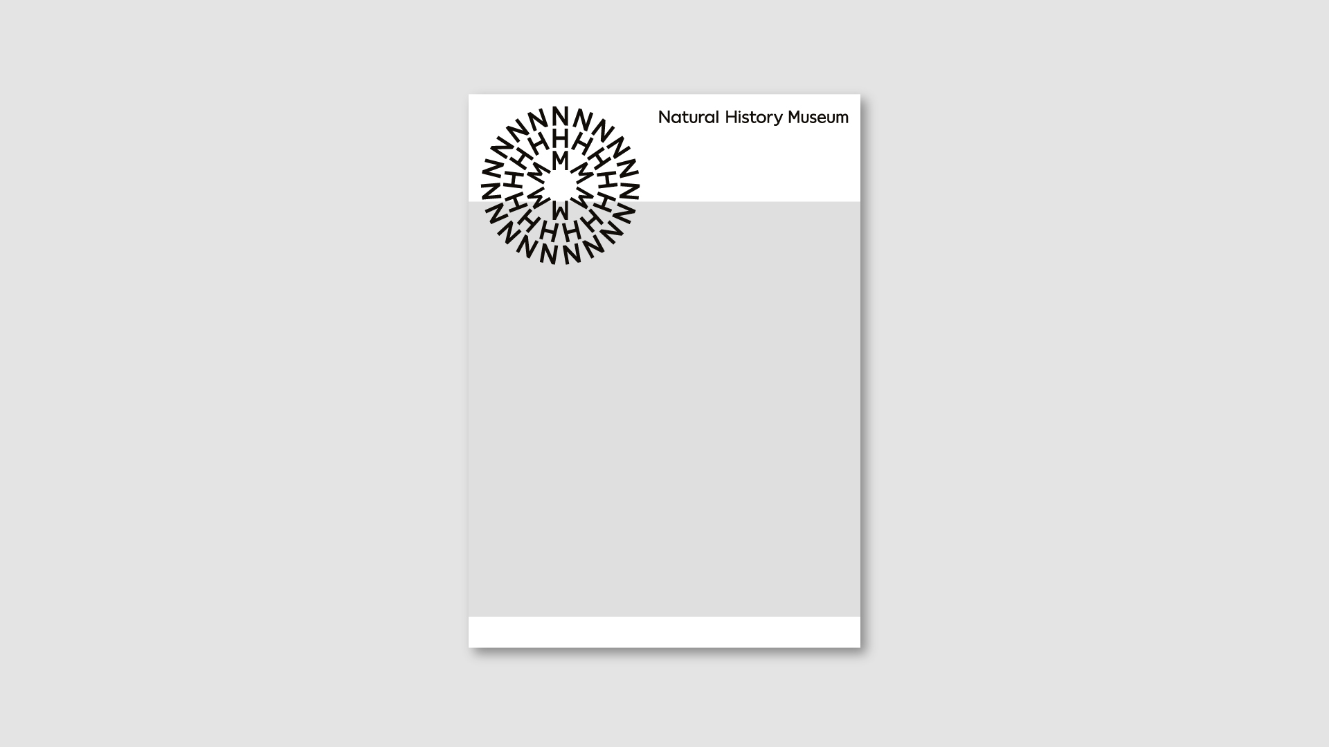
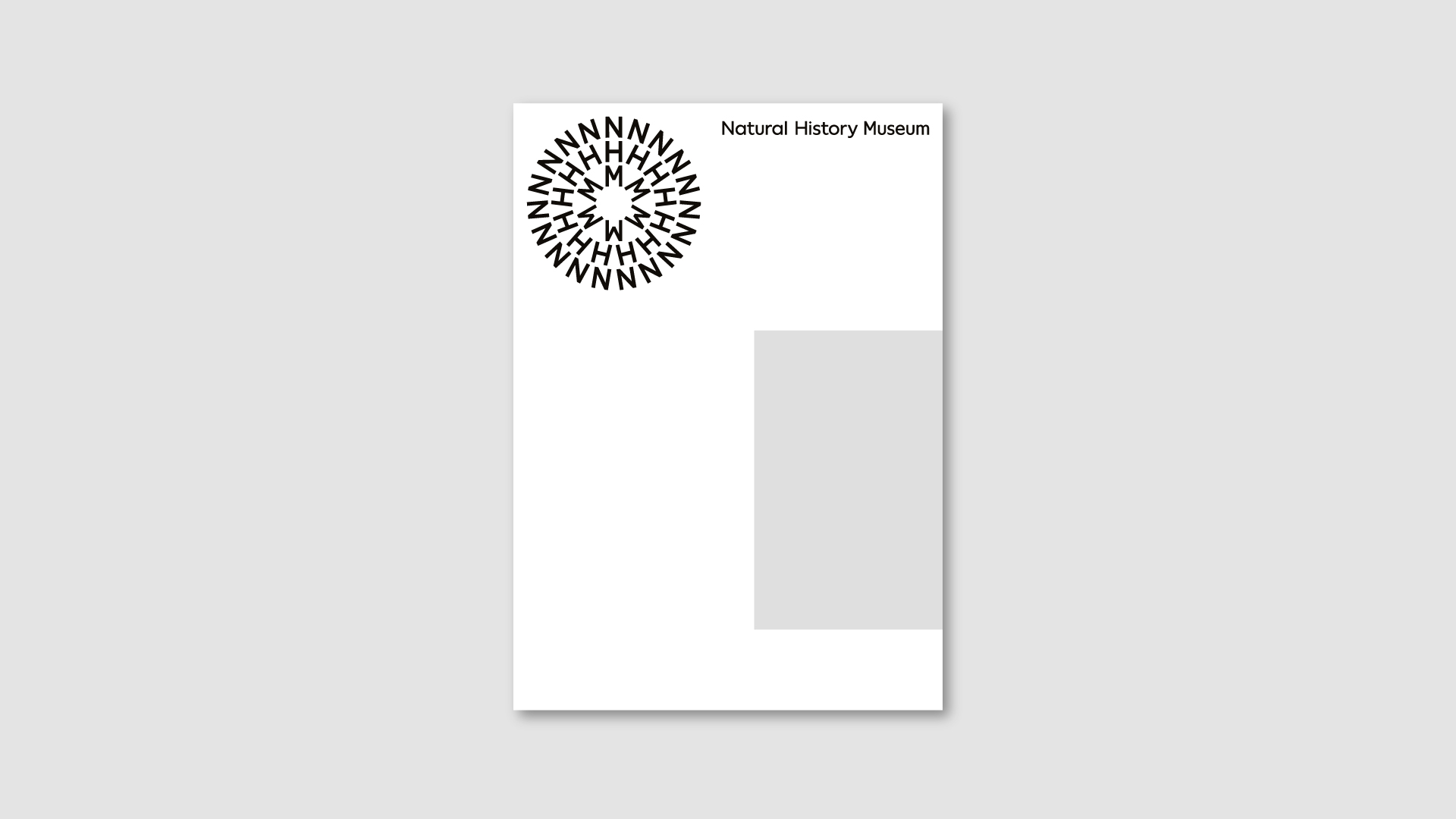
Colour blocks
When a cleaner background for information is required, we can use a colour block – spacing between the colour block and text is equal to the margins. Colour blocks always bleed to three edges and must be a colour from the symbol.
Always use black or white text on top of the colour block, ensuring adequate legibility
Vertical
Horizontal
Square
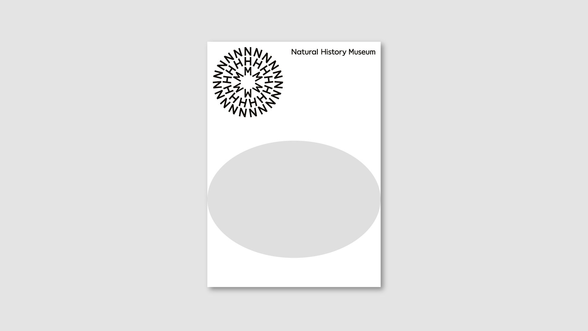
Content frames
We can place content within frames – this can create a recognisable aesthetic whilst providing clear space for text. Follow the rules below to create coherant applications.
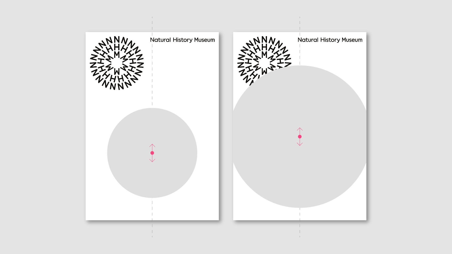
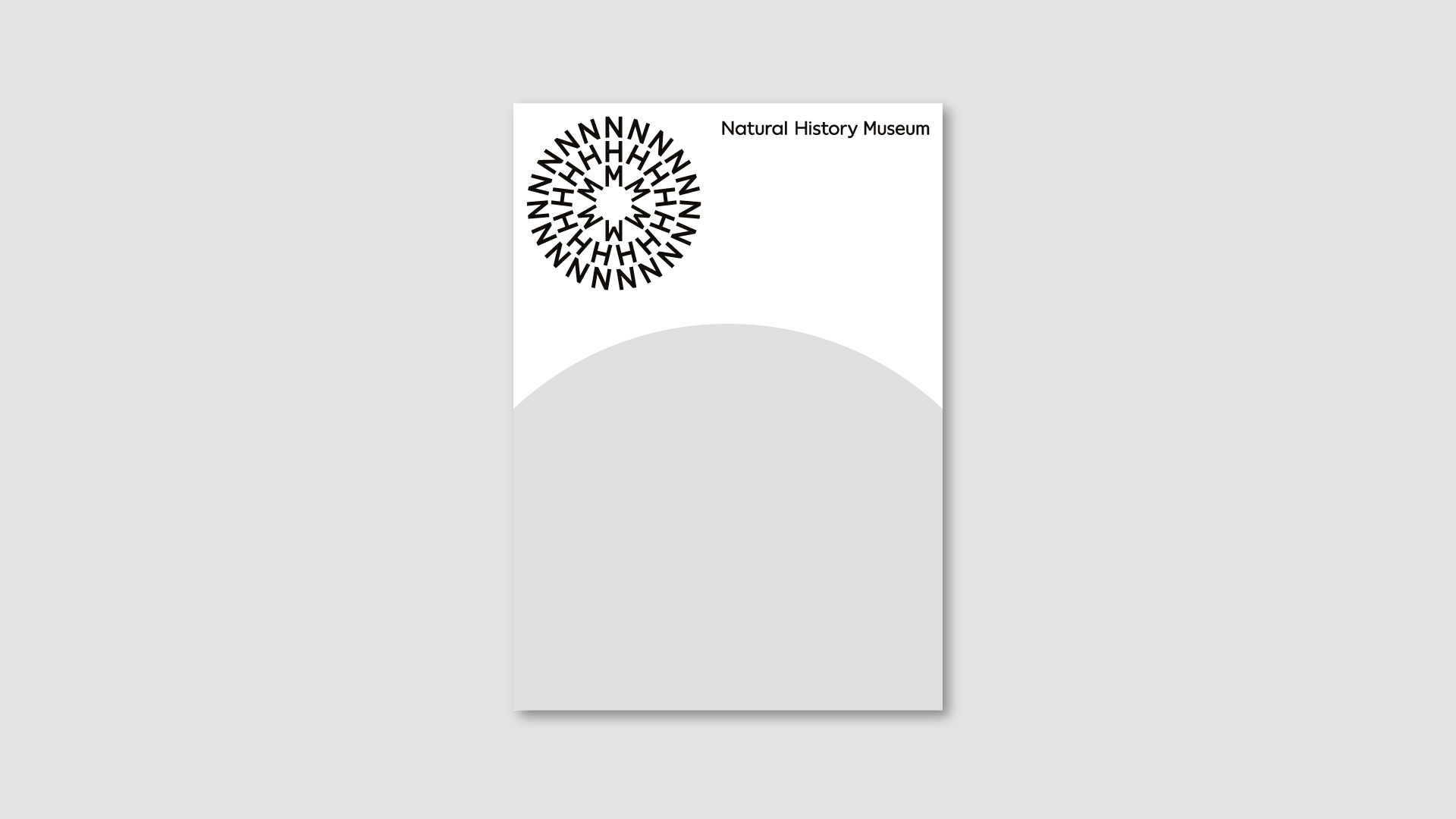
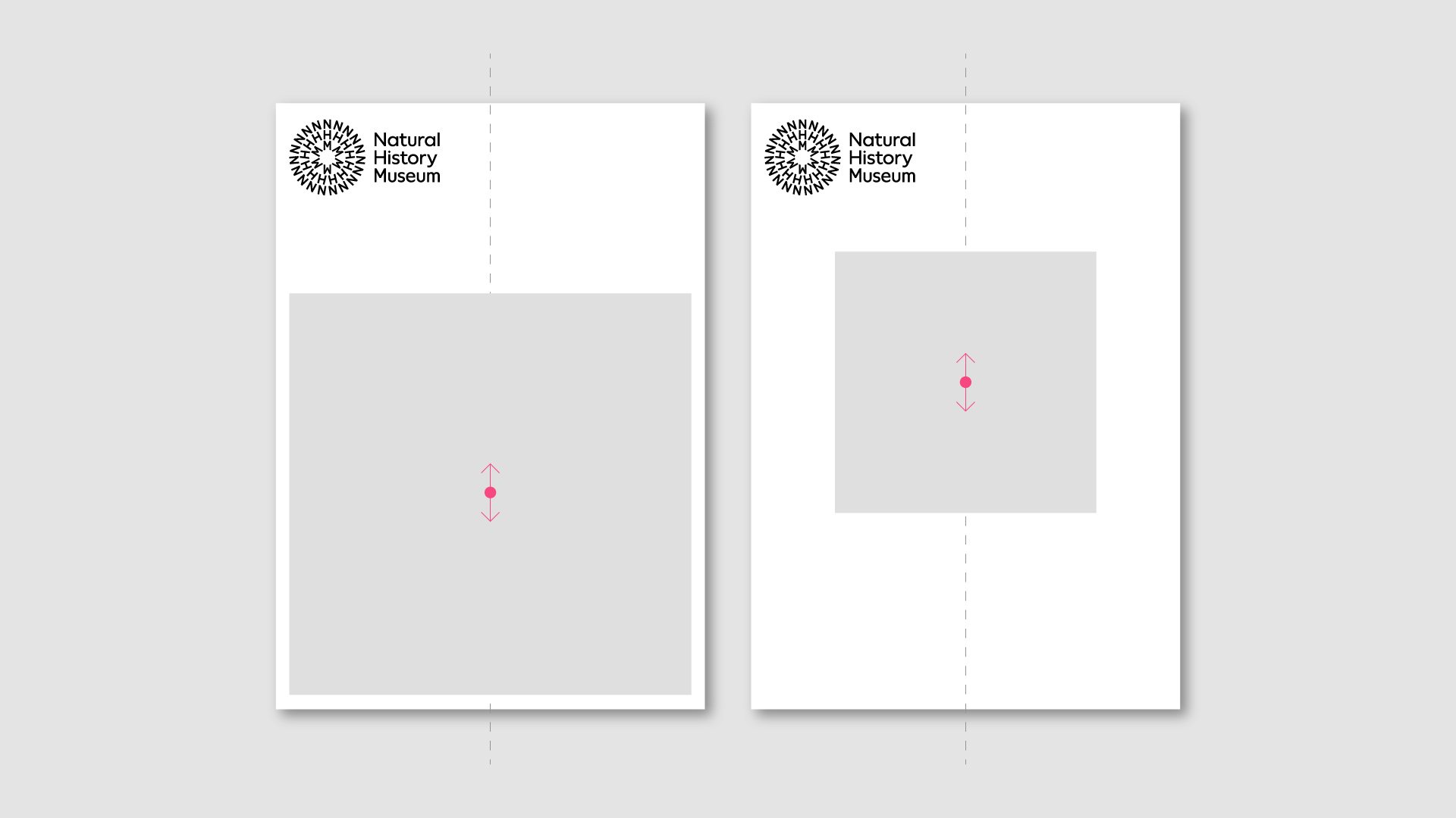
Circular
A circular frame connects closely to the other brand assets - we position the frame along the middle of a format.
Vertical formats
The frame can move up and down.
Landscape formats
The frame can move left and right.
Always maintain the proportions of a circle – ensure it isn't cropped heavily to maintain the identifiability of a circle.
Don't
Stretch/distort
Scale too large
Avoid positioning off centre
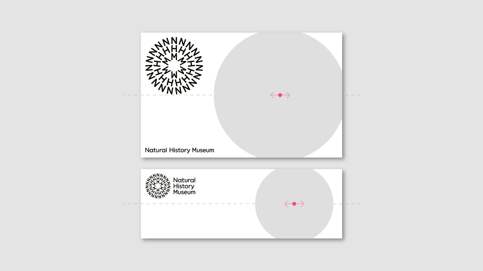
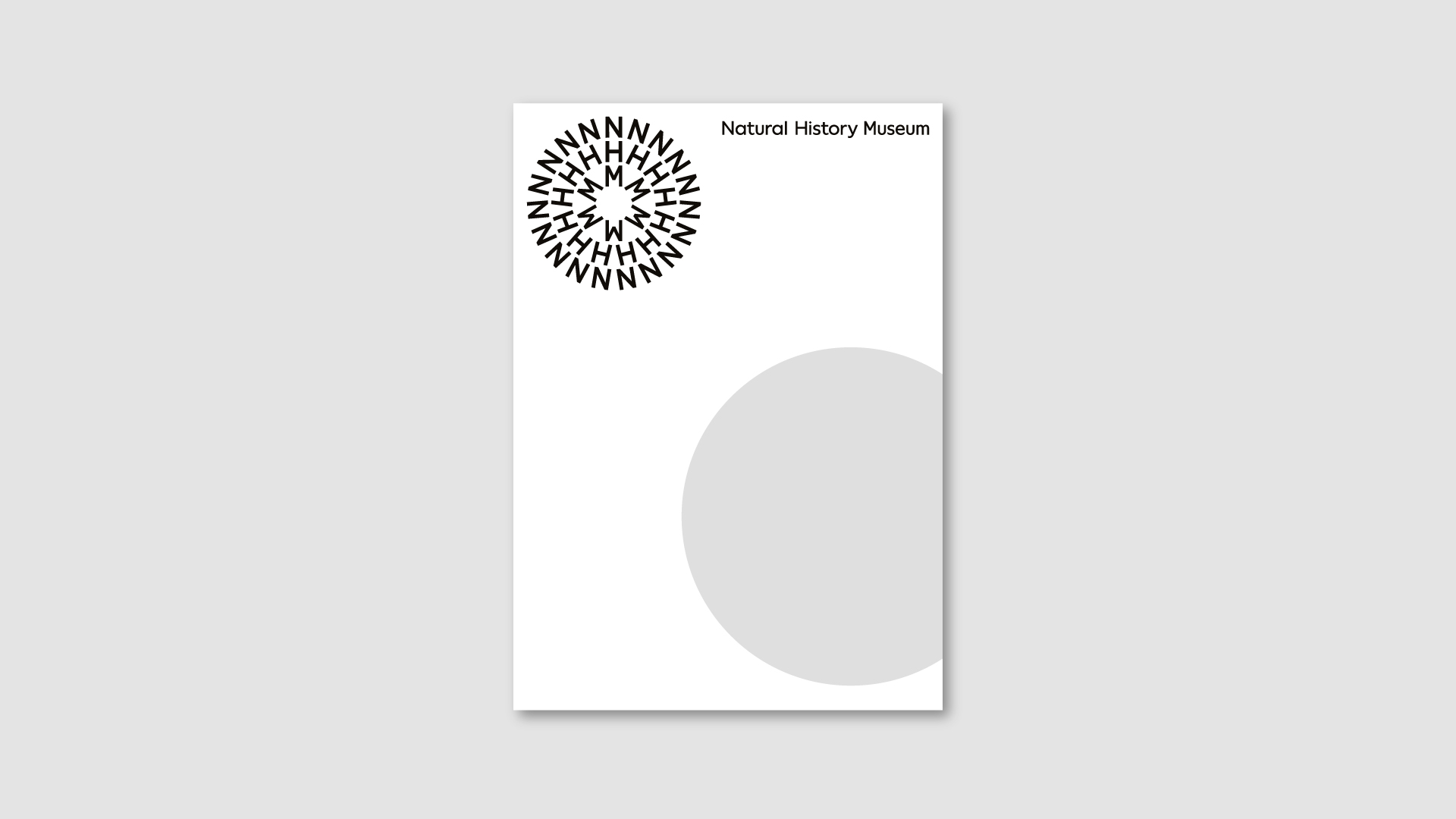
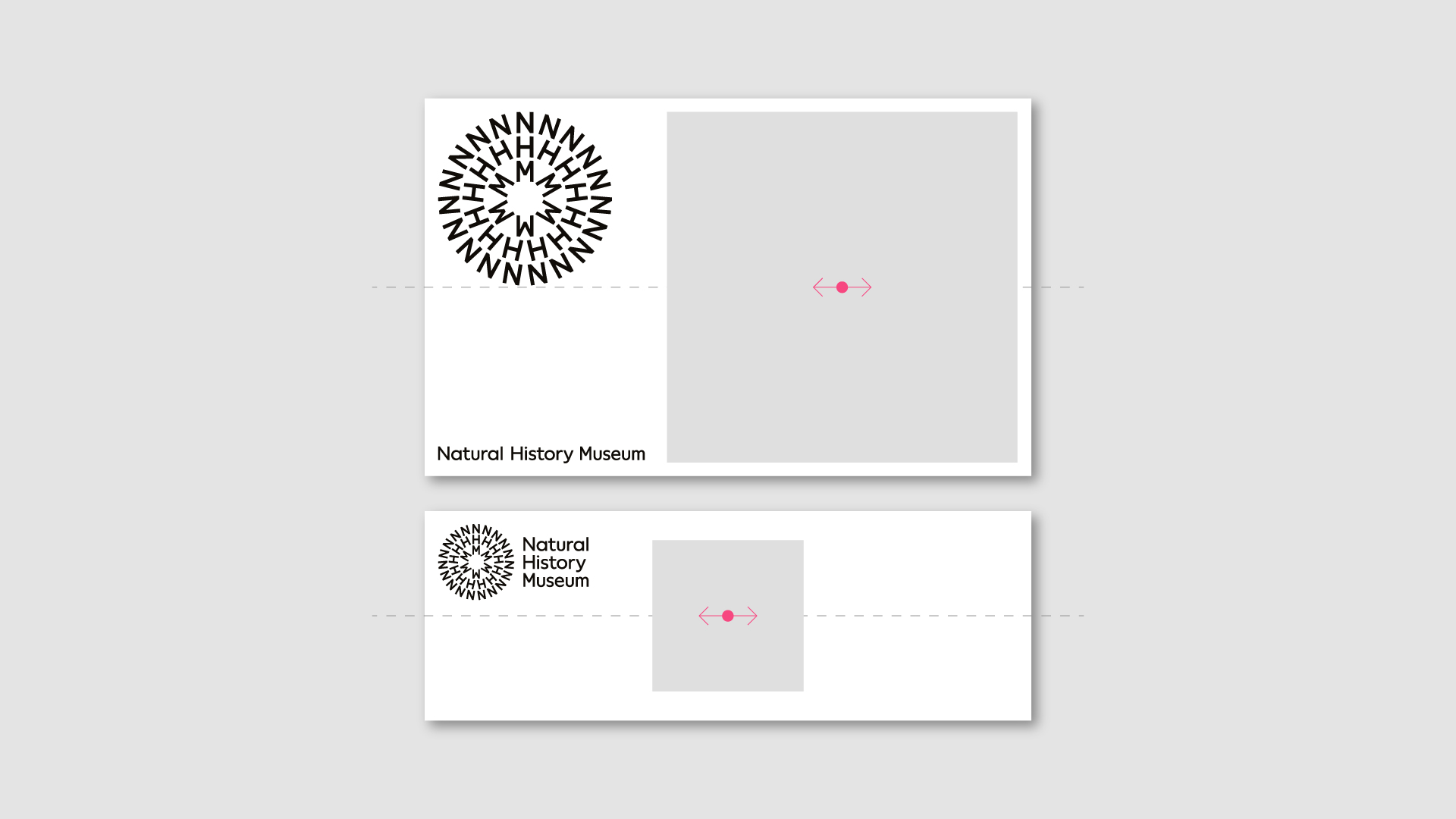
Square
We can also use a square frame – we position the frame along the middle of a format.
Vertical formats
The frame can move up and down.
Landscape formats
The frame can move left and right.
To maintain the proportions, never crop the square frame.
Don't
Stretch/distort
Scale too large
Avoid positioning off centre