Motion
Our motion theory is born from nature, from ripple effects and surface tension to the roar of a lion. We amplify the principles of nature through our motion design, always acting as a catalyst, bringing the brand to life in a way that encourages collective exploration, participation and action through curiosity, inspiration and joy. Fit for every audience. Appropriate to every use-case. A brand made to move.
Characteristics
In everything we do, we are always organic, alive and natural. We keep it simple, never overcomplicate or use tricks. We are a catalyst brand, so our motion design is full of energy, dynamism and momentum. Never passive, forced or unnatural.
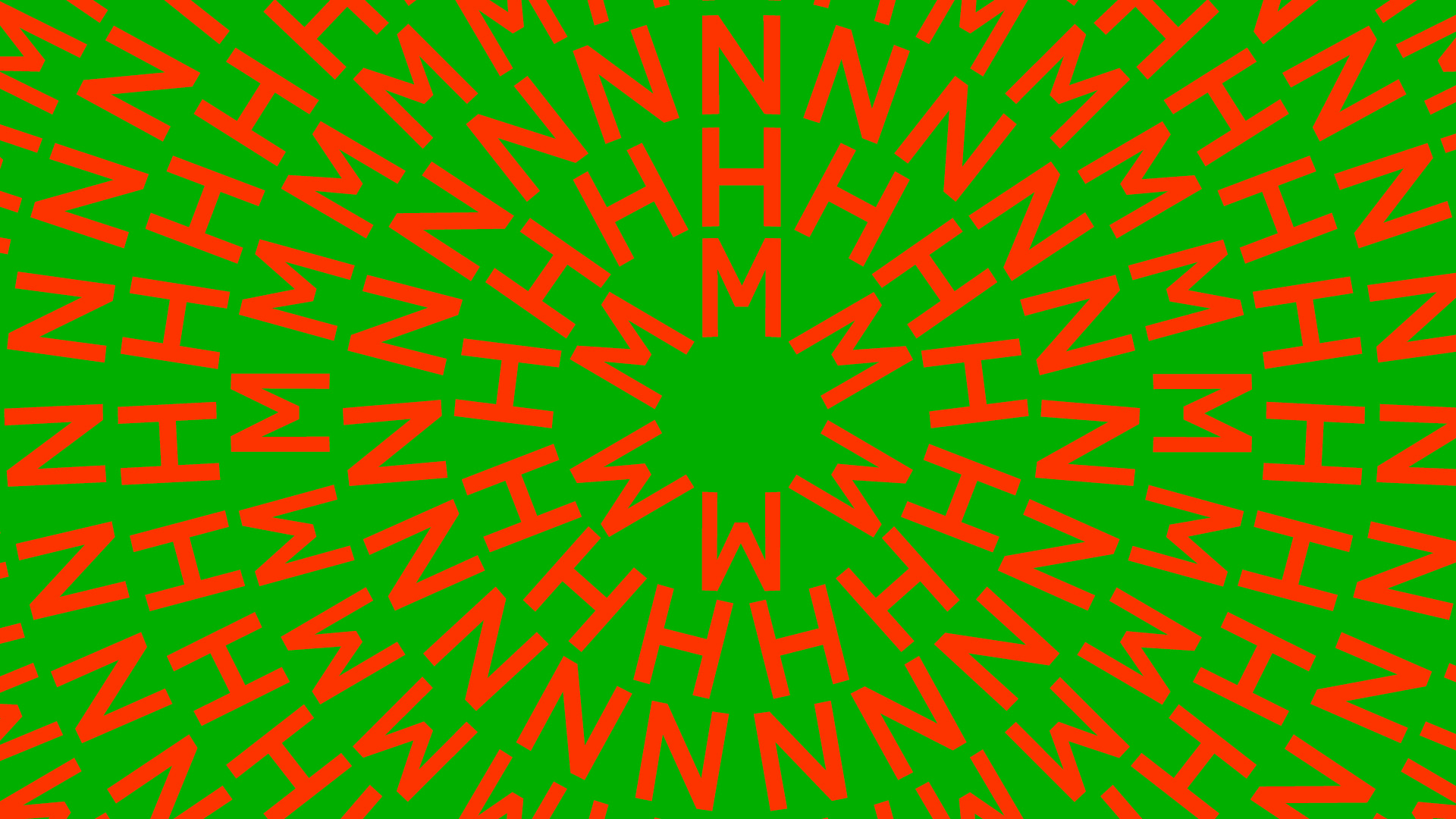
We define four key characteristics for motion: Ripple, Grow, Pulsate and Orbit.
The key similarity shared by the characteristics is the clear focal point at the centre, where all movement flows out from. Another overarching principle is that every motion design is made up of multiple moving parts, moving individually but coming together as a whole.
Ripple
Motion that starts from the centre and emanates outwards – starts quick and slows as energy dissipates. Utilises lots of overlapping action, as each wave of the ripple moves individually, and the energy from one, influences the others.
Grow
Motion based on multiplication, creating new identical versions of itself.
Pulsate
Constant, rhythmic movement. The beating heart of nature.
Orbit
Rotating around a central axis to tell stories and bring the content to life. Slow orbiting/rotating words create less visual disturbance but are challenging to read and can lead to disorientation.
We are:
Responsive
We are always responsive and relevant to each scenario in which we appear.
We use sonic and motion in fusion to tell stories and create advocates for the planet.
Active
We use motion to activate, inspire, kick start movement and bring information to life. We’re always active, always alive to what’s happening.
For everyone
As the brand must engage all audiences, of all backgrounds and ages, motion is key to make it inviting and inclusive but always with simple and natural movement.
We are not:
Complicated
No tricks, no gimmicks. We know who we are and what we are here to do.
Passive
Never static, never stagnant, we bring joy to the world. We’re nature’s biggest fan and we’re here to create advocates for the planet.
Mechanical
We are born from nature, so we’re fluid, not fixed, natural, not mechanical. Our motion design should flow effortlessly.
Logos in motion
Primary
Our principal mnemonic is used for intros, outros and end cards.
Landing our brand and making it famous requires us to use assets in a way where they become instantly recognisable. That's why the movement of our logo coming in and out plays a vital role in telling our new story and building strong attribution.
Alternative
Calmer, with more favourable accessibility. Use this when appropriate but we prefer to lead with our primary version.
This version can also be used as a transition between Symbol and Logotype.
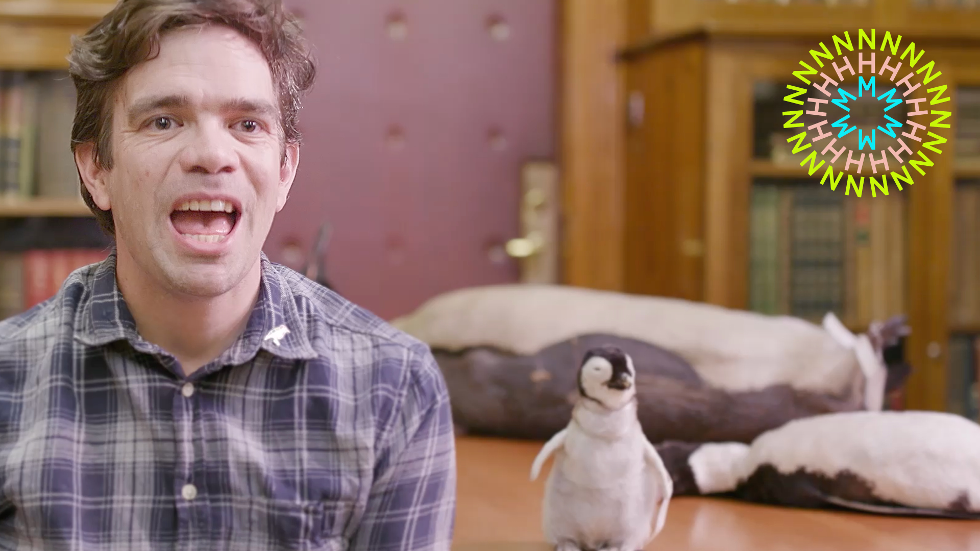
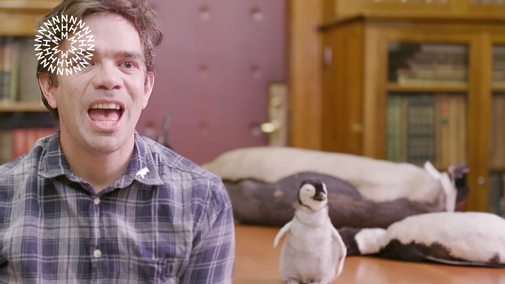
Patterns and Word Rings
We can adjust the colour, speed and frequency of rings to fit different contexts. For example, a holding screen media backdrop during a conference may be slower and more subtle than a pattern used as a transition screen in between digital posters.
We use patterns and word rings as living holds for broadcast, live events and backdrops. There is enough flexibility to be fit for purpose for any environment and any audience. These work best when calm in movement and restrained in colours. Here, we are not the centre of attention, we're the moment before the event. Patiently waiting.
Avoid making the movement too fast or too overwhelming. Don't use clashing colours. Don't overcomplicate.

Ensure it is appropriate for the audience. Consider the use-case. Keep it calm and mesmeric. Prefer analogous colours. Keep it simple.
Sound reactive
Born from nature and the animal kingdom, our sound reactive animations celebrate the creatures we all love. Here we are expressive, fun, joyful and emotive. Each animation should mirror the sound from an animal or natural phenomena, so they work in harmony with each other and help us convey our love for nature.
Animations are playful, joyful and fun, but avoid being silly. Animation should express the tonal qualities and speed of the sound so they work in harmony with each other.
Don't go overboard, it's a beautifully simple idea that requires nuance. Never use sounds of animals suffering or in pain. Do not use the sound of human-made objects and mechanisms.
The NHM Generator can also be used to create audio reactive motion files. These can be downloaded and combined with footage on video editing softwares. Go to the Pattern section to discover more.
Turn your audio on and check some examples here.
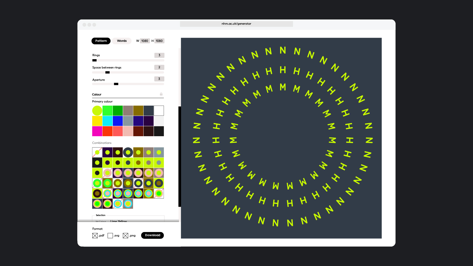
The NHM Generator
To create the circular pattern from the letters NHM or to create word rings, we use the NHM Generator so anyone creating designs with the brand identity can choose configurations that are the correct proporation, size and colours. The use of the NHM Generator is crucial to make sure the brand is applied consistently.
See Pattern section.
Transitions
Transition wipes are key to our brand. The point is that they are seen often without our brand world. Our aim is to make them instantly recognisable to our audience, and to bring our catalyst idea to life.
We have a suite of transition wipes to choose from to ensure the brand always stays fresh. It is important that you use the same transition wipe throughout a show or piece of content. The first option is the master version, so we recommend you use this predominantly, with the others there if you need a different tone to better match your content.
Not every scene transition needs to use the wipe. It's also fine to use clean cuts. The wipes must be used in moments to bring our brand story to life. We are compelling and vibrant. We get in and out as quickly and effectively as possible.
Avoid making the transition too complicated. Remember, it will be seen many times by the same person. There is a fine line between compelling and annoying so keep it simple, make it quick, don't add any unnecessary tricks or overly complicated colour ways.
Bug
Our bug is our hallmark and our stamp of quality. It watermarks our content and tells viewers who it's from. Our bug is a supplied and fixed asset that always sits top left.
The bug must be visible, legible and not covering over important areas of the content. Ensure you always use the bug master artwork file with the correct placement.
Avoid changing the artwork file in any way, including colour, opacity, size and placement.
Avoid covering faces or key parts of content with the bug.
Moving headlines
Moving headlines are a great way for us to bring our tone of voice and brand idea to life. They're fun, engaging and ownable - ensuring we build brand recognition, and capture the imaginations of our audience.
For moving headlines, use short sentences (around three words) in one line, or medium sentences (up to seven words) in two lines.
Avoid using circular type for long sentences.
Captions
Captions serve a functional purpose, to inform audiences in a clear and confident way. They are set as straight type inside colour block backgrounds. We use a colour flourish to highlight key words and make them feel in line with our brand.
Be sparing when highlighting words and do not highlight words in every caption as this can cause overstimulation. Use one of the accessible combinations displayed here.
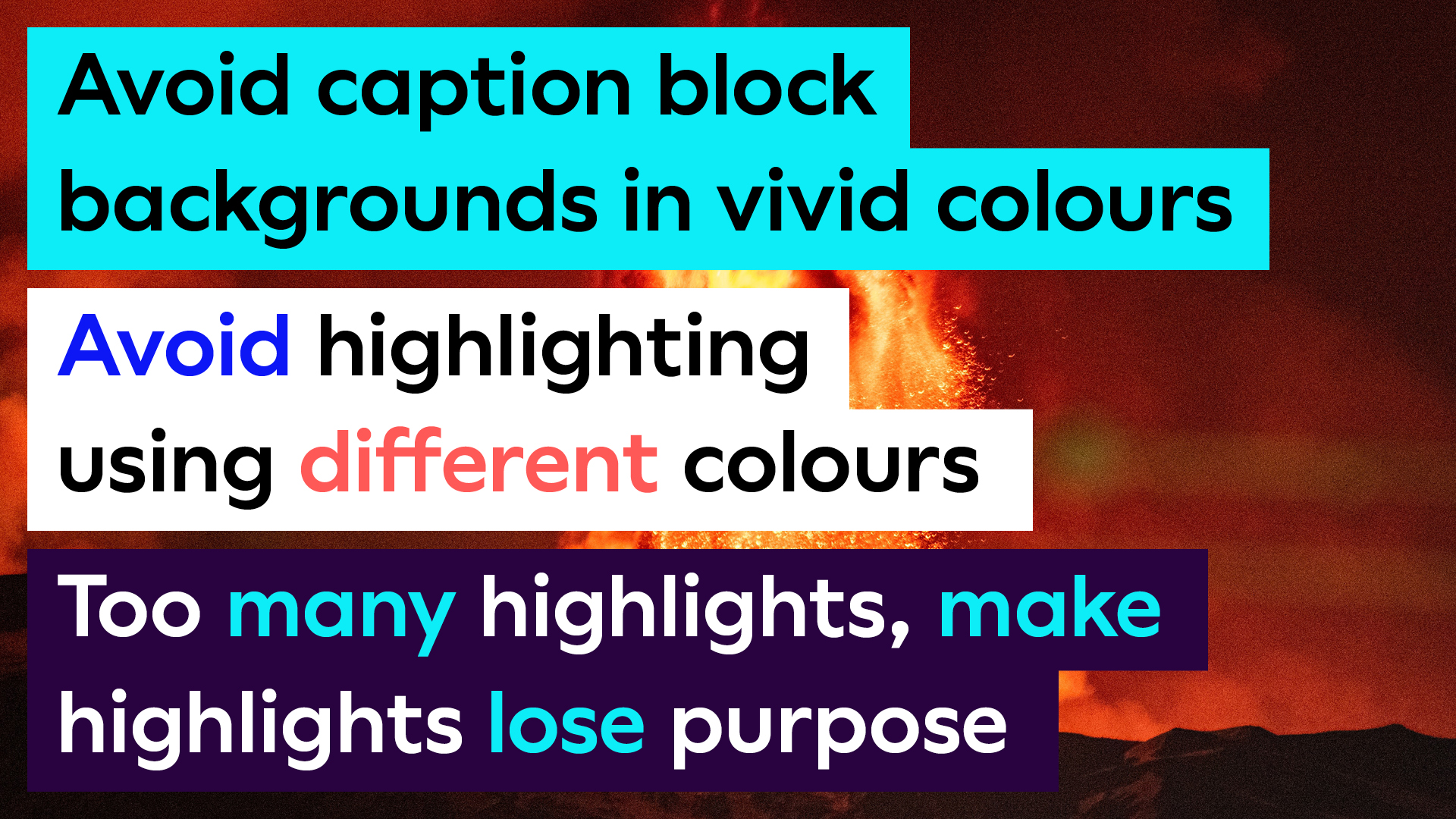
Avoid using low contrasting colours, adding too much vibrant colour, using different colours for highlights, changing the artwork files or covering key parts of the content.
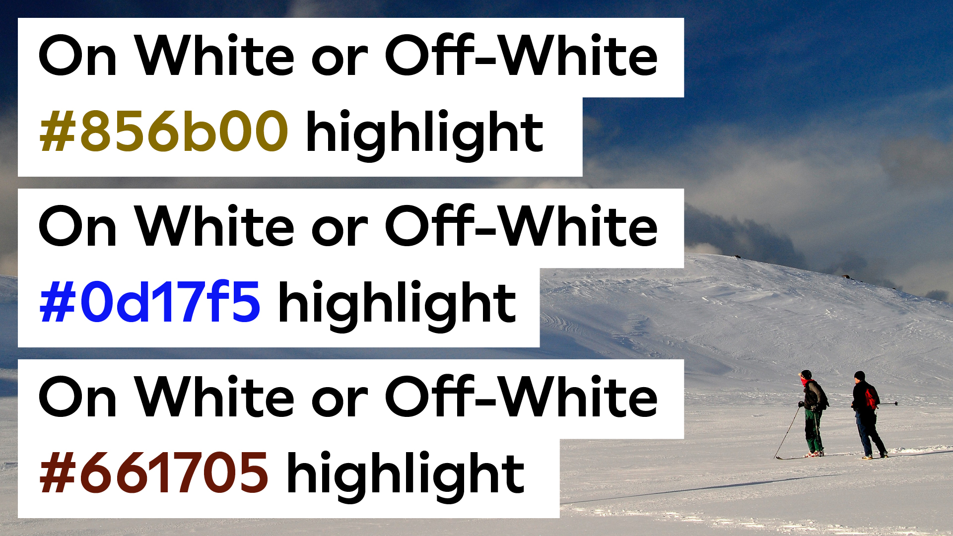
In exceptional circumnstances colour block backgrounds can have white or off-white backgrounds. Only use white background blocks if none of the dark backgrounds shown on the left work with the content.
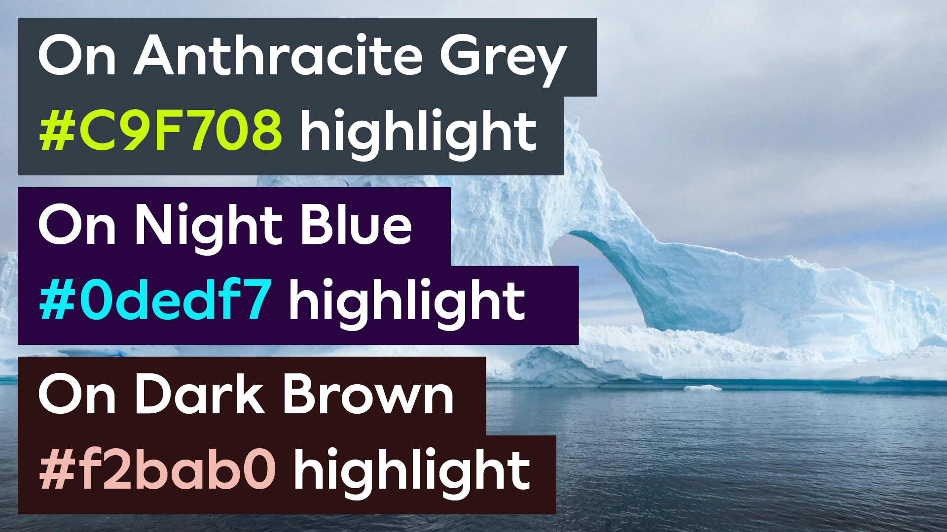
Ensure you keep it simple, make it legible. The colour blocks are there to ensure information stands out, so preferably use a dark colour with predominantly white type. Vibrant colours can be used to highlight key parts of the copy but keep to a minimum and use sparingly.
Name straps and subtitles
Name straps follow the same thinking as captions. They are a functional device to introduce our colleagues, scientists, presenters and guests on our content. They are clean, simple and elegant with a colour flourish at the end to connect with the wider brand system.
The artwork files provided contain specified colour combinations for the name straps from our four colour combination sets. See Colour section for extra information.
Avoid manipulating the supplied files, changing font weights or sizes, making the name strap too big or too small or using colour ways that are not specified.
When using subtitles and name straps together ensure there is enough space for clear and visible subtitles.
Title squeeze
Our branded title squeeze follows the same principles as name straps and captions to convey information in a clear and coherent way that doesn't fight with the content.
Single squeeze version
Double squeeze version
End cards
Our primary Logo In is used for end cards. Our branded transition style is used to introduce different background colours for supporting information and partnerships.
When sizing partnership logos, follow the guidance provided in the Accreditation section.