Our logos
We use a couple of key components in a number of configurations, creating a flexible system that can work with different content and communicate with different audiences.
A flexible system
Our components work to form a monolithic brand model that can flex across different applications for a range of audiences.
It’s crucial these are reproduced correctly to maintain a coherent visual identity that our audiences can trust.
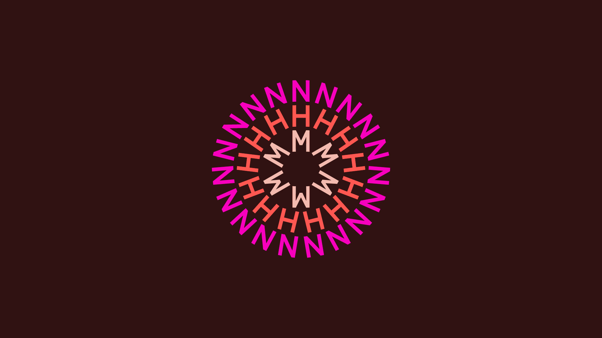
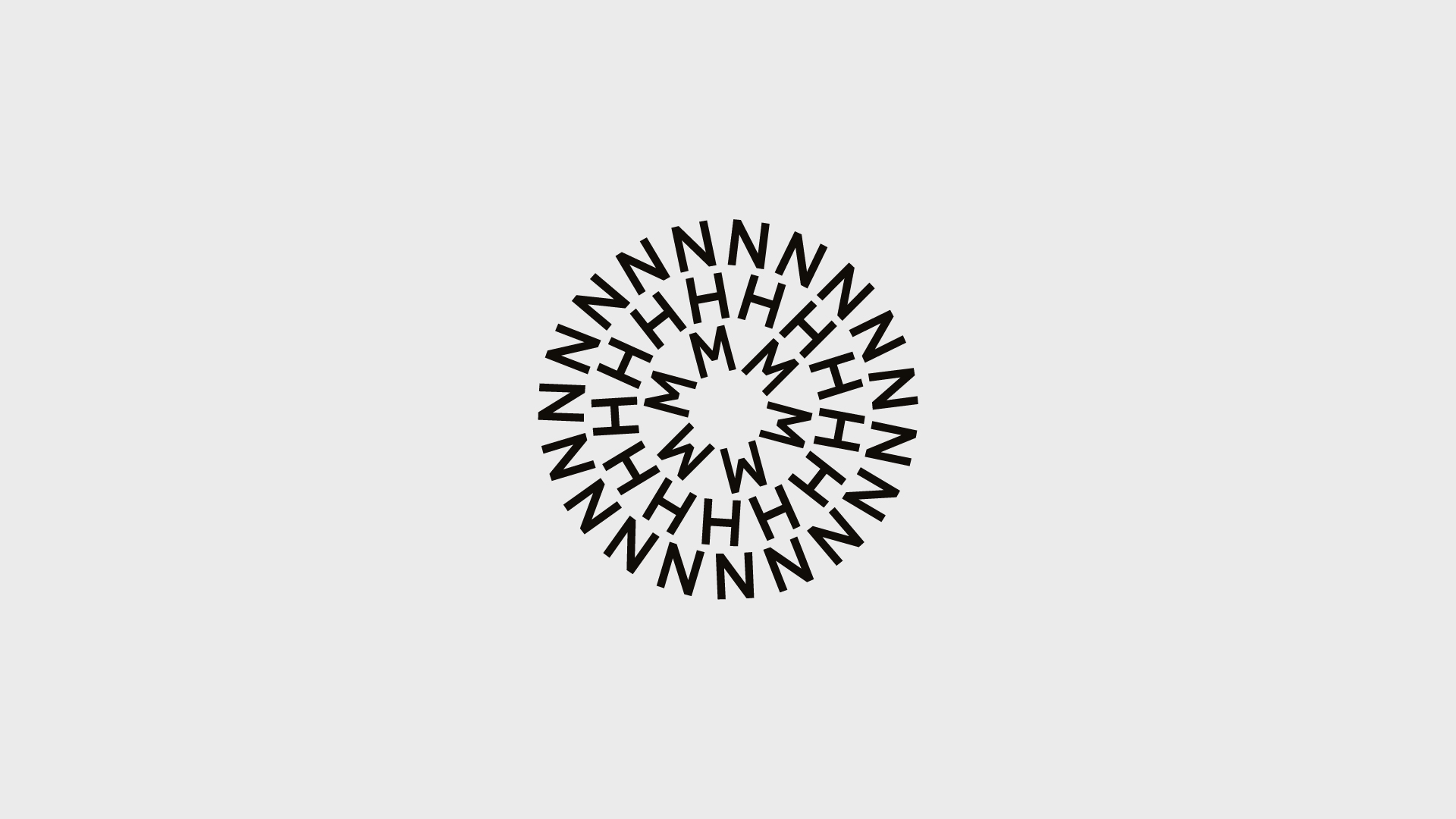
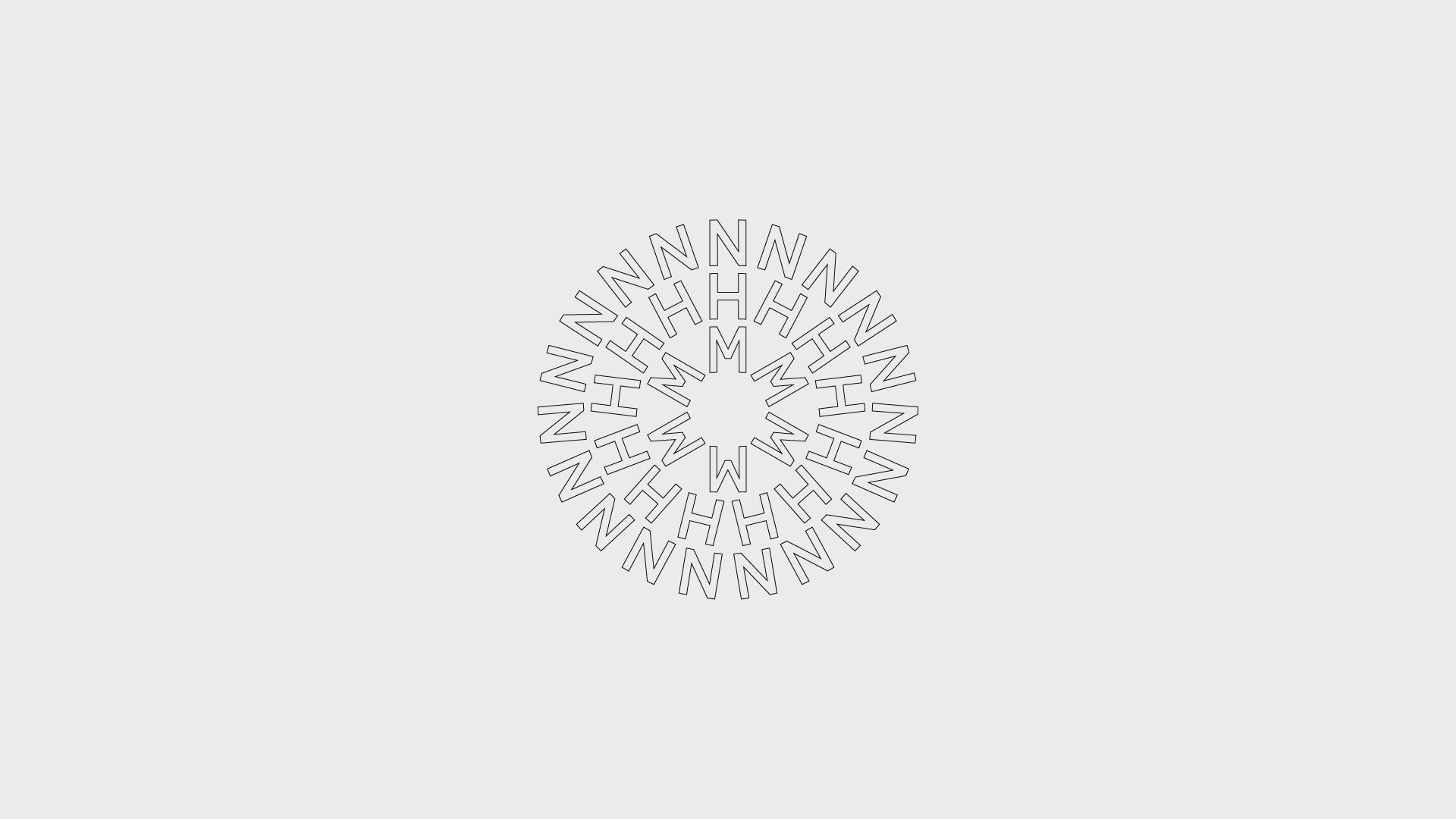
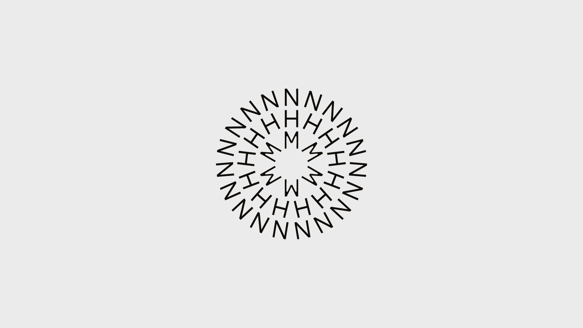
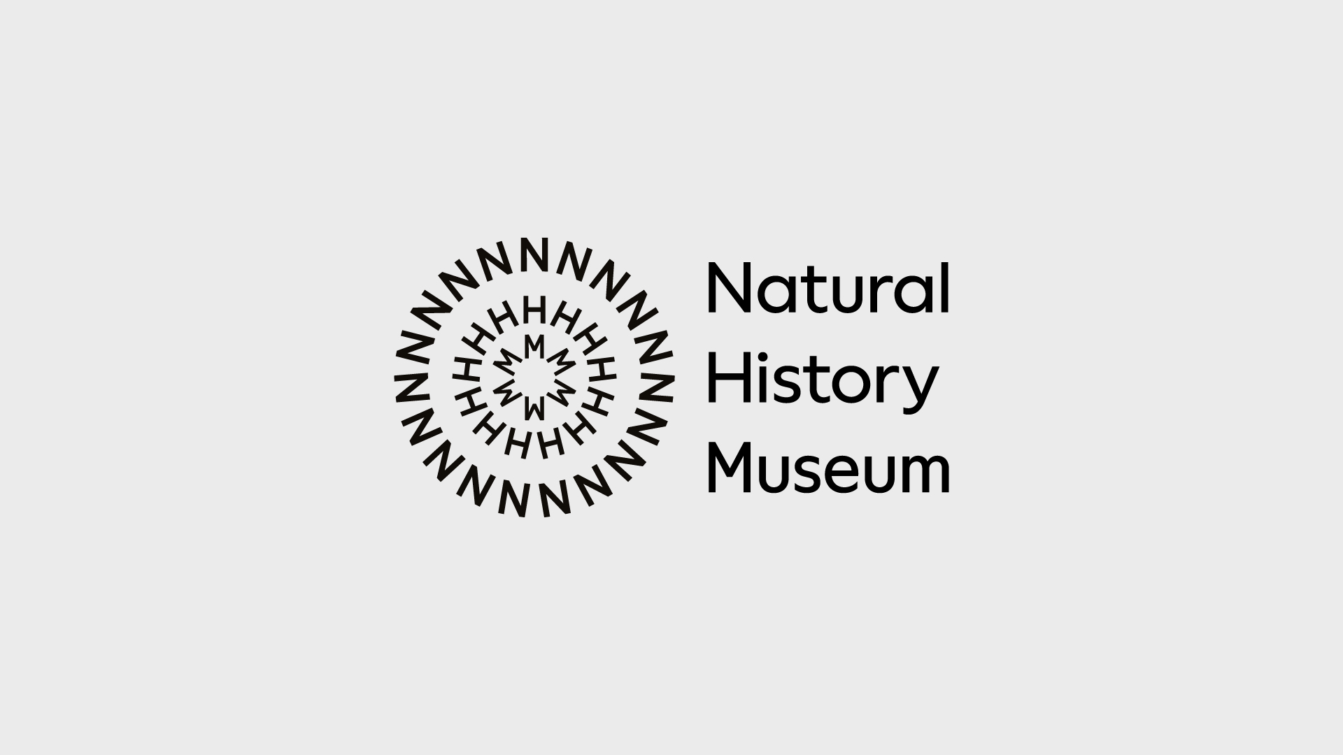
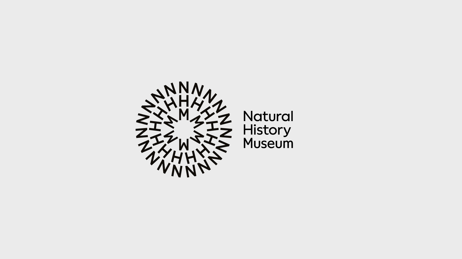
Symbol
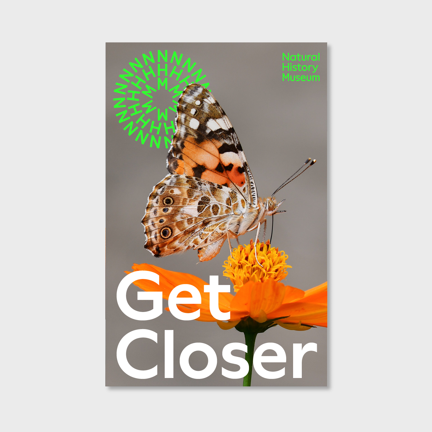
Our symbol is composed using the characters N, H and M to create a recognisable marque that is unique to our organisation. It conveys the planet perspective as a constant connection between all the themes that we invite our audiences to engage with.
The three rings make reference to a ripple effect, conveying the catalyst role that we play in instigating change. The structure resembles structures seen in nature, from snowflakes to alliums. The repetition of characters makes reference to a collective - a community and movement of advocates for the planet - led by us.
The symbol is the foundation for our pattern, giving us an asset that has more expression and greater flexibility. See the Pattern section for more information.
Whenever the symbol is used, the logotype is usually nearby.
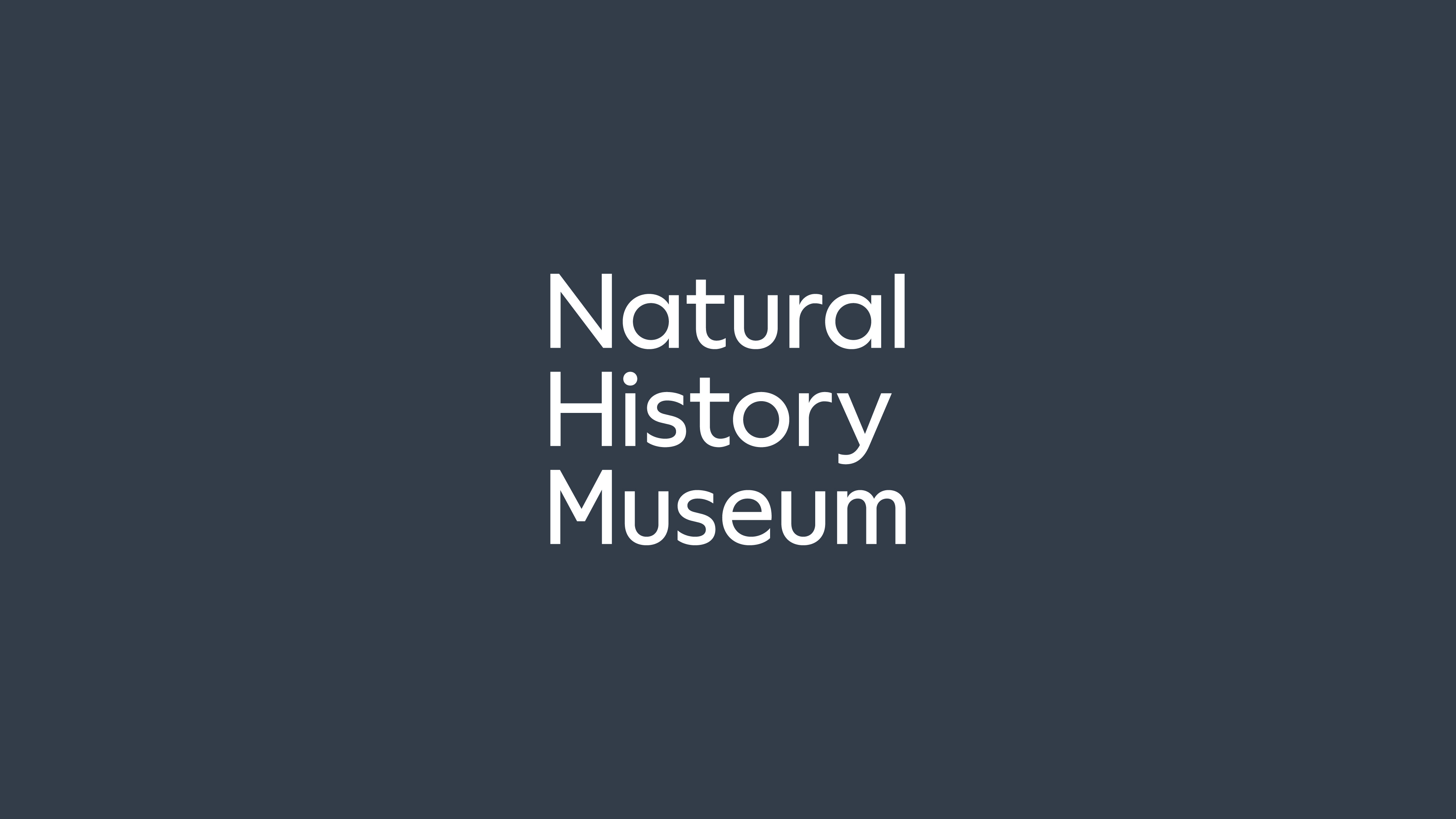
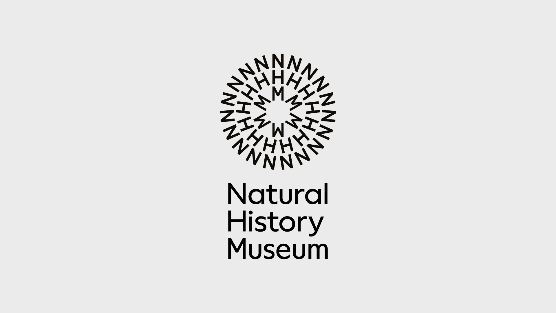
Logotype
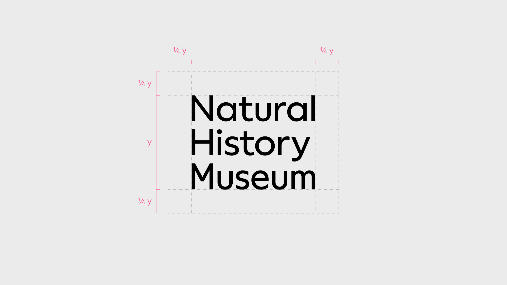
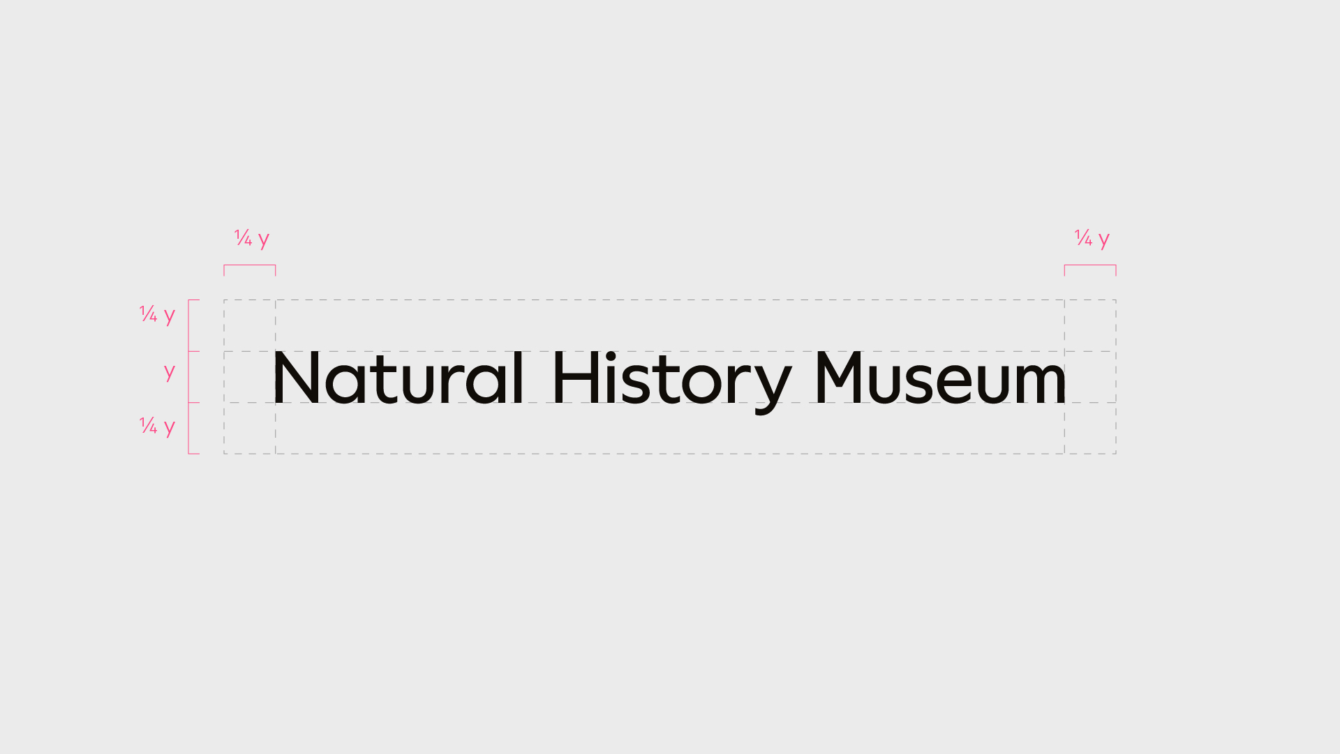
The logotype uses an adjusted version of our custom typeface. It is approachable, open, modern and timeless. Each letter and space of our logotype has been crafted for maximum legibility and ownability.
We use the logotype in a few configurations for maximum flexibility. We also add descriptors, such as locations, to the logotype.
Whenever the logotype is used, the symbol or pattern usually appear nearby.
Always use the artwork provided here for the logo, never typeset or alter the logotype configuration.
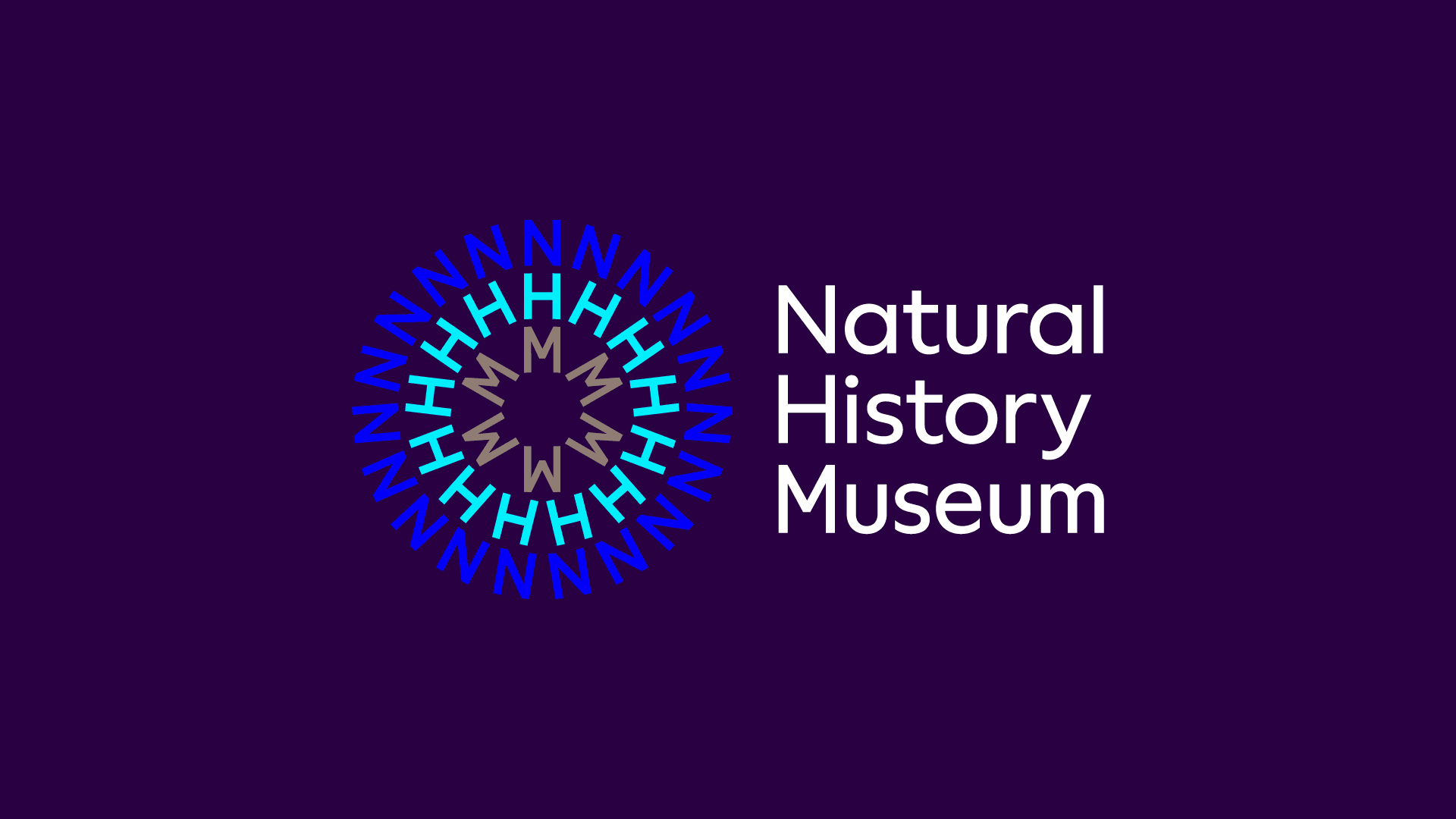
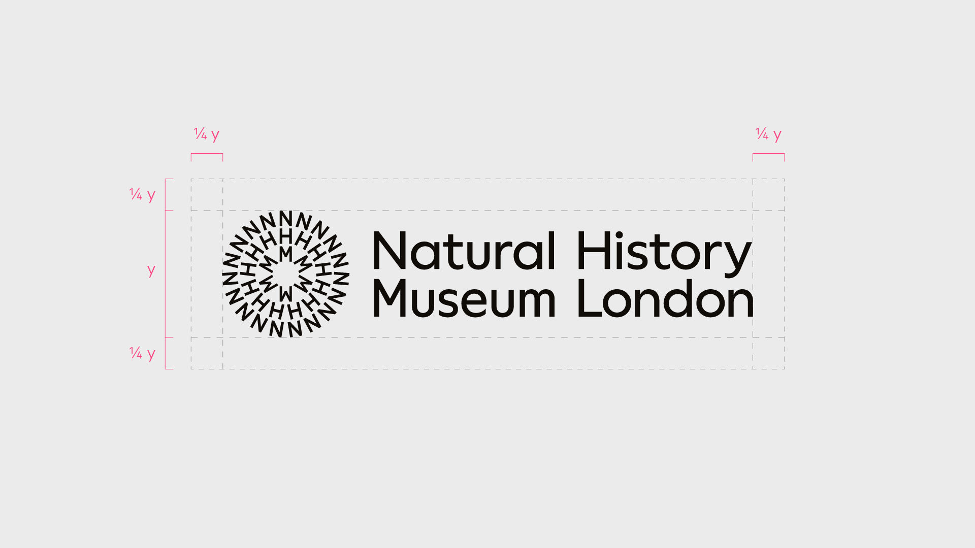
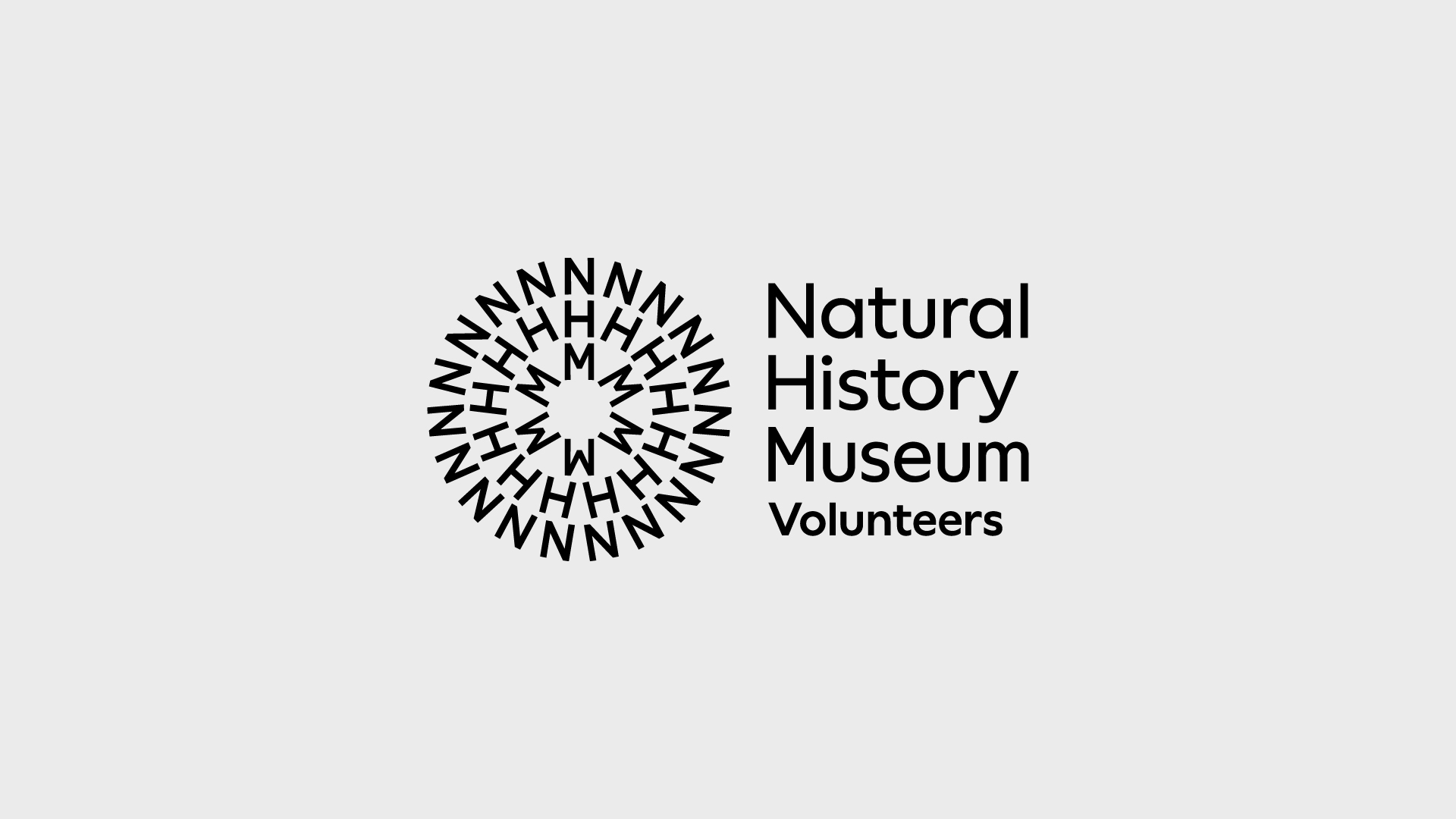
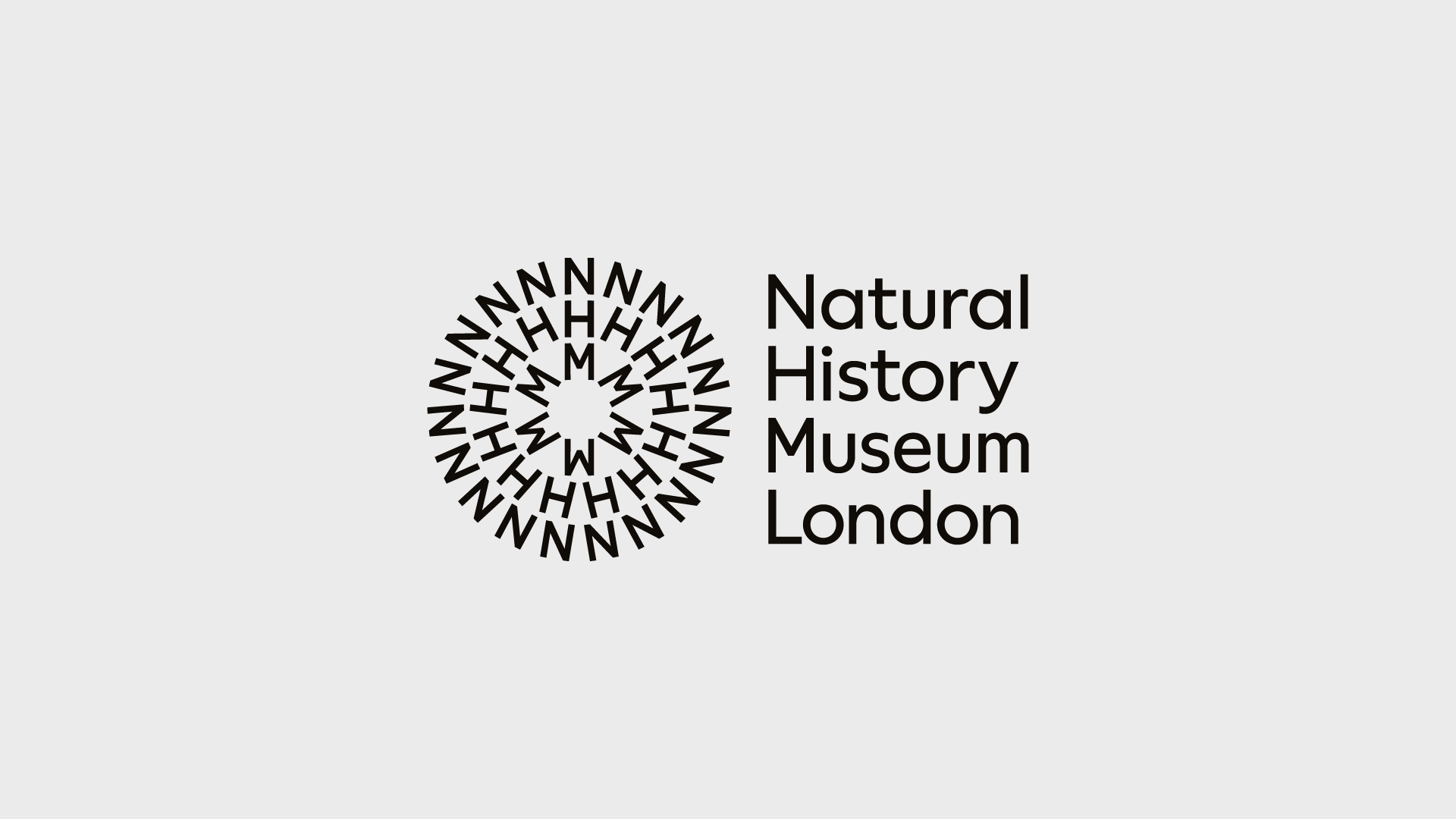
Lock-up
The symbol and logotype work to compliment one another. The logotype is more neutral in its expression, allowing the richness of the symbol to come through.
The lock-up has the same options as the symbol and logotype. We can use colour to emphasise the brand diversity in brand-led situations, as well as add to the logotype to raise awareness of our offering.
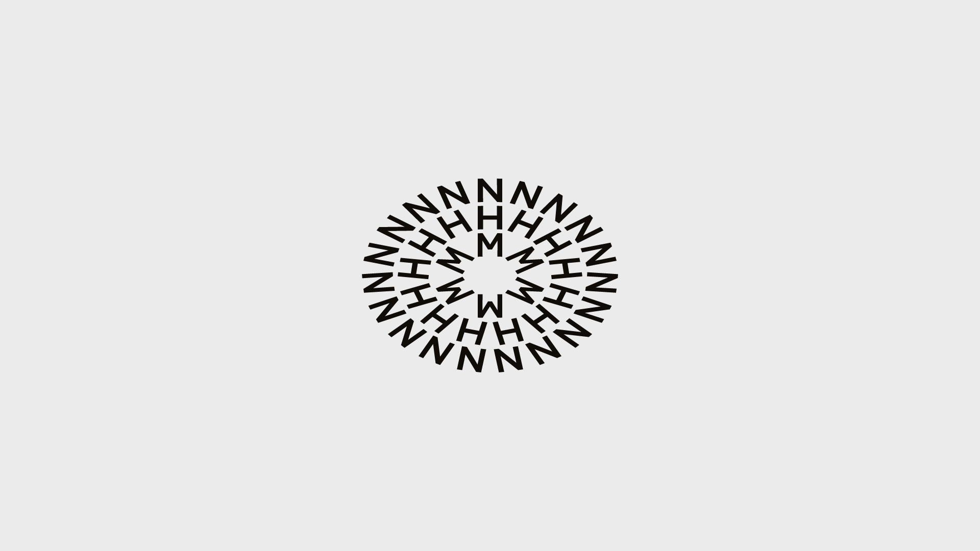
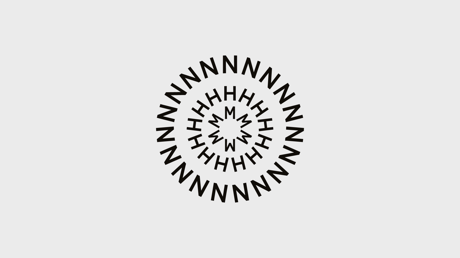
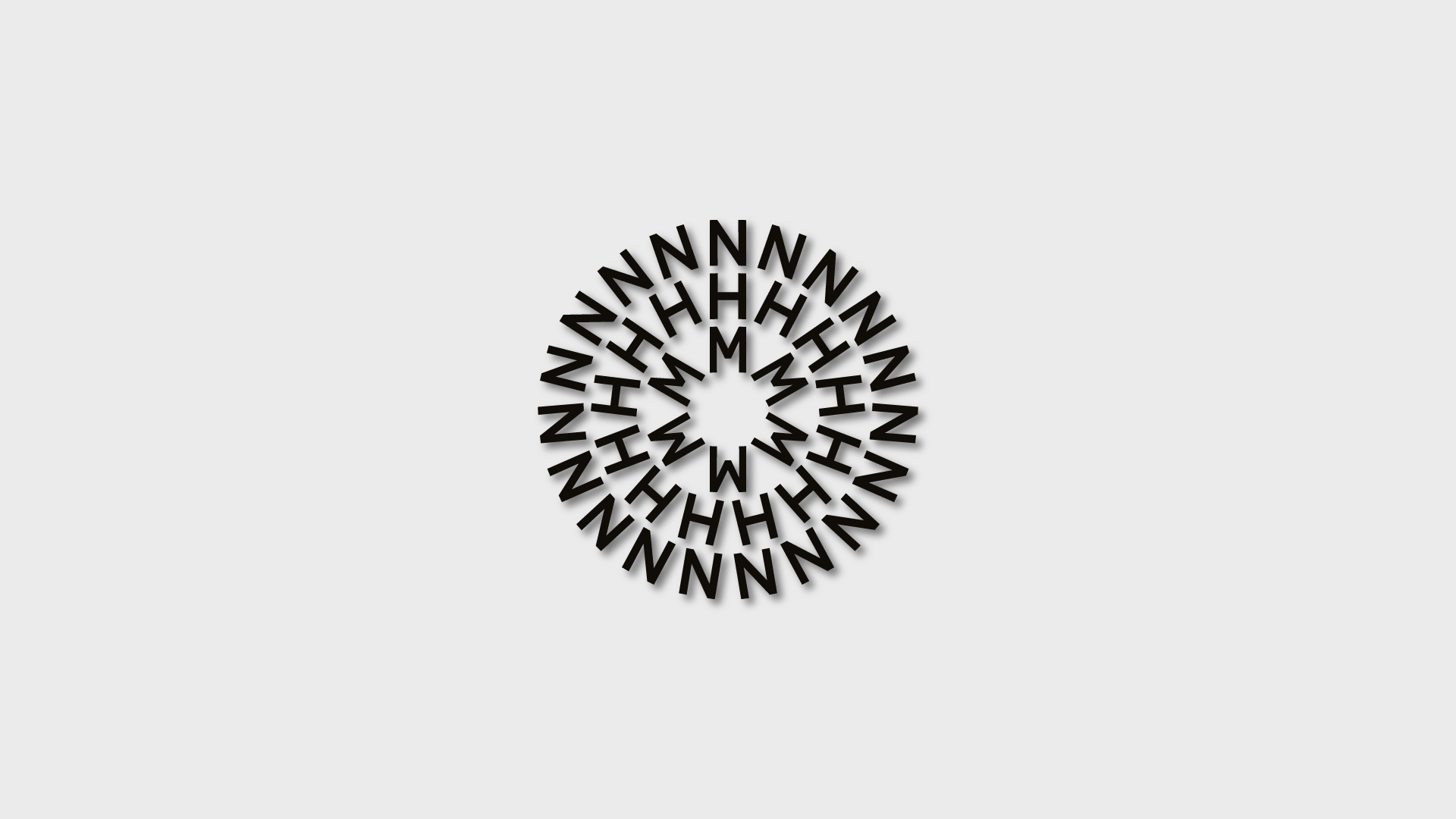
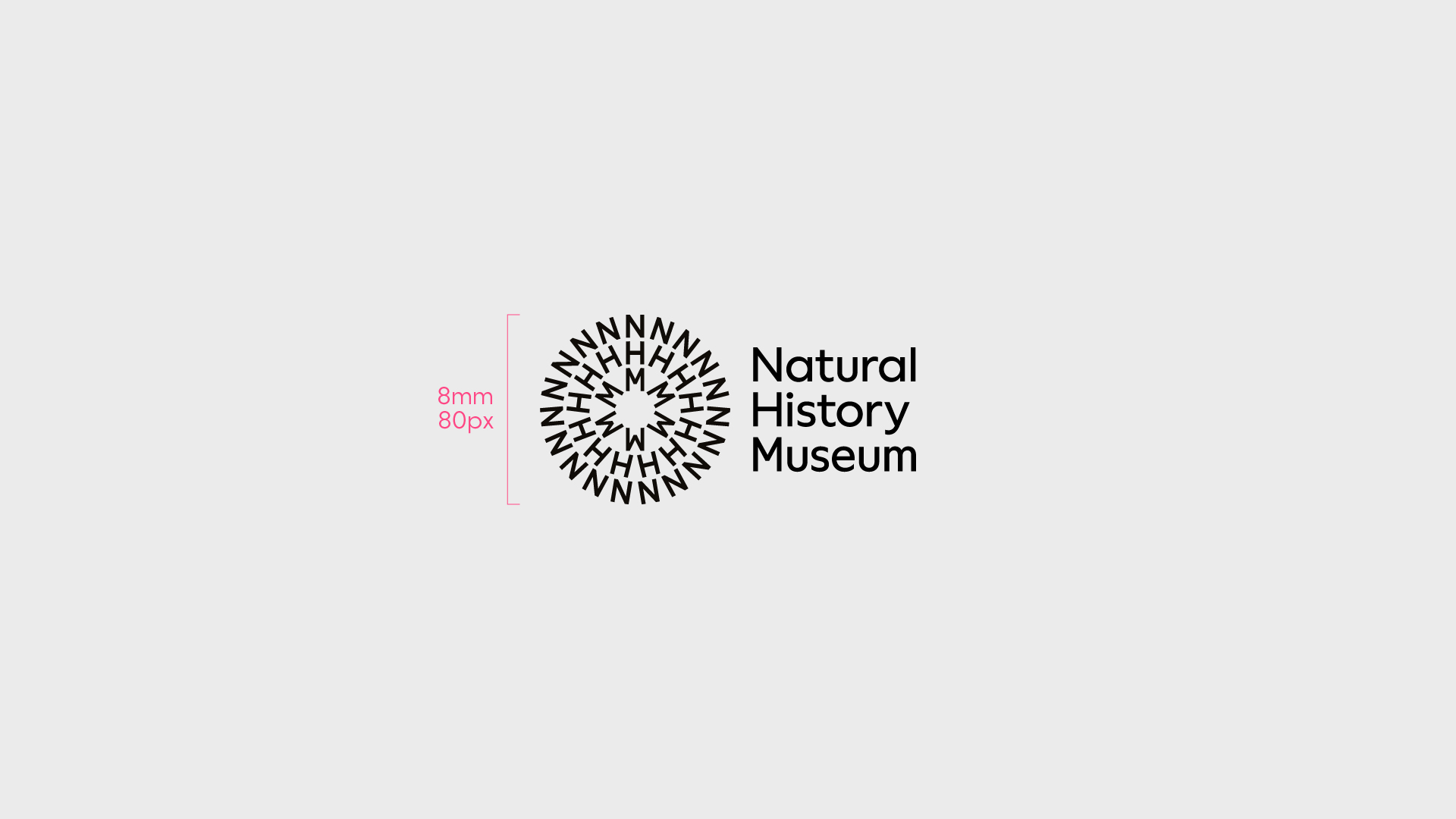
Symbol
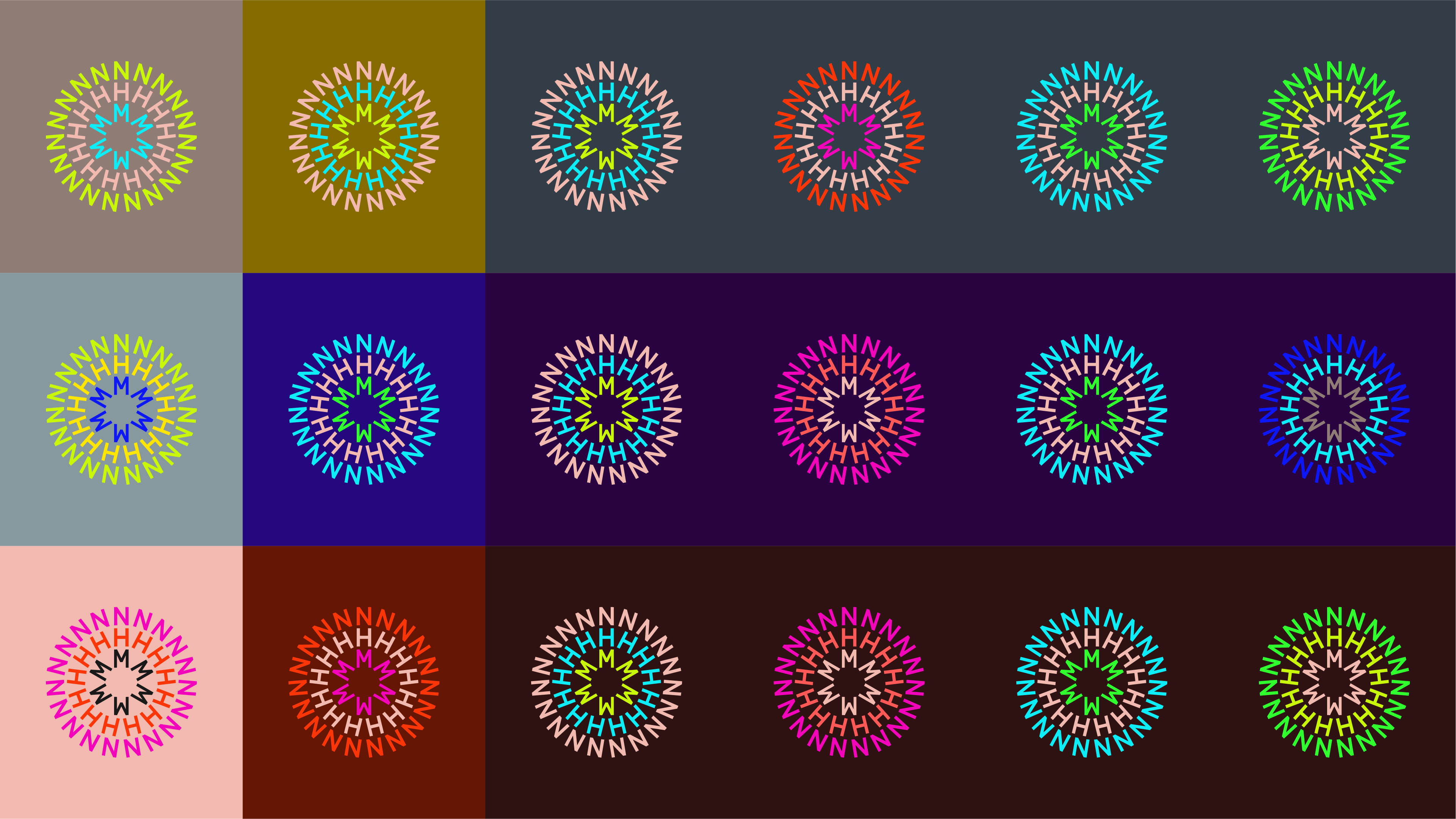
Our symbol can either be used as a multicoloured asset (three colours) or a single colour asset (one colour) – this is dependent on where it’s being used and for what purpose.
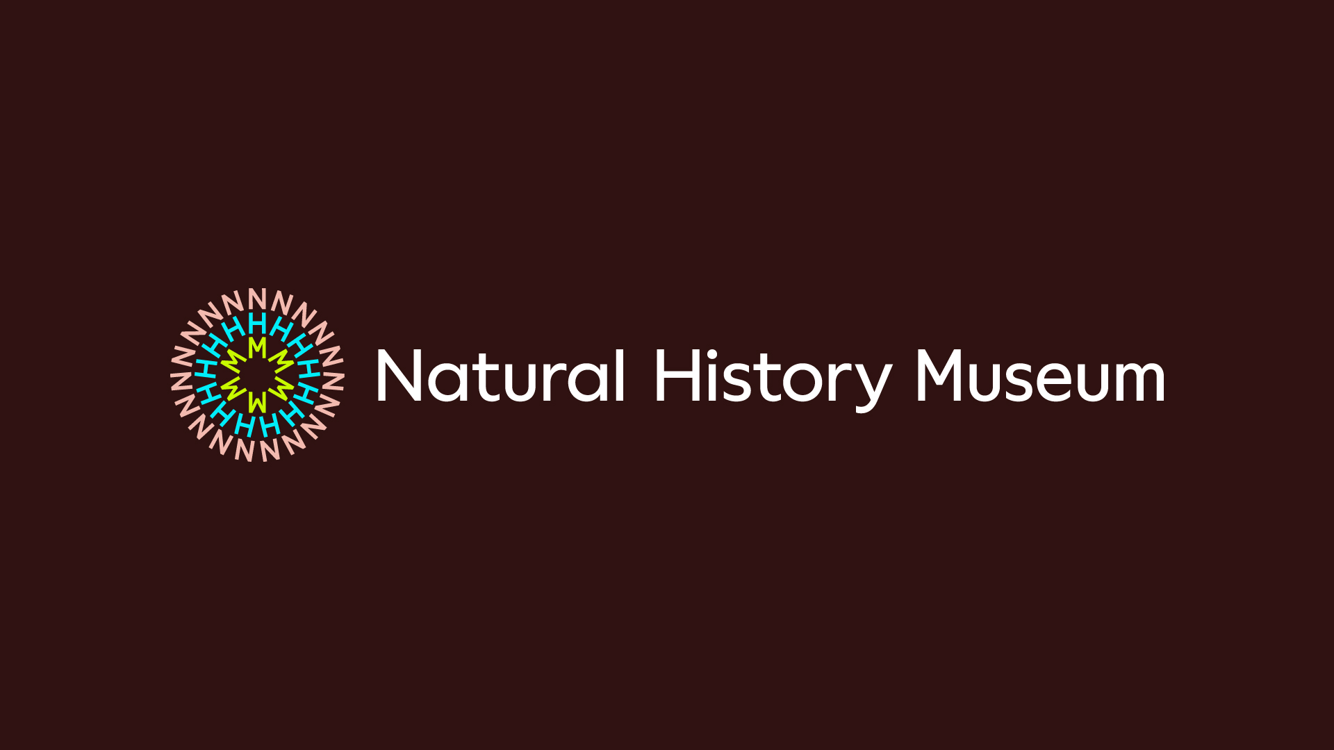
Multicoloured symbol
Every multicoloured symbol has been carefully curated using colours from the palette – these are unique to the organisation and must always be followed, including the predetermined background colour as shown here. The multicoloured symbol is only ever used on muted or white backgrounds.
Use the multicoloured symbol when creating graphic or typographic applications. This includes applications without imagery, such as merchandise, brand-led signage, information literature, website header, newsletters, stationery etc.
Avoid using black backgrounds, always strive to use the darker tones.
See the Colour section for more information.
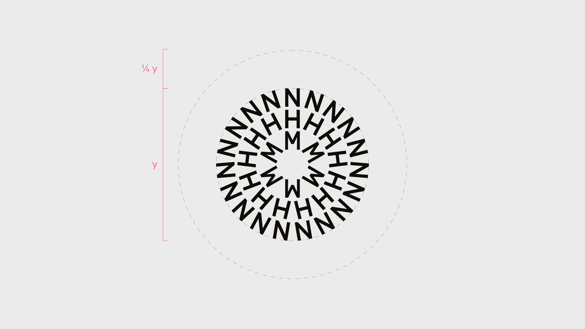
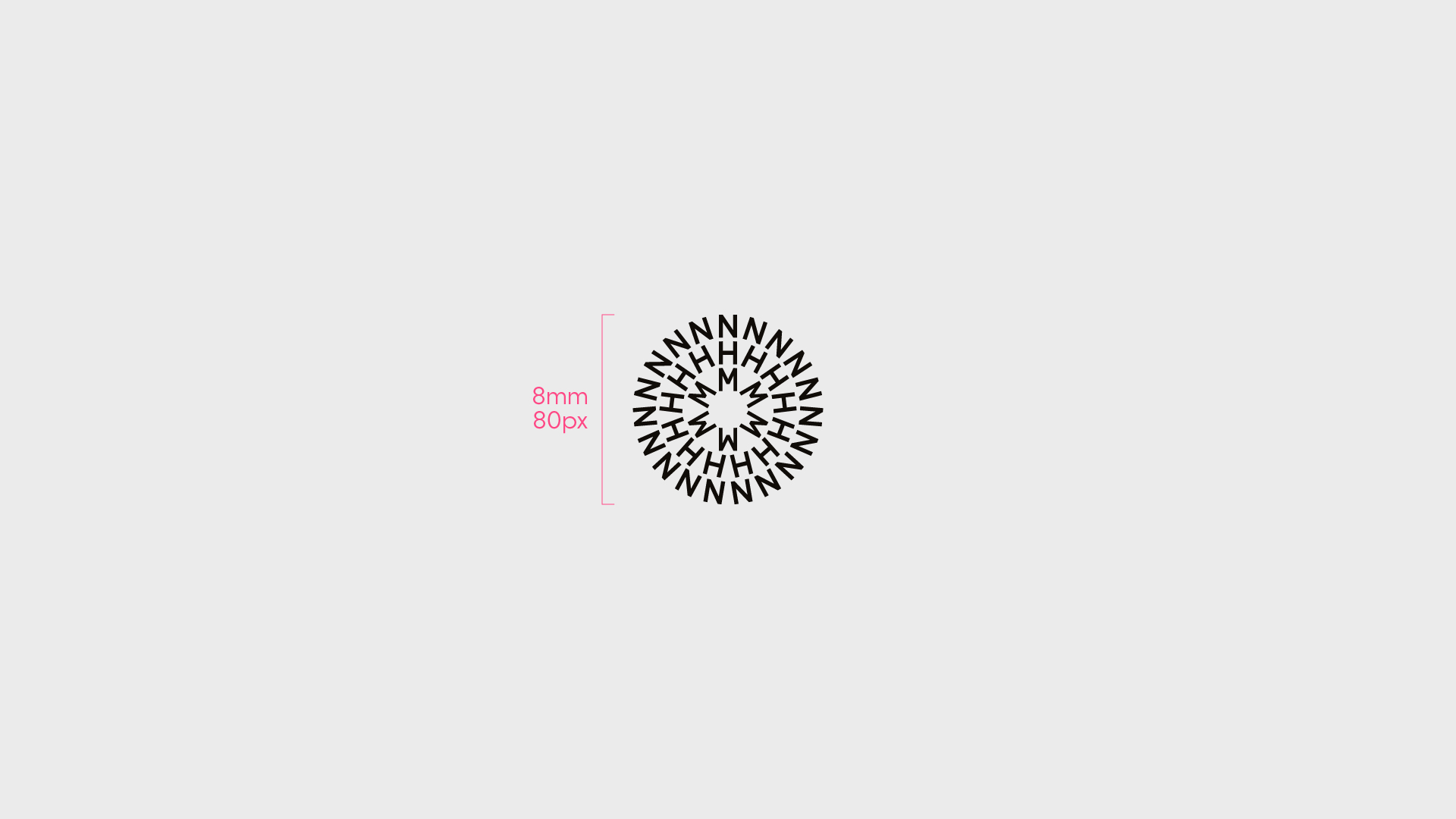
The height of the symbol must never be used below 8mm/80px.
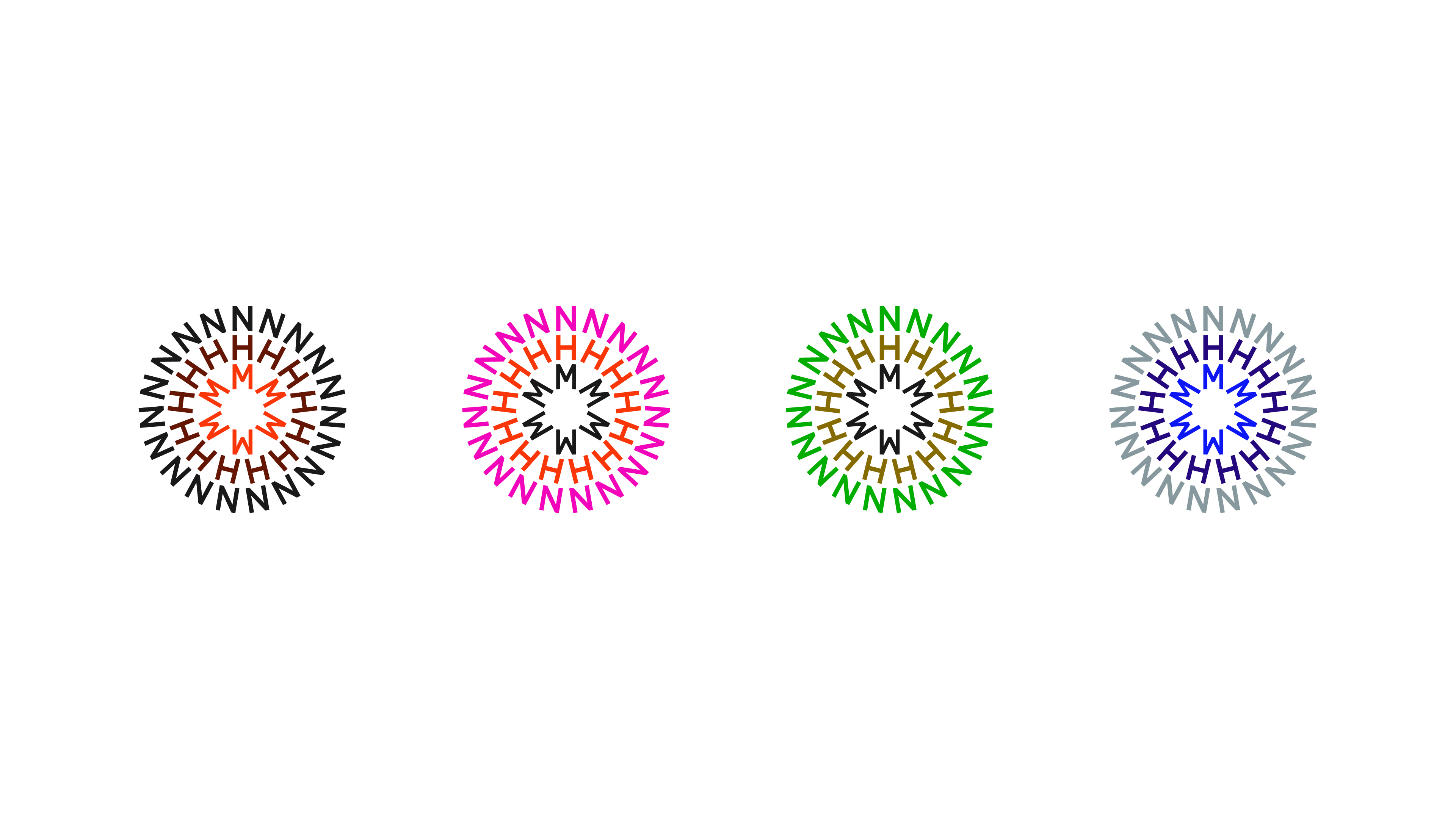
Single-colour symbol
Always use colours from the palette – these need to work with the content.
Single-colour symbols are used when working with imagery, footage or illustration. When placed on coloured backgrounds, we follow the supplied combinations to ensure best practice, as shown here or go to the Colour section for more information.
Colours and colour combinations can be assigned to specific areas of the brand, such as initiatives, including Members and Patrons, or major programmes, such as Wildlife Photographer of the Year and Urban Nature Project. These are not exclusive, so check with the Design Team before assigning colour combinations to ensure a variety of colours are in use throughout the brand.
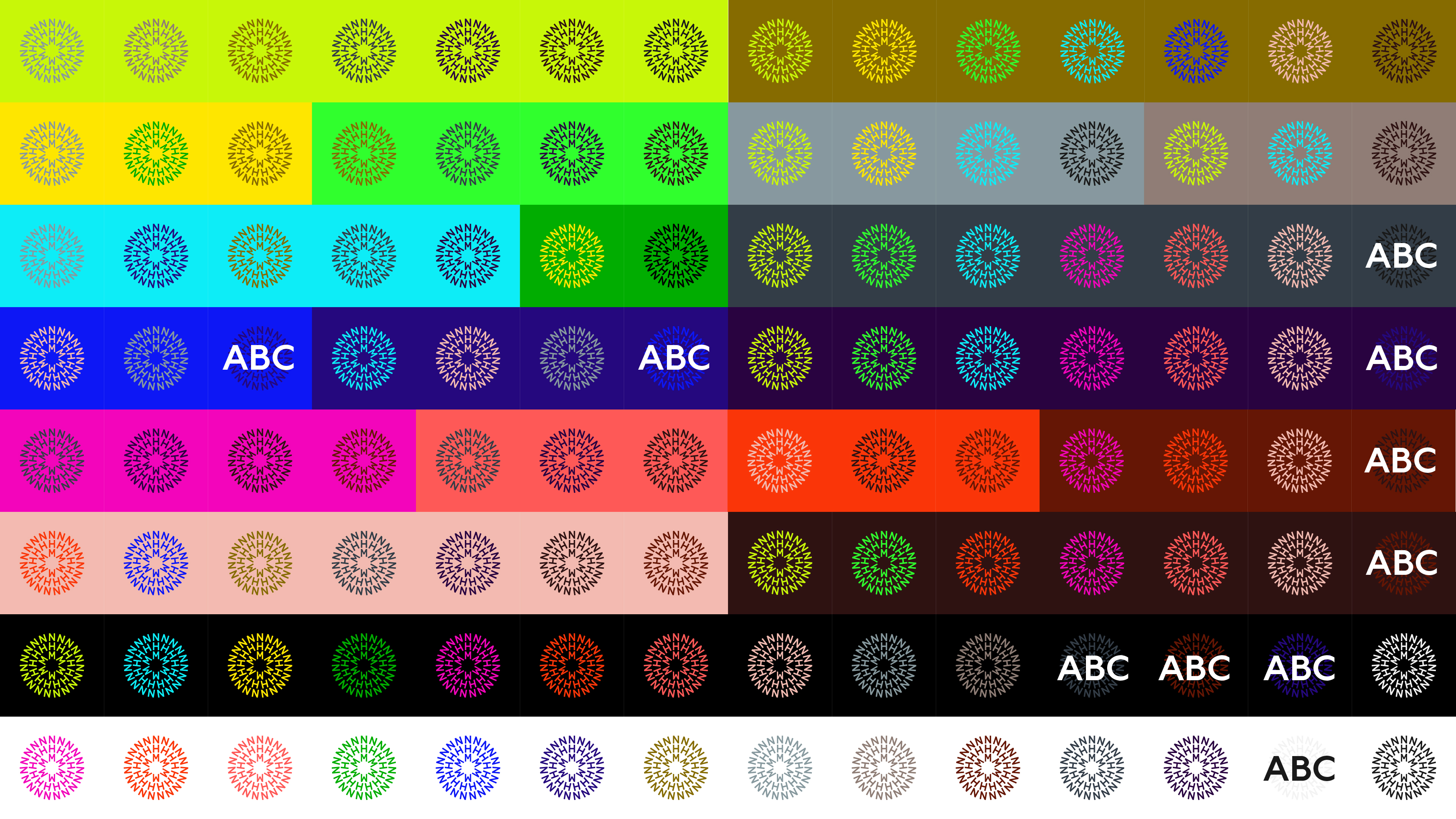
Single-colour symbol on colour backgrounds. Some colour combinations offer low contrast to allow type to be placed on top of it.
Don’ts — Symbol
The following treatments, and similar, must not be used under any circumstance.
Rotate
Distort
Adjust spacing and scale
Effects
Outline
Weight
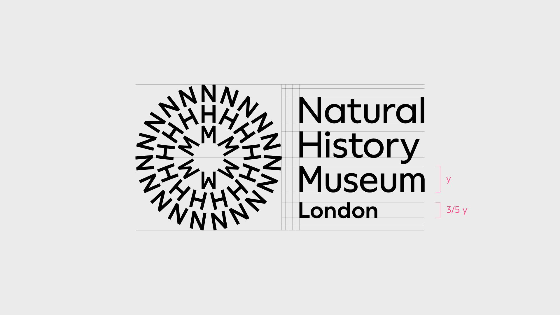
Logotype
We use the logotype in a few configurations for maximum flexibility. When appropriate, we also add descriptors, such as locations, to the logotype.
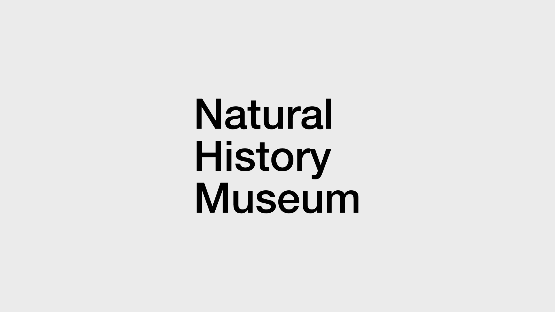
Logotype
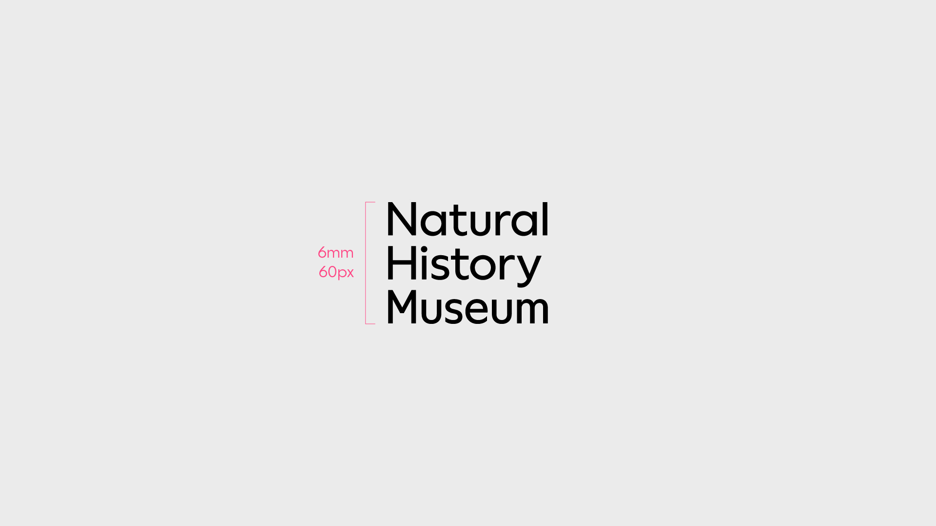
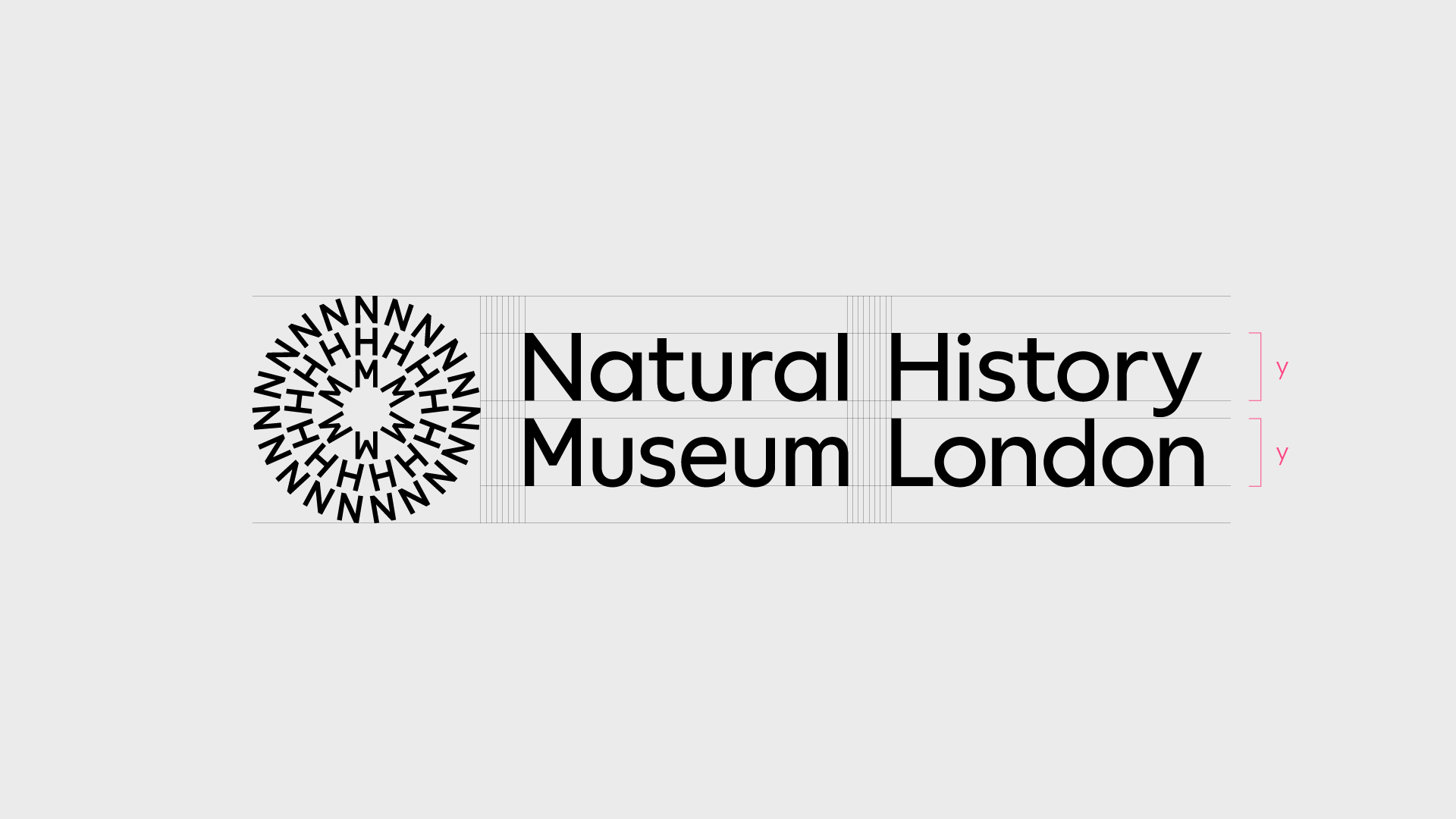
The stacked version of the logotype puts emphasis on the monospaced N, H and M that's found in the symbol.
The height of the three-line logotype must never be used below 6mm/60px.
Always ensure the logotype is legible.
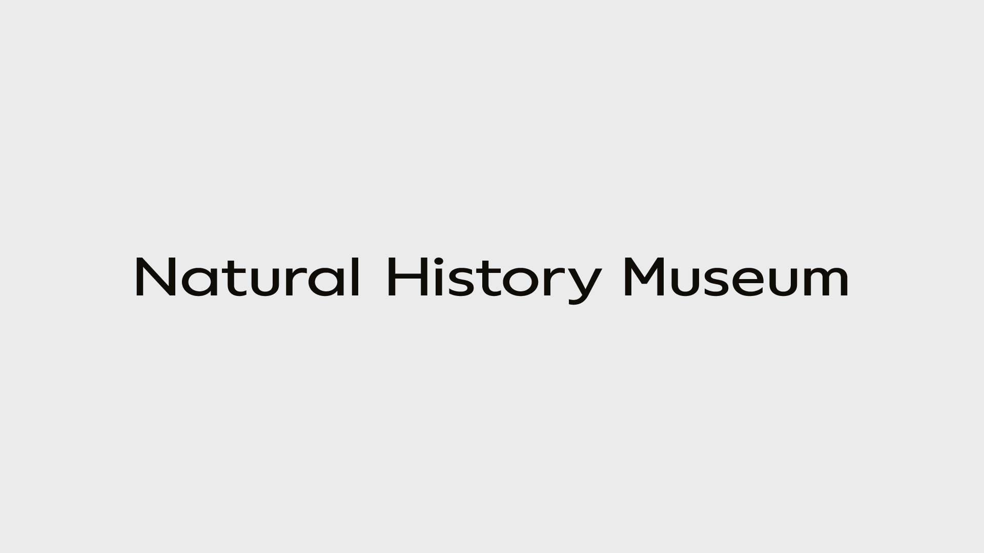
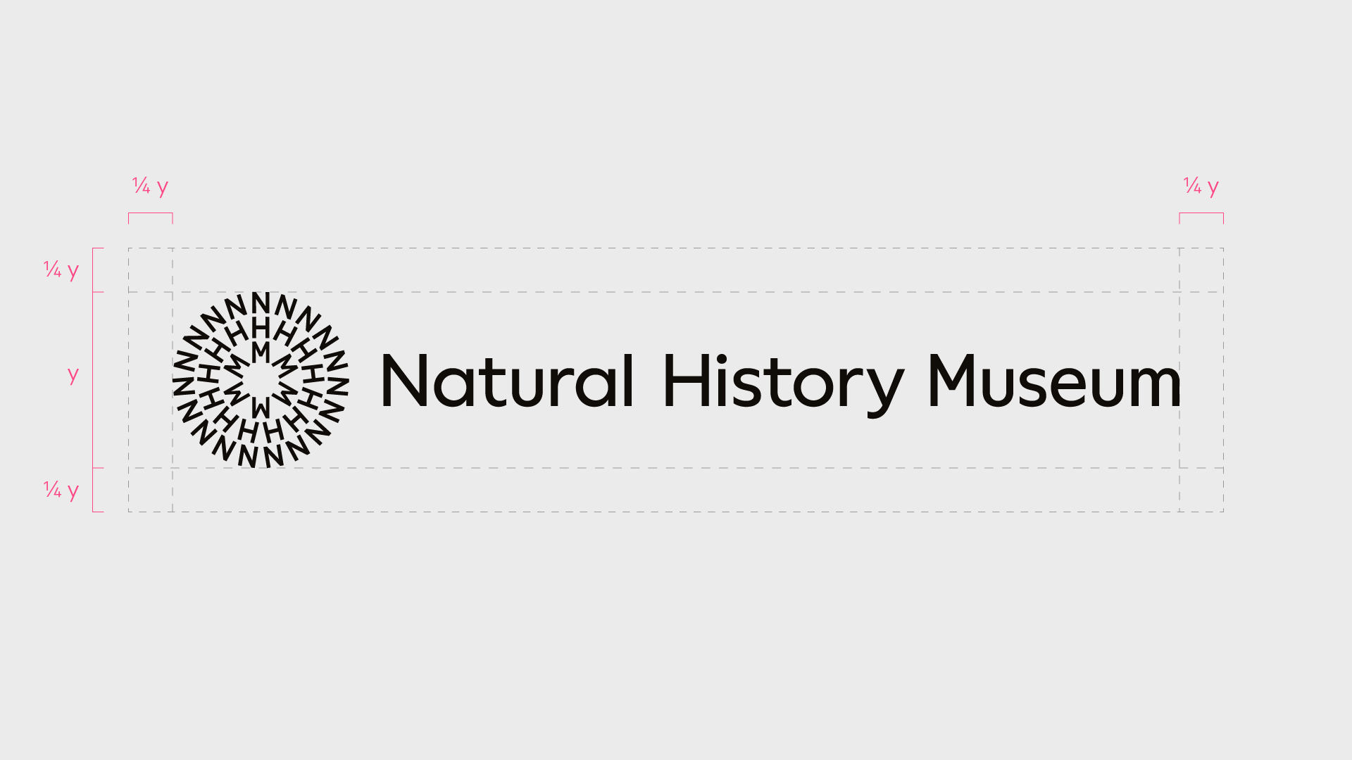
Logotype alternative
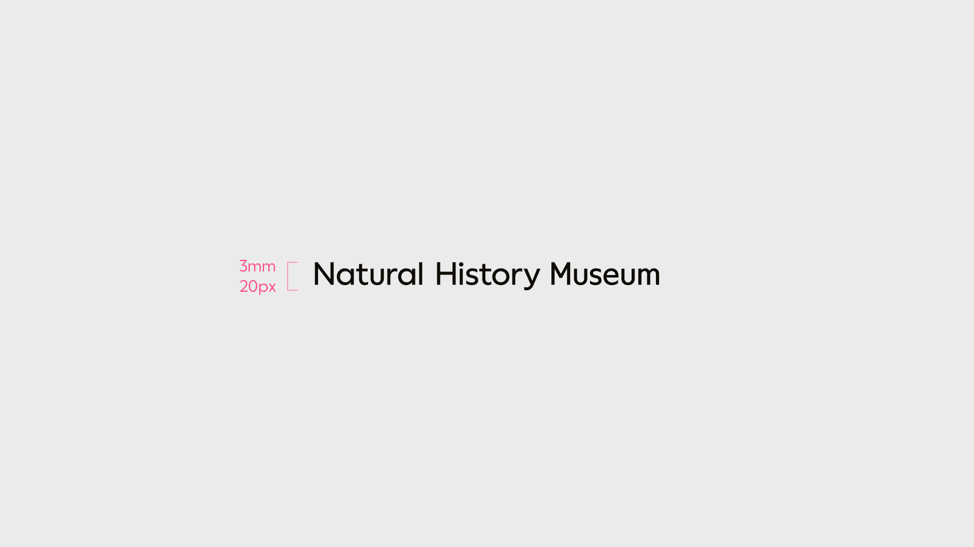
Our logotype can also be used in a single line.
The height of the one-line logotype must never be used below 3mm/20px.
Always ensure the logotype is legible.
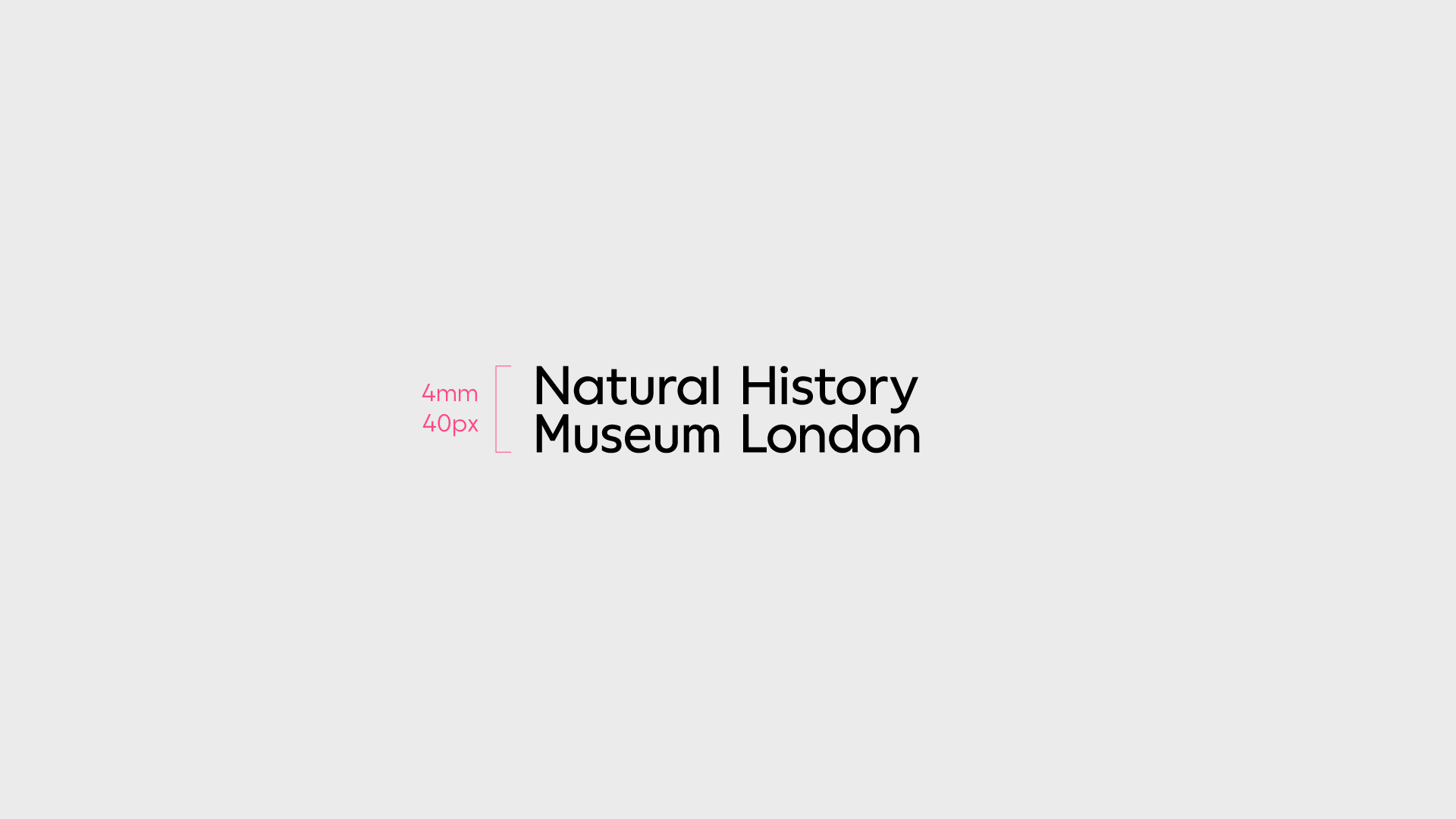
Logotype platforms
To highlight a fundamental offering we add it to the logotype to maintain a strong connection to the masterbrand.
The height of the two-line logotype must never be used below 4mm/40px.
Always ensure the logotype is legible.
Additional structural platforms must be discussed and agreed in advance with the Design Team.
Don’ts — Logotype
The following treatments, and similar, must not be used under any circumstance.
Other typeface
Distort
Change position
Effects
Outline
Adjust spacing
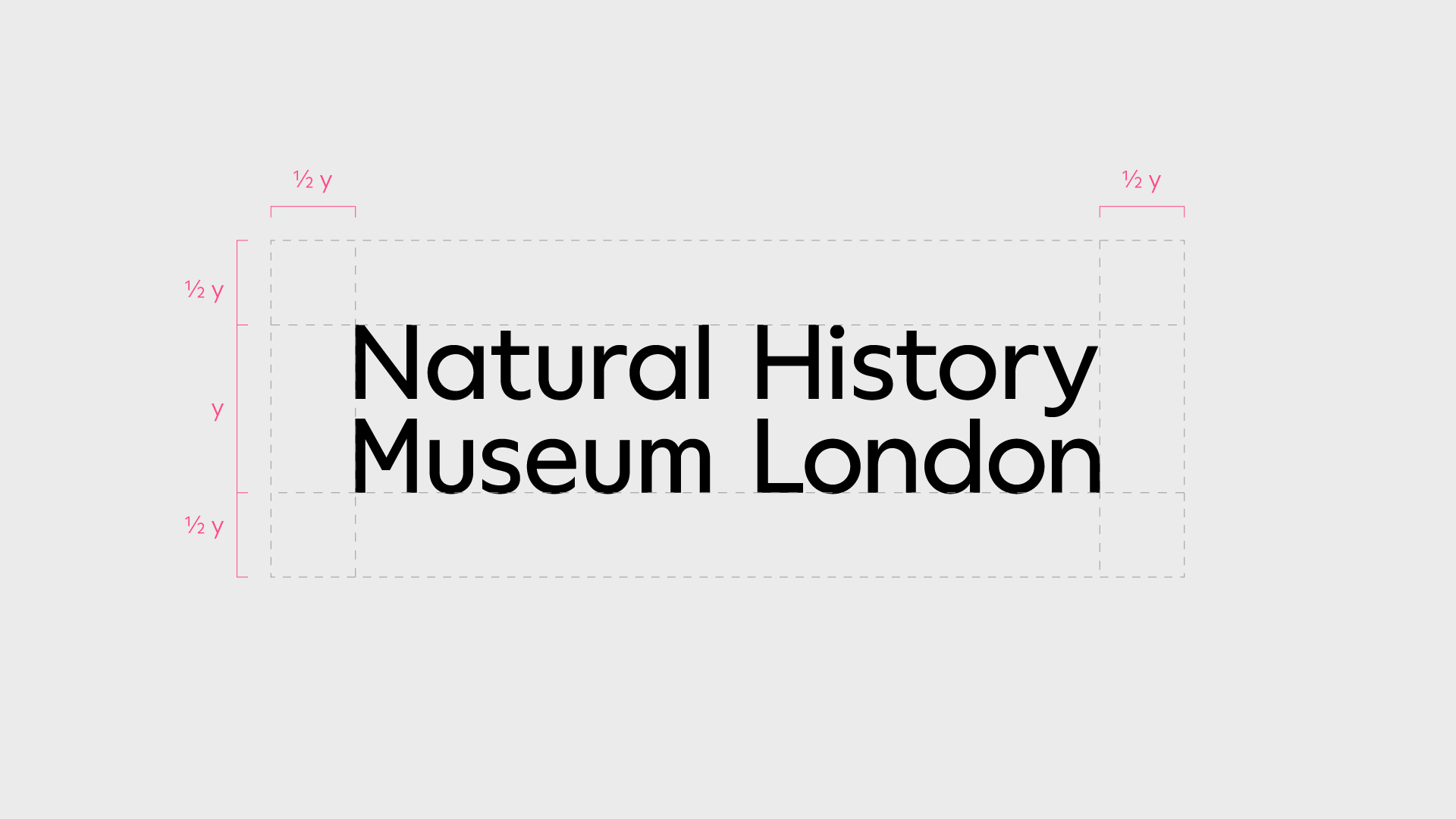
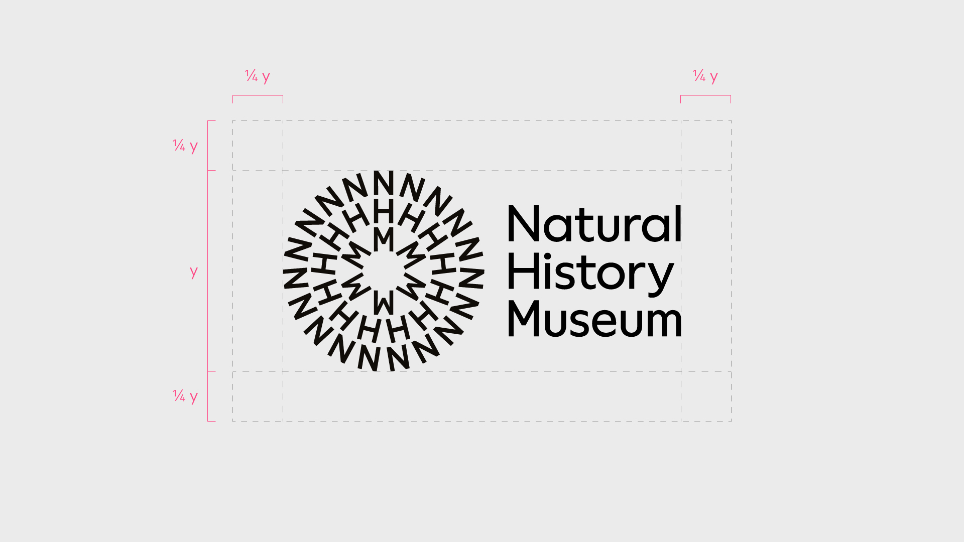
Lock-up
Our symbol and logotype can appear together as a pre-determined lock-up. There are a few different combinations that can be used depending on what works best for the application.
Lock-up
These must work with the content – we use a multicoloured symbol for graphic or typographic applications and a single colour symbol when working with imagery, footage or illustration.
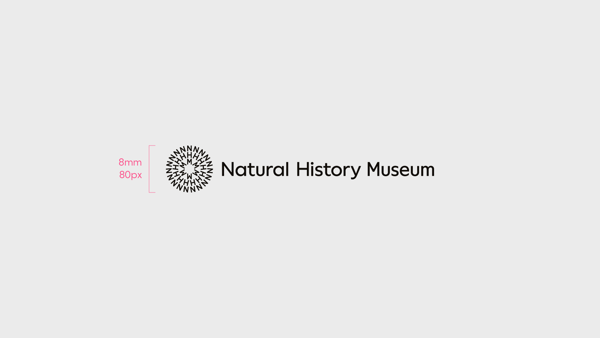
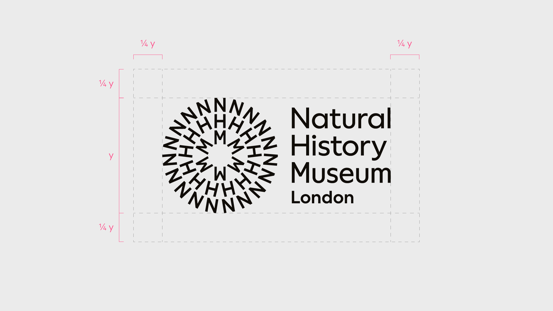
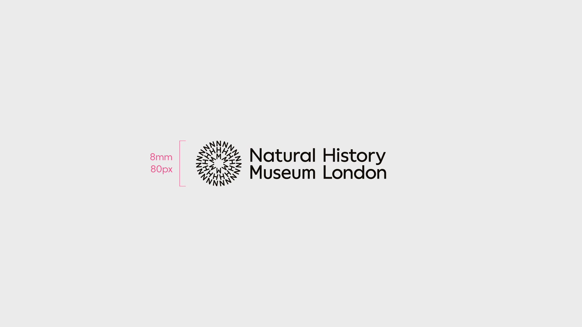
The height of the Natural History Museum lock-up must never be used below 8mm/80px. Always use the provided artwork and ensure the logotype has adequate legibility. Never try to recreate the lock-up.
For situations where the Brand Team doesn't have control over the output, such as co-branding partnerships designed by third parties, supply black or white lock-ups.
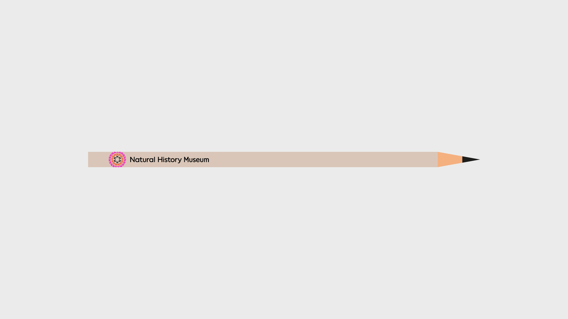
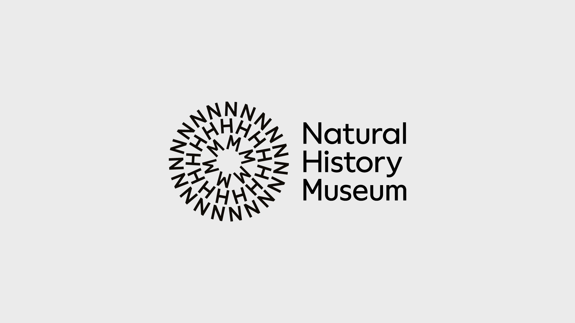
Lock-up alternative
Some formats or compositions will suit the alternative lock-up more than the other lock-up. For example, the alternative lock-up can fit wider formats such as a pencil or a super wide banner better, offering greater legibility.
The height of the lock-up alternative must never be used below 8mm/80px. Always use the provided artwork and ensure the logotype has adequate legibility. Never try to recreate the lock-up.
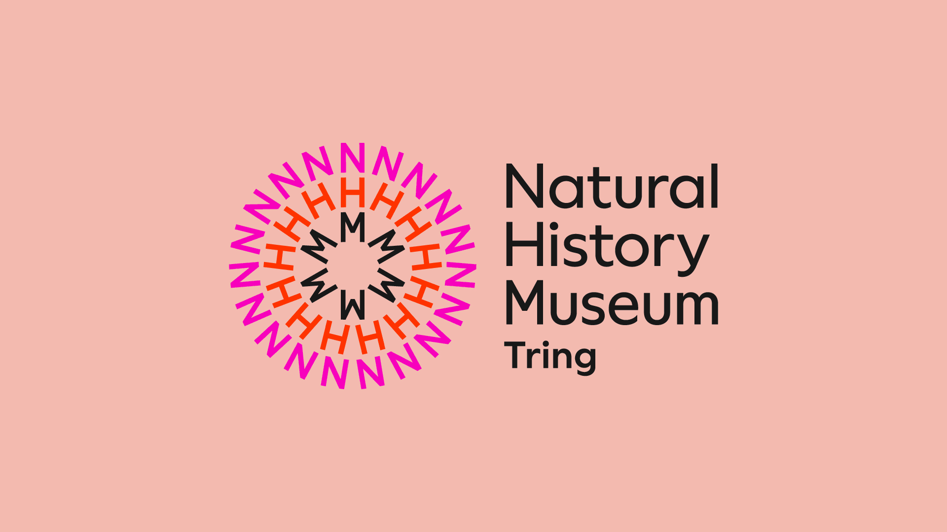
Lock-up platforms
To highlight a fundamental offering we add a descriptor to the lock-up to maintain a strong connection to the masterbrand.
These must work with the content - we use a mulitcoloured symbol for graphic or typographic applications and a single-colour symbol when working with imagery, footage or illustration.
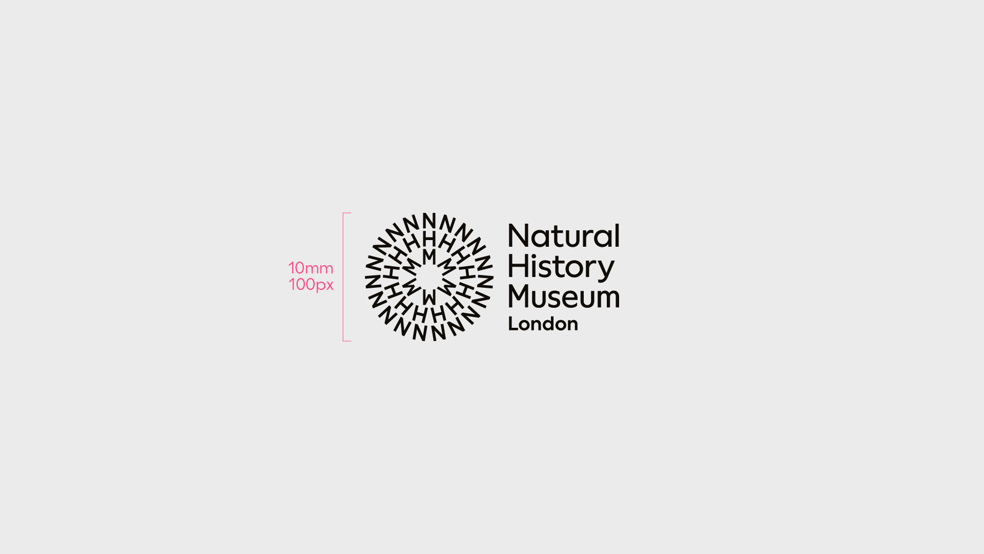
The height of a lock-up with structural platform label must never be used below 10mm/100px. Always use the provided artwork and ensure the logotype has adequate legibility. Never try to recreate the lock-up.
Additional structural platforms must be discussed and agreed in advance with the Design Team.
Lock-up platforms alternative
To highlight a fundamental offering we add it to the lock-up to maintain a strong connection to the masterbrand. Use our alternative lock-up for greater legibility on more challenging formats.
These must work with the content - we use a mulitcoloured symbol for graphic or typographic applications and a single-colour symbol when working with imagery, footage or illustration.
The height of a lock-up alternative with structural platform label must never be used below 8mm/80px. Always use the provided artwork and ensure the logotype has adequate legibility. Never try to recreate the lock-up.
Additional structural platforms must be discussed and agreed in advance with the Design Team.
Don’ts — Lock-up
The following treatments, and similar, must not be used under any circumstance.
Rotate
Effects
Add departments/initiatives
Change position
Adjust spacing
Create new lock-ups
Scale
Adjust scale
Create new symbols
Interact with imagery
The symbol can be used to create interplay with the imagery surrounding it. Using cut-out imagery, the symbol can go behind to add depth.
This can be applied to static and motion content.
No more than 30% of the symbol can be overlapped - the image, object or text must never completely obscure the symbol.
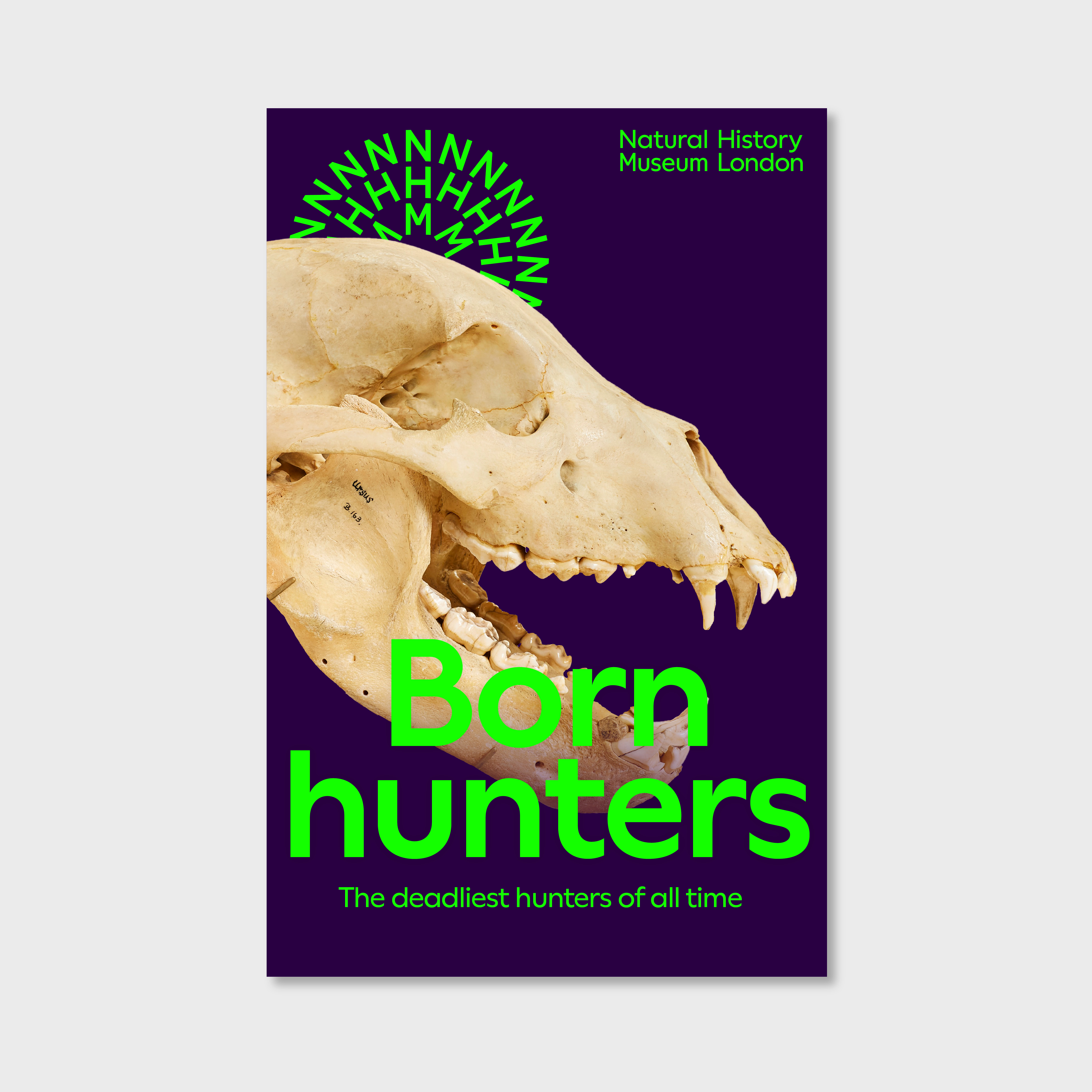
Do not obstruct more than 30% of the symbol
Use imagery that interplays with the symbol to add depth